 On Monday, October 26, CNN.com introduced a new website design, making a number of major changes to their information-heavy layout.
The new design is beautiful, clean, organized and well-structured. It invites the eye to scan and find something interesting with the goal of clicking through to another page.
The previous design was somewhat cluttered and not very inviting; the content looked liked it was being forced into an unstructured space. The new layout is very different and embraces a number of modern web design and usability best practices and trends.
So, let's look in more detail at not only the notable improvements, but some of the questionable design and usability decisions.
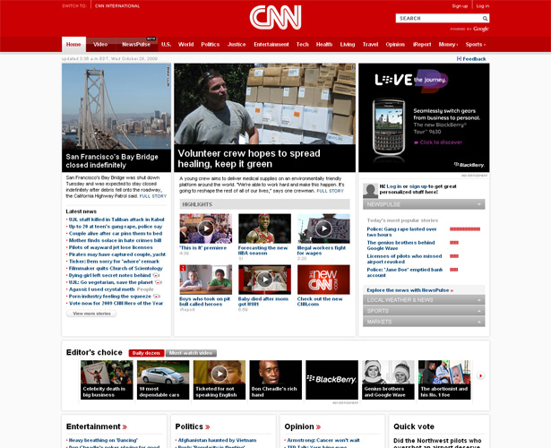
Grid-Inspired Layout
I'm using the phrase "grid-inspired" because the new design seems to be based on a grid, but the precision alignment of elements is not exactly there.
Taking a cursory look at their primary stylesheet, they appear to have loosely based their style and grid on the Blueprint CSS framework.
Their CSS reset bears many similarities to the Blueprint framework, and the word "blueprint" is included at the top, so this would be a logical assessment based on my own limited knowledge of Blueprint.
After analyzing a screen capture of their home page, I've concluded that if they based the new layout on a grid, the specifics of that grid would be: 16 columns, 50px per column, with 12px gutters (the space between columns), totaling 980px in width.
Below is a visual representation of my grid estimate, as a Photoshop mock up:
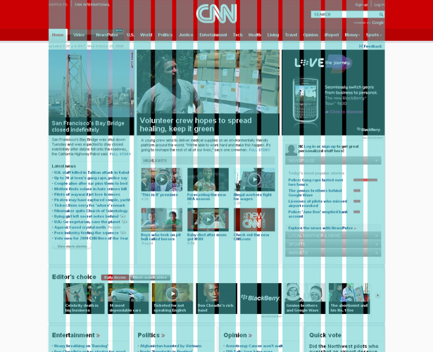
Even though the elements on the page do not follow the kind of alignment and balance that would customarily be expected of a grid layout, there is a noticeable improvement in this layout over the previous design, shown below:
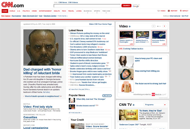
The new layout keeps all page elements inside the 980px-wide container — unlike the clunky-looking previous design that had a fluid-width header that spanned the entire page above a fixed-width content section.
Also, while the old design couldn't seem to decide between rounded corners and square, the new design consistently features square corners with subtle bevel effects separating appropriate elements, as shown in the image below.

Although the format is grid-like, it is, as mentioned, not a strict grid format, and the sections below the fold stray quite a bit in structure from those above.
Drastically Improved Header Section
One of the most apparent improvements in the new design is the header section.
The horizontal navigation bar is modern, clean, and clear. The search box, signup option and login link are in the top-right corner, where they should be.
And, although it is not customary in modern design to center the site logo, in this case it works. It creates a very dominant, vivid, brand experience that is not easily forgotten.

Another nice feature of the navigation bar is that it indicates by means of color and graphics which links are primary, which are secondary, and which will open in micro-sites or sister sites. The latter are indicated by right-pointing triangles ("Money" and "Sports" — more on this below).
Effective Use of Space
On the right-hand side of the page, below the primary ad unit, they've included an accordion-style content switcher, allowing the user to view previews, in a relatively small area, of content related to a number of different topics.
Emphasis on Video & Story Popularity
In the previous design, video had fairly strong emphasis, featured in a box on the right side. In the new design, video is a major category in the primary navigation bar, given virtually the same visual importance as the "Home" link.

Video stories are featured throughout the site, and are clearly indicated by the customary "play button" link on photos that link to video content, as shown below:
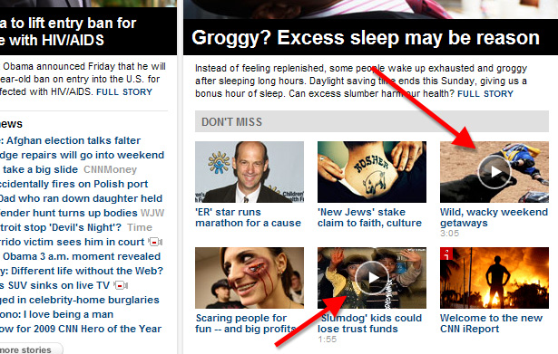
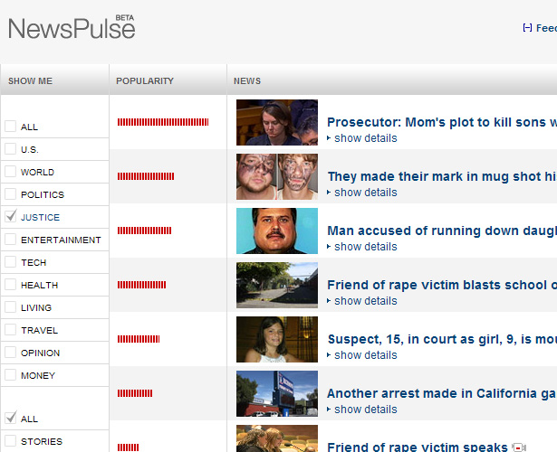
Another category given the same importance as "Home" and "Video", as shown in the image above, is the "NewsPulse" section, which is new and still in beta.
This section displays news stories by popularity (which seems to be calculated by total page views, not comments), and allows the reader to filter the results by category or story type.
Strong Category Pages
The main category pages ("U.S.", "World", "Politics", etc.), accessed from the primary navigation bar, work similarly to the home page.
In fact, if you didn't know what page you were on, you might think you were on the home page. The "U.S." category is shown below:
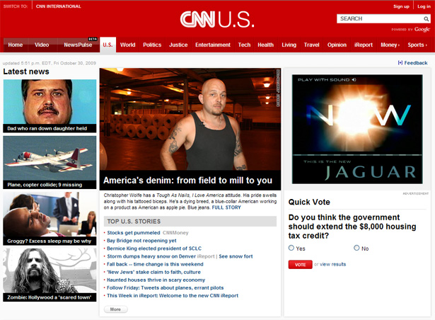
Each of these sections conveniently displays top stories, latest news, and other items related to that category.
The black and white captions below images, also featured on the home page and on article pages, are eye-catching and easy to read, without the use of overly-fancy graphics or font styles.
Strong Article Pages
The article pages, for the most part, maintain the vivid branding of the home page. Body text is nicely displayed in 14px Arial with a very readable line-height.
Although some elements on the pages seem somewhat small, I personally like the way the font size of the article body stands out on the page, so the reader can stay focused on it.
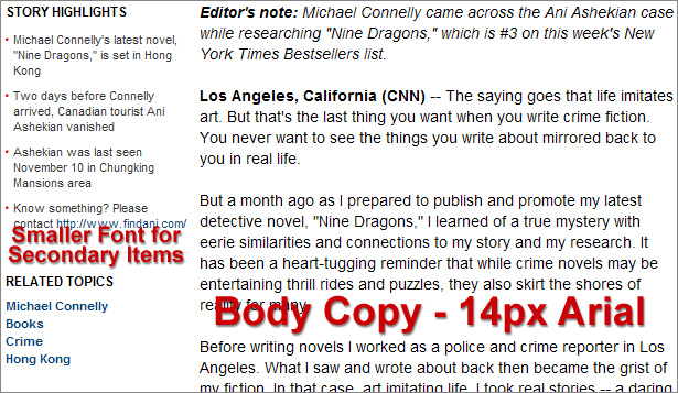
Also, on the left side of each story, there is a section called "Story Highlights" that summarizes the current story in a few bulleted-list points. This shows that CNN's designers are aware of the online tendency of users to "scan" lengthy material.
Information Overload
Of all the negative aspects of the new design, probably the first problem that is immediately evident is the overload of links and information on the home page — although it is more structured and organized, as discussed earlier.
The home page is about two and a half screens long, and includes sections that duplicate items in the main navigation bar, with about a half dozen sub-links under each category. These sections appear below the fold and are shown in this image:
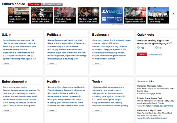
Since CNN is one of the most popular sites in the world (38 million unique visitors each month), these sections will receive considerable traffic in comparison to other sites, however, because they appear so far below the fold, and because there are so many links, the relative amount of traffic visiting those links through the home page would likely be quite low.
Important Sections Buried?
As pointed out above, a lot of information on the home page appears well below the fold. And, significantly, it appears that some important content is completely buried at the bottom of the home page, more than two full screens below the header.
For example, a section entitled "Hot Topics" appears near the bottom, on the right side, just above some promos and ads.
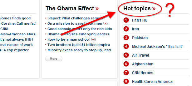
It seems to make more sense that this section would replace the accordion content switcher, or else be incorporated into the accordion.
The ads and promos that appear below the "Hot Topics" also appear to be more important than their location reveals. Again, although such a high traffic website would receive many clicks on these areas, the click-through rate in comparison to the sections and ads above the fold would likely be drastically different.
Of course, CNN's producers know what content is most important, and they understand their users' habits better than anyone else — but these layout and usability challenges are helpful to analyze should other developers face similar decisions.
Usability Mysteries
There are a few elements on the new site that may not be designed for optimal usability.
One example is the right-pointing triangle that appears on each of the micro-site links. At first glance, I wasn't sure what those triangles were for. They appear to indicate some sort of a JavaScript slider section that would pop up.
Some users not paying full attention may even mistaken them for downward-pointing arrows that produce drop-down menus.

Is there a better way to indicate a same-window micro-site link? I'm really not sure. Maybe something similar to the well-known Wikipedia icon  would have sufficed — but then that would present the problem of users assuming that the links opened in a new window, which in this case is not true.
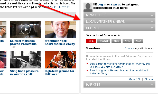
The accordion content switcher, discussed earlier, also has a few usability problems. First, when JavaScript is disabled, the accordion is rendered useless and doesn't display any content.
It should expand by default to display all content, or else display one of the items. Also, the hyperlinked headers for the accordion sections should still link to their respective sections, but they don't.
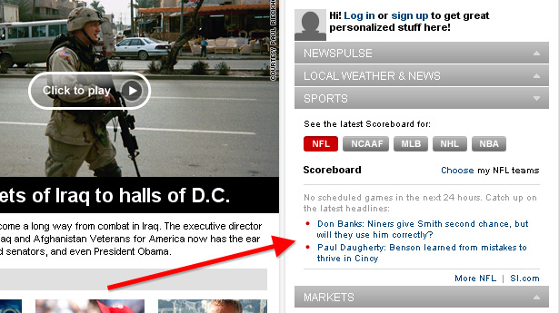
Another problem with the accordion content is that, since the text it contains is so small, it is not always clear what is clickable inside the accordion. This makes the links less distinct from the rest of the accordion content.
In the image below, the red arrow I've drawn is pointing to two bulleted list items. The text in those list items is hyperlinked, but this is not obvious at first glance.
Some Sections Still Reflect Old Design
As will be the case with any redesign of a site the size of CNN's, some sections will still reflect the old design until all pages are fully integrated.
This is usually the case with older content that won't be visited as often, but in the case of CNN, some important sections still have the old skin.
Two examples are the about and contact pages.
Small Typography
One particular design issue that does not conform to modern web design trends is the use of small text and small typographic elements.
The small size of the font in the accordion content was discussed earlier. There's also the "share" toolbar that appears on article and video pages, the "Latest News" section on the home page, the "Sign up" and "Log in" links in the header, and the text links below the fold on the home page, to mention a few.

Would the "share" toolbar, shown above, be more effective with bigger typography? What about the "recommended" section, shown below, or other sections with smaller type?

Conclusion
The new CNN.com site has added a number of features not discussed here that relate more to their news services and customized content. The first link below contains a video presented by CNN that discusses some of the new features.
I definitely think the new site presents a much more beautiful and interesting user experience than the old, and aside from the weaknesses in the accordion content switcher, the drawbacks to the new design are not really that significant.
It looks like a lot of time and planning went into the design of the new CNN.com, and I think web designers and those interested in improving usability on their own sites would do well to consider and try to learn from some of the changes presented on CNN's new website.
Further Reading
- Welcome to the New CNN.com (Video on CNN.com)
- The New CNN.com (First Screenshots on TechCrunch)
- New CNN.com Goes Live: What Do You Think?
This post was written exclusively for Webdesigner Depot by Louis Lazaris, a freelance writer and web developer. Louis runs Impressive Webs where he posts articles and tutorials on web design. You can follow Louis on Twitter or get in touch with him through his website.
What do you like or dislike about CNN's new site design? Share your comments below.


