 As seen in our previous article on the subject and examples around the web, minimalism is quite the trend.
When the theory behind it is well implemented, it makes for some beautiful, simple and yet modern designs.
Because it is a trend, everyone wants to follow it. But can it be taken too far? And is it right for all types of websites?
This article explores some of the potentially negative side-effects of minimalist designs and the consequences of implementing one incorrectly.
Unlike our previous post, we'll look at when minimalism is a bad idea, however inspiring it is supposed to be.
It's Just a Style
Simplifying a website is one thing, but minimalism on its own is just a style. It is a style just as grunge, illustrated and sleek Web 2.0 are styles.
Sometimes we forget that and assume that every design needs it.
Minimalist design is the inclusion of only the bare essentials in an attractive and usable layout.
There are no gradients or strokes and no superfluous imagery, colors, textures or the like. Often you'll find one main visual element and a few pieces of content.
Many websites could benefit from more content, though, as well as more visual stimulation. We'll look at a few examples and see why minimalism is trendy but not imperative.
Minimalism Is for "Artsy" Websites
Extreme minimalism is inspiring and has made recent appearances in portfolios and other creative-type websites.
As creative people, we see the beauty and understand the logic in it and long to create our clients' websites in the same image, all the while not realizing that it may simply not be practical.
Minimalist design, to put it simply, best suits modern websites in creative industries.
It has an outside-the-box attitude and allows designers to be original with components such as the wireframe and navigation.
The Ordinary Web User
We know why we love minimalist design. Now it's time to consider the average user's perspective.
Many people in non-design-related fields don't fully appreciate minimalist design or even find it visually appealing. And because the vast majority of Internet users are not creative types, we have to respect this view and address it accordingly.
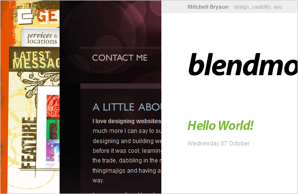
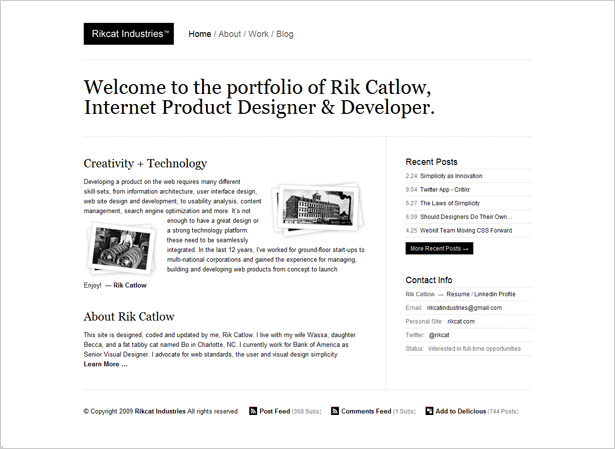
Take the design below as an example. This popular minimalist design has been featured in many showcases. It's a beautiful design and highly effective. It also happens to be the portfolio of a designer, so it fits our model.
Imagine if it were a musician's website. Obviously, this wouldn't be the right look. Even with the right visual elements substituted, it still wouldn't have the right look.
What if the website belonged to a business consulting company? A bit too bare still.
Some websites just look and work better with more content and a fuller design.
Supplementary features are also what makes certain types of websites so successful. Take the magazine website below:
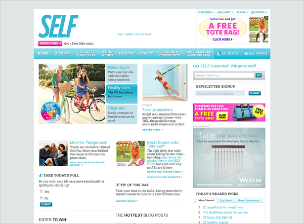
A website like this thrives on rich content, enticing the viewer with fun and entertaining articles, videos, blogs, programs, etc.
A minimalist look would not engage the reader much at all. This website is successful because of the sheer amount of visual interactivity right on the home page.
Content-Rich vs. Cluttered
We often mistake non-minimalist websites as being cluttered, and therefore ugly. No doubt, cluttered websites are confusing and unattractive.
New designers often make the mistake of adding and adding and adding, and then their clients are forced to tell them to remove most of the clutter.
Even experienced designers think first to remove elements when something is "missing."
"Cluttered" has almost become a four-letter word—and rightly so. But content-rich websites have also dropped in esteem because of their association with clutter. Are content-rich websites really cluttered?
Usually, no. A genuinely cluttered design has little white space; its typographic styles, colors and other elements clash; it is a disorganized mess; the wireframe is ineffective or absent; and content is excessive, not rich.
We have to understand what excessive really meanss. What happened to being happy with a reasonable amount of content and layout elements?
Are We Just Lazy?
For those of us who follow a minimalist style, why do we do it?
Is it because we genuinely love the style, despite the complexity of mastering it? Are we committed to using only the minimum requirements in the most effective way, based on our learning and analytics? Or do we do it because we're lazy?
Minimalism is undoubtedly effective. But it's not for everyone, and some people prefer other styles.
In spite of what's best for a particular project, we may opt for a minimalist style to avoid having to work on difficult code, slicing or features. Looking at the best minimalist designs, it's easy to see why imitations abound.
If you're guilty of this, don't worry: it happens to most of us at some point. Just bear in mind that a truly minimalist style takes time to develop, like any complex style.
If you're simply opposed to working out challenging graphical elements, though, you're doing a disservice to the project.
Minimalism Misused
When venturing into minimalist territory, be sure it is right for the website you're working on.
Also, try to understand minimalism's true value, to avoid resorting to it as a quick fix. Below are a few common mistakes made with minimalist design and reasons why it gets a bad rap.
- Self-Defeating Usability
Minimalist websites should be the most usable websites, because nothing is there to confuse or get in the way; and the text is thought out extra carefully. Often though, with little on the page, visitors have difficulty figuring out where to go. So, attention to visual hierarchy is a must. Also, getting creative with the navigation is great, but don't get too creative. - Minimal Design or Minimal Interest?
Beautifully minimal or just plain boring? You can make a minimalist design interesting in a number of ways, while preserving its calm and simple appeal. - Is the Message Strong Enough?
Minimalist designs are best for adorning messages that are compelling on their own. The idea is to strip the website of any excess content or elements that would detract from the message. If the message is weak, ill-conceived or absent, then a minimalist design may not be the right choice. Brochure websites are an example of this: basic information with no distinct message.
Wrapping Up
Born in the late 1950s, minimalism has become a design ideal. Most of the time, we improve a design by simplifying it: that's a basic design rule.
Many people assume, though, that simplifying a design means stripping it to the bare bone. This isn't—and shouldn't be—the case.
We have to learn to recognize what types of websites would and would not benefit from a minimalist style.
The deciding factor may be the target audience's sensibility, the client's goals or the way visitors will use the website. But there is an appropriate style for each website, and the decision should not be taken lightly.
Look at your content, and figure out the design that would best carry it, whether minimalist or not.
Written exclusively for WDD by Kayla Knight.
When do you choose a minimalist design over one that is not? Please share your opinions with us...
WDD Staff


Read Next

15 Best New Fonts, July 2024

20 Best New Websites, July 2024

Top 7 WordPress Plugins for 2024: Enhance Your Site's Performance

Exciting New Tools for Designers, July 2024

3 Essential Design Trends, July 2024

15 Best New Fonts, June 2024

20 Best New Websites, June 2024

Exciting New Tools for Designers, June 2024

3 Essential Design Trends, June 2024

15 Best New Fonts, May 2024

How to Reduce The Carbon Footprint of Your Website
