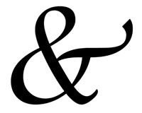
 The ampersand is one of the most unique typographical characters out there.
Typography designers can exercise a lot more artistic freedom in the design of the ampersand, ranging from very traditional representations to those that bear little resemblance to the original form.
But many designers have little knowledge about the origin and meaning of the ampersand. The ampersand has a long and rather interesting history, though.
And with all the variations available out there, there are a whole host of design possibilities presented by this particular character.
Read on for more information, a history of the ampersand, and a gallery of ampersand designs from a variety of different typefaces.
A Brief History of the Ampersand
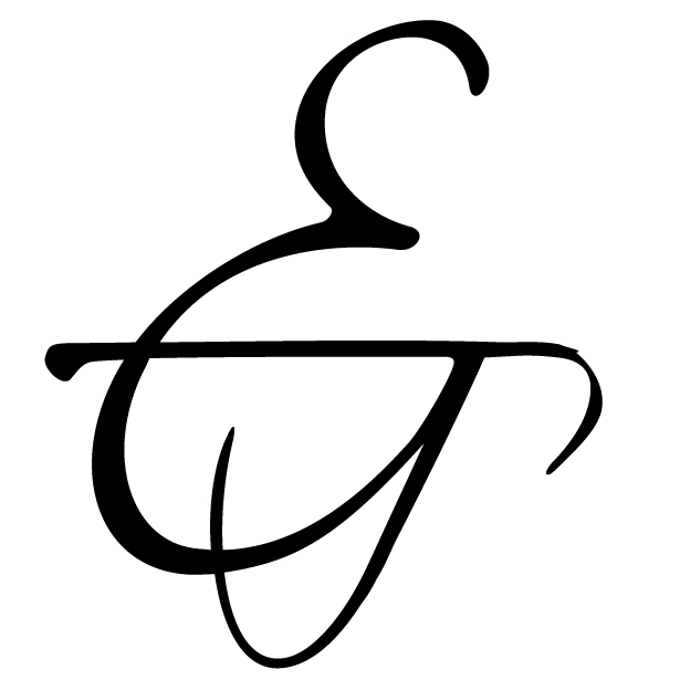
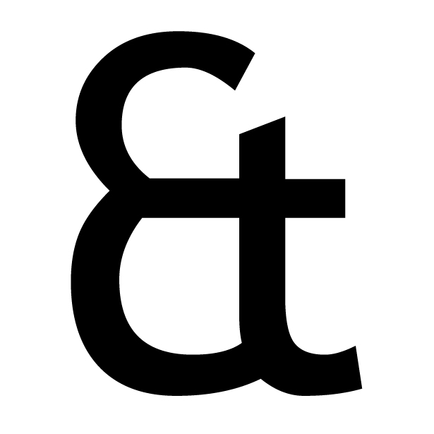
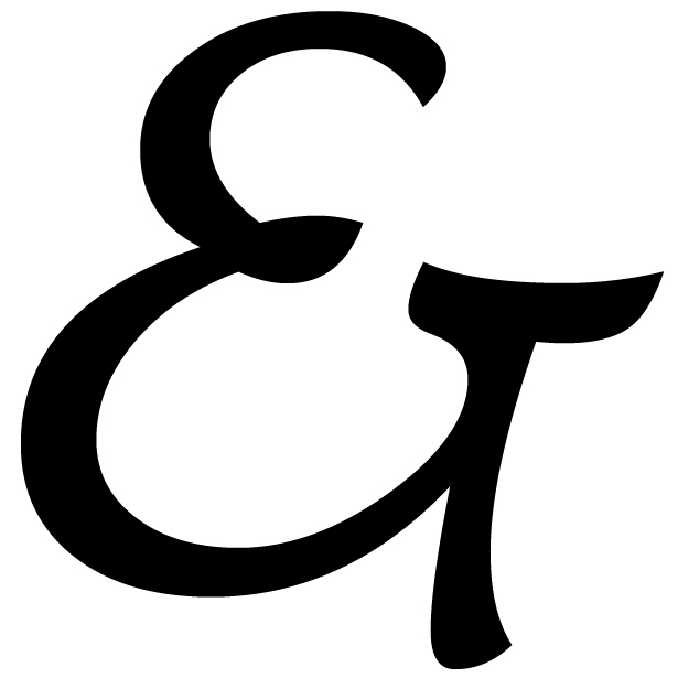
The ampersand can be traced back to the first century AD. It was originally a ligature of the letters E and T ("et" is Latin for and). If you look at the modern ampersand, you'll likely still be able to see the E and T separately.
The first ampersands looked very much like the separate E and T combined, but as type developed over the next few centuries, it eventually became more stylized and less representative of its origins.
You can see the evolution of the ampersand below (1 is like the original Roman ligature, 2 and 3 are from the fourth century, and 4-6 are from the ninth century).
The modern ampersand has remained largely unchanged from the Carolignian ampersands developed in the ninth century.

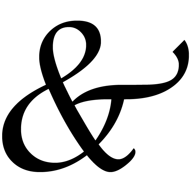
Italic ampersands were a later ligature of E and T, and are also present in modern fonts. These were developed as part of cursive scripts that were developed during the Renaissance. They're often more formal-looking and fancier than the standard Carolignian ampersand.
The word "ampersand" was first added to dictionaries in 1837. The word was created as a slurred form of "and, per se and", which was what the alphabet ended with when recited in English-speaking schools. (Historically, "and per se" preceded any letter which was also a word in the alphabet, such as "I" or "A". And the ampersand symbol was originally the last character in the alphabet.)
The ampersand is a part of every roman font. It's used in modern text often, probably most frequently in the names of corporations and other businesses, or in other formal titles (such as Dungeons & Dragons).
It's experiencing a bit of a resurgence in general usage, as it commonly replaces "and" in text messages and Twitter updates. Ampersands are also commonly used in programming, particularly in MySQL, C and C++, XML, SGML, and BASIC.
Ampersand Designs
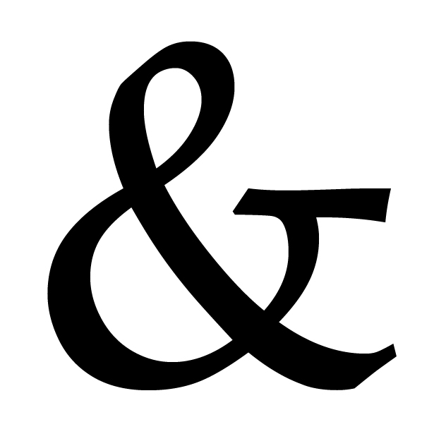
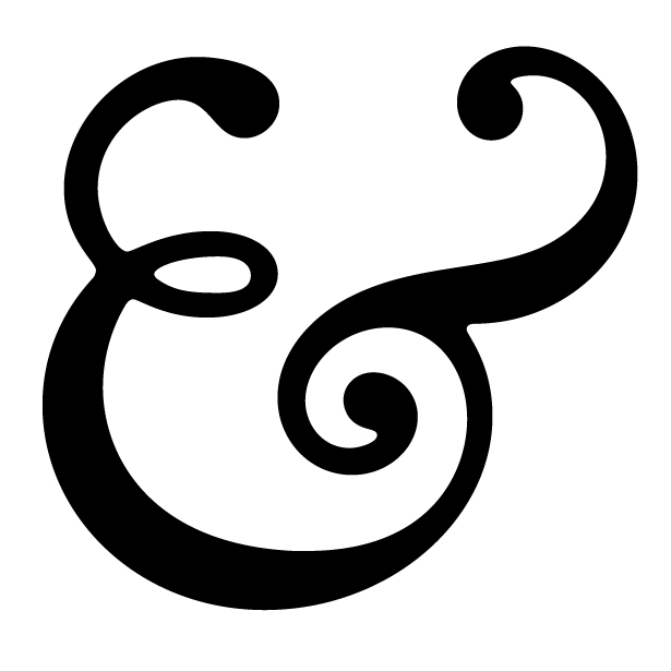
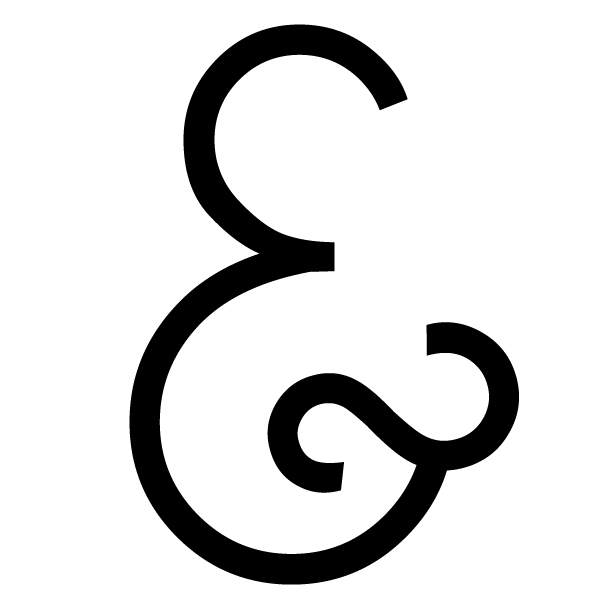
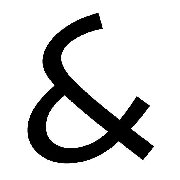
The original ampersand designs reflected their origins as a ligature of E and T. Even as the ampersand has evolved and become more stylized, it still retains the basic shape of E and T combined.
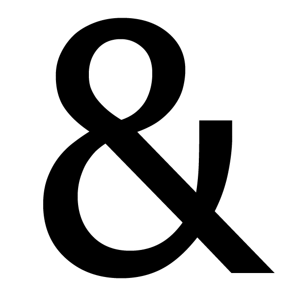
The standard ampersand most of us are used to seeing is the Carolignian variety, and is featured in many commonly-used fonts. Here are some examples:
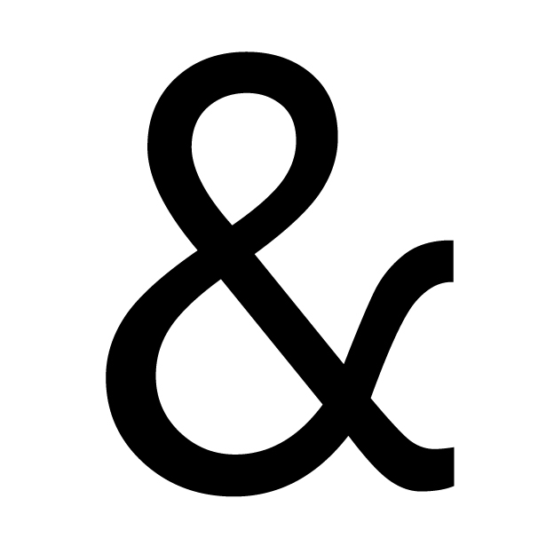
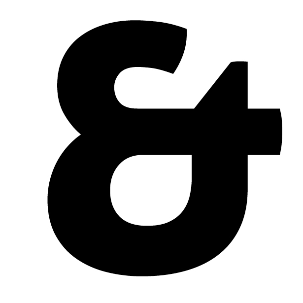
Andale Mono - A very traditional, sans-serif example.
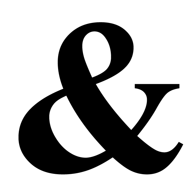
 Apple Chancery - A fancier, serif example.
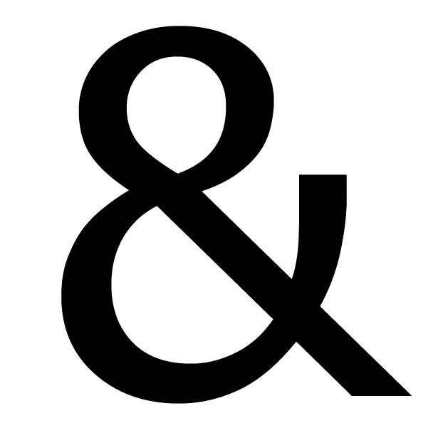
 Kingthings Petrock - A gothic example.
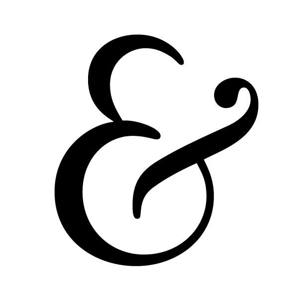
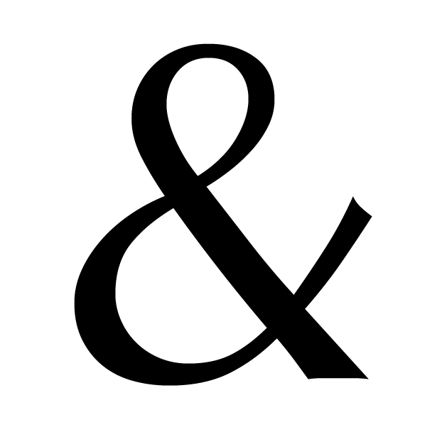
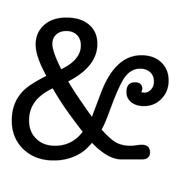
The other common ampersand design is the italic ampersand, featured below:
 Monotype Corsiva - A traditional script example.
 Scriptina - A less-formal script example.
 Aller Dispay - A modern, sans-serif example.
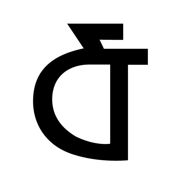 Hill House - A craftsman-style example.
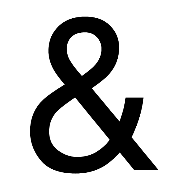
Ampersands in Websafe and Web-Common Fonts
Some websafe and commonly used fonts on the web have excellent ampersand designs. Others, not so much. Here are the ampersands from a variety of web-common fonts:
 Arial - Arial has a very basic, sans-serif ampersand.
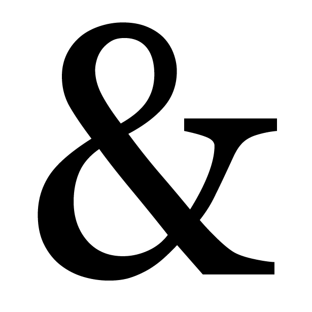 Georgia - A very traditional, serif ampersand.
 Helvetica - Helvetica's ampersand is slightly more refined than Arial.
 Palatino - Another very traditional example.
 Times New Roman - A heavy, somewhat bulky-looking ampersand.
 Verdana - The verdana ampersand is more squat and square than many other sans-serif examples.
 Trebuchet MS - The only web-common font that uses an italic-style ampersand.
If you're unhappy with the ampersand in a font you've chosen for your website, there are ways to use custom ampersands. The Typogrify plugin for WordPress makes it incredibly easy to use a custom ampersand on your WordPress blog.
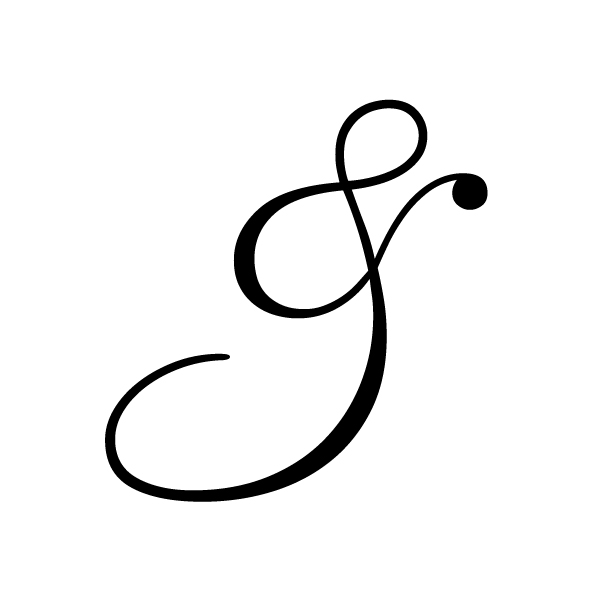
The Ampersand in Design and Art
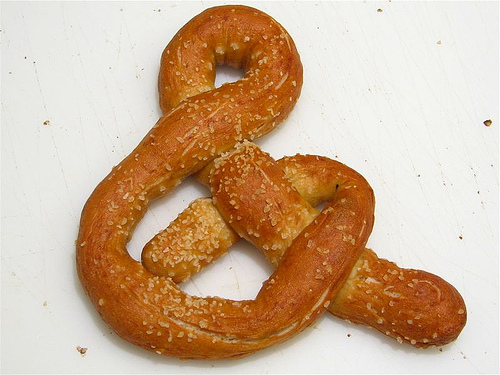
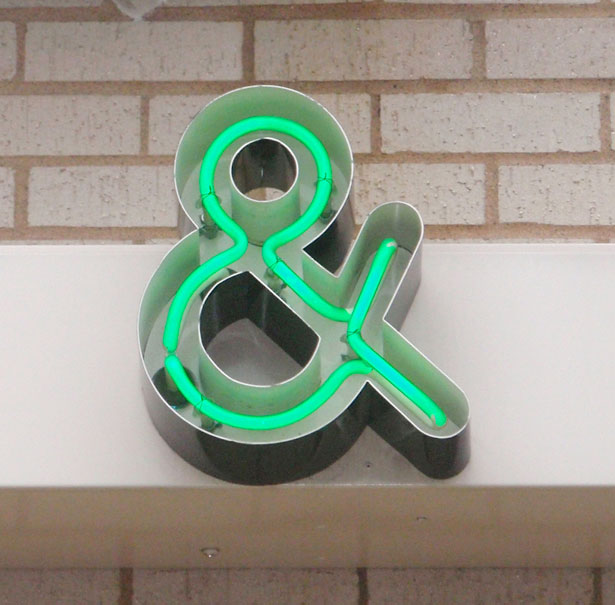
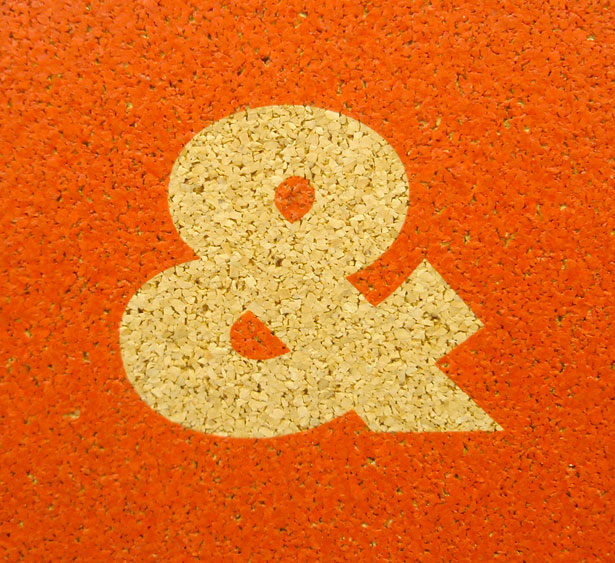
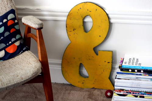
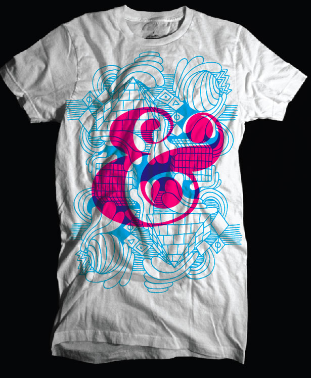
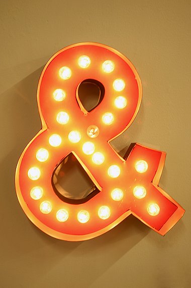
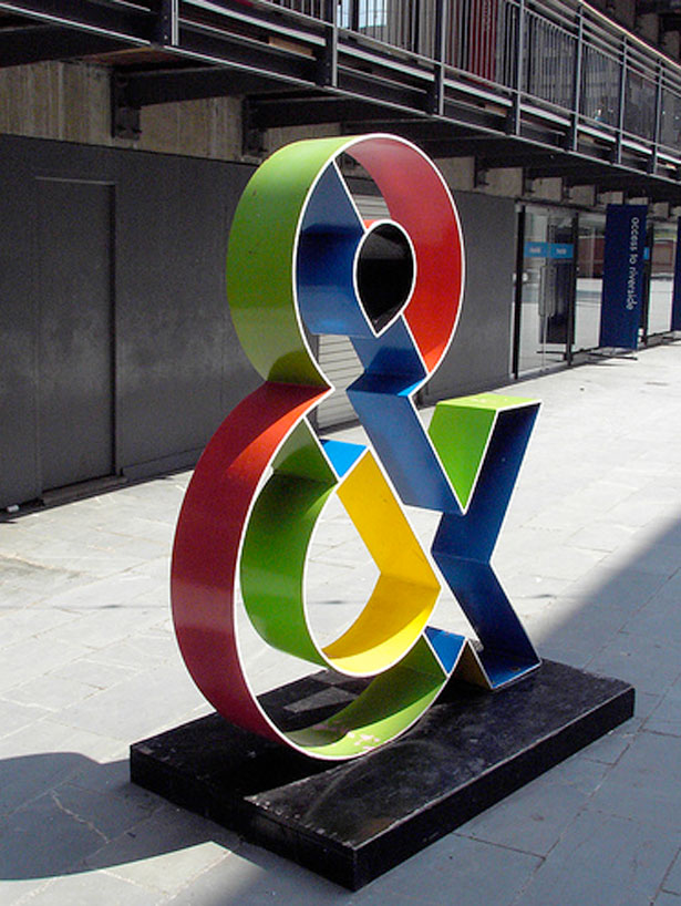
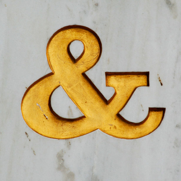
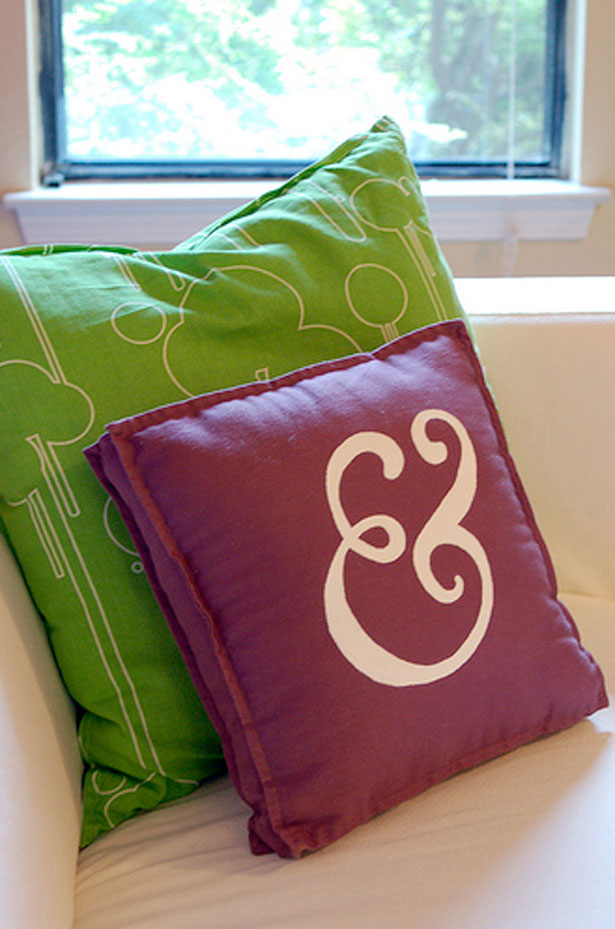
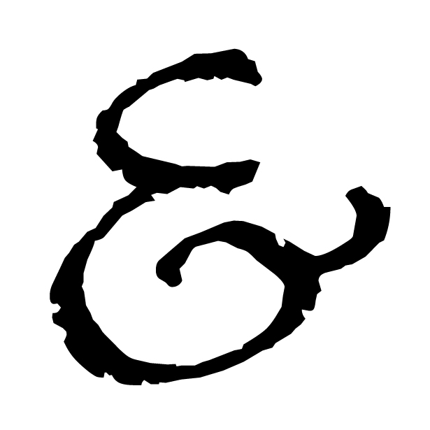
Ampersands have become a bit of an obsession for some. There are blogs that focus on ampersands (some within larger typography blogs, others focusing solely on the ampersand). There are t-shirts. And there are a surprising number of people out there who have ampersand tattoos. Here are some examples of ampersands in real life:


Using Ampersands in Your Designs
Whether for a web project or a print design, ampersands can play a prominent role in the look and feel of your website. When used in titles or headers they can add some extra graphic impact without images.
Italic ampersands, which are generally formal and fancy, can add extra elegance to a design that otherwise remains minimal. Carolignian ampersands in a sans-serif font are often bolder and have a modern feeling.
Carolignian ampersands in a serif font have a very traditional feeling, though depending on the specific font they can become more formal or more modern. A few more examples:
Italic Ampersands
 Lucida Handwriting
 Papyrus
 Windsong
 Goudy Bookletter 1911
 Bernhard Modern
 Caviar Dreams
Carolignian Ampersands
 Lithos Pro
 Tahoma
 Optima
 American Typewriter
 Regency Script
Further Information
Here are some additional resources, and sources used in the crafting of this post.
- 112. Ampersand - A short but excellent history from Art Lebedev Studio.
- Ampersand - Wikipedia's entry on the ampersand.
- The Ampersand - Adobe's history of the ampersand.
- The Ampersand - An entire blog devoted to real-life examples of the ampersand.
- Ampersand Typography - Another blog devoted to ampersand examples, particularly historical ones.
- The Funkiest Ampersands You Have Ever Seen - An excellent roundup of unusual ampersand designs from Spoon Grahpics.
- The Mesmerizing Curves of Ampersands - Another excellent roundup of ampersand designs, with download links. -
Written exclusively for WDD by Cameron Chapman.
Do you use the ampersand in your designs? Feel free to share some examples below...
WDD Staff


Read Next

15 Best New Fonts, July 2024

20 Best New Websites, July 2024

Top 7 WordPress Plugins for 2024: Enhance Your Site's Performance

Exciting New Tools for Designers, July 2024

3 Essential Design Trends, July 2024

15 Best New Fonts, June 2024

20 Best New Websites, June 2024

Exciting New Tools for Designers, June 2024

3 Essential Design Trends, June 2024

15 Best New Fonts, May 2024

How to Reduce The Carbon Footprint of Your Website
