 Recently I picked up an old design book that I hadn't touched in a while, and it reminded me of a design principle that many of us put into practice probably only subconsciously, if at all.
The book deals with designing for print, but I thought it would make a great topic to discuss in the context of web design.
The principle of proximity calls for related items to be grouped visually, creating less clutter and making for a more organized layout. Items unrelated to each other should be placed further apart, to emphasize their lack of relationship.
I'll discuss details and some ways in which this can be implemented effectively, but this definition should suffice for what we'll discuss in this article.
The correct use of proximity, in conjunction with other design principles, has a big impact on the user experience and, ultimately, a website's overall success.
Don't Fear White Space
The first step to properly implementing the principle of proximity is understanding the importance of white space in design.
Lack of white space is a common problem in amateur designs. Design is a means of communicating information, and when amateurs attempt to convey a message through design, their natural inclination is to spread out the content evenly to fill the space, without giving much thought to the potential of well-organized white space.
White space can affect the user's behavior as much, if not more, than the actual content on the page. White space guides the user's eyes in the intended direction, creates contrast and makes a lasting impression.
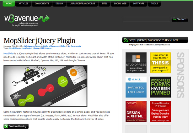
Even though W3Avenue's website above contains a considerable amount of content (with articles under numerous categories, like any design blog) and a series of sidebar ads, it doesn't overwhelm the user visually.
The generous room in the header and appropriately spaced items in the content and sidebar areas contribute to this clean and organized look. W3Avenue is not doing anything particularly unique with its content, but its design probably contributes to the strong traffic it gets in a short period of time.
So don't be insecure about empty space in your design. Properly using white space is the first step in implementing the principle of proximity and, thus, making a design more visually appealing.
Visually Group Related Elements
White space, however, is just one part of implementing proximity. A design can have a lot of white space, but if items are not grouped correctly, the white space will have little effect, as illustrated by the two business cards below:
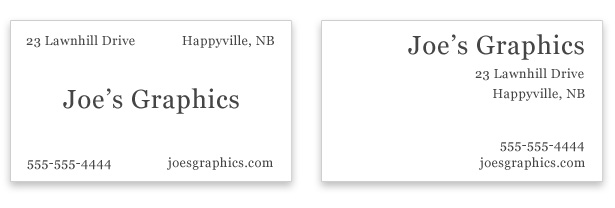
The card on the left is not cluttered; it has some white space. But the elements are not logically grouped, so the effect is weak.
The reader is forced to scan the card multiple times. The card on the right, however, has a more pleasing visual effect. The reader simply has to glance at it to take in the information (more on this later).
The grouping of elements in the card on the right is also more logical. In the first set of elements we see the company name in large font with the location below it. The second set tells us how to get information on the services provided (i.e. phone number and website address).
This example illustrates the importance of proximity in print design, and a similar idea can be used for elements in web design, as shown in the screenshot below.
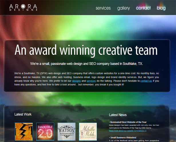
Although Arora Designs' website is not complex or information-heavy, its use of white space and visual separation of grouped elements are effective. It should be noted here that "white space" does not have to be white; it can be any empty space between elements, regardless of color.
In the case of Arora Designs, although the white space has color, it serves the same purpose of visually separating the header, navigation and content areas.
Creating Visual Hierarchy
Using white space effectively and grouping related elements are critical to giving your website a clear visual hierarchy. Of course, the website's architecture and flow of information are the foundation of effective proximity.
Hierarchy is conveyed by the way in which elements are grouped and sub-grouped.
This hierarchy helps the user understand where they've been and where they want to go and, thus, helps to communicate the purpose of the website. A list is a good example of an element that has the potential to communicate visual hierarchy, as demonstrated in the image below:
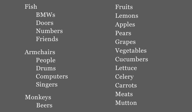
Just by glancing at the two lists above, without even examining the content, you'll see that the list on the left has a clear visual hierarchy, showing the relationships between items (indented items are sub-categories of the primary items).
This hierarchy would not be possible without white space (including macro and micro white space). The list on the right is just a random grouping of elements with no seeming relationship or hierarchy.
Implementing this principle on a website with something as simple as an HTML list is easy. The challenge is to use this principle as a guiding factor in the website's construction from the planning and wireframing stage through to the design.
Layouts That Are Easy to Scan and Read
Content that is organized into a hierarchy and logically grouped is easier to read and scan.
Headings, for example, should allow the user to scan by clearly indicating main points. Needless to say, content should be planned from the get-go to reflect an appropriate visual hierarchy; the list above with the indented items is a poor example, because the content does not match the visual hierarchy.
A website that uses proximity in its architecture and design does not overwhelm the user with information.
So, although it is relatively easy to implement the principles of proximity on websites that are light on content, proximity is much more important on content-rich websites.
News websites are good case studies of this principle. Below is a comparison of the Los Angeles Times and the Globe and Mail.
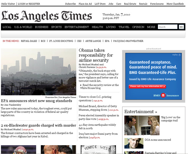
Overall, the LA Times website has a pleasing design mainly because of color choice and typography. But it also has a clean and uncluttered look, especially in the header section.
The logo is big and stands out, contributing effectively to the website's branding. The object nearest to the logo is the horizontal navigation bar below. Because the navigation bar is dark, it contrasts with the logo.
The text links above the logo are neatly arranged, with plenty of space between the two sections. Left alignment of the content in the header also contributes to the clean look.
Every bit of information in the LA Times header is grouped with related items, except for the logo, which stands alone. Nothing in the header confuses you or makes you wonder where it belongs.
What about the Globe and Mail website, shown below?
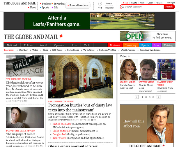
The Globe and Mail website has a complex header section that fails to implement the principle of proximity.
The only significant amount of white space is in the center, beside the logo, which accomplishes nothing. Two ads appear in the header, contributing to the clutter. The ads may be necessary for financial reasons, so the problems are understandable.
The biggest problem is the messy section above the large banner ad. There is no clear distinction between elements in that section.
Three dotted vertical lines attempt to separate the area into four sections, but the first separator doesn't make any sense. In fact, that section would probably look more inviting if those dotted separators were removed.
Grids Help With Proximity
One way to group items and use white space appropriately is to start with a grid.
From a cursory glance at both the LA Times and Globe and Mail websites, only the LA Times seems to have based its design on a grid, or at least used grid-based principles in the planning stage. The Globe and Mail's website shows little evidence of a grid format.
A grid-based layout, with appropriate gutter sizes, allows for plenty of room between sections, and in many cases it forces the designer to implement principles of proximity without even thinking about it.
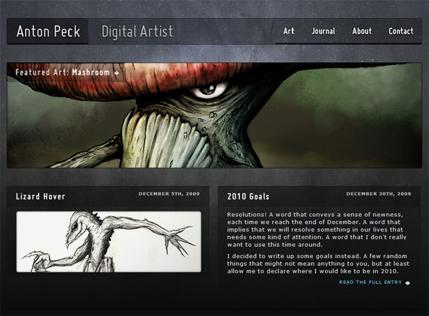
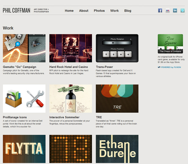
Below are screenshots from two websites that have employed the 960 grid system. They're both fairly simple (i.e. not content-heavy like the news websites discussed above), but they show that grids give page elements breathing room, affording each section its own visual home.
Lead Users Down the Right Path
One other major benefit of proximity is that it help users navigate a website without unnecessary delays or obstacles. When the primary navigation is clearly separated from the other elements on the page, it will be found instantly and is less likely to be forgotten.
Proper visual hierarchy by way of proximity helps users delve deeper into your website without worrying about where they've been or where they're going.
They'll always feel comfortable, and they'll get to the most important sections of your website quickly and efficiently.
Web designers with little or no experience in print design could benefit greatly from the principles that print designers have been putting into practice since years before the web boom.
Proximity is not the only design principle that will help a site be more usable and visually pleasing, but it is an important factor to consider for many of the reasons just discussed.
Further Reading
- Design Basics: The Proximity Principle
- How C.R.A.P. Is Your Site Design?
- Using Grouping in Web Page Layouts
This post was written exclusively for Webdesigner Depot by Louis Lazaris, a freelance writer and web developer. Louis runs Impressive Webs, where he posts articles and tutorials on web design. You can follow Louis on Twitter or get in touch with him through his website.
WDD Staff


Read Next

15 Best New Fonts, July 2024

20 Best New Websites, July 2024

Top 7 WordPress Plugins for 2024: Enhance Your Site's Performance

Exciting New Tools for Designers, July 2024

3 Essential Design Trends, July 2024

15 Best New Fonts, June 2024

20 Best New Websites, June 2024

Exciting New Tools for Designers, June 2024

3 Essential Design Trends, June 2024

15 Best New Fonts, May 2024

How to Reduce The Carbon Footprint of Your Website
