 The visual language of a website impresses a visitor far beyond their first glimpse.
In fact, in observing the best websites, you notice that the small details speak to you subconsciously and that consistency improves your experience of the website and as a result makes you more likely to return.
In this article we'll explore what makes a design consistent, and we'll showcase some of the most consistent website designs out there.
Please comment at the end of the article about the consistency of these websites and feel free to add links to others that follow this principle.
What do we mean by consistency in design? According to this definition, consistency can be defined as: "A harmonious uniformity or agreement among things or parts."
You goal as a designer is to create order, to make it easy for users to find the information they are looking for. Consistency can help you achieve that goal.
Checklist of Details
First, let's define the criteria by which we will determine whether the websites we review here are consistent. Setting criteria for yourself would also benefit your own daily design work. As I like to say, good design is first created with good observation. Here are our criteria:
Typographic consistency:
- Is there a consistent vertical rhythm?
- Is the typographic alignment consistent?
- Are the typeface choices consistent?
- Is the typographic navigation predictable across pages?
Graphic consistency:
- Do the website's images convey a consistent mood?
- Do the colors in the images match?
- Are the textures of the images consistent?
- Are the sizes of the images consistent with the overall structure of the website and each other?
Color consistency:
- Are colors used consistently across pages?
Icon and button consistency:
- Are the website's icons of the same family?
- Do the icons match in size?
A website doesn't have to meet these criteria to the dot, but the list is a good starting point to help make your own designs consistent and harmonious.
Okay, we now have a nice little checklist to play with. Let's review our websites, learn from them and get inspired!
52 Weeks of UX
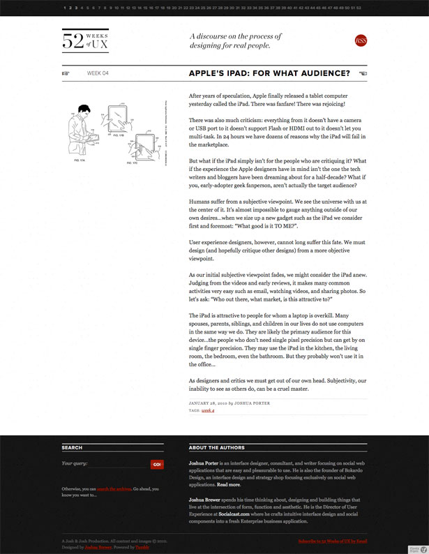
What are some of this website's highlights:
- The white space in the header is equally divided.
- The typography is consistently aligned, flush left with a ragged right.
- The persistent paginated navigation at the top is both clever and familiar.
- Images for posts are always black and white.
Now, because this article is about details, I do want to point out two minor issues with this website, both in the footer: First, notice how the "Go" search button has a reflection, while the other elements on the website do not (compare, for example, the RSS button at the top).
Secondly, notice that the space between the headings and text is much tighter in the footer compared to the rest of the website.
Ribbons of Red
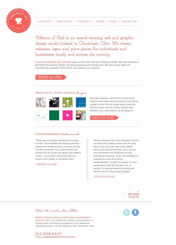
- First, the most prominent element of the website: the red! Beautifully and consistently used from the logo to the headers to the links to the buttons.
- Next, the texture of the button graphics is the same as what is used for the logo.
- Also, notice that the buttons are visually all of the same family, even the social icons at the bottom.
- The display type is a nice slab serif—again, used consistently from the logo to the headers to the buttons.
- Finally, the text elements throughout the website are aligned consistently, flush left and ragged right.
Yaron Schoen
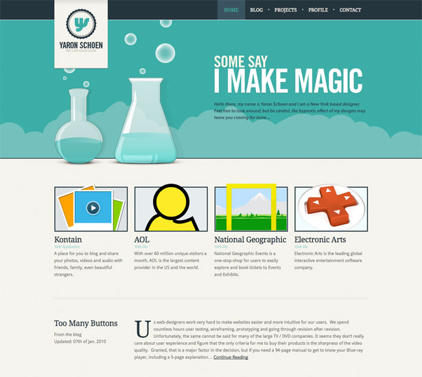
- The first thing that catches the eye is how the illustration in the header plays with depth. Even the four graphic elements below pop out of their containers and play with depth the same way.
- The typography is aligned perfectly in a grid.
- The typeface is well chosen and executed. The home page and other pages exhibit continuity as well.
- The colors are also very consistent, playing nicely with the dark blue to the bluish green, all the way from the header to the footer.
Fuzzco
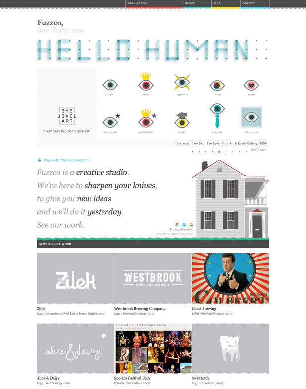
- Look at the texture in the top navigation; it is also used for the images near the bottom.
- Check out the type in the header across pages; nicely done with custom Flash, giving it a creative feel.
- The serif is consistent across the home page but breaks a bit on internal pages.
- The colors in the top navigation match the footer, harmonizing and framing the content.
Styleboost
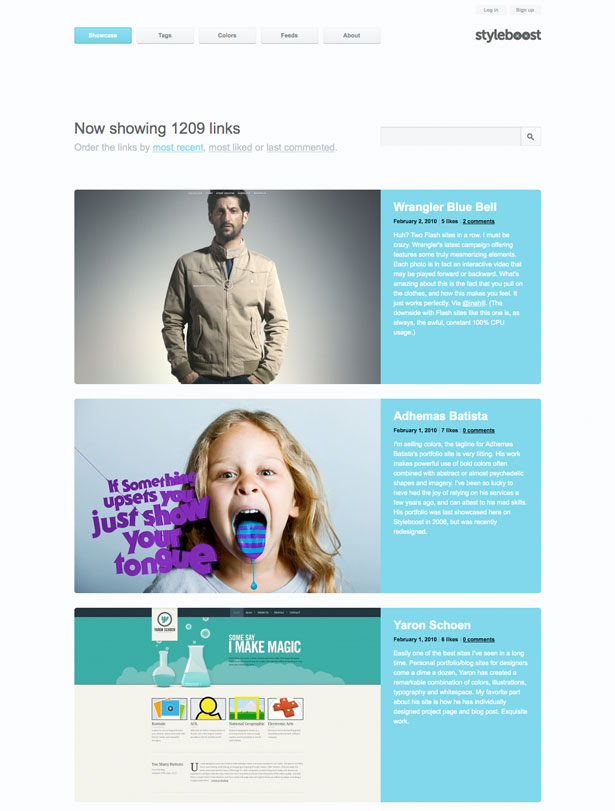
- The size definitely makes this website consistent: big. Big buttons, big images (all consistent in size), big type, big white space.
- The color is kept to a minimum and used well. The light blue maintains harmony, and the secondary gray plays with depth and hierarchy.
- The buttons are all big and uniform. They are also slightly rounded, matching the search box.
- The grid structure is simple and tells you what's coming next. Even the footer is in proportion, which seems to be close to the golden ratio.
Delicious Monster
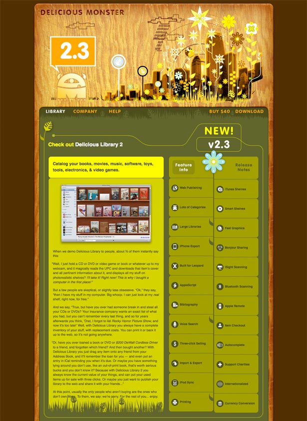
This website isn't new, but it is beautiful in how it has remained consistent over the years and hasn't aged a bit. The attention to detail has helped.
- Notice the textures. The website is framed by a wood shelf, which ties into the theme of the software being offered by the company.
- The graphic elements such as grass and plants maintain the harmony.
- Every section has rounded corners, even the slideshow buttons.
- The greenish-yellow dominates the page, inviting you to enter this imaginative and memorable world.
Richard Meier & Partners Architects.
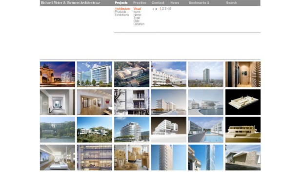
It was designed by Massimo Vignelli, who is known for having mastered the grid and producing modern, consistent and logical designs.
- Notice the alignment of graphic elements. The flush-left type in the menu aligns with the images below.
- The horizontal rule below the sub-navigation is persistent, helping users to orient themselves on the website.
- The space between the navigation and body content is consistent, giving the eye a clear path to follow.
- And the typography is simple, flush left and sans-serif, falling consistently into the grid.
The team behind Information Architects has also mastered simplicity, grid design and consistency.
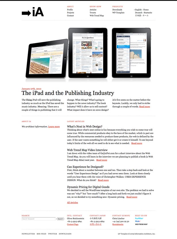
- Notice how the navigation at the top is aligned with the body content below.
- The color palette is simple and consistent: red, white and black.
- The textual elements are evenly aligned. Notice how the space between the horizontal rules are consistent down the page.
Wilson Miner
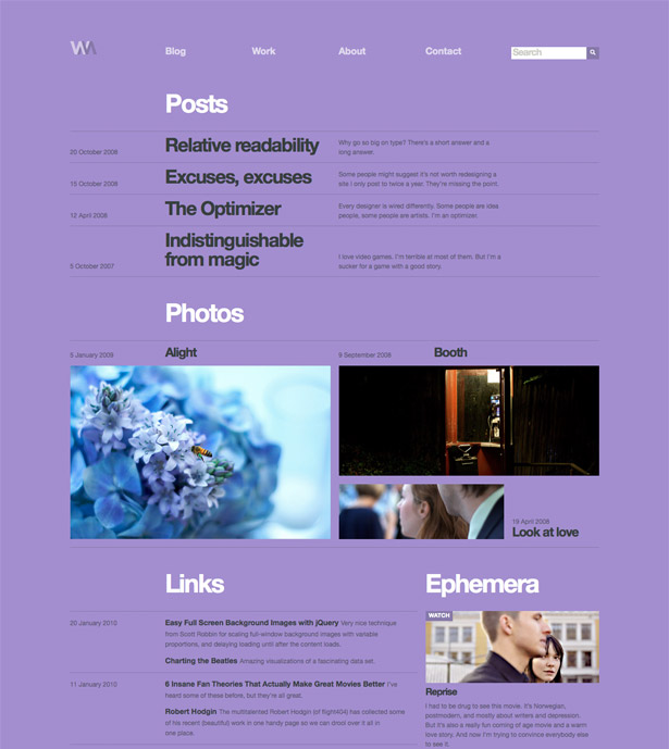
- The dates and meta content are aligned in the first column, followed by the body content.
- Notice how the navigation at the top falls into the grid, aligning with the content below.
- The typography is a simple white and black: white for section titles, black for body copy.
Tapbots
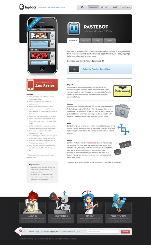
- The first thing that catches my eye is the excellent use of white space, particularly the even spacing between the logo and navigation, both above and below.
- The icons all seem to come from the same family, creating harmony.
- The use of depth, from the top graphic to the footer illustrations, is also consistent.
- The colors match across the page: the black on top matches the footer; the red button at the top matches the search button below; and the gray navigation matches the gray bar in the footer.
Wrapping Up
Consistent design requires many tools and can be difficult to achieve.
One tip I can offer is to start with a nice grid and then build a wireframe on top of it. This will give you a bird's eye view of the graphic elements and how they relate to each other.
The above examples should give you food for thought with regard to executing your design. Consistency is made up of many parts, all of which are essential ingredients in the process.
Written exclusively for Webdesigner Depot by Noam Almosnino, a web designer in Brooklyn, New York. Follow Noam on Twitter, or visit his website hellonoam.com.
Know of other consistent websites to share with us? Please post them in the comments!
WDD Staff


Read Next

15 Best New Fonts, July 2024

20 Best New Websites, July 2024

Top 7 WordPress Plugins for 2024: Enhance Your Site's Performance

Exciting New Tools for Designers, July 2024

3 Essential Design Trends, July 2024

15 Best New Fonts, June 2024

20 Best New Websites, June 2024

Exciting New Tools for Designers, June 2024

3 Essential Design Trends, June 2024

15 Best New Fonts, May 2024

How to Reduce The Carbon Footprint of Your Website
