 The size of an image in a website layout is important. From proper alignment to getting just the right amount of white space, sizing photos and graphics properly beforehand is essential to creating a balanced look.
Images on the web are measured in pixels. Yet many people go through the trouble of setting their images to 72 dots per inch (DPI). The process of sizing images for the web is often misunderstood.
The misconception about resolution in digital images bound for the web is that they must meet a certain number of dots per inch.
In print, pixels per inch and dots per inch impact the size of an image on a page. DPI doesn’t apply to layout on the web.
When someone converts an image to 72 DPI, they’re adding an extra step with no benefit. Web pages are measured in pixels, not real-world units such as inches.
When someone asks you for a web image that’s, say, two inches wide, they’re estimating how it would appear on their own monitor. Without changing the image’s pixel dimensions, that image would appear larger or smaller on different monitors—and would even look different on the same monitor at a different resolution setting.
Pixel Size Depends on Context
A pixel (which is short for “picture element”) is the smallest unit of measure on a grid displaying a digital image. DPI measures how big those pixels, or dots, are when they’re printed.
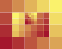
The image below is shown in different DPIs.

36 DPI

150 DPI

3,096 DPI
Download and open them in an image editor to see for yourself. All three look the same because they were resized, not resampled.
Resizing Changes Pixel Sizes; Resampling Changes Pixel Count
There are two ways to enlarge an image: add more pixels or make the pixels larger. Likewise, you can reduce an image's size by shaving off pixels or shrinking pixels. But shrinking and shaving are two different processes.
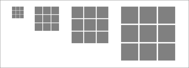
Shown above, resizing an image changes the size of its pixels, not its number of pixels. We’re not increasing or decreasing the number of pixels, only changing how large those pixels are when printed. It’s an inverse relationship: images with larger pixels will have a lower pixel density (fewer pixels in the same number of inches) when printed.
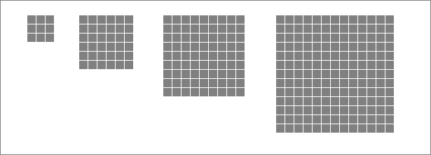
Shown above, resampling changes the image’s size by increasing or decreasing its number of pixels. Images with more pixels will contain more information and often make for richer graphics.
Web design is concerned with resampling, not resizing, because every pixel in a web page will always be the same size. A web page that measures 800 pixels wide can accommodate images up to 800 pixels wide. Making every pixel wider doesn’t change the fact that the layout can hold only 800 of them.
You can’t make an image appear larger on screen by resizing its pixels because every pixel on the same screen will always be the same size.
Resizing and Resampling in Photoshop
Photoshop’s Image Size box (Image ‚Üí Image Size) controls both the resizing and resampling of images.
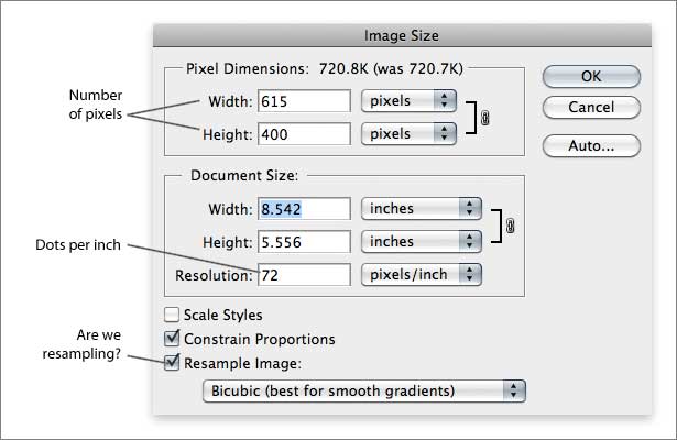
The “Resample” checkbox changes how many pixels fit into a linear inch—literally the pixels per inch. If we turn off resampling, the only way to change the image’s size would be to enlarge its pixels for printing.
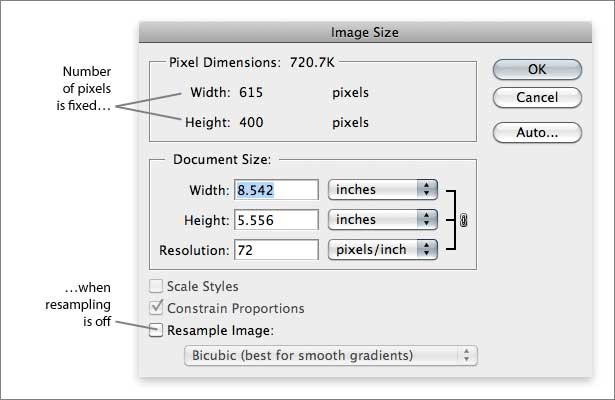
With the resampling box left unchecked, changing the “resolution” box would alter the image’s physical size when printed, but not its number of pixels. When printed, an image would appear larger or smaller. On a web page, it would be the same size.
An Experiment
Figuring out whether DPI matters in web layouts can be done by a little experiment. If we alter an image from 300 x 100 pixels at 72 DPI to 300 x 100 pixels at 144 DPI, how many pixels would we have?
- Make an image 300 pixels wide and 100 pixels tall, at 72 DPI.
- Let’s do some math. How many pixels would that be?
- Now resize the image to 300 x 100 pixels at 144 DPI.
- Let’s do some more math. How many pixels is that?
The answers are:
- 300 x 100 = 30,000
- 300 x 100 is still 30,000
Pixels per Inch on Screen
The number of pixels per inch is still relevant online, but DPI settings do not affect how an image is displayed.
Computer monitors can be physically measured in inches, and each displays a certain number of pixels. For example, let’s say a 19" monitor shows 1280 x 1024 pixels. The user could change it to display 1600 x 1200 pixels, thus increasing its PPI (i.e. adding more pixels in the same number of inches.) The important difference in print is that you can control an image’s pixels-per-inch.
You can try this on most modern computers. On a Mac, go to Apple Menu ‚Üí System Preferences, and then click on “Displays” to see the various resolutions at which you can set your monitor. For Windows, right-click on the desktop and select “Personalize,” and then choose “Display settings.” Change the screen resolution (number of pixels) and watch as the items on your Mac or PC desktop get larger or smaller.
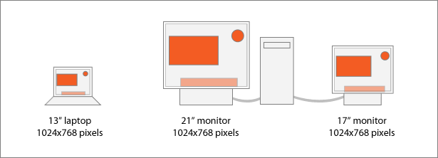
Obviously, your monitor isn’t changing in size. But if you hold a ruler to the screen, you’ll see that the size of icons and windows is inversely proportional to the number of pixels displayed. For example, a 13" laptop, a 17" CRT monitor and a 21" flat-panel monitor can all present a desktop that measures 1024 x 768 pixels. More pixels mean smaller icons; fewer pixels mean larger icons. More pixels in the same monitor give you a higher pixel density; fewer pixels is lower.
The difference becomes more noticeable with other types of displays:
- A digital billboard measuring 47 x 12 feet might use only 888 x 240 pixels (about 1.6 PPI).
- An iPhone screen today measures 2 x 3 inches and holds 320 x 480 pixels (about 160 PPI).
A single PNG file measuring 100 x 100 pixels would fit on both the 888 x 240 billboard and the 320 x 480 iPhone. But it would appear much larger on the billboard because the board’s pixels are 100 times larger than the iPhone's (1.6 vs. 160).
The illustration below shows two devices with different pixel dimensions.
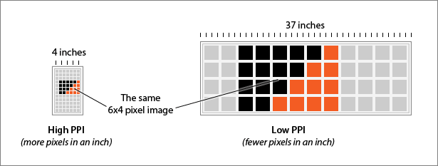
The same image is being shown on two different displays. The differences in each display’s PPI make the image on the right-hand display appear larger, even though it has fewer pixels overall.
You can test this yourself:
- Create a JPG that measures 960 x 100 pixels, at any pixel density.
- Measure it by hand with a ruler.
- Look at the same image on a computer with a larger or smaller monitor. For example, if you created the image on a 20" screen, test it on a 13" laptop.
- Print the same number of pixels at different pixel densities to see different sizes on paper.
The result is that this one image would have the same number of pixels but a different width in inches. The website layout would appear in different sizes, despite identical code. (For an extreme case, look at the entire page on an iPhone; 960 pixels is fitted to three inches or less, without the file itself being changed.)
Why 72 is significant
Many file formats, including JPG, TIF and PSD, store an image’s pixel density setting. If you save a JPG at 200 pixels/inch, it will remain at 200.
Other formats, including GIF and PNG, discard pixel density. If you save a 200 DPI image as a PNG, it won’t save that DPI at all. Many image editors, including Adobe Photoshop, assume that an image is 72 DPI if the information is not stored. (Note: Photoshop’s “Save for Web” feature discards unnecessary print information, including pixels/inch from its Image Size dialog box.)
Seventy-two is a magic number in printing and typography. In 1737 Pierre Fournier used units called ciceros to measure type. Six ciceros were 0.998 inches.
Around 1770, François-Ambroise Didot used slightly larger ciceros to fit the standard French “foot.” Didot’s pica was 0.1776 inches long and divided evenly into 12 increments. Today we call them points.
In 1886, the American Point System established a “pica” as being 0.166 inches. Six of these are 0.996 inches.
None of the units ever strayed far from 12 points per pica: 6 picas per inch = 72 points per inch. It was an important standard by 1984, when Apple prepared to introduce the first Macintosh computer. The Mac’s interface was designed to help people relate the computer to the physical world. Software engineers used the metaphor of a desk to describe the arcane workings of a computer, right down to “paper,” “folder” and “trash” icons.
Each pixel on the original Mac’s 9-inch (diagonal) and 512 x 342 pixel screen measured exactly 1 x 1 point. Hold a ruler to the glass, and you’d see that 72 pixels would actually fill 1 inch. This way, if you printed an image or piece of text and held it next to the screen, both the image and hard copy would be the same size.
But early digital pictures were clunky and jagged. As screen technology and memory improved, computers were able to display more pixels on the same size monitor. Matching a print-out to the screen became even less certain when raster and vector apps allowed users to zoom in and examine pixels closely. By the mid-1990s, Microsoft Windows could switch between 72 and 96 pixels per inch on screen. This made smaller font sizes more legible because more pixels were available per point size.
Today, designers and clients alike understand that the sizes of items on the screen are not absolute. Differences in screen size and zoom functionality are commonplace. But 72 is still the default.
Higher Screen PPI Means Better Legibility at Smaller Point Sizes
Screens with higher PPI are great for legibility. More pixels per inch make letterforms easier to read. It also means that images and text must be larger (in pixels) to be readable.
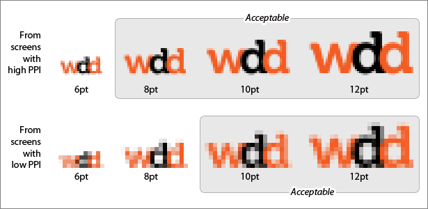
The text sample above has been resized from two different screen PPI settings. The top row has smaller pixels (i.e. a higher PPI on screen), so 8 points is the smallest legible font size. Text in the bottom row is barely legible below 10 points.
As PC monitors surpassed the pixel density of Mac monitors in the mid-1990s, websites built on Windows boasted smaller font sizes, much to the dismay of Mac users. Today, screens for both platforms enjoy pixel densities high enough to make the differences moot.
Elastic Web Images With Modern Browsers
We know now that DPI alone doesn’t change an image’s size on the web, and we have no control over which device an image is displayed on. So, are an image’s pixel dimensions the only thing that matters? Yes… for now.
Fluid-width layouts, which change according to the browser’s size, can better accommodate a range of devices and monitors. Modern browsers, from FireFox 3, Safari 3 and Internet Explorer 7 and up, are better than older versions at scaling images on the fly. The max-width CSS property forces images to fit their container but not grow past their actual size. For example:

p { width: 25% } /* A quarter of the content area */ img { max-width: 100% }
p { width: 50% } /* Half of the content area */ img { max-width: 100% }
p { width: 75% } /* Three quarters of the content area */ img { max-width: 100% }
/* No width set for the paragraph */ img { max-width: 100% }
Here we see one 800-pixel-wide image fit into four different-sized paragraph elements. If the page width were flexible, resizing your browser window would expand the image—but not past its original 800 x 323 pixel dimensions. It would never become distorted, or “pixellated,” from over-expansion.
Preparing images for the web means planning in pixels. If someone asks for a 2-inch graphic for the web, not for print, ask them, “How big are your pixels?”
Written exclusively for WDD by Ben Gremillion. Ben is a freelance web designer who solves communication problems with better design.
In which media does resolution count? What’s the best way to size online images? Share your ideas below.
WDD Staff


Read Next

15 Best New Fonts, July 2024

20 Best New Websites, July 2024

Top 7 WordPress Plugins for 2024: Enhance Your Site's Performance

Exciting New Tools for Designers, July 2024

3 Essential Design Trends, July 2024

15 Best New Fonts, June 2024

20 Best New Websites, June 2024

Exciting New Tools for Designers, June 2024

3 Essential Design Trends, June 2024

15 Best New Fonts, May 2024

How to Reduce The Carbon Footprint of Your Website
