 Since March 9 of this year Microsoft has been rolling out their new design of MSN.com.
Backed by countless hours of testing and roughly 70,000 pieces of feedback from their users, the design has been tweaked over the last four months to its current state.
Visitors who cannot yet view it at http://www.msn.com can access it at http://preview.msn.com.
In this post, we take a look at the new redesign and examine its positive and negative aspects.
Feel free to share your opinion on the design in the comments area.
Over the last decade three main search pages established a solid grounding as sites that people turn to when they start their online experiences.
While Yahoo and MSN focused on adding functional elements to their pages, Google stayed with a minimal design and instead they put their new applications on different URLs with only subtle mentions on their main page. Google came out ahead but Yahoo and MSN have not given up and they still hold a major portion of the market.
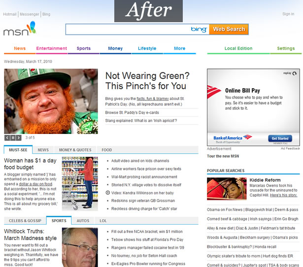
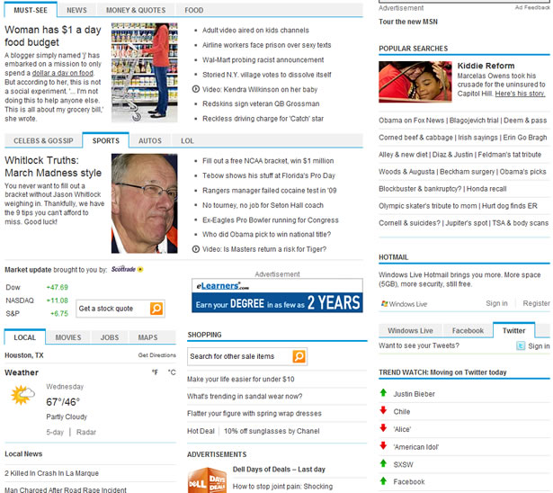
One of the main goals of the new design is to update the interface with a much cleaner look; a look reminiscent of Google. To achieve this they’ve changed the background to a consistent white and they’ve added tabs for the various content sections. They’ve also given higher visual weight to the main news section by giving it a bigger heading and making its images larger. This gives the user a clear indication of where their eyes should be immediately drawn, which helps to make the site feel less busy.
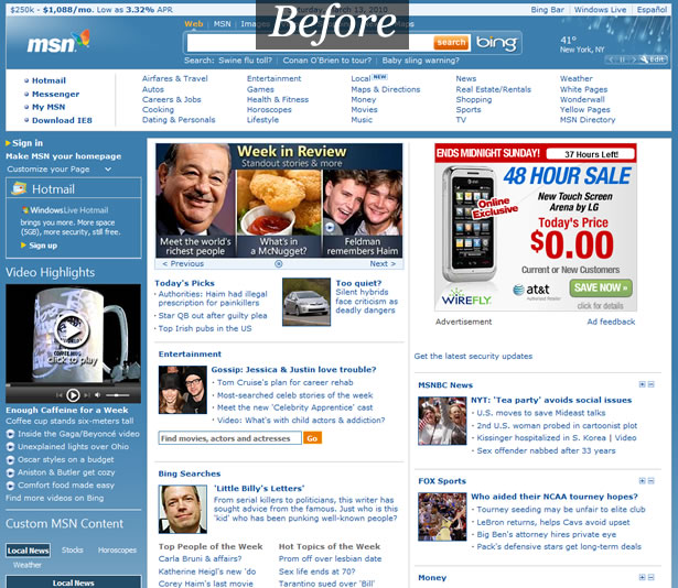
The white background makes the site look clean but it does so at the expense of losing the blue, which made the old site easily recognizable and unique. Despite the feedback that MSN has been receiving that states that the white background feels cleaner, it might be beneficial in the long run for Microsoft to embrace their old blue background color. By going with a single background color many vertical lines were removed. This makes the site feel wider despite it actually being slightly thinner by around 20 pixels.
The tabs also make the page look much cleaner. The sections on the page do not seem to be grouped in an obvious way but this isn’t necessarily detrimental. MSN realizes that this page will not be used like a newspaper or even as a news website.
Each section provides small headlines and short sentences aimed at enticing the reader to click through and learn more. When talking about the new design, Scott Moore (MSN’s General Manager of Content and Programming) explained that the site uses machine learning to divide the users into eight groups.
He didn’t go over the details but this might mean that the placement of the sections/tabs will be determined by the things in which the users have shown interest.
Content Additions
A feature that the MSN team decided to focus on is social networking. Users can now log into either their Windows Live/Facebook/ Twitter account to get live updates displayed on their MSN homepage.
This is a feature that some people will find slightly handy and others will ignore completely. "Social Media" has been an Internet buzz word for more than a year now and it’s surprising that MSN has taken so long to integrate it into their home page.
The social media addition won’t influence many people into using their homepage but it doesn’t affect their appearance negatively and it shows that they’re embracing the Internet instead of forcing their users to only use MSN applications.

The MSN homepage redesign has given the Bing search bar much more prominence. It’s been given its own section instead of being forced to share its space with many various elements.
This increase in attention for Bing has given their search engine a double digit increase in searches. The larger Bing search bar could be one of the best features of the MSN redesign because it shows that MSN now has a better understanding that homepages are generally used as a starting point for a web search. People will be quick to change their homepage if they think that MSN is taking too long to load irrelevant content.
The third major addition is a focus on local content. At the top right of the page there’s a link for Local Edition. Local Edition is like another version of the homepage but it’s more relevant to each individual. The user can save up to three different cities (or zip codes) but it’s not very intuitive about how to add them. The user has to input a city name, click "Save" and then to add another one they must click "Change". It would make more sense to instead have the link read "Add".
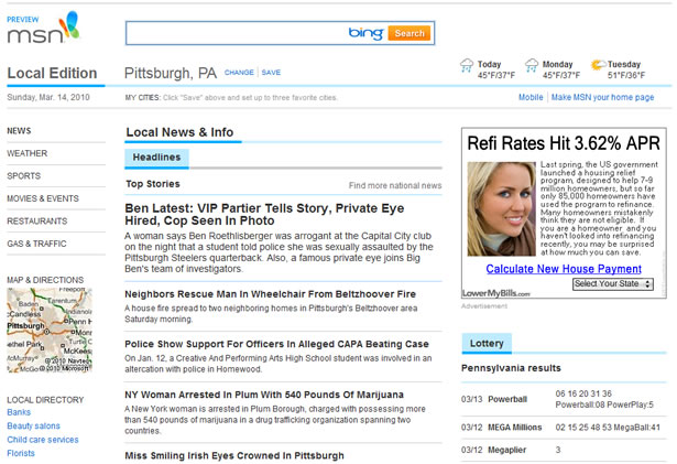
Local Edition
Once the user has selected a city they have access to local news, weather, sports, movies/events, restaurants, gas/traffic and a few other items. All these features are really well implemented except for the Restaurants section.
For the Restaurants it simply lists nearby restaurants with links to reviews, 5 star rating images, and directions. When the Review or Ratings links are clicked a page is loaded that lists various details about the restaurant but it doesn’t have any customer reviews and the rating widget is nowhere to be seen. It feels like this feature was taken from a static reference book.
sThe other features are all well done and it’s worth trying them out. Be advised that at this point in time Local Edition is only available in the United States.
The last addition worth mentioning is the TrendWatch feature which lists the latest Twitter trends. This feature is oddly similar to Yahoo’s Trending Now section but it has arrows next to each search query to show its popularity momentum. It’s a bit tacky and its placement at the bottom of the page makes it feel more like an after-thought than a useful feature.
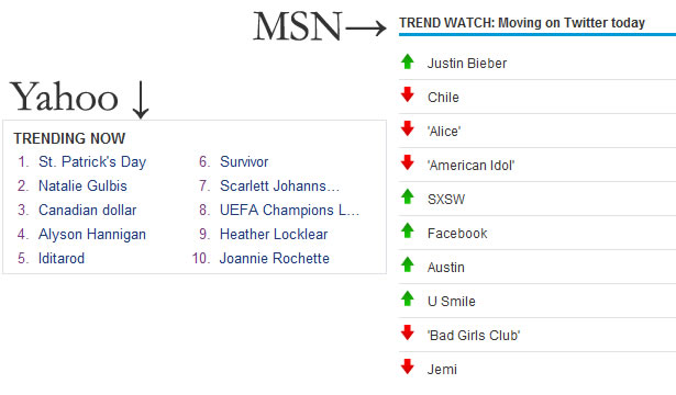
Yahoo's Trending Now compared with MSN's TrendWatch
Performance
Interestingly, the old MSN site downloads all its content to the user’s machine using one second less than the new design. The new design then executes much more code making its total completion time almost 3 seconds longer than the old design.
The Local Edition performs slightly better than the new design with a document ready time of 2.582 seconds but the fully ready time is an ugly 10.545 seconds due to an embedded video being loaded.
Because everything displays in roughly the same amount of time, users are not likely to notice the difference in performance and this might be detrimental to the new design’s success.
Home pages should be extremely fast and this is an area where MSN has the opportunity to really shine against the majority of their competitors. Crowds of people crammed in coffee shops or airports sharing wireless networks want sites that load the fastest.
If they have MSN set as their home page they will quickly navigate to a faster site or they’ll use the search at the top right corner of most modern browsers. If this occurs often enough then the users will be tempted to change their home page altogether.
Note: http://www.webpagetest.org was used for testing. The following are the three tests that were performed:
Overall Design
The overall redesign is effective. It addresses some of MSN’s concerns with their old design and it provides a cleaner image for Microsoft.
The design provides a slightly better visual hierarchy but there’s definitely room for improvement. The main content section is the first to grab the user’s attention, followed by the sizeable Bing search bar, but after those two elements it’s tough to pinpoint what exactly will draw their attention next.
This is due in part to the page having a large amount of content which all has different levels of importance to each individual. Because everyone is different it’s tough to know exactly how to set the visual path but even a slight hint could yield significant results.
No section has a higher visual weight than any other section.
While the color scheme works, it does not define the design. Except for the slight gradient at the top of the page and the MSN logo, there’s nothing that displays the MSN identity. The site comes across as bland and without any personality. The page isn’t given a chance to sell itself by being charming; it can only rely on its features.
One of the best aspects of the redesign has been the introduction of significant white space. Each news heading has been given an extra 12 pixels of vertical space to separate it from the other headings. The font size has been increased as well which makes everything much easier to read.
Conclusion
This new design feels like it is being updated to fit in with MSN’s competitors. While everything looks nice and behaves as it should, not enough has been done to make the design push the boundaries of what a modern website can do.
The site traded its identity and clutter for cleanliness and a few mediocre features. Local Edition is a great addition and it has a good chance of catching on, especially if it’s given a well marketed mobile version.
References
- http://en-us.nielsen.com/rankings/insights/rankings/internet
- http://www.youtube.com/watch?v=h82ykmMHxSE
This article was written exclusively for Web Designer Depot by Eli Penner
What do you think of MSN's redesign? What would you have done differently?
WDD Staff


Read Next

15 Best New Fonts, July 2024

20 Best New Websites, July 2024

Top 7 WordPress Plugins for 2024: Enhance Your Site's Performance

Exciting New Tools for Designers, July 2024

3 Essential Design Trends, July 2024

15 Best New Fonts, June 2024

20 Best New Websites, June 2024

Exciting New Tools for Designers, June 2024

3 Essential Design Trends, June 2024

15 Best New Fonts, May 2024

How to Reduce The Carbon Footprint of Your Website
