 When is orange more like red? Web designers, even picky ones, sometimes ignore color shift across monitors.
How is a web designer to manage color when the screens of their users could be any size or color or could be viewed under any lighting conditions?
Unlike fixing HTML errors, which affect browsers as the page is loaded, getting accurate color is part of the designer’s work process.
Maintaining colors across projects is possible once the problems are understood. Read on for the challenges—and solutions—to getting consistent color on the web.
Can you spot the difference between the photos below?

One of the images is slightly more blue than the other. This “color shift,” or overall tint of a particular hue, might go unnoticed by the casual observer. After all, a slight change in hue doesn’t make this any less of a flower or detract from the dewdrop’s detail. It’s a cumulative change.
Over time, maximum-quality JPEG images and 256-color PNG icons eat up precious bandwidth. Complexity in HTML increases the browser’s workload with each page load. Unlike these problems, which add up as visitors browse the website, color management is a problem with the design process. Images created on an uncalibrated monitor become inconsistent over time.
Color shift could go by another name: inattentiveness.
When can we say that a graphic’s color matches the page close enough? At what point is a photo’s color too inaccurate? What details don’t matter to the project as a whole? Everyone may have different answers, but no one who takes digital images seriously can ignore color calibration.
The print industry has struggled with getting accurate color for decades. Ensuring that the exact same colors appear at all stages of production—including in various monitors, office printers and high-end presses—has spawned its own industry of calibration devices, software solutions and even ISO standards.
The web design community generally doesn’t worry about press checks. But maybe it should.
The Web Has Had Color Issues Since It's Had Color
In the 1990s, getting accurate color on the web meant using a palette of 216 “web-safe” colors. These hues and shades were (mostly) guaranteed not to dither when displayed on monitors that could not handle more than 8-bit color.
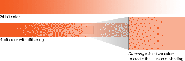
Above is a gradient with and without dithering. Today, the vast majority of computers can show 24-bit color or better (according to these browser display statistics and Google Analytics tracking of websites, including Webdesigner Depot). That is, each pixel can show one of millions of colors, making calibration both complicated and more critical.
The web has long relied on hexidecimal codes, like #F35C23, to define colors. These six-character strings can display a wide variety of hues and values with great precision. An image that has #F35C23 and a CSS background in #F35C23 will match perfectly.
The problem is that the code defines a combination of red, green and blue but does not always result in consistent color. Display screens account for the difference.
White Is White, Except When It Isn’t
Many factors affect color accuracy when creating and editing digital images. As with print, color on the web depends on the environment in which the image is created. Unlike print, web-based images can change every time they’re displayed because the monitors of users will vary, and no press check can catch problems that crop up.
Although many modern web browsers can display CMYK images, most images for the web are based on the additive RGB color model. This model applies a mixture of red, green and blue to each pixel.
But not all monitors are built the same, and so a particular shade of orange could be inconsistent across different screens. Here are some of the causes of color change:
- Slight changes between manufacturers and models account for slight inaccuracies in shade and hue.
- Many screens (especially CRT monitors) change color over the years and even as they warm up over the course of a day.
- Until recently, Mac OS X and Windows used two different “gammas,” which meant that images on Macs appeared brighter than ones on PC. Mac OS X 10.6 (Snow Leopard) uses the more common gamma of 2.2, which is the same as Windows and many televisions and camcorders.
- People browse the web from many different locations and in many different lighting conditions. The effect of overhead lights and the amount and color of natural light all affect the appearance of color on the screen.
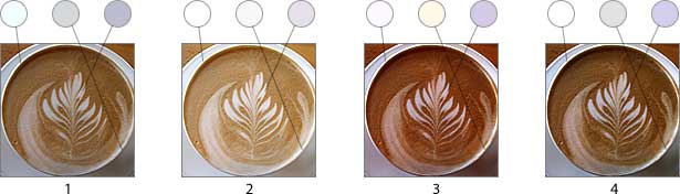
Above, different calibration shows that “white” is often an assumed color:
- The original image, shot under fluorescent light with a point-and-shoot camera.
- Approximate color shift on a Mac before Snow Leopard.
- Approximate color shift on an aging CRT monitor.
- Close to true color, as seen on the laptop on which the photo was processed.
A slightly red monitor might show an otherwise perfect blue as slightly purple, or show a green with a yellow tinge. Monitors set too bright will wash out shadows and highlights; monitors set too dark will muddy shadows and increase the chance of color shift in highlights. For designers who care about these details, quality control is definitely a challenge.
PNG Color Shift
Simply put, the gamma value changes the luminance of a displayed image. Designed for digital display, the PNG image format enables designers to add gamma correction to each image. But without knowing the luminosity of the output device (that is, without knowing the type of monitor the image will appear on), designers have a hard time adding accurate gamma correction.
This characteristic has become PNG’s most notorious problem. On the web, an image will sometimes match the hex colors specified in the CSS, and other times it won’t—even though it was created with the correct color.
Programs such as PNGCrush (Windows) and PNGenie (Mac) can remove excess information from PNG files, including the gamma setting, which makes color more reliable.
Other Issues
Preventing color shift can require changes in the way designers work. Poor color calibration will stand out over time. It’s one of those design details that doesn’t get talked about and shouldn’t get noticed.
Industry Solutions
Various solutions have taken much of the guesswork out of managing color and preventing color shift.
The International Color Consortium (ICC) was created in 1993 to establish a platform-independent standard for color management. The goal was to ensure consistent color across all devices, including monitors, scanners and printers.
ICC profiles are files that contain information on how various devices display color. Printers and most computers ship with ICC profiles built in, because their manufacturers know precisely how they work. But custom ICC profiles can adapt a particular device to certain conditions—say, when a monitor is used under fluorescent lights, as opposed to next to a large window.
In addition to matching colors across screens (and in print), Adobe Flash Player 10 supports ICC profiles, enabling color management between Flash and printers (assuming that the end user’s printer uses an ICC profile).
In 1996, Hewlett-Packard and Microsoft defined the standard red, green, blue (sRGB) color space as a convenient standard for devices that use additive color models. Although more limited than other forms of RGB (its colors can’t be quite as saturated as Adobe RGB, for example), its popularity grew as monitors, scanners, cameras and camcorders adopted the spec.
These technical solutions are industry-wide responses from professional organizations. But designers can also take steps to keep their work consistent over time.
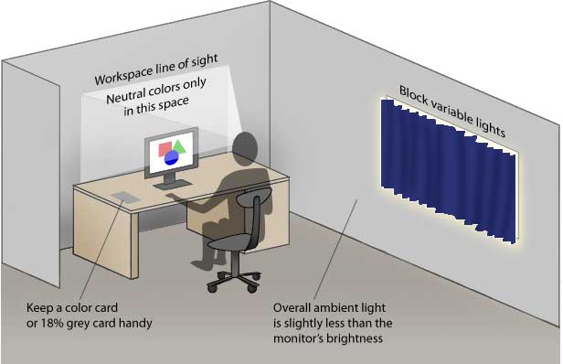
Tips to Prepare a Room for Color Work
What kind of light are you using right now? If you’re reading this in your primary workspace, and if accurate color is important to you, then you can take steps to improve your workspace right now.
- Ten seconds per half hour
Take a quick break and stare at an 18% gray card. Looking at the same card under the same lighting conditions is a good way to “reset” your eyes. (Note: purists recommend 12% gray cards. They’re fine, too, as long as you use the same card every time. The point is to look at something consistent and neutral.) - Ten minutes
Move your monitor out of direct light. Never let a light source directly hit the screen. - Fifteen minutes
Remove colored desk accessories (calendars, markers, photos, folders—anything not gray) from your line of sight. If your monitor is reflective, do not keep colorful items directly behind you. - Ten minutes per day
Let your eyes adjust to the environment before starting work. Give your eyes time to adapt to the workspace, especially if you’ve just come in from sunlight or exterior night lighting. If necessary, use a timer. - Ten minutes per week
Clean your monitor. Use a lint-free cloth to gently remove dust and fingerprint smudges, or refer to your owner’s manual for cleaning instructions. Do the same to your eyeglasses, if you wear them. - A day or so
Cover nearby windows with thick screens or curtains. The primary benefits of natural light are accuracy—it’s hard to get more natural than sunlight—and availability. But natural light varies. It changes throughout the day, with the weather and with the seasons. - A weekend
Surround your workspace with neutral gray. Paint the walls, and replace dark furniture with something bland. Ideally, your desktop should reflect only about 60% of the light that strikes it. GTI Munsell Neutral Gray Paint is popular among photographers for creating neutral backgrounds. - A weekend or shipping time
If you’re not able to adjust your office lighting, purchase or assemble a monitor hood to prevent glare and changing conditions.
Tips to Calibrate Your Monitor
The purpose of calibration is to eliminate color shifts and optimize the tonal range of your monitor. Shadows should be rich but still show detail. The brightest highlights should be neither too warm nor too cool. In the long run, this makes for accurate, consistent color.
Here are the general steps:
- Warm your monitor up for at least 30 minutes.
- Select gamma (5000–9500° K, gamma 1.8–2.2).
- Find the best white and black points.
- Balance red, green and blue to prevent color casts.
- Repeat this process monthly.
Many programs will walk you through this process. Adobe Gamma is a popular quick solution for calibrating CRT displays. Aside from being easy to use, it’s free with the purchase of Photoshop or Photoshop Elements. Other solutions are QuickGamma (Windows) andDatacolor’s Spyder hardware calibrator.
Color Me Picky
Accurate, consistent color is one of those minor details that most people—including web designers—choose to ignore in the face of parsing errors, web standards, client misinformation and good ol’ deadline pressure.
But it’s also one of those elements that make for a better overall experience. Once designers start to notice deviations in hue and muddy shadows, not wanting to do a better job will become unusual.
Written exclusively for Webdesigner Depot by Ben Gremillion. Ben is a freelance web designer who solves communication problems with better design.
WDD Staff


Read Next

15 Best New Fonts, July 2024

20 Best New Websites, July 2024

Top 7 WordPress Plugins for 2024: Enhance Your Site's Performance

Exciting New Tools for Designers, July 2024

3 Essential Design Trends, July 2024

15 Best New Fonts, June 2024

20 Best New Websites, June 2024

Exciting New Tools for Designers, June 2024

3 Essential Design Trends, June 2024

15 Best New Fonts, May 2024

How to Reduce The Carbon Footprint of Your Website
