 Working with a company as large as Virgin Atlantic was something of a dream come true for me. I it's something that a lot of web designers aspire to.
Over the last few months, I was fortunate enough to be given the opportunity to fulfill this dream.
I was about to write this post up over on my blog but Walter very kindly invited me to share this case study with the much larger audience here on Webdesigner Depot and across the Smashing Network.
I'm no Elliot Jay Stocks and I certainly don't claim to be, so when Virgin Atlantic got in touch with me back in November I was surprised, humbled and extremely enthusiastic at the prospect of working with the company on a new blog for the "vtravelled" website.
Many people have since asked me why Virgin chose to work with me in particular. The answer is that they found me on Twitter, enjoyed my blog posts and, most importantly, liked my work. This won't end the debate about the "value of Twitter" for some people but it certainly has without a shadow of a doubt for me.
The Beginning
In November 2009 vtravelled's editor, Maxine Sheppard, got in touch to ask if I would be available to design and develop a complete blog for the vtravelled website (Virgin's new online travel community and web app). Meetings were arranged and after a week or so I got the green light for the project. I've done some work for big companies before, including Ubisoft, but this was really my first time getting into the corporate culture of the industry. To be totally honest it's really not as scary as people make it out to be, though I can imagine that there is some variation in people's experiences. Virgin Atlantic has managed to put together a truly great team at vtravelled; as a result, not only was the company very easy to work with but it was great fun, too.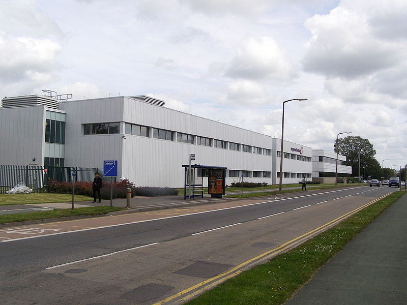 The building is as wide as it is long, it even has its own set of traffic lights.
Bizarrely, I think the most daunting (perhaps awe-inspiring) part of the whole process was going to Virgin Atlantic's headquarters for meetings.
Something about driving up to a building that can (and does) physically contain both offices and actual aeroplanes is pretty special. The entrance to the building contains the company's own gift store, and after a long walk you end up in the atrium, which is directly adjacent to large sections of Boeing aircraft that are used to train cabin crew.
At the first meeting I asked the head of vtravelled, Lysette Gauna, (as a joke) if all of the design awards lining the vtravelled office were hers. The answer was, "Yes, but I keep most of them at home." D'oh! Time to be really afraid.
The Brief
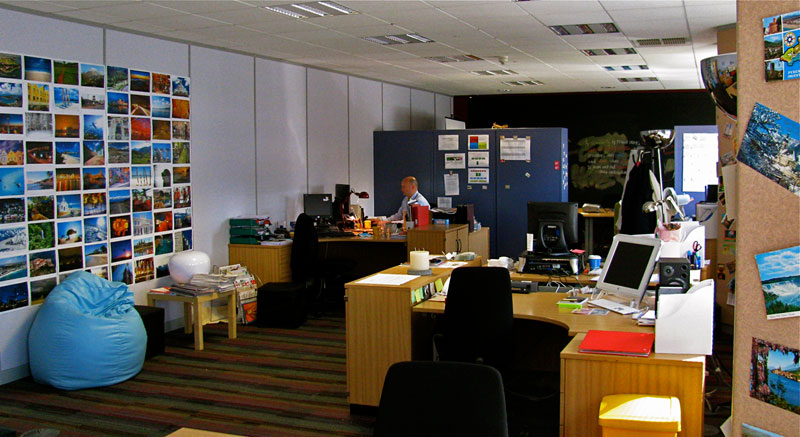 The vtravelled offices are bright and creative and the whole back wall is a chalk board!
The brief was fairly straightforward: vtravelled is a big web application and community for travel lovers but it's still being actively developed. The team needed a way to put out editorial content and engage with users on social networks. A blog was the obvious answer.
I wanted to make sure that I really nailed the direction it was looking to go in on the design side, so I came up with a slightly different implementation of using mood boards; I called them Moo'd cards. The idea was simple but effective: I took 100 samples of great design work that I'd collected and printed them on 100 MiniCards from Moo.com.
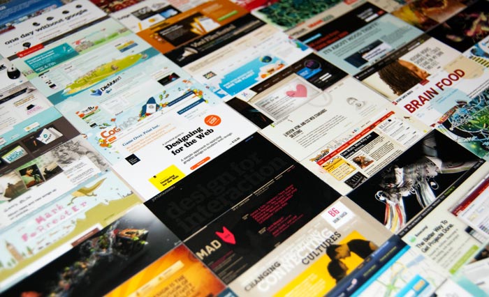 Some of the Moo'd cards that were used.
We looked through all of them during the kick-off meeting and eight cards were selected to represent the sort of style that the team was looking for to appeal to vtravelled's user base.
If you haven't tried this technique, I highly recommend it; It's a great way to discover client expectations of design. I've since released all the source files for the Moo'd cards as an OpenSource project, including web and iPhone versions.
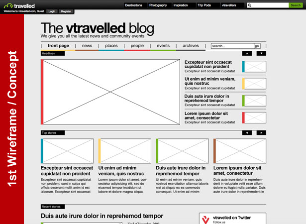
Once we established an overall style (minimalist, in keeping with vtravelled branding but creative and different from the main website) and an overall direction (a magazine-style blog, with plenty of avenues for user interaction), it was up to me to get started.
The Design Process
The design process when working with a large company is pretty similar to any other: starting with wireframes, then developing mockups. The main difference comes at the feedback stage: two or three people had to review and sign off at each stage, at which point they took much larger issues into consideration. For example, Virgin is particularly sensitive to how its brand is portrayed. Anything the company does has to fit in with its morals, standards and qualities. After establishing the structure of the website, it was time to move on to actually creating the design. This was about a 30-hour process (for the home page) which moved through several interesting phases leading up to the end result. Luckily, in anticipation of writing this post, I recorded a screencast of almost every minute of design time and compressed it into a three-minute video. All in all, the design process took place over about six weeks. This video was created with ScreenFlick ($25) for Mac OS X, recorded at 1 frame per second, and edited in iMovie.The Development Process
Once final-signoff for the design had been achieved, the development process began and lasted approximately another six weeks. Virgin Atlantic uses IE6 in its corporate offices, so this was a big consideration in developing the front end. The website had to degrade gracefully enough to accommodate this browser so that it was at the very least functional. Once again, because of the great team at vtravelled, I was also permitted to use progressive enhancements with CSS3 for newer browsers. Turning the front-end code into a custom WordPress theme was the next step. There were a few special considerations here to make the website as powerful as possible. I started with the WooThemes "WooFramework" to allow a high level of back-end customization but, in the end, it was modified and customized so much that the vtravelled blog pretty much ended up with its own custom system. It was important to take into consideration that a lot of people would be administrating the blog, so it needed to be as flexible as possible in all areas. Finally, the theme needed strong pagination and light-hearted error messages on the 404 and search pages that would reflect the friendly nature of the brand.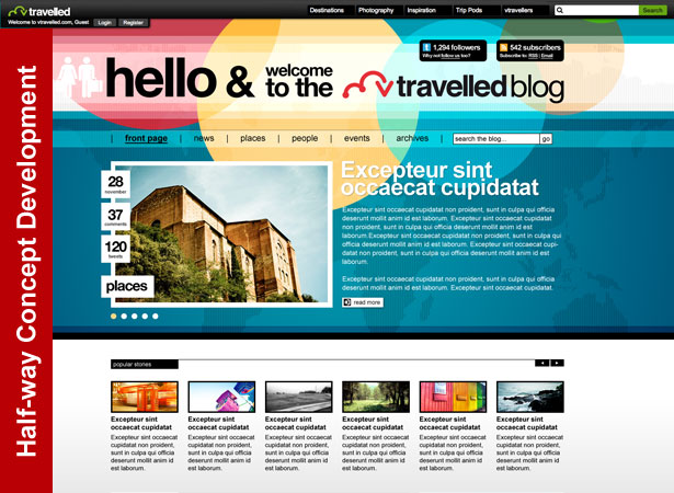
A Little Trickle Tweet
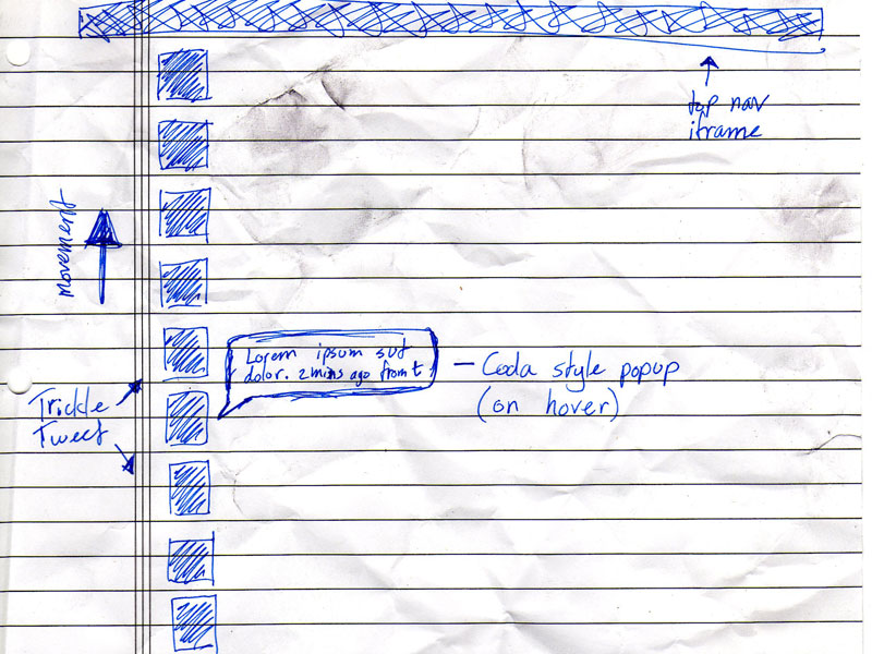 The first sketch of the Trickle Tweet plugin.
I'm pretty handy when it comes to writing PHP for WordPress but when I need something totally custom built, there's only one guy I turn to: my partner in crime, Japh Thomson.
During the design phase, I had sketched out an idea during a meeting that went over really well with the vtravelled team. The idea was to use the Helvetica-Man branding that existed throughout the vtravelled website and social media profiles for a stream of live conversation about travel.
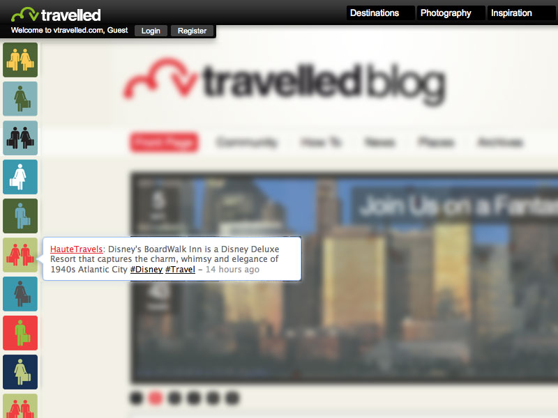 The final version of the TrickleTweet plugin.
Japh had already developed a piece of code with the Twitter API, called Trickle Tweet which allows you to search for any term on Twitter and view a live (up-to-the-second) stream of the latest mentions of it.
I was permitted to sub-contract Japh and he was commissioned to modify his script to become a completely custom WordPress plugin for vtravelled. This has turned out to really be the piece-de-resistance of the website.
Launch and Conclusion
Launching a website for a big company is a little different than a normal launch. I had to liase with vtravelled's development company fo proper server settings and to remove password protection to the sub-domain at the right time. I had to liase with the advertising company to ensure that the right ad codes were installed, and I had to go through a mad 24-hour period of beta-testing, bug-fixing and reviewing performance. In the end, we soft-launched the blog at about mid-day on Tuesday and started the announcements and press releases a few hours later. Fingers crossed, nothing has gone wrong so far and the website has gotten a very positive response on Twitter, which was reflected in the blog's day-one traffic levels and some other features around the web. As with any website, there are improvements can be made and features will develop over time, but I'm pretty pleased with how v1.0 of the vtravelled blog has turned out. Working with Virgin Atlantic has been one of the absolute highlights of my career so far, and I'm very pleased to be working with the company again at the moment on a few other pieces of design work. I still suck at estimating time though; we initially thought the whole blog design and build would take four weeks!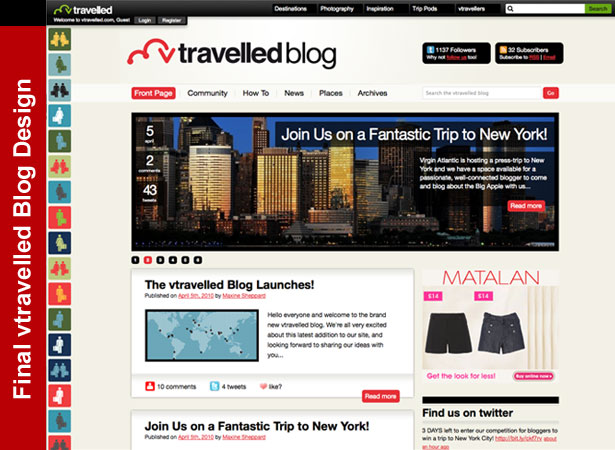
Credits
- Post image by sebas
- Virgin Atlantic HQ photo by MilborneOne
- vtravelled offices photo by Maxine Sheppard
- New York photo courtesy of vtravelled
- All other photos and screenshots by John O'Nolan
WDD Staff
WDD staff are proud to be able to bring you this daily blog about web design and development. If there's something you think we should be talking about let us know @DesignerDepot.
Read Next
15 Best New Fonts, July 2024
Welcome to our monthly roundup of the best fonts we’ve found online in the last four weeks. This month, there are fewer…
By Ben Moss
20 Best New Websites, July 2024
Welcome to July’s round up of websites to inspire you. This month’s collection ranges from the most stripped-back…
Top 7 WordPress Plugins for 2024: Enhance Your Site's Performance
WordPress is a hands-down favorite of website designers and developers. Renowned for its flexibility and ease of use,…
By WDD Staff
Exciting New Tools for Designers, July 2024
Welcome to this July’s collection of tools, gathered from around the web over the past month. We hope you’ll find…
3 Essential Design Trends, July 2024
Add some summer sizzle to your design projects with trendy website elements. Learn what's trending and how to use these…
15 Best New Fonts, June 2024
Welcome to our roundup of the best new fonts we’ve found online in the last month. This month, there are notably fewer…
By Ben Moss
20 Best New Websites, June 2024
Arranging content in an easily accessible way is the backbone of any user-friendly website. A good website will present…
Exciting New Tools for Designers, June 2024
In this month’s roundup of the best tools for web designers and developers, we’ll explore a range of new and noteworthy…
3 Essential Design Trends, June 2024
Summer is off to a fun start with some highly dramatic website design trends showing up in projects. Let's dive in!
15 Best New Fonts, May 2024
In this month’s edition, there are lots of historically-inspired typefaces, more of the growing trend for French…
By Ben Moss
How to Reduce The Carbon Footprint of Your Website
On average, a web page produces 4.61 grams of CO2 for every page view; for whole sites, that amounts to hundreds of KG…
By Simon Sterne
20 Best New Websites, May 2024
Welcome to May’s compilation of the best sites on the web. This month we’re focused on color for younger humans,…


