 One task drives web professionals to distraction more than almost any other: testing whether their design works equally well in a multitude of browsers and on different devices.
The list of browsers and platforms to verify against keeps getting longer, and as designers, our tempers are getting proportionally shorter; IE6 will probably feature in nightmares for years to come!
Yet doing our work in an ever-widening range of situations is becoming increasingly important.
This article highlights the most common issues that arise when testing with “the usual suspects” and explains why a change in tactics may soon be needed. Your entire perspective on compatibility testing could change.
The Fantastic Five
Back during the browser wars, designers had to suffer through constant bickering between Internet Explorer and its rival (some things never change). The turning point came when newer browsers committed to supporting web standards, which gradually eroded Internet Explorer’s dominance of the browser market.
Times are changing. The increasing relevance of mobile browsing devices and new rendering engines has led to a desire among designers to curb the need to test on every device imaginable.
Designers now resort to playing a numbers game, usually by testing their work in the five or six most common browsers, then claiming coverage of the rest. While this seems like an easy fix, it presents a few problems, because unlike in print, one size certainly doesn't fit all.
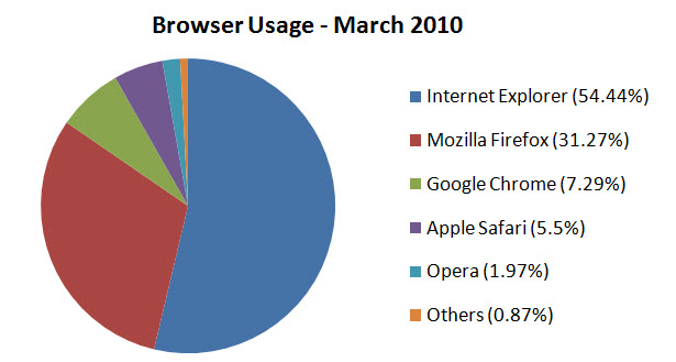
Although the market is dominated by five browsers, designers shouldn't disregard the orange “Others” slice. Visitors on other browsers still need to be accommodated.
The key to accurately presenting your website’s lovely design to the end user is the rendering engine. One might assume that if you tested a website in the most popular browser for each of the Trident, Gecko, Commit and Presto rendering engines, then you could safely ignore other devices that share the same engines because you would have covered the vast majority of users.
I generally agree that testing in these browsers alone would catch any problems that are visible to the user, but testing in a broader range of browsers, devices and systems has its benefits. It’s worth examining potential problems and deciding whether further testing is required in order to give visitors the best possible experience.

Trident (Internet Explorer), Gecko (Firefox), Webkit (Chrome and Safari) and Presto (Opera).
Beyond the Breaking Point
An obvious issue these days is device (or plug-in) dependence, which affects browsers not only at the browser level but at the rendering level. The Apple faithful are surely aware of the iPhone and iPad’s issues with Flash—and because Adobe and Apple started boo’ing each other, we’re still hearing about it.
While Flash does indeed handle the general rendering of content all by itself, testing only in the most popular browsers wouldn’t necessarily show problems with it. While mainstream technologies (both open and closed) are at risk of exclusion, expanding your test base can be critical.

Flash renders outside of the browser, but not every web browser can make use of the technology.
Another issue is the versions of rendering engines. While having the latest and greatest browser is key to taking advantage of new technologies, the continued use of older versions (especially the various devil-incarnate versions of Internet Explorer) requires that we limit ourselves not only to the latest builds of a renderer but also to those that can still function in environments where upgrading software would be either unsuitable or impossible.
Even in compatibility mode, testing in current browsers does not account for old versions of the browsers that use earlier versions of the rendering engines.
Internet Explorer 6.0 uses an older and buggier version of the Trident desktop browser rendering engine.
Rendering issues might also occur if there are differences between the device and platform being used. It goes without saying that testing your website on a range of mobile handsets and pocket surfers may drive you to the brink of insanity, particularly given how different everything can appear.
Designing for such a small screen can be quite a task, especially because conventions for mobile devices are still in their infancy. But this issue applies to desktop platforms, too. It’s not uncommon to see minor rendering issues crop up between Windows and Mac versions of Firefox, for example—a worrying thought indeed.
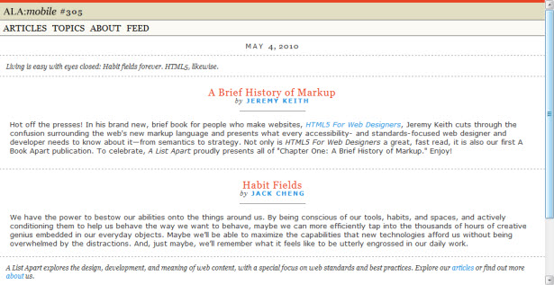
A List Apart cares so much about rendering differences that it has a separate design for mobile devices.
Another key component that might differ from browser to browser is the JavaScript engine. In the early days, the only question about JavaScript was whether to use it.
These days, browsers with the same visual rendering engine often have different JavaScript engines (Chrome and Safari are a perfect example). Using multiple browsers to benchmark your website’s ability to render those gorgeous jQuery scripts is of equal importance, especially if your design has a lot of functional interactivity.
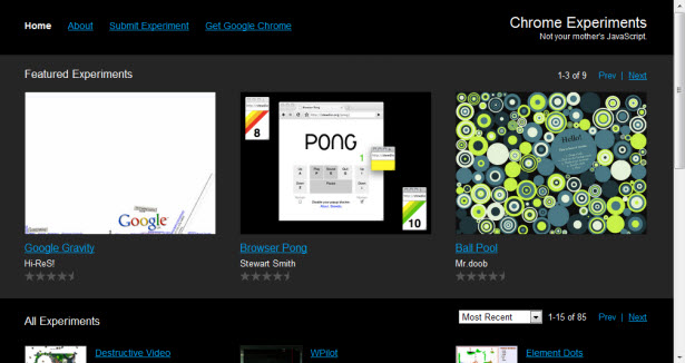
Chrome Experiments showcases the rendering performance of Google’s browser.
And finally, a topic that gets some people cheering and others groaning: accessibility! In many people’s eyes, accessibility and the way a browser renders a website aren’t related. But it’s worth noting that when people visit your website, their accessibility software might force them to use a particular browser, one that supports the computer’s screen reader or their accessibility device.
In such cases, minority browsers may be overlooked entirely. Remember that your design should also work for these people whose needs are often forgotten.
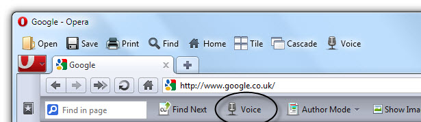
Opera may have a small market share, but its voice options can be a lifesaver for those with special needs.
The Long-Term Cure
Given all of the accessibility needs, different JavaScript engines, cross-platform issues, display differences, technology dependencies like Flash and the mobile revolution, one could be excused for resenting how much testing is needed. Still, have a look at your target audience’s needs to see whether expanding your current testing workflow would yield long-term results.
Take some time to communicate with your visitors. Perhaps you could run a poll asking which browsers and devices they’re on, and then examine your statistics to see whether they’ve mentioned ways you could improve or expand the interaction on your website.
You may find that you need a mobile design, or maybe there is enthusiasm for an iPhone app, or you may simply get more bug reports for minority browsers. Encouraging feedback is paramount in the evolutionary process of design.
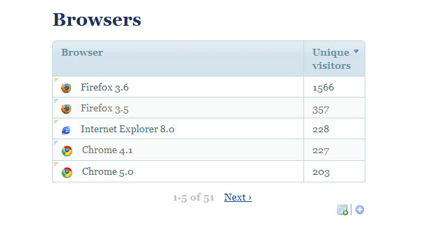
Statistics packages can give a clear idea of which devices have been used to visit your website.
Reaching customers on an increasingly broader scale is something every website owner should consider in the context of usability. Good communication creates an emotional connection with visitors; they feel like their interest is being validated and their time well-spent, and this can turn clicks into customers.
Staying on top of things at the testing stage, then, goes beyond fixing visual flaws. A wider testing field could lead to new features and unique ways of navigating the website. One reward could be a deeper bond with your website’s regular visitors and fans.
Start Your Engines
How you would expand the testing process is beyond the scope of this article, but the simplest way to improve your website’s appearance and the user experience is by ensuring that everything looks presentable on screen.
Below is a list of a wide range of browsers, both mobile and desktop, which might help you widen your horizon as you test. While some will render your design the same, these browsers should help you ascertain the scale of the tests you will need to perform.
More browsers will no doubt be created (and some may already exist), so consider the future as well.
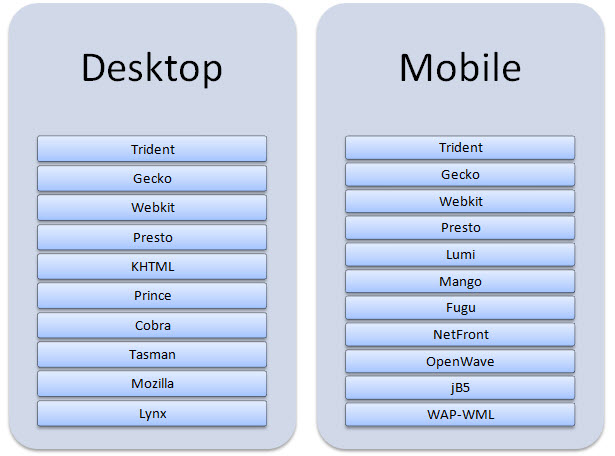
Both desktop and mobile platforms have a broad range of rendering engines.
While browsers built with Trident, Gecko, Webkit and Presto are included (along with their older variants Tasman, Mozilla and KHTML), other rendering engines with a user base have not been included here because of the very limited range of devices that support them.
Devices and browsers with unique rendering engines (text, visual and mobile) that are not mentioned here can be tested individually and could potentially increase the compatibility of your design.
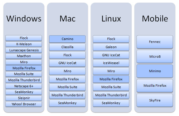
I recommend the browsers highlighted below for each platform. With the exception of the Mac, which uses Tasman, all of these use the Trident rendering engine:
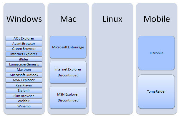
All of these use of the Gecko (previously Mozilla) desktop rendering engine:
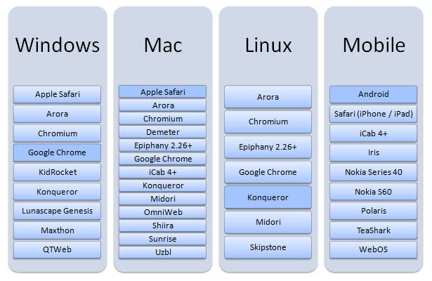
All of these use the Webkit rendering engine (or the KHTML fork in Konqueror’s case):
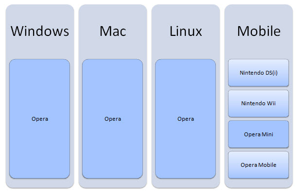
Because Presto is a proprietary platform, it’s no surprise that it is limited to Opera projects:
Over the Rainbow
Perhaps your website is entirely free of errors. Perhaps it looks great in every situation. But if you consider the sheer scale of the requirements for compatibility across platforms, no longer do the big five give you an accurate picture of web users as a whole.
If you take away only one thing from this article, then understand the value of spending more time analyzing your visitors’ needs, because that will help you re-evaluate the testing phase to encompass a wider range of scenarios.
Spend extra time going over browsers for each rendering engine, and don’t forget about the following: other operating systems, which might have differences; other types of devices (such as mobiles), which might render very differently; unique JavaScript renderers, which have implications for speed; older versions of web browsers; and in general the wider scope that is needed as code evolves and changes the web itself.
Summary
In a world where people are willing to invest time, effort and money into making their websites as friendly as possible by catering to search engines and social media, ensuring that your design works (rather than focusing on pixel perfection—remember, the web is not print) can be more valuable to the hundreds or thousands of people who access your website in different ways.
It certainly could mean the difference between attracting customers and having frustrated “Hi and goodbye” visitors.
Written exclusively for WDD by Alexander Dawson
How do you go about testing your carefully crafted designs so that they perform flexibly? Do you plan to optimize your testing workflow so that it is less restrictive? Could your website encourage more visitor feedback on its design?
WDD Staff


Read Next

15 Best New Fonts, July 2024

20 Best New Websites, July 2024

Top 7 WordPress Plugins for 2024: Enhance Your Site's Performance

Exciting New Tools for Designers, July 2024

3 Essential Design Trends, July 2024

15 Best New Fonts, June 2024

20 Best New Websites, June 2024

Exciting New Tools for Designers, June 2024

3 Essential Design Trends, June 2024

15 Best New Fonts, May 2024

How to Reduce The Carbon Footprint of Your Website
