
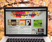
And here it is... After way too many delays, countless mock ups and ideas, the new WebdesignerDepot.com is finally here! This was an incredibly complex redesign process for the entire WDD team but we're extremely proud of the results and we hope that you love it as much as we do.
We launched the new design yesterday and the Twittersphere has been giving us great feedback and helping to identify some bugs. We've been fixing bugs for the past day and are still doing so, so please excuse some tech glitches that you may still come across over the coming days.
It was important for us that the new design keeps the old site's soul so to speak, while at the same time inspiring our visitors and bringing it up-to-date to current web design standards and techniques.
The new homepage, in particular, does a better job at introducing new visitors to our site. You'll notice that the navigation and information structure is much cleaner and clearer now.
In this post, we'll go into some more details about what's new and what went on behind the scenes to bring you this new version of WDD. So, let's dive right in!
If you've been one of our 40 million visitors (!) over the past few years, you'll notice that the design is, well, how to say it? Radically different! In fact, none of the old design has been kept. We threw it all away and started fresh from the ground up. This is as radical as you can get with a redesign and it carries certain risks for us as we lose our previous branding benefits in favor of what we believe is a better choice for our site, its content and most importantly: YOU, our amazing readers!
Let's starts with some credits to see who's behind all this...
- Art: Radim Malinic
- Logo: Steven Bonner
- Web design: Walter Apai
- Code: WDD Team
- Some design elements by Matthew Skiles
- Design quotes: Quotes on Design
So here's what's new in this design:
Hybrid layout: Magazine & traditional blog style
While the old design had a traditional blog layout, with the latest posts always appearing on the top, the redesigned version is a hybrid between a magazine style and a traditional blog layout. We find that this works quite well for our content. The wider layout allowed us to bring a lot more content into the homepage, while the 2 columns in the homepage, makes it easier to read than some traditional magazine style blogs where the content can at times be overwhelming.
Featured content
The blog posts are interspersed by three featured areas: 2 vertical and 1 horizontal. The vertical areas feature some of the hottest topics right now on the site (responsive design, jQuery, etc), while the horizontal area is used to showcase the latest deals from our site MightyDeals.com. In total, we can feature 10 more posts than we used to in the previous design without overpowering our readers.
Balance and weight
Homepage: Due to the heavy imagery, we tried to keep an even balance between text and images by displaying sufficient preview text content for each post. For the actual article pages we chose to have images and code snippets at full width, while the text is displayed centered at a narrower width to the images. This makes the site quicker and easier to read (or scan) and displays the images at their largest possible sizes for maximum impact. For the images in older posts and other narrower images, we chose to display grey bars on the side, reminiscent of the black bars you see when watching a standard definition show on an HD TV. This was the best compromise we could find to integrate those older posts into the new look of the site without retrofitting hundreds of posts!
Responsive design
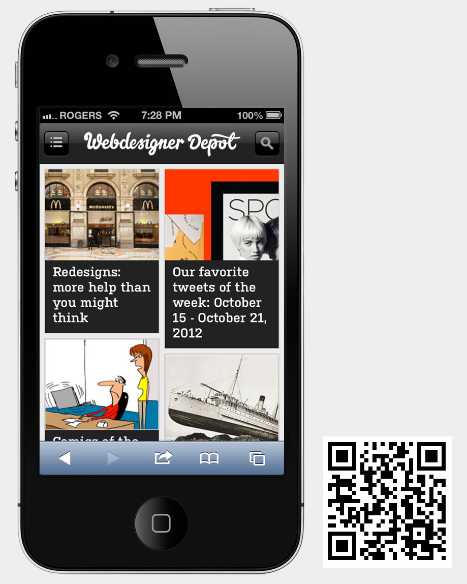
The new site is now fully responsive and looks great whether you're on a desktop computer, laptop, tablet or smart phone. Check out the smart phone version as it looks and feels more like an app than a website and we're really proud of the way this one turned out. It loads fast too!
Retina graphics
With Apple rolling out more retina devices, higher resolution displays are becoming more relevant for websites. The new WDD is serving retina graphic wherever possible. The site's design looks perfectly crisp on retina devices. Going forward, we will have retina optimized graphics in all our posts wherever possible. This is easier said than done as the web isn't quite retina ready yet, in fact, very few sites are serving large high-res graphics at this time. Some of our latest posts are already partially retina ready and some will carry this in the future. We also heard that retina ads may not be too far in the future.
Enhanced navigation
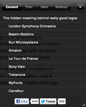
You'll notice a plus sign on the right side of your browsers (not on mobile devices) when viewing articles. When clicked on, this opens a mini browser that allows you to navigate through the current article, like browsing through the table of contents of an eBook. You can also share the current article via the mini browser, or see related articles, as well as reading the next and previous posts.
The art
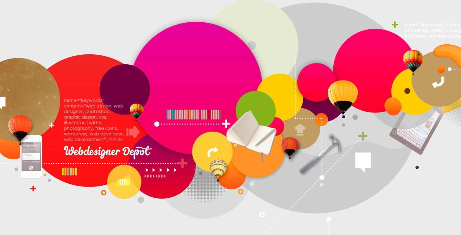
Once again, we collaborated with über talented illustrator Radim Malinic to create the art for our new site. Radim is an award winning art director and graphic designer, based in London, England. Under the name of Brand Nu he works with leading household brands. Since the original WDD website design, he has gone on to working with Goldman Sachs, Bacardi, Blistex, London Film Museum and many more. His style of work is one of the most diverse in the industry. His bold and colorful designs inspire a lot of people that see them. We asked Radim to focus his design on circles this time, as this is a timeless shape that is extremely popular and favored in current website designs.
Parallax
The new art and logo on the header are brought to life with a 5 layer parallax effect (moving at different rates) in the header section of the website. To see it, simply move your mouse around the header area (not on mobile devices). We think it looks pretty cool and adds an element of fun to the site! [UPDATE] The parallax effect was loved by most, but some people didn't like it, so we added the option to turn it off by right clicking on the effect area.
Logo
Although, the old logo served us well and was well liked, as this was a complete redesign, a new logo was in order! We collaborated this time around with Steven Bonner to redesign our logo. He's a very talented typographer based in Scotland with an enviable portfolio of type-led illustrations for some of the biggest brands in the world. We think it turned out great and balances the site well with a personal hand drawn touch, while looking professional and polished at the same time.

Typography
We finally ditched the old boring system fonts in favor of Typekit web fonts, used exclusively throughout the site. We use Kulturista for the all headers which looks great and has a nice personality and unique feel. For the body text we chose Proxima Nova which has superb readability and is great for large chunks of text. For headers, we also considered Adelle, and for body text we also considered Museo Sans, Adelle Sans, Myriad and Helvetica.

Pictos Icon font
We use lots of icons in this new design. The icons are part of the awesome Pictos icon font designed by Drew Wilson. We even use it for our animated social icons at the bottom of the site.
Footer
We have 2 footer areas at the bottom of the site. The first one highlights some areas that we feel are important to emphasize and then you have a more traditional looking footer at the very bottom with mostly text links and some animated social icons.
Social integration
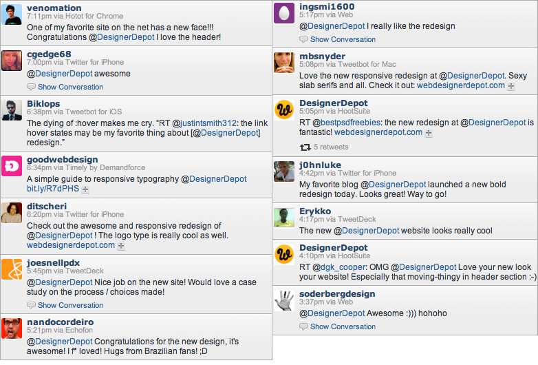
We wanted to showcase our readers in a bigger way, so the new WDD is way more social than before. We now feature your comments and retweets right under each post in the homepage. So, if you want a little bit of fame, you can now get your avatar right there for all the world to see! Well, that's a bit of an exaggeration!
Fewer ads
Alright, some good and some bad news. Some of our ads got bigger, but we have also cut down on the number of ads running on the site. We admit that over the years our site got a bit too bloated with ads, so this was a great opportunity to clean things up. This has made the layout cleaner and more aesthetically pleasing to navigate, while still being able to able to pay the rent - don't forgot to support our kind sponsors :)
Depot.ly
This one is actually a couple of weeks old: we started using the depot.ly short URL for our tweets, so you can recognize our posts in any social channels that you use. Pretty useful we think!
More content
As you may have noticed, we recently started posting more articles each day. Although editorial posts have been and continue to be the essence of our content, we now also cover relevant news and mini posts that will be a good fit for the designers and developers visiting our site. We feel this keeps the site more current and in touch with what's happening in the world right now without resorting to full editorials for every post.
We encountered lots of issues getting this design to work across all browsers and devices (and still do!). In fact, this was the cause for some of the last minute delays that we experienced. We were meant to launch last week, but many browser issues slowed us down. Sorry for that! Firefox was particularly challenging, but IE 8 proved to be the worse and the cause of many headaches and frustrations for our coders. Since our launch yesterday, we have received a lot of extra info via Twitter of issues that still need to be be resolved. Thanks for your patience while we address these.
What you see today is the new design, but that's not all. We're planning to add some new stuff soon. You'll learn more about this in the coming weeks.
We all personally love the new design and we expect it to keep evolving based on your feedback. We will really appreciate it if you could still let us know about anything that you'd like us to improve on. Also, please let us know if you happen to find any browser compatibility issues, or issues on any particular mobile devices that you use so that we can address them quickly.
As always, we're deeply and immensely grateful to all of you for supporting WDD for all these years. From the entire team here at WDD, a big thanks to each of you and we hope that this new design inspires you and serves you well while you browse our site.
What do you think of the new WDD redesign? We welcome your feedback!


