 A logo is an essential part of your company brand. It works together with elements such as your website, collateral, brand promise, and marketing efforts to set the tone for your company as a whole in the public arena. And while this sounds simple enough, many logos tend to overshoot or fall short.
Let’s see if your logo makes the grade and consider four essential rules for successful logo design.
Test Your Logo
Before sharing the rules of logo design, let's start out by grading the latest logo you've created. Spend a minute and answer the 14 questions below (you can do it in your head):
Get one point for each "yes" below
- Does your logo work horizontally?
- Does your logo have both horizontal and vertical options?
- Does your logo work in black and white?
- Does your logo work on both black and white backgrounds without a box around it?
- Can you sketch all non-typography elements in five seconds or less?
- Did you buy the font you used in the logo?
- Do you have less than two fonts?
Subtract one point for each "yes" below
- Do you use more than two colors in your logo?
- Do you have more than one shape in addition to the wordmark (text) in your logo?
- Are any shapes in your logo explicit instead of abstract? (i.e. a globe or something else recognizable)
- Did you use any clip art in your logo?
- Is there a photo or complex pattern in your logo?
- Do you have a gradient in your logo?
- Did you use default font kerning?
Scoring
<0 = Don't even think about it
1-4 = Acceptable for a $50-million-a-year company
5+ = Great job!
Regardless of how you did, rest assured there are always ways to get better. Improving a logo relies on an understanding of brand and how brand differs from the visual identity of a company or organization.
Brand vs. logo
Your brand is the sum total of every interaction that someone has with your organization. Your brand is the music a client hears while holding for a call. Your brand is your parking lot. It's your front lobby and how clean your bathrooms are. Your brand is every interaction with someone on your team.
So what part does your logo play in your brand?
Your logo shows up everywhere. On your website, business cards, letterhead, signs, cars, and advertisements. It goes everywhere you go.
But it isn't the logo's job to tell the whole story.

Which logos look most professional and reputable?
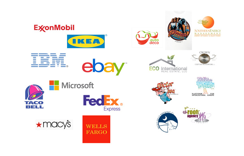
Compare the logos above. Notice how most major corporations get by with a wordmark, or at most some very basic geographic shapes? Compare them to the smaller companies in this list who have multiple fonts, colors, and shapes.
A logo should be an impression. A suggestion. A clue. A logo's job is to provide a legible, recognizable team uniform for your marketing material to wear. A logo works in conjunction with your name to make your brand unique. But by no means should a logo tell the whole story.
4 rules of logo design
1. Start with your brand
When deciding on a logo consider your brand first. Ask tough questions. Know who your clients are and what they want from you. Know what you want from your clients. Do research and think hard about your company's mission statement.
Remember to ask the right questions internally. If you ask ten people if they prefer blue or green, you won't get anywhere. But if you ask, "Is it more important that we look technical (blue) or trendy (green)?" then you're moving in the right direction. If you start out by showing logo concepts and asking what people like, you've already lost. Once you've more clearly defined your brand then you can ensure your logo effectively represents that brand.
2. Simplify
The more lines, shapes, stories, colors, and fonts you have in your logo, the more provincial you look. If being provincial is part of your brand then feel free to break this rule. Otherwise less is more. Remember your logo isn't the whole story, it's a single unifying thought.
Try to limit your logo to a single font. Two is fine if your tagline is part of your logo. Three is just wrong regardless of your size. Go for solid colors over gradients. Gradients never print well and almost always look amateur.
3. Shoot for ten times your size
If you're a million-dollar-a-year company, your logo should be as strong, or stronger, than your ten-million-dollar-a-year competitor.
Don’t worry about what the other million-dollar-a-year companies are doing in your space. Follow the advice of dressing for the job you want, choose your logo for the multi-billion dollar capitalist success story you know you are.
4. Know that someone will hate it
Let's face it, someone isn't going to be happy with your choice. Any major branding changes, such as logos, should be combined with an internal public relations campaign to make sure that people understand why you've made the choices you made.
Make sure anyone that can derail your design has their voice heard. The only thing worse than getting two dozen opinionated, smart, dedicated people to agree on one color is having five people pick the color and annoying the other nineteen.
Are there any logos that violate these tenants in spite of their success? Are there any mathematically perfect logos that make you gag? How does your logo rate? Let us know in the comments.
Featured image/thumbnail, drawing image via Shutterstock.


