
 Marissa Mayer is many things. A brand designer she is not.
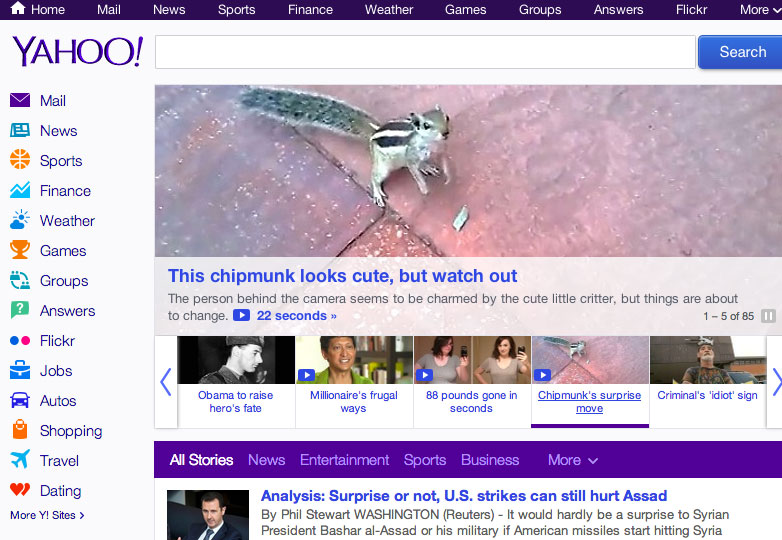
After 30 days of change and countless dollars thrown at R&D, Yahoo! have unveiled their new logo. The past month showcased some options — most of which were bad — and unfortunately the end result is distinctly amateurish.
So what's wrong?
Well to start with, in the context of a world waking up to the value of minimalism — if not flat design — Yahoo! have managed to date themselves overnight by embracing bevels reminiscent of stone carving; a skeuomorphic ornament best left in the 1990's.
That carved stone look extends to the terminals, which are sharp and concave; except the 'O's which don't have terminals, and the '!' which does.
They've based the logo on Optima, which may be a great choice for a lawyer, but seems deeply inappropriate for a daring young brand with an exclamation mark in its name.
What's more, the team at Yahoo! have tweaked the letter forms badly: compare the original contrast on the horizontal and vertical strokes with the newly symmetrical diagonals on the 'Y' and 'A'; this is a large part of the reason the left half of the logo feels heavier than the right.
We wanted there to be a mathematical consistency to the logo, really pulling it together into one coherent mark.
You'd think that if you were going to apply kerning inconsistently you'd get it right somewhere, just by chance, but they haven't. Take a look at the 'YA', 'AH', 'HO' and 'OO' as pairs. Mayer has suggested that there'll be some small refinements made in future, and the first thing that needs to be done is fixing the tracking.
All in all it feels as if the logo has been derived from mathematical rules rather than set by eye, and both the promo video Yahoo! have released and one of Mayer's stated aims seem to support that conclusion:
How did this happen?
The answer is depressingly familiar:
On a personal level, I love brands, logos, color, design, and, most of all, Adobe Illustrator. I think it's one of the most incredible software packages ever made. I'm not a pro, but I know enough to be dangerous :) — Marissa Mayer
The in-house design team at Yahoo! must have been thrilled to discover an enthusiastic amateur was calling the shots.
This situation is in my opinion the worst kind of exploitation, in which designers are treated as little more than a mouse, or a walking-talking substitute for a CEO's lack of design education. I have a lot of time for Marissa Mayer, but on this occasion it seems her ego was calling the shots.
How can we avoid this ourselves?
The first rule of branding, in fact the first rule of design, is that it's not about making something the CEO likes; it's about making something appropriate for the brand. No one is saying that branding is easy, especially with a brand valued at billions of dollars, but that's all the more reason not to knock it out on the kitchen table over the course of a weekend.
The answer is to bring in a trained professional, from outside the organization who can take objective, informed decisions.
In other words, hire a designer.
What do you think of Yahoo!'s new logo? Have you rebranded recently? Let us know in the comments.
WDD Staff


Read Next

15 Best New Fonts, July 2024

20 Best New Websites, July 2024

Top 7 WordPress Plugins for 2024: Enhance Your Site's Performance

Exciting New Tools for Designers, July 2024

3 Essential Design Trends, July 2024

15 Best New Fonts, June 2024

20 Best New Websites, June 2024

Exciting New Tools for Designers, June 2024

3 Essential Design Trends, June 2024

15 Best New Fonts, May 2024

How to Reduce The Carbon Footprint of Your Website
