

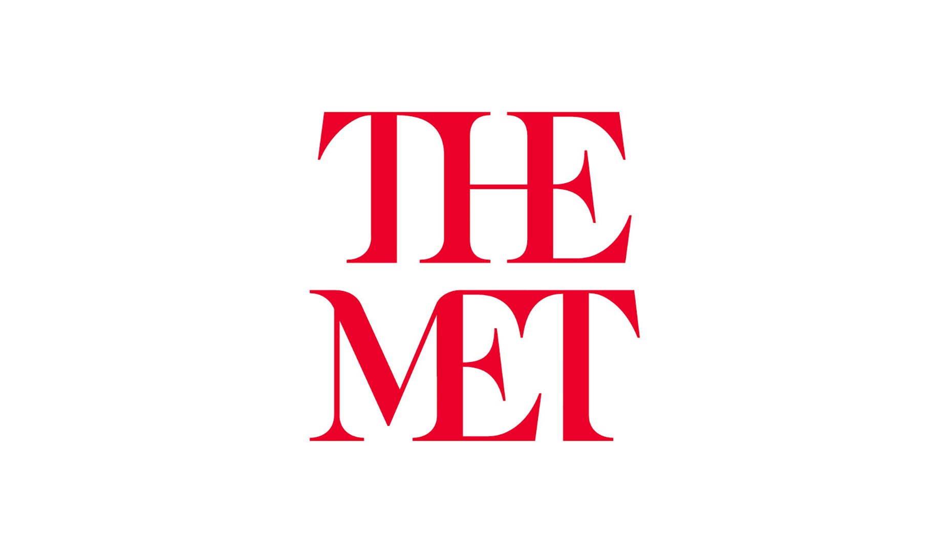
 The Met’s new logo embodies its nickname, which is what it’ll be known as from now on. Accordingly, the museum’s new logo is the words “THE” and “MET” stacked on top of each other in bright, red letters. This has prompted some critics to demean it as a “red double-decker bus that has stopped short, shoving the passengers into each other’s backs.” The criticism makes oblique reference to initial objections that the museum outsourced the rebrand to a London-based design studio—in fact, although the company in question, Wolff Olins, does indeed herald from London, the studio responsible was actually their New York office.
It’s quite a change when your logo used to be a single letter for the past 45 years, but it’s with good reason. The Met has a longer-term goal going forward: it wants to give its graphic identity a facelift to make the museum more navigable and aesthetically consistent for visitors.
The Met’s new logo embodies its nickname, which is what it’ll be known as from now on. Accordingly, the museum’s new logo is the words “THE” and “MET” stacked on top of each other in bright, red letters. This has prompted some critics to demean it as a “red double-decker bus that has stopped short, shoving the passengers into each other’s backs.” The criticism makes oblique reference to initial objections that the museum outsourced the rebrand to a London-based design studio—in fact, although the company in question, Wolff Olins, does indeed herald from London, the studio responsible was actually their New York office.
It’s quite a change when your logo used to be a single letter for the past 45 years, but it’s with good reason. The Met has a longer-term goal going forward: it wants to give its graphic identity a facelift to make the museum more navigable and aesthetically consistent for visitors.
 The logo itself is a study in technique and fusion. Crafted by British designer Gareth Hague—also responsible for the controversial typeface used for London’s 2012 Olympics—it features a combination serif face, sans-serif touches, and calligraphic influences. The six letters form a design that’s clean, modern and stripped-down. The individual letters seamlessly flow from one to the next, like a collection of ligatures; think of the connections as making a bigger statement on the Met’s history that’s both subtle and significant. Since the Met features modern art and medieval pieces, the ligatures symbolize that the Met’s past is connected with its future.
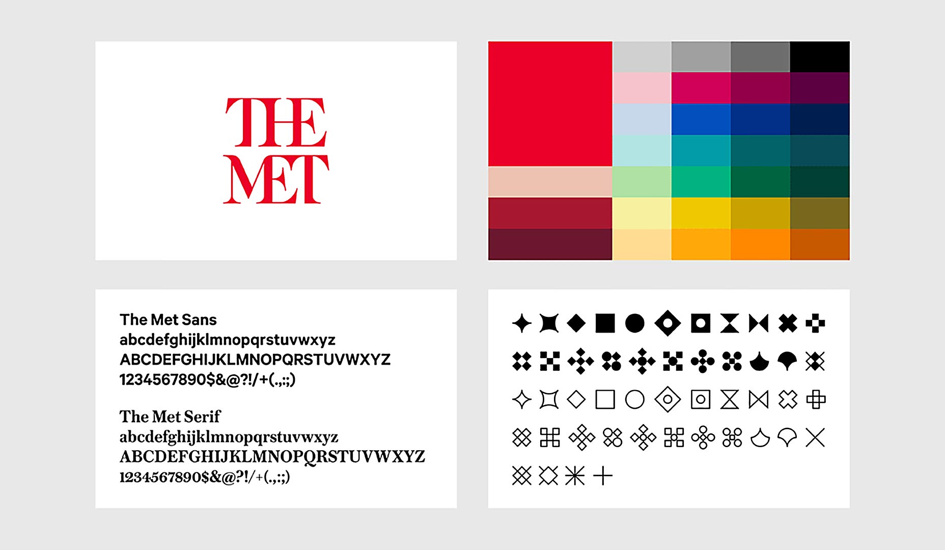
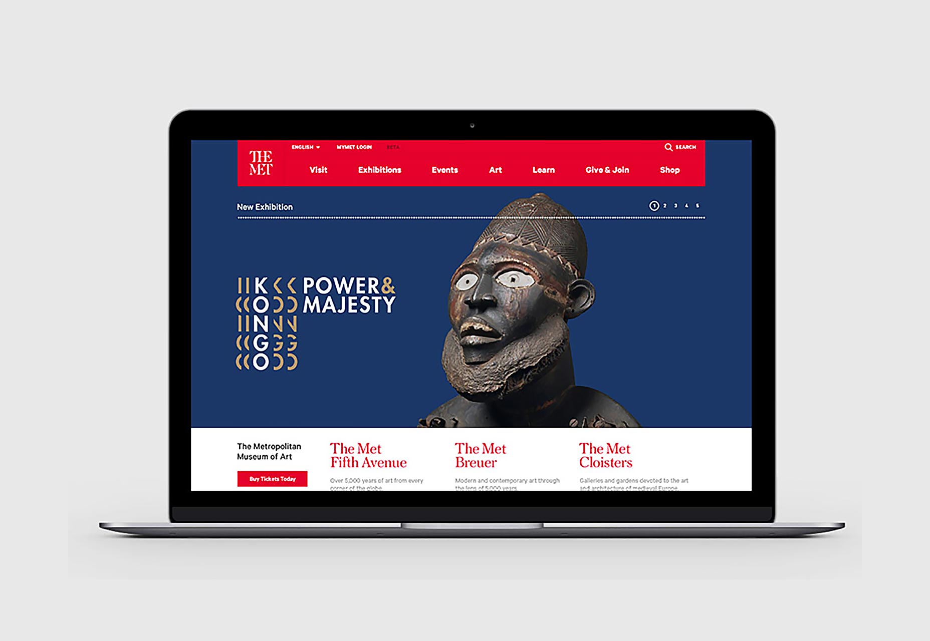
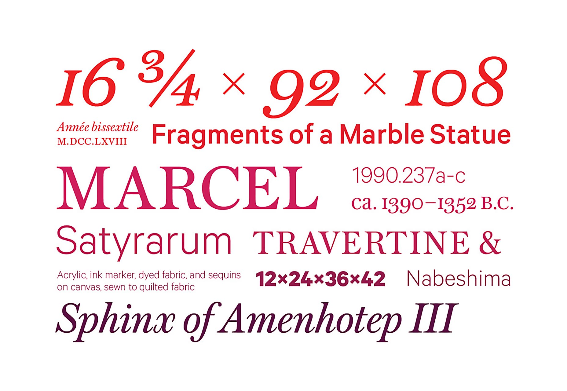
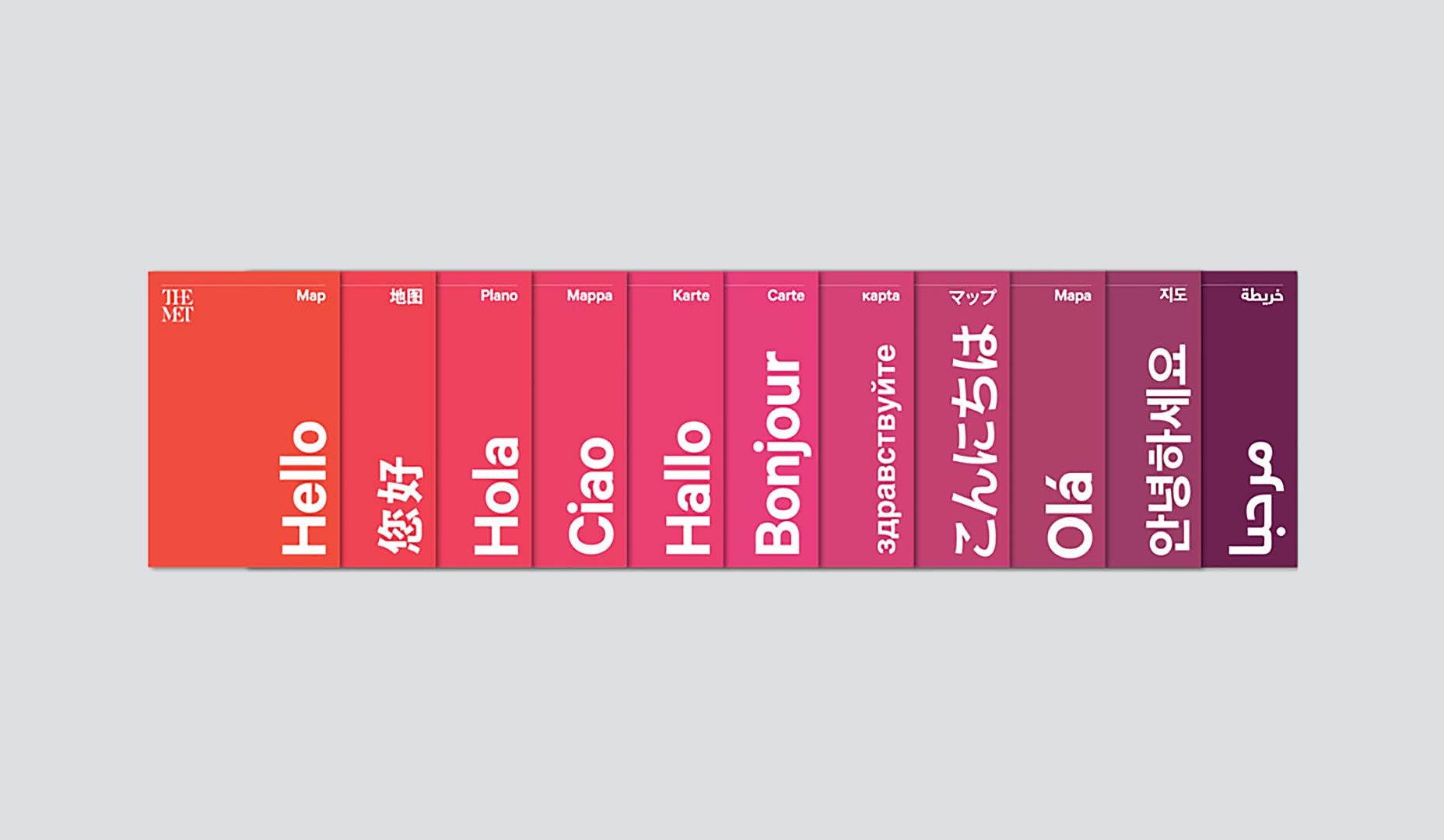 The redesign includes two, distinct typefaces: Austin, a serif typeface and a sans serif typeface with Calibre influences. There’s also a bold and vibrant color palette along with a dotted line featuring diamond-shaped icons that are being dubbed “ornaments.” These design touches will be featured on the Met’s maps, digital platforms, signage and info material.
The philosophy behind the wider redesign was to focus on accessibility. The new brand’s designers say that they wanted to communicate accessibility to the museum’s visitors. Therefore, the typeface choice—as well as the color palette—is simple, friendly and global. For an institution as big as the Met, this redesign strategy makes sense, as simplicity is a way to link all of its different components for worldwide visitors of different backgrounds.
The redesign includes two, distinct typefaces: Austin, a serif typeface and a sans serif typeface with Calibre influences. There’s also a bold and vibrant color palette along with a dotted line featuring diamond-shaped icons that are being dubbed “ornaments.” These design touches will be featured on the Met’s maps, digital platforms, signage and info material.
The philosophy behind the wider redesign was to focus on accessibility. The new brand’s designers say that they wanted to communicate accessibility to the museum’s visitors. Therefore, the typeface choice—as well as the color palette—is simple, friendly and global. For an institution as big as the Met, this redesign strategy makes sense, as simplicity is a way to link all of its different components for worldwide visitors of different backgrounds.
 In total, this new design represents a broader, new brand identity for the Met. It’s the culmination of a two-year relationship between the Met and Wolff Olins. Whether or not the Met ultimately succeeds with the aims of its new logo is anyone’s guess at this point. One thing should be kept in mind, though: when longstanding designs change, the updates are often criticized, only to be gradually accepted as time wears on. It’ll be interesting to see if this happens with The Met’s new logo.
Marc Schenker
Marc’s a copywriter who covers design news for Web Designer Depot. Find out more about him at thegloriouscompanyltd.com.


Read Next

15 Best New Fonts, July 2024
Welcome to our monthly roundup of the best fonts we’ve found online in the last four weeks. This month, there are fewer…
By Ben Moss

20 Best New Websites, July 2024
Welcome to July’s round up of websites to inspire you. This month’s collection ranges from the most stripped-back…

Top 7 WordPress Plugins for 2024: Enhance Your Site's Performance
WordPress is a hands-down favorite of website designers and developers. Renowned for its flexibility and ease of use,…
By WDD Staff

Exciting New Tools for Designers, July 2024
Welcome to this July’s collection of tools, gathered from around the web over the past month. We hope you’ll find…

3 Essential Design Trends, July 2024
Add some summer sizzle to your design projects with trendy website elements. Learn what's trending and how to use these…

15 Best New Fonts, June 2024
Welcome to our roundup of the best new fonts we’ve found online in the last month. This month, there are notably fewer…
By Ben Moss

20 Best New Websites, June 2024
Arranging content in an easily accessible way is the backbone of any user-friendly website. A good website will present…

Exciting New Tools for Designers, June 2024
In this month’s roundup of the best tools for web designers and developers, we’ll explore a range of new and noteworthy…

3 Essential Design Trends, June 2024
Summer is off to a fun start with some highly dramatic website design trends showing up in projects. Let's dive in!

15 Best New Fonts, May 2024
In this month’s edition, there are lots of historically-inspired typefaces, more of the growing trend for French…
By Ben Moss

How to Reduce The Carbon Footprint of Your Website
On average, a web page produces 4.61 grams of CO2 for every page view; for whole sites, that amounts to hundreds of KG…
By Simon Sterne

20 Best New Websites, May 2024
Welcome to May’s compilation of the best sites on the web. This month we’re focused on color for younger humans,…