

Remove navigation
One of the reasons this discussion still exists today is the fact that many landing pages still have navigation bars, sad to say. Just 16% of all landing pages are free of navigation, which is alarming because of all the lost conversion opportunities. Designers who include navigation on their landing pages aren’t looking out for the best interests of their clients. If you happen to have a client who insists on navigation on the site’s landing page, it’s your job as the designer to educate him. Point him to numerous studies like this one, backed by hard data, that show that taking navigation away from a landing page increases conversion rates. This is true for any type of content that the page is offering, from free trials and demos to ebook templates and content-creation kits. Sure, your client may push back because of various reasons such as disbelieving the data, branding (company logo on the navigation menu), or refusing to prioritize the importance of removing the navigation on a landing page. In all these situations, gently persuade your client by consistently impressing him with case study after case study:- Child-minding site Minders increased its conversion rates by 90% after removing navigation
- Kitchen tool-maker Yuppie Chef increased its conversion rates by 100% after removing navigation
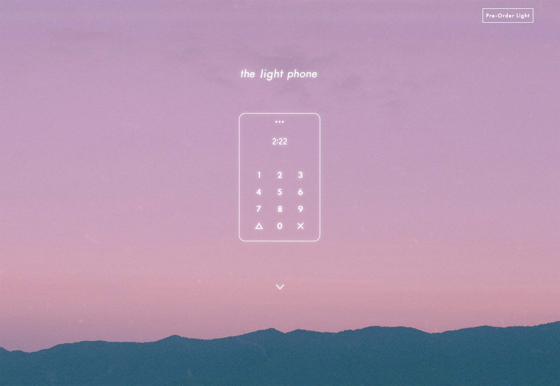 The Light Phone site gives you two simple options: pre-order, or scroll for more information.
Drop stock images
With the navigation menu gone, the next thing on your list to ax is stock images. These dreaded and generic nightmares that celebrate insincerity will hurt your clients’ conversion rates, too. Stock images fail to inspire trust on a landing page because it’s almost like a business concealing who’s behind it. So on your landing page, be sure to use real images of the people behind the product or service, as nothing inspires conversions like credibility. Further, be sure to place images on top of the landing page headline. This is highly important, as marketing guru David Ogilvy himself found when he conducted research, headlines underneath images are read by 10% more viewers. Of course, when more people read your page’s headline, more continue reading down the page. Now that you have images under control, you have to make your page’s flow work its way toward the all-important call to action button.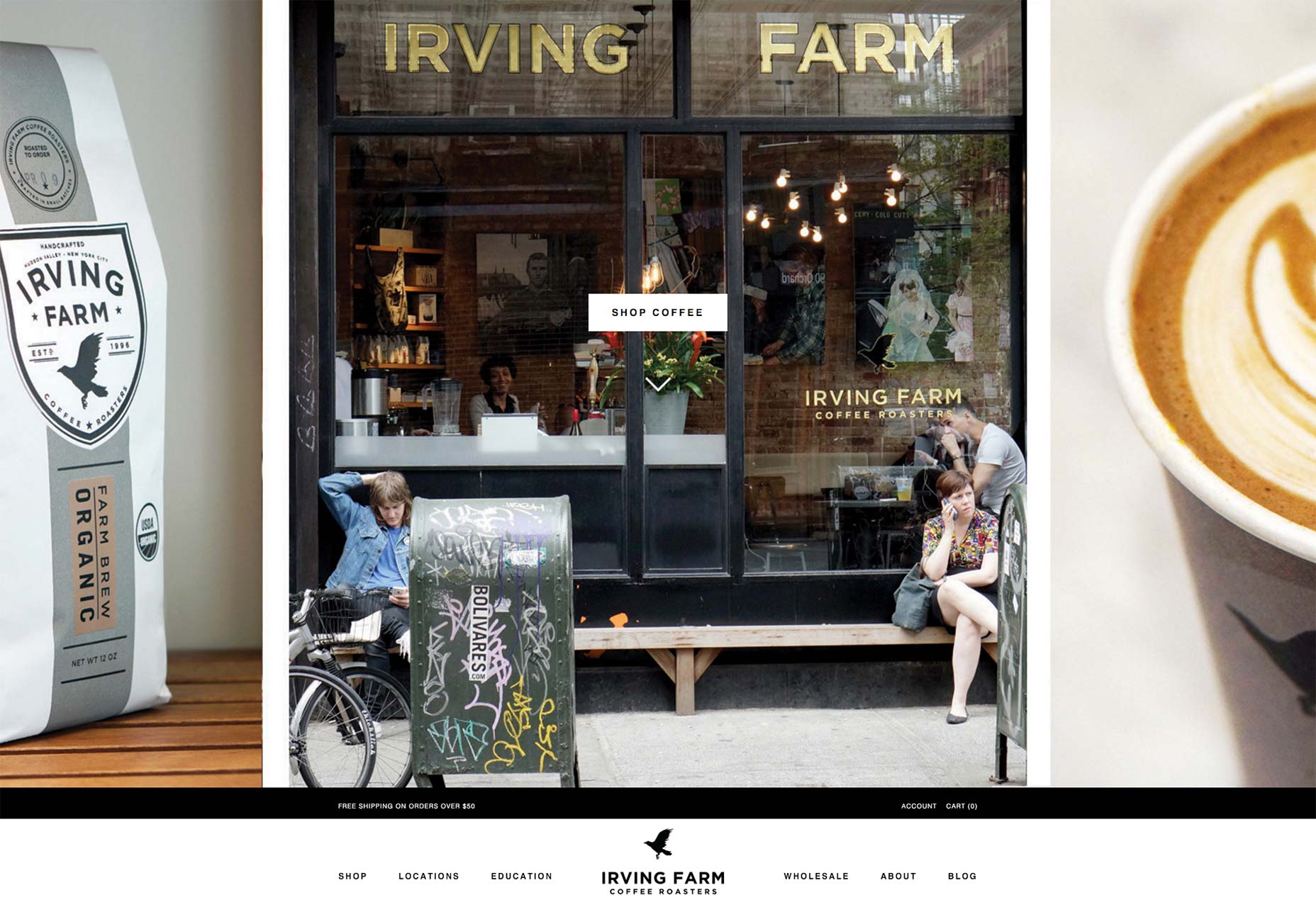 Irving Farm’s site uses real photographs to pack the site with the company’s brand personality.
Focus on calls to action
One of the hardest things to possibly design on a landing page is the call to action button. It requires a lot of thought and consideration because it is the star of your page, the whole reason it exists. If your page flow and information architecture make your offer persuasive and clear, then visitors should have no problem clicking on the button. There are a couple of things to get right. First, there’s the color: it should feature good color contrast so that your visitors can easily find and click it. Then, there’s the size: it has to be big enough to be easily read. You can also add a directional cue next to the button to make it all the harder to miss. Don’t neglect the button copy. It should be persuasive and use a sense of urgency. This means using action-based words like “hurry,” which is also one of the most persuasive words in the English language, and “now,” which also speaks of urgency.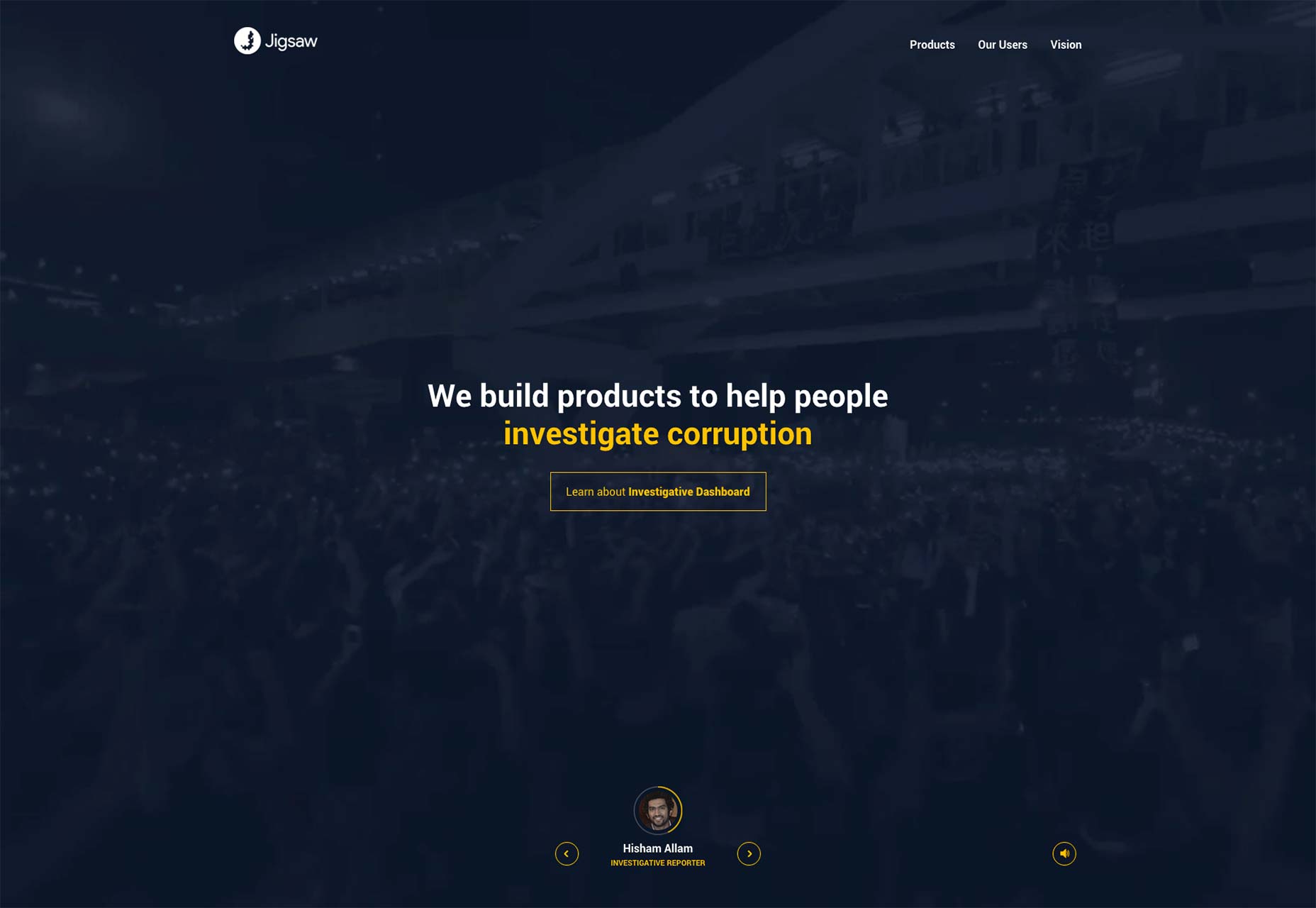 Google’s Jigsaw delivers a very clear call to action.
Downplay other links
We spoke of eliminating the navigation menu from the very beginning of this article, yet the goal of a high-converting and successful, landing-page design should involve getting rid of as many links as possible. When you remove the navigation, there may still be other links on the page that you need to deal with to make the page as much of a single-action environment as possible and support your conversion funnel. Another clever tactic is to make any necessary links as unnoticeable as possible. After all, the fewer links on the page, the fewer elements will compete for your clients’ leads’ attention on the page. And when there are fewer distractions, there are greater chances for conversions.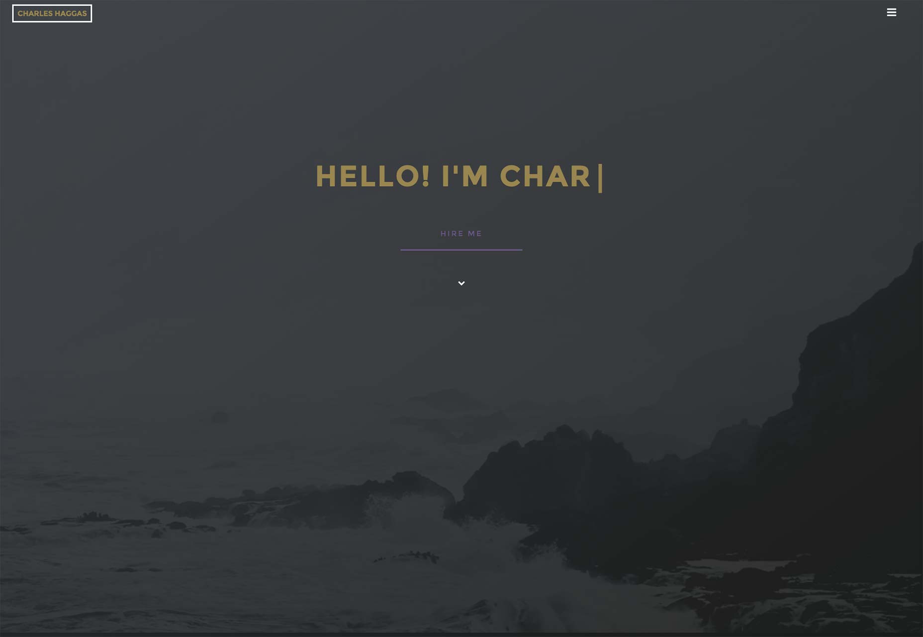 Charles Haggas’ site prompts you to hire him; nothing else on the site matters as much.
Minimalism and conversion rates
Designers should always keep in mind that they’re designing for consumer psychology when they’re designing for landing pages. Many studies have been done that prove how consumers are simply overwhelmed and experience decision-making problems when faced with too many choices. The notorious jam experiment of a few years ago springs to mind; in it, people bought less jam from a table with more jam choices than the table with fewer choices. Thus is the case with landing pages as well. When your clients’ leads arrive on your landing page and are greeted with way too many links and a navigation menu, they’re likely to go elsewhere and fail to complete the conversion. Combine that with horrible stock images and poorly designed call to action buttons, and you’ve designed a low-converting disaster for your client. That’s why you have to think minimalism when designing your landing page. From the initial conception to the wireframe to the final testing, the landing page you design must have few choices so to only emphasize to visitors and leads the one and only goal of the entire page: to convert by clicking on the product or service offered. And that’s it!Marc Schenker
Marc’s a copywriter who covers design news for Web Designer Depot. Find out more about him at thegloriouscompanyltd.com.


Read Next

15 Best New Fonts, July 2024
Welcome to our monthly roundup of the best fonts we’ve found online in the last four weeks. This month, there are fewer…
By Ben Moss

20 Best New Websites, July 2024
Welcome to July’s round up of websites to inspire you. This month’s collection ranges from the most stripped-back…

Top 7 WordPress Plugins for 2024: Enhance Your Site's Performance
WordPress is a hands-down favorite of website designers and developers. Renowned for its flexibility and ease of use,…
By WDD Staff

Exciting New Tools for Designers, July 2024
Welcome to this July’s collection of tools, gathered from around the web over the past month. We hope you’ll find…

3 Essential Design Trends, July 2024
Add some summer sizzle to your design projects with trendy website elements. Learn what's trending and how to use these…

15 Best New Fonts, June 2024
Welcome to our roundup of the best new fonts we’ve found online in the last month. This month, there are notably fewer…
By Ben Moss

20 Best New Websites, June 2024
Arranging content in an easily accessible way is the backbone of any user-friendly website. A good website will present…

Exciting New Tools for Designers, June 2024
In this month’s roundup of the best tools for web designers and developers, we’ll explore a range of new and noteworthy…

3 Essential Design Trends, June 2024
Summer is off to a fun start with some highly dramatic website design trends showing up in projects. Let's dive in!

15 Best New Fonts, May 2024
In this month’s edition, there are lots of historically-inspired typefaces, more of the growing trend for French…
By Ben Moss

How to Reduce The Carbon Footprint of Your Website
On average, a web page produces 4.61 grams of CO2 for every page view; for whole sites, that amounts to hundreds of KG…
By Simon Sterne

20 Best New Websites, May 2024
Welcome to May’s compilation of the best sites on the web. This month we’re focused on color for younger humans,…