

1. Ditch the Mega Menus
Mega menus was a design fad that clients loved—even when designers hated it. The oversized menu style that includes “everything but the kitchen sink” is overwhelming to users and doesn’t provide any real value. Only a handful of major retailers can really get away with using mega menus, and the purpose there is to show scale of inventory. The usefulness of the overloaded navigation element is questionable. Often, a mega menu option is selected because it is too hard to narrow down what to put in the navigation. Make the tough choices. Dig in analytics to see what users are looking for. Honestly, most users who want a very specific thing will find it using search anyway.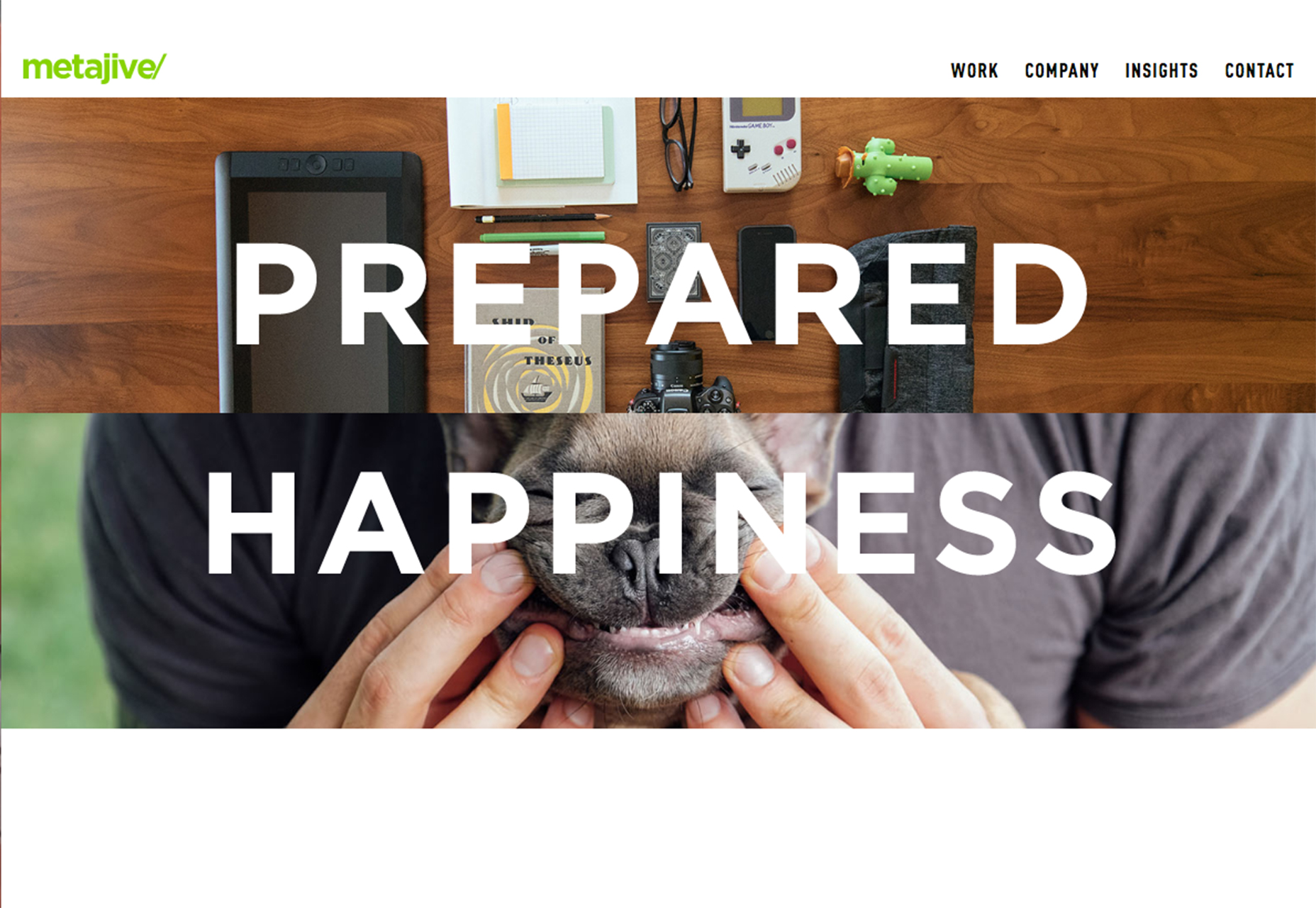
2. Make Search Prominent
And speaking of search: Make it prominent. Search should be on every page. It should in in the main navigation. And it should be large and easy to access. Superb search functionality is the link that will keep users on a website. If what they are looking for isn’t readily available, the next option is likely to search for it. (You can thank Google for this search-first thought process.) Don’t try to fight it. Work with users and include search as part of the main navigation. (And make sure the box is big enough to type, and fully see, common phrases into.)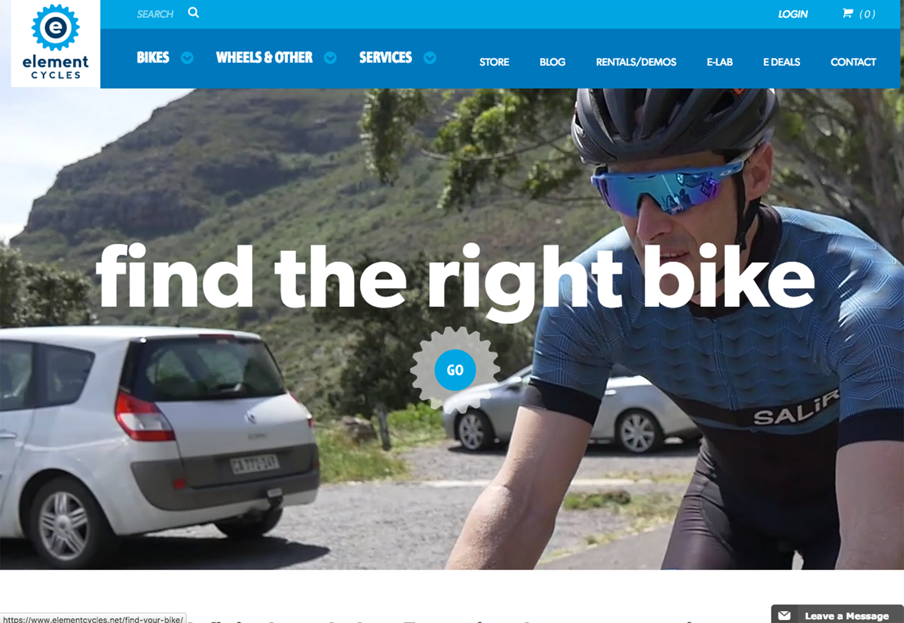
3. Limit the Number of Navigation Choices
It’s your job to anticipate what content users will want to access next. Limit navigation choices to the most popular pages and information in the website design. Almost every navigation menu should include search, an about or contact page and e-commerce sites should always include a cart or buy now button. After that navigation elements should be driven by site content.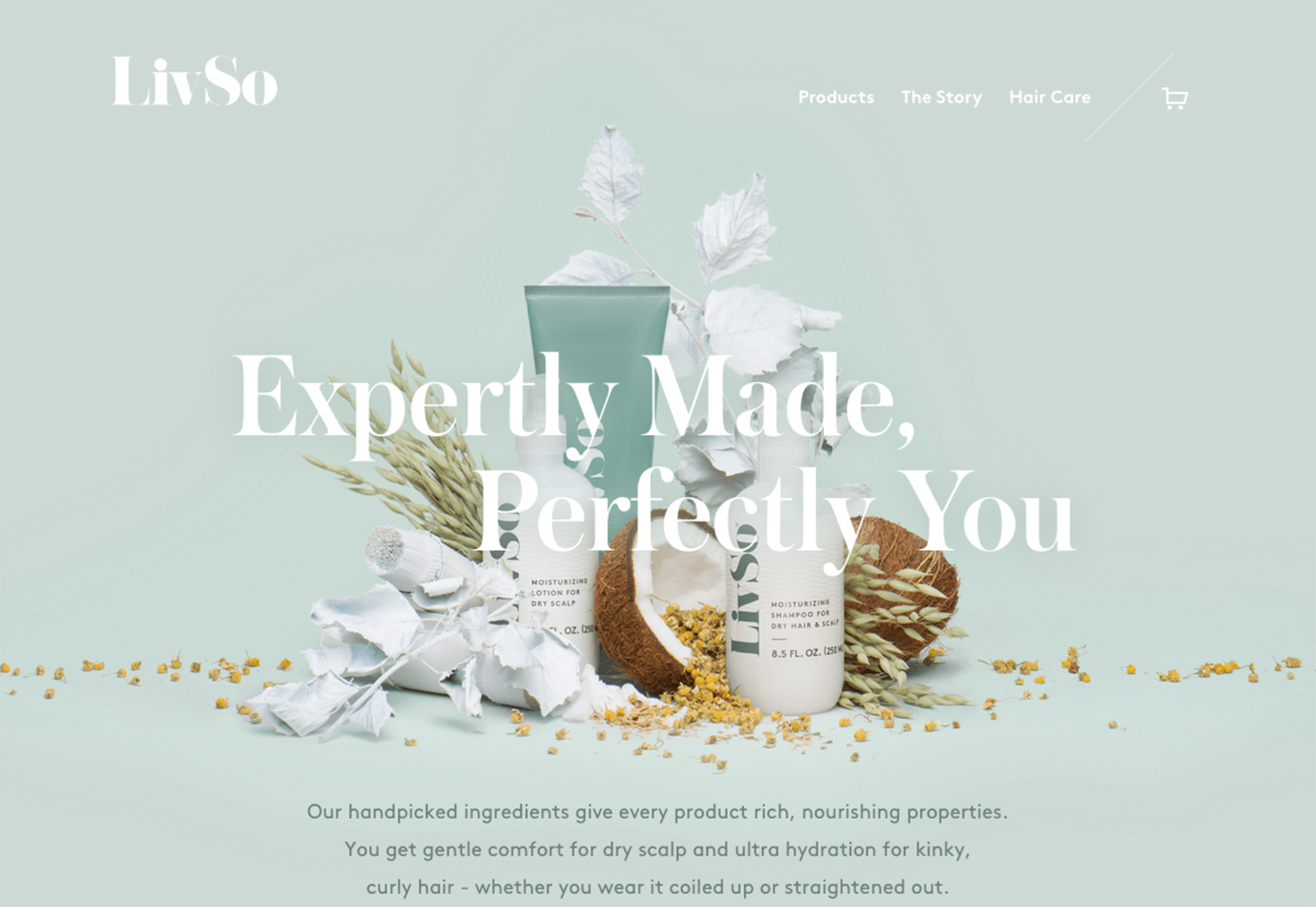
4. Develop Smart Navigation Menus
Good navigation will help users move from one bit of content to the next logical point. This content is often different on different parts of the website. Create multiple navigation configurations so that users have easy access to the content that is the next logical step in their path around the design. While some elements might overlap, others assist users and help them move deeper into the design. We are in an age where users have come to expect certain levels of personalization. Amazon does a great job of this with navigation elements that even call users by name. Take a close look at the navigation next time you log in to see [Your Name Here]’s Amazon.com. The secondary navigation includes information such as the user’s annual donation for Smile users, recent order history and even credits to other Amazon services. (Everything thereafter is pretty personalized, too.)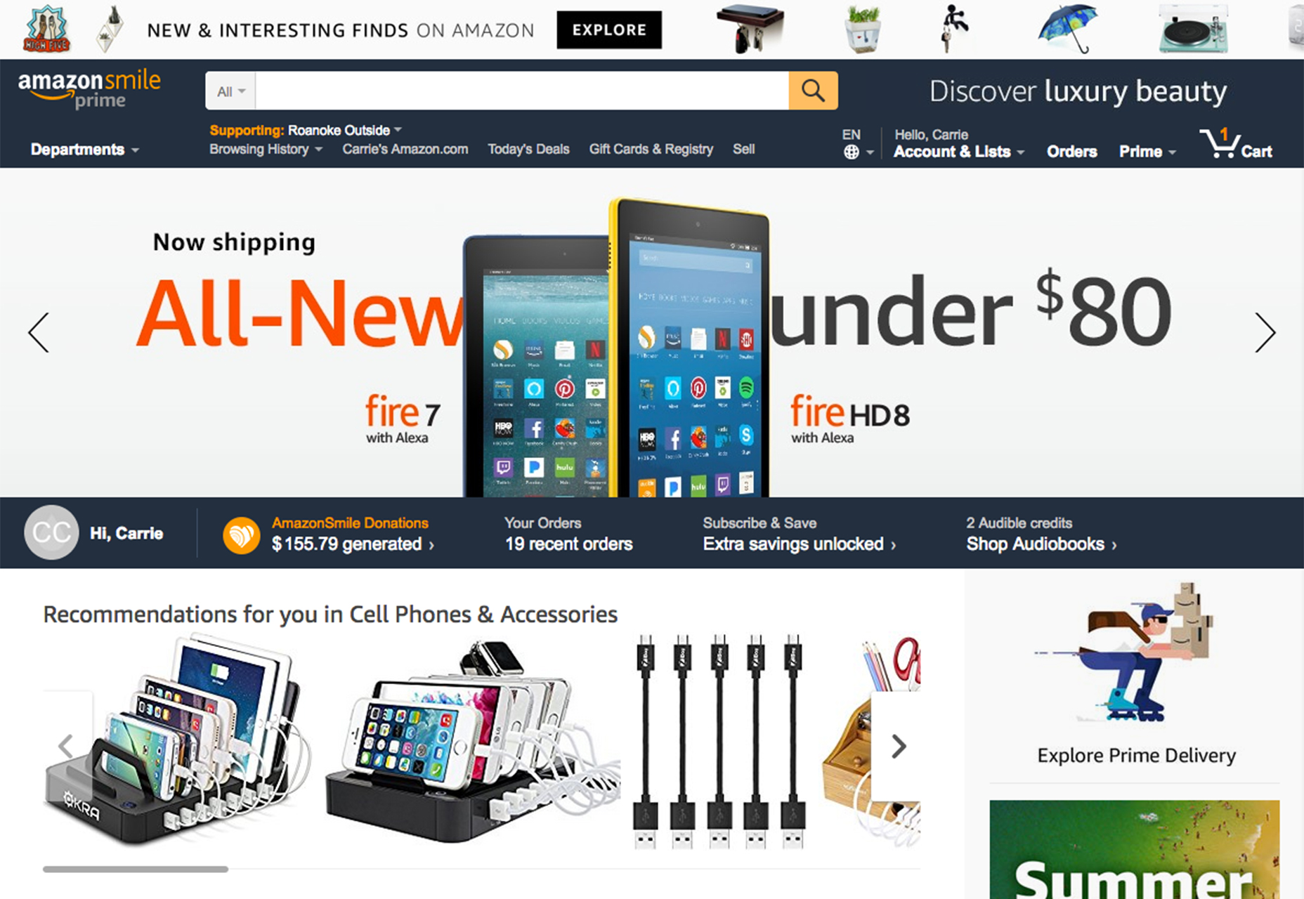
5. Order Nav Elements Purposefully
The order of navigation elements is just as important as the decision to use them. Items at the beginning and end of the navigation element will be most effective, most seen and most clicked. User these positions carefully. There’s even some science to back this up. The serial position effect is the tendency of a person to recall the first and last items in a list most consistency. Further, users tend to recall the most recent items best (recency effect) and the first few items in a list are recalled better than middle elements (primacy effect). Look at user flow patterns in your website analytics to help determine exactly what pages and elements should be front and center. Include pages that users are going to from the homepage and content that you want users to connect with. Eliminate navigation elements that aren’t driving user flow.
6. Use Sticky Navigation for Long-Scrolling Pages
Don’t let users lose track of navigation. Whether it sticks to the top, or bottom or side of the screen, any page with a long-scrolling format should include a sticky menu. The reason behind this is simple: Don’t make users work to keep interacting with your website. The easier it is to move around and experience content, the more likely users are to do just that. The more time a user spends on your website with your design, the more likely they are to convert on a desired user action.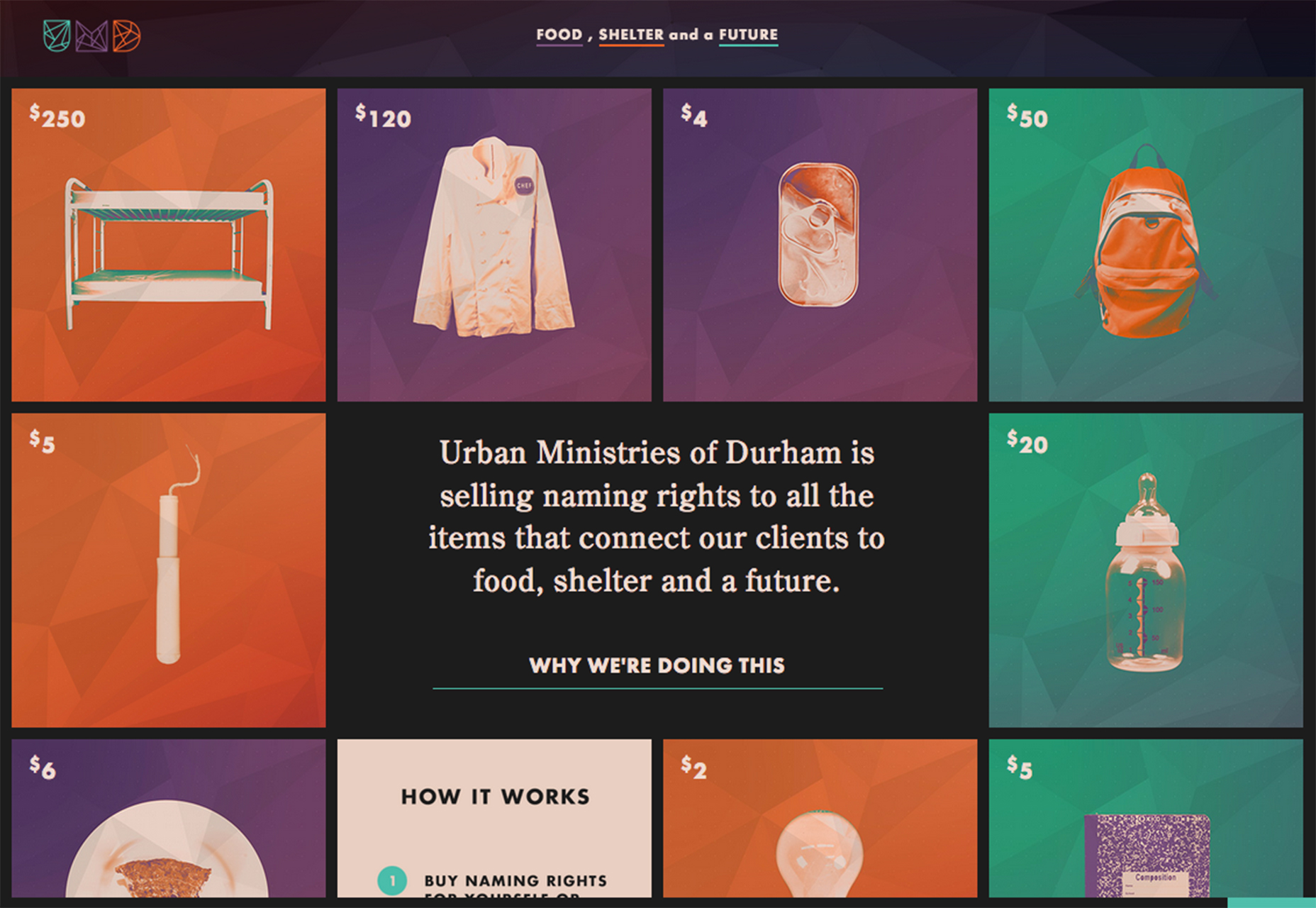
7. Don’t Hide the Navigation
Tiny menu items, links tucked away at the bottom of the screen or only in the footer, and pop-out navigation hidden behind oddball icons and lack of navigation on interior pages will only keep users from clicking. Don’t hide website navigation. It should be front and center. It should be on every page. Users can get to your website in any number of ways. Make sure that there’s a navigational element waiting form them when they arrive.
8. Use Descriptive Labels
From navigation words to icons, every element should tell users exactly what will happen with a click. Use commonly accepted icons, such as a shopping card to check out or magnifying glass for search or even a hamburger icon for pop-out menu styles. Then take it a step further and use text labels that tell the user exactly what information is contained therein. Try to avoid overly generic labels such as services or offerings, if there’s a word that better explains the content.
9. Consider Full-Page Nav
Sometimes the design is the navigation. If there are a few key elements that are vital for users, showcase them with full-screen navigation. While this won’t be appropriate for every project, it can be effective for smaller websites, portfolios or project work.
10. Go Vertical
Vertical navigation is trendy right now, and for good reason. It is easy to see and draws the eye because it is somewhat different. Side, vertically-oriented navigation is a good option for websites that need a little more space for number of navigation elements. With a deeper menu, the design can accommodate more nav elements without feeling cluttered and maintaining adequate space between elements.
Carrie Cousins
Carrie Cousins is a freelance writer with more than 10 years of experience in the communications industry, including writing for print and online publications, and design and editing. You can connect with Carrie on Twitter @carriecousins.


Read Next

15 Best New Fonts, July 2024
Welcome to our monthly roundup of the best fonts we’ve found online in the last four weeks. This month, there are fewer…
By Ben Moss

20 Best New Websites, July 2024
Welcome to July’s round up of websites to inspire you. This month’s collection ranges from the most stripped-back…

Top 7 WordPress Plugins for 2024: Enhance Your Site's Performance
WordPress is a hands-down favorite of website designers and developers. Renowned for its flexibility and ease of use,…
By WDD Staff

Exciting New Tools for Designers, July 2024
Welcome to this July’s collection of tools, gathered from around the web over the past month. We hope you’ll find…

3 Essential Design Trends, July 2024
Add some summer sizzle to your design projects with trendy website elements. Learn what's trending and how to use these…

15 Best New Fonts, June 2024
Welcome to our roundup of the best new fonts we’ve found online in the last month. This month, there are notably fewer…
By Ben Moss

20 Best New Websites, June 2024
Arranging content in an easily accessible way is the backbone of any user-friendly website. A good website will present…

Exciting New Tools for Designers, June 2024
In this month’s roundup of the best tools for web designers and developers, we’ll explore a range of new and noteworthy…

3 Essential Design Trends, June 2024
Summer is off to a fun start with some highly dramatic website design trends showing up in projects. Let's dive in!

15 Best New Fonts, May 2024
In this month’s edition, there are lots of historically-inspired typefaces, more of the growing trend for French…
By Ben Moss

How to Reduce The Carbon Footprint of Your Website
On average, a web page produces 4.61 grams of CO2 for every page view; for whole sites, that amounts to hundreds of KG…
By Simon Sterne

20 Best New Websites, May 2024
Welcome to May’s compilation of the best sites on the web. This month we’re focused on color for younger humans,…