

Laura Trouiller
To start off, we have a simple, elegant portfolio that starts and ends with great type. The imagery, while minimal, fits the tone and…are those tasteful drop-shadows? Why, I haven’t seen that in a long time. Well, a couple of months, at least. Drop shadows. Those were the days. Anyway, the one case study available is one of the more detailed and beautifully-designed case studies that I’ve seen in a long time.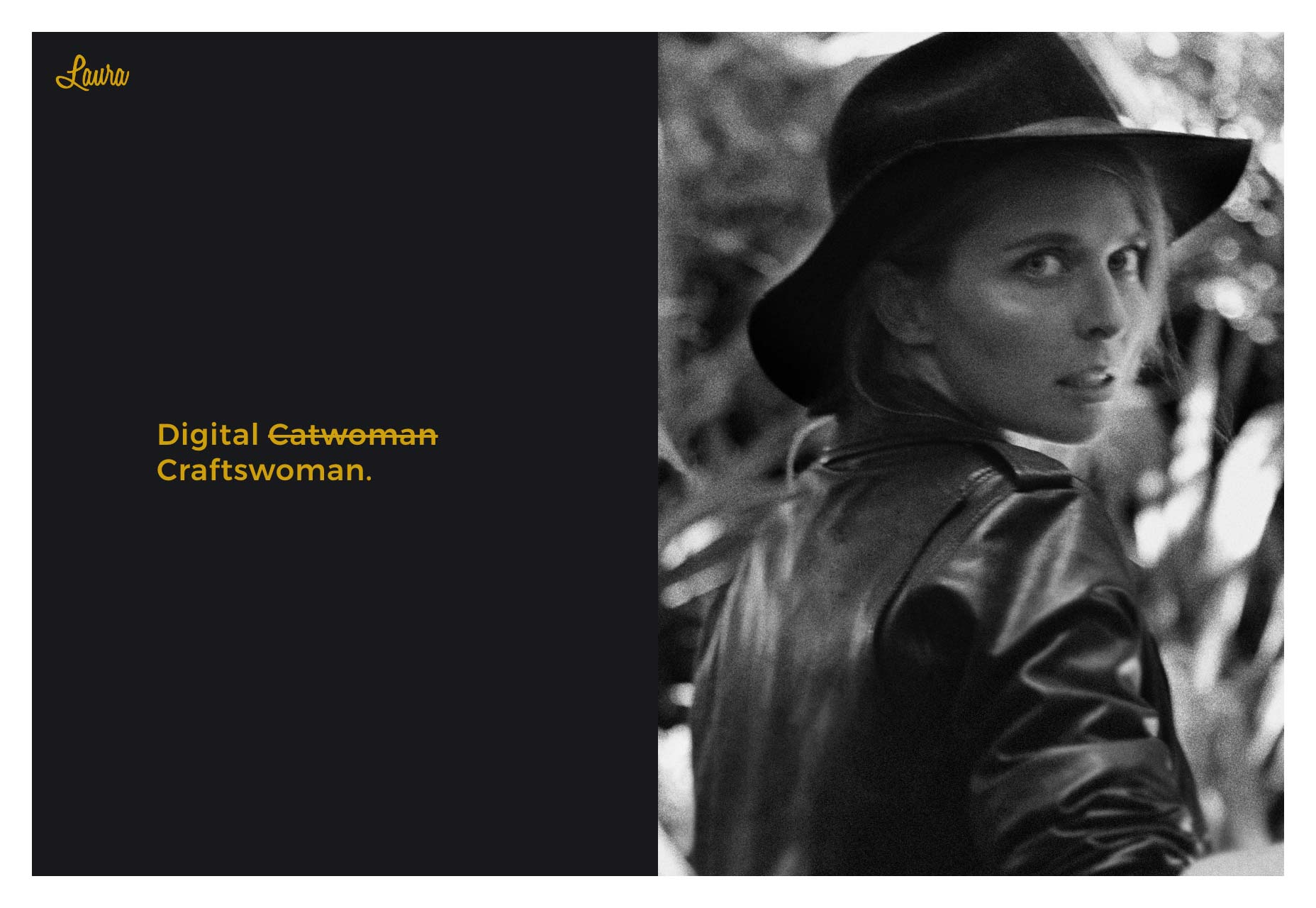
Christopher Wool
There are type-lovers, and then there are text lovers. Christopher Wool is the latter. Well actually, it’s more likely that he just has so much work to show off (and there is a ton of it), that a gallery won’t do the trick. It needs to be organized and categorized if you’re ever going to find anything twice. I do like the year-based calendar on the home page. It gives context to his career by showing just how long he’s been doing what he does. Also, if you wait long enough on the home page, you get a screensaver-like slideshow of his work.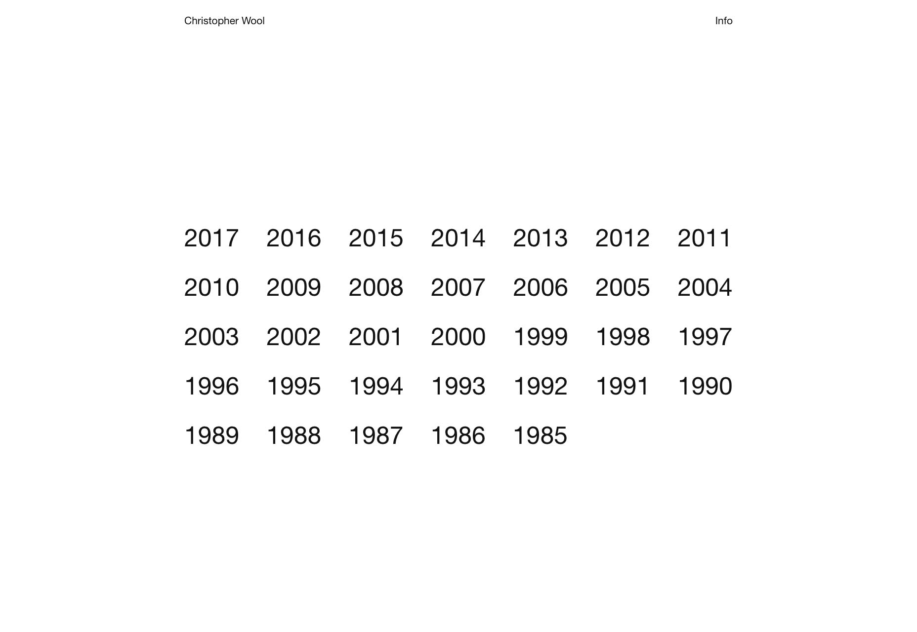
Victoria Spicer
Victoria Spicer’s portfolio is another classic example of artsy, asymmetrical minimalism. It doesn’t do anything too original, but it is quite well-executed.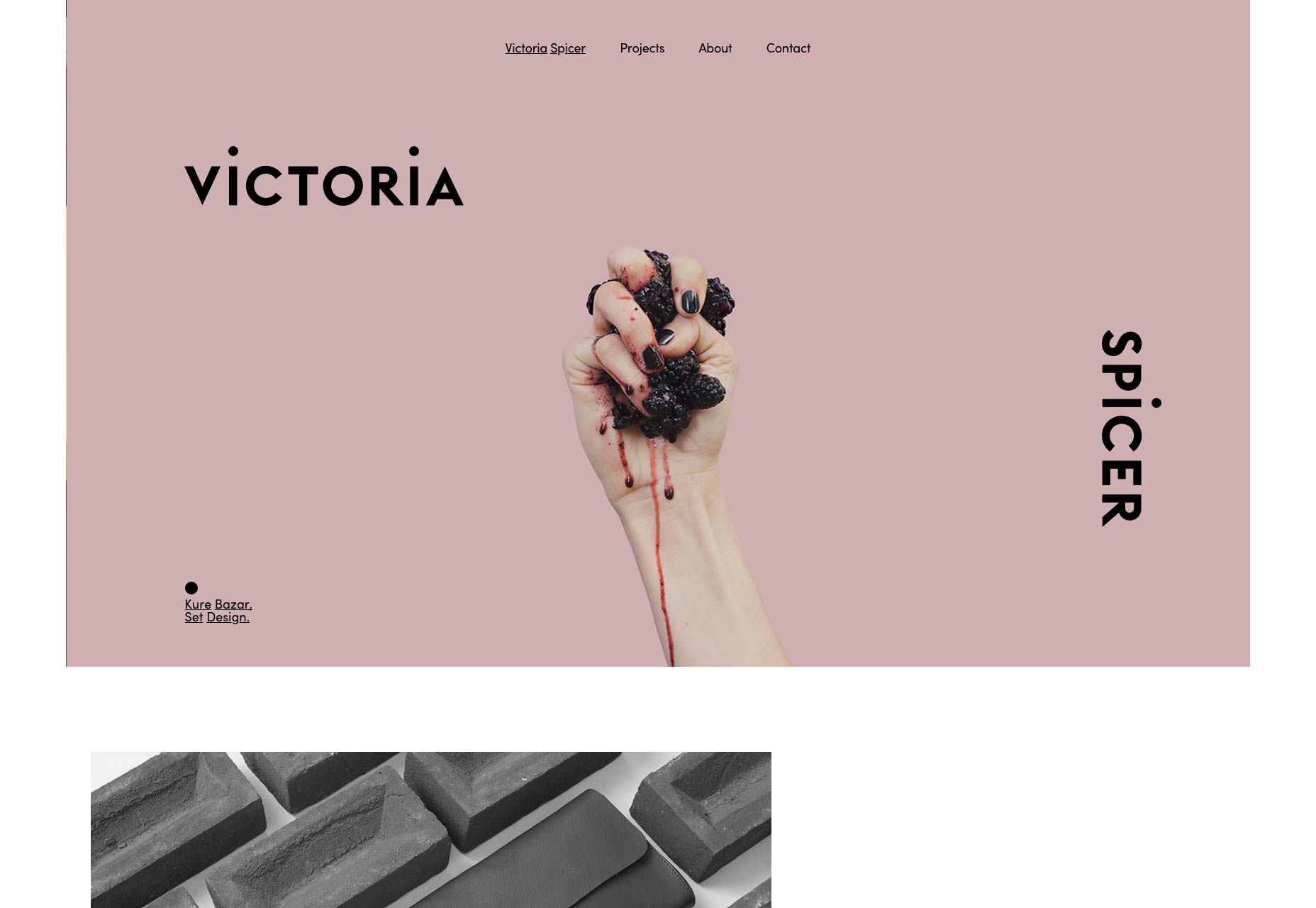
Tim Roussilhe
Tim Roussilhe’s portfolio is kept simple and mostly monochromatic, until you start to dig a little deeper. Interact with the elements on screen, and you’ll start to see more than a few fun surprises. His work includes the portfolio of Alexandre Rochet (which we’ve featured before), another site that clearly demonstrates Tim’s love of type and animated chaos.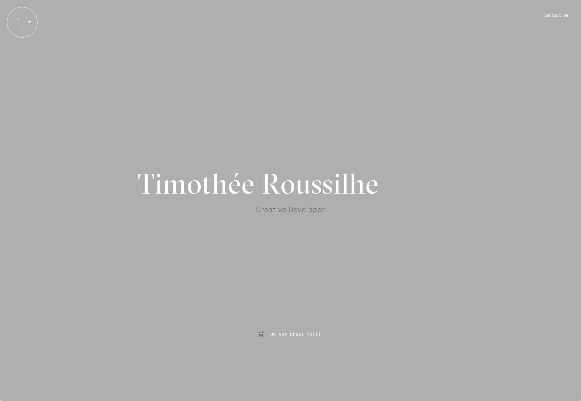
Andre Ribeiro
Andre Ribeiro’s site will probably remind you of Squarespace, and Apple. And then you’ll see those two companies in his portfolio—among other big names—and everything will make sense. His site is minimalistic and modern, with smooth animation, and loving attention to detail. It also follows a new mini-trend I’ve been seeing: there are two options for browsing the portfolio. One is a timed slideshow, and the other is a grid, for the more impatient.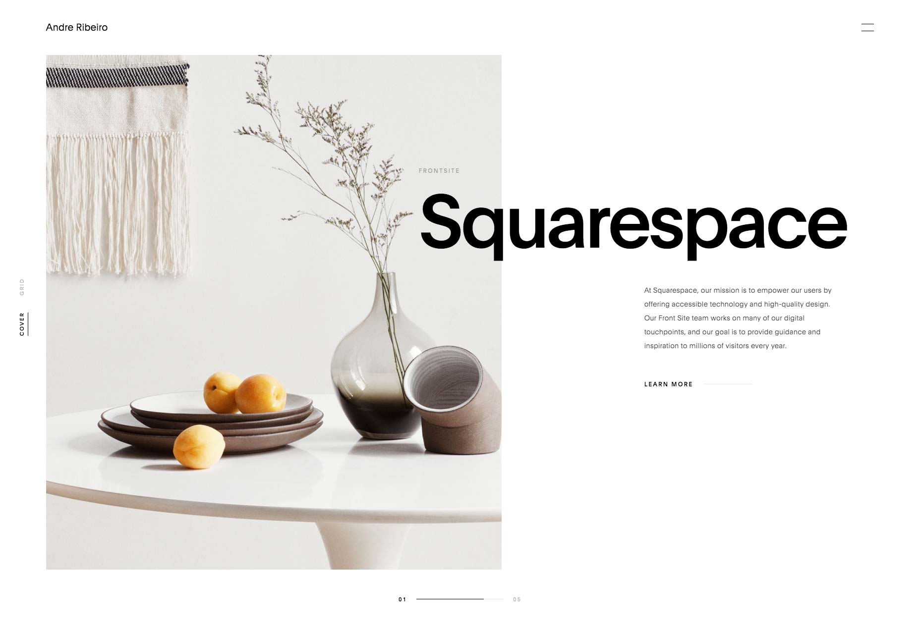
TUX
TUX takes the now-familiar post-minimalism and mixes it with with regular minimalism, animation, background video, and general organized chaos. I’ll admit, some parts of the site can be a bit visually overwhelming, at first. But hey, they’re doing something creative, so it’s worth a look.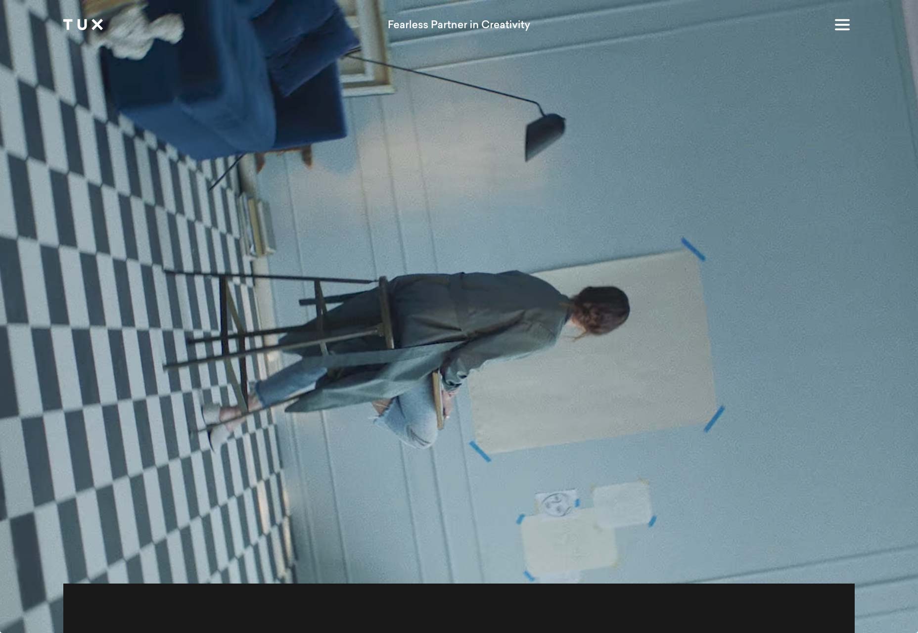
Pierre-Antoine Coupu
Pierre-Antoine Coupu is, among other things, an art director. As you might expect, this is heavily reflected in his portfolio’s design, where every page gets its own personal touch. Combined with a flat, asymmetrical, overlapping layout, and the off illustration of a swordfish here or there, you get a memorable experience.
Jordan Sowers
Jordan Sowers’ portfolio is an odd duck. The type is good, the imagery... well it’s his work, so it’s striking. The style is clearly modern and minimal. It looks good, and it works. I just can’t get the hang of his home page. It shows you a stack of images. Click the top one, it takes you to see some of his work. Click the image just underneath the top one, and it does the same. The rest do not. Is the site still under construction? In any case, if you want to make a presentation-style site, have a look at this one. it has some interesting ideas.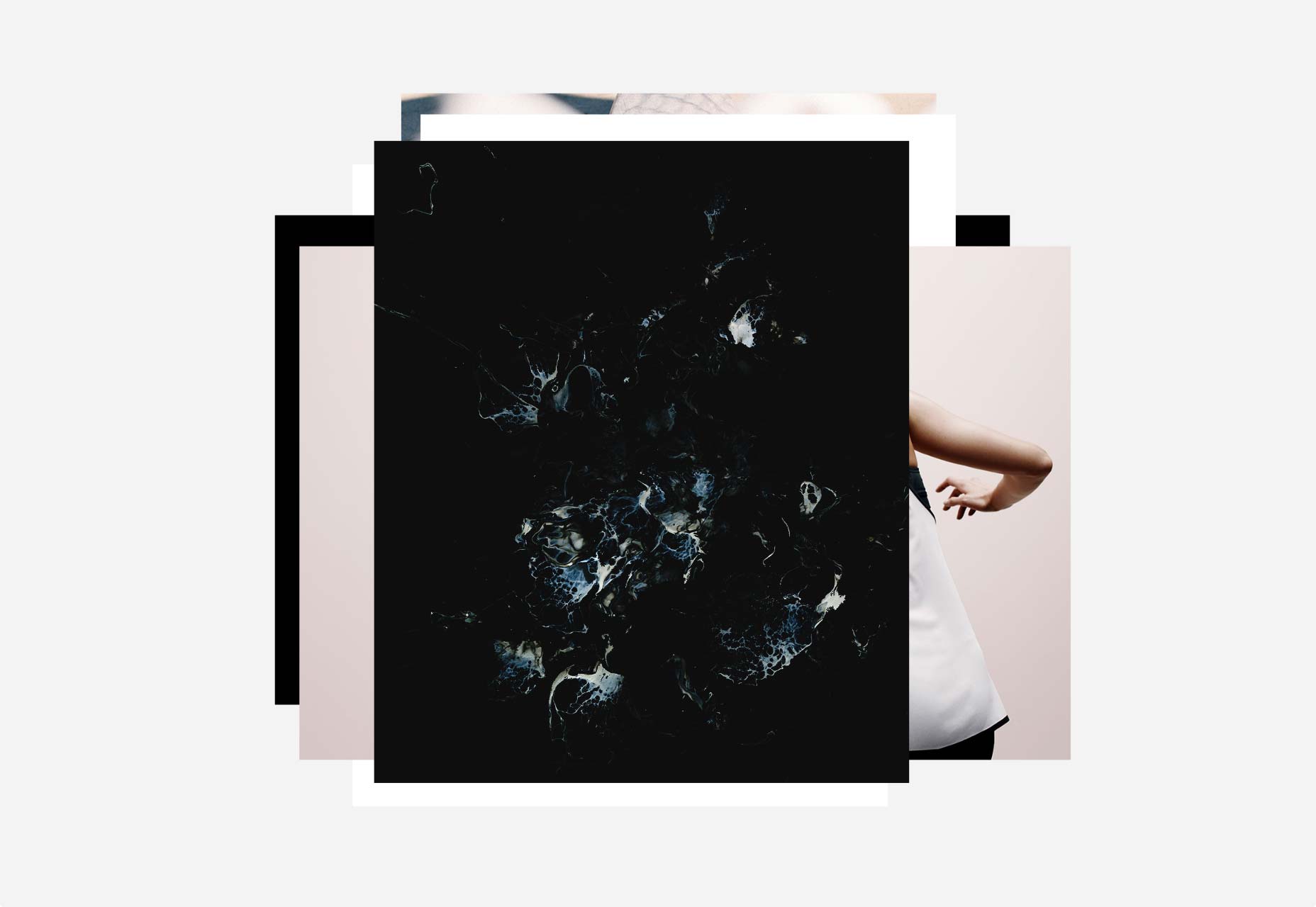
Dac Davy Nguyen
Dac Davy’s portfolio is clean, pretty, and dark. The animation is clean and smooth, and the whole thing just feels right. The use of subdued imagery and right-aligned text brings the whole design some personality, too.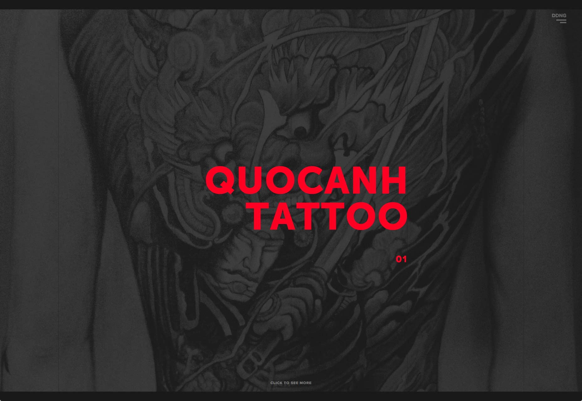
7h34
7h34 is a fantastic example of taking a classic minimalist style and layout, and giving it a personal twist. The use of color, imagery, and they way they sort of brand everything with arbitrary times of day (that’s where the name comes from) make this portfolio stand out from others that might look rather similar.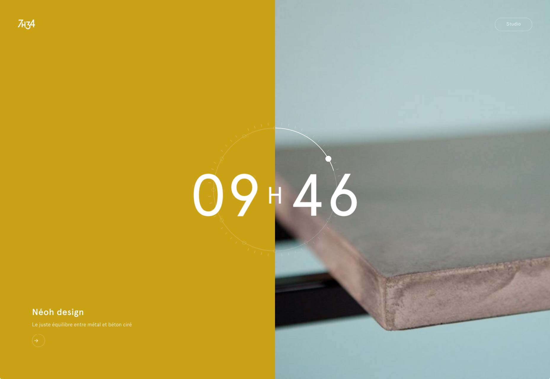
Matt Souza
Another clean, simple, professional portfolio. I particularly appreciate the inclusion of the hand-written notes, and the hand-drawn wireframes. And the testimonials. And the…look, this guy just put a lot of effort into making this site tell a story about him, his work, and each project in particular. I like it.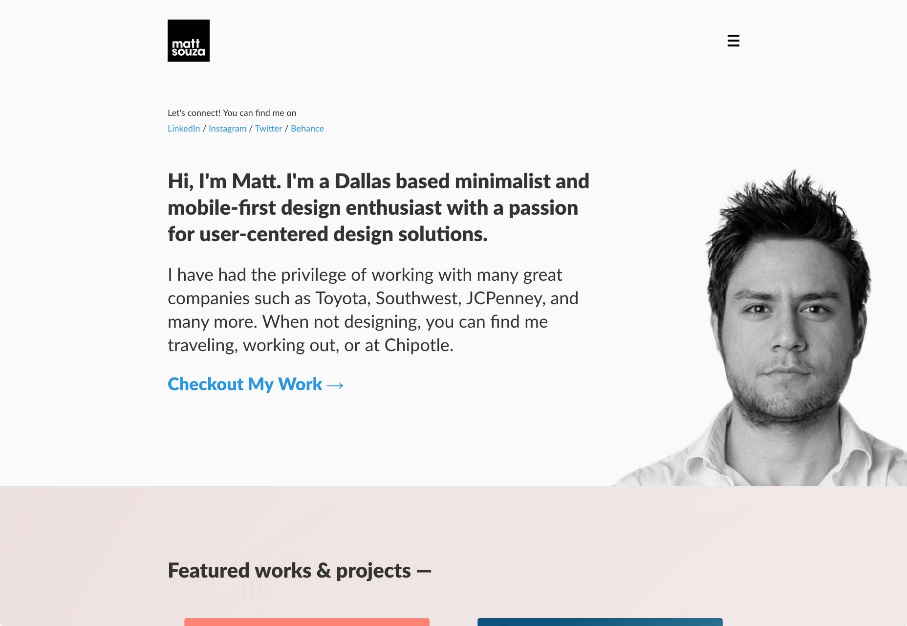
Nerios Lamaj
Nerios Lamaj combines overlapping elements, fantastic type, surprisingly eye-catching pastels, and subtle particle animation to make one good-looking site.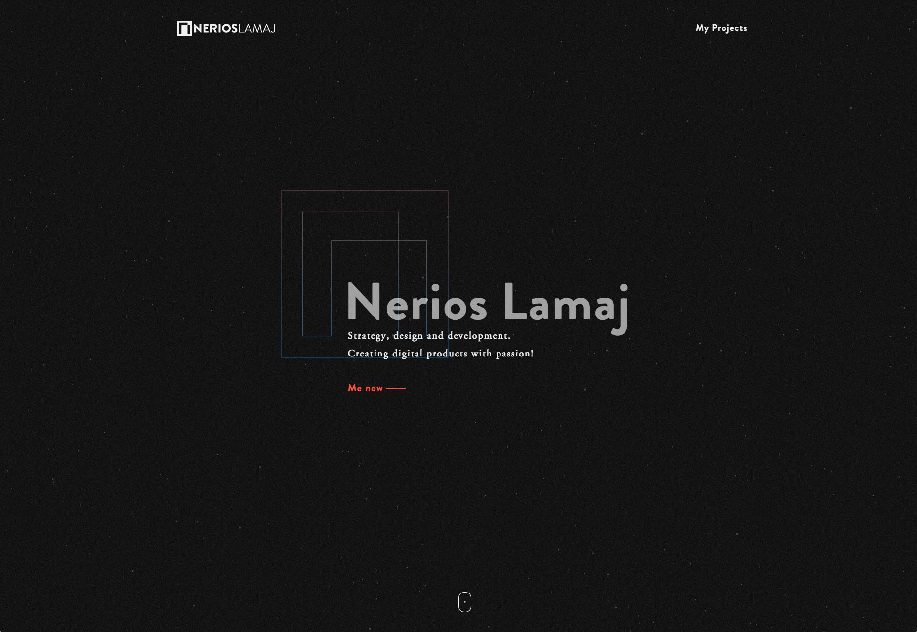
Fresh Design
Fresh Design is clean and corporate-feeling, and downright pretty. Most of what makes this site interesting is the animation. it’s everywhere. Most of it is simple stuff you can do in CSS, but its combined with a little bit of background video to great effect.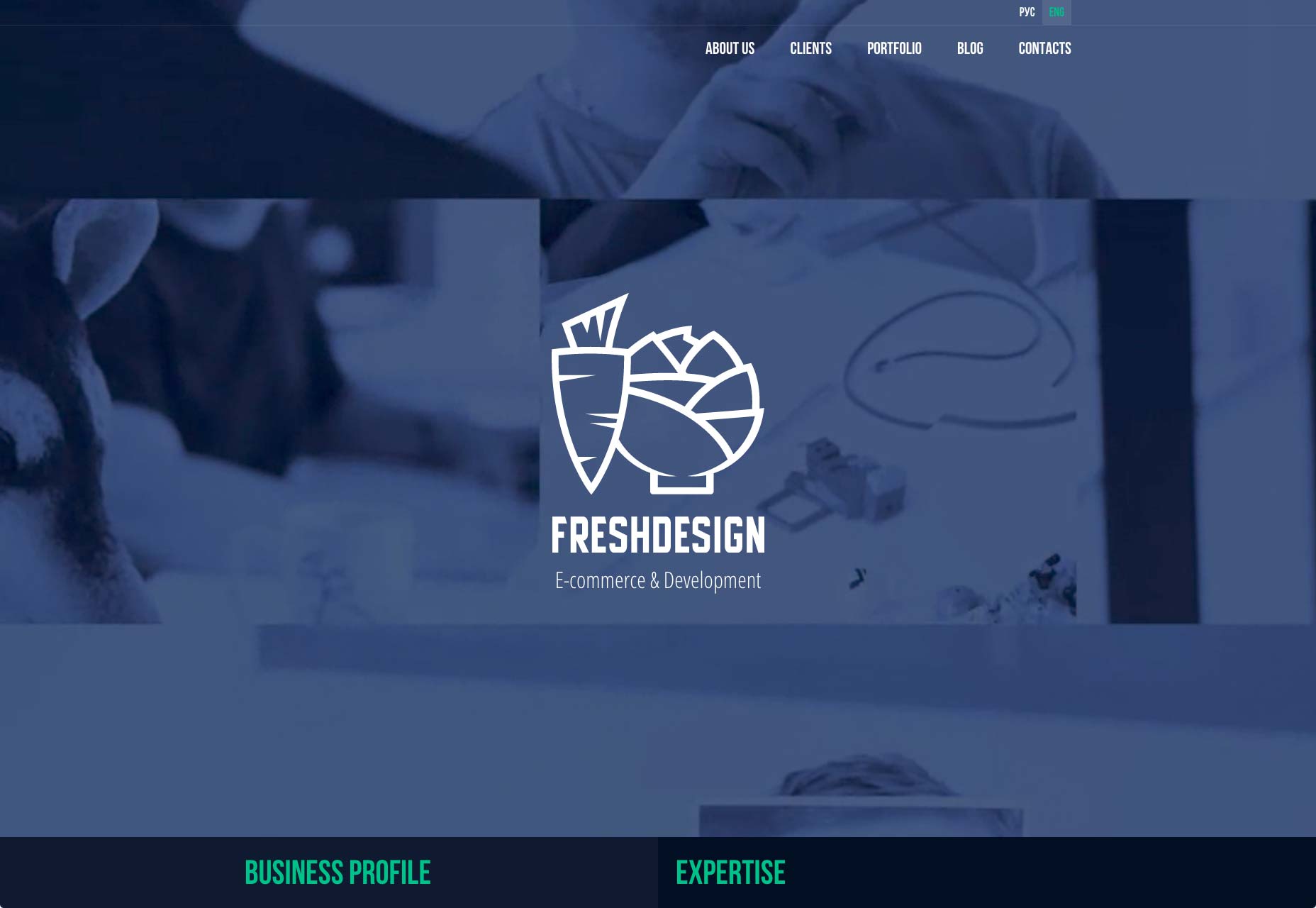
Vasyl Kish
Vasyl Kish brings us a dead-simple one-pager, in a style that I can only call dev-chic with a touch of ’90s MTV. It’s a master class in only saying what must absolutely be said.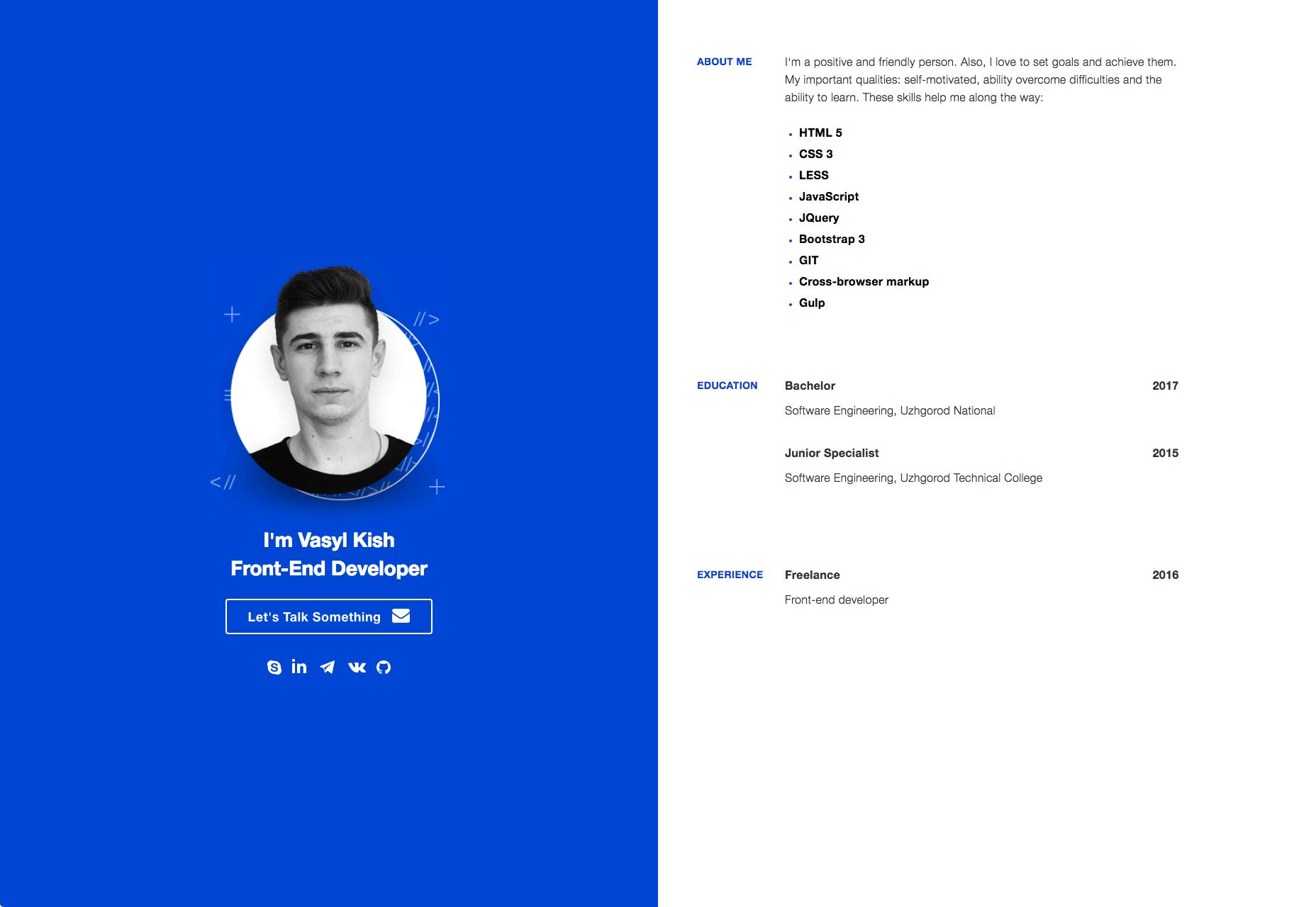
Innovolve
Innovolve brands their site by putting a whole bunch of dots all over their images (except in the actual portfolio, of course). That, with some subtle animation, makes Innovolve’s site feel like it’s more than your average corporate-style site.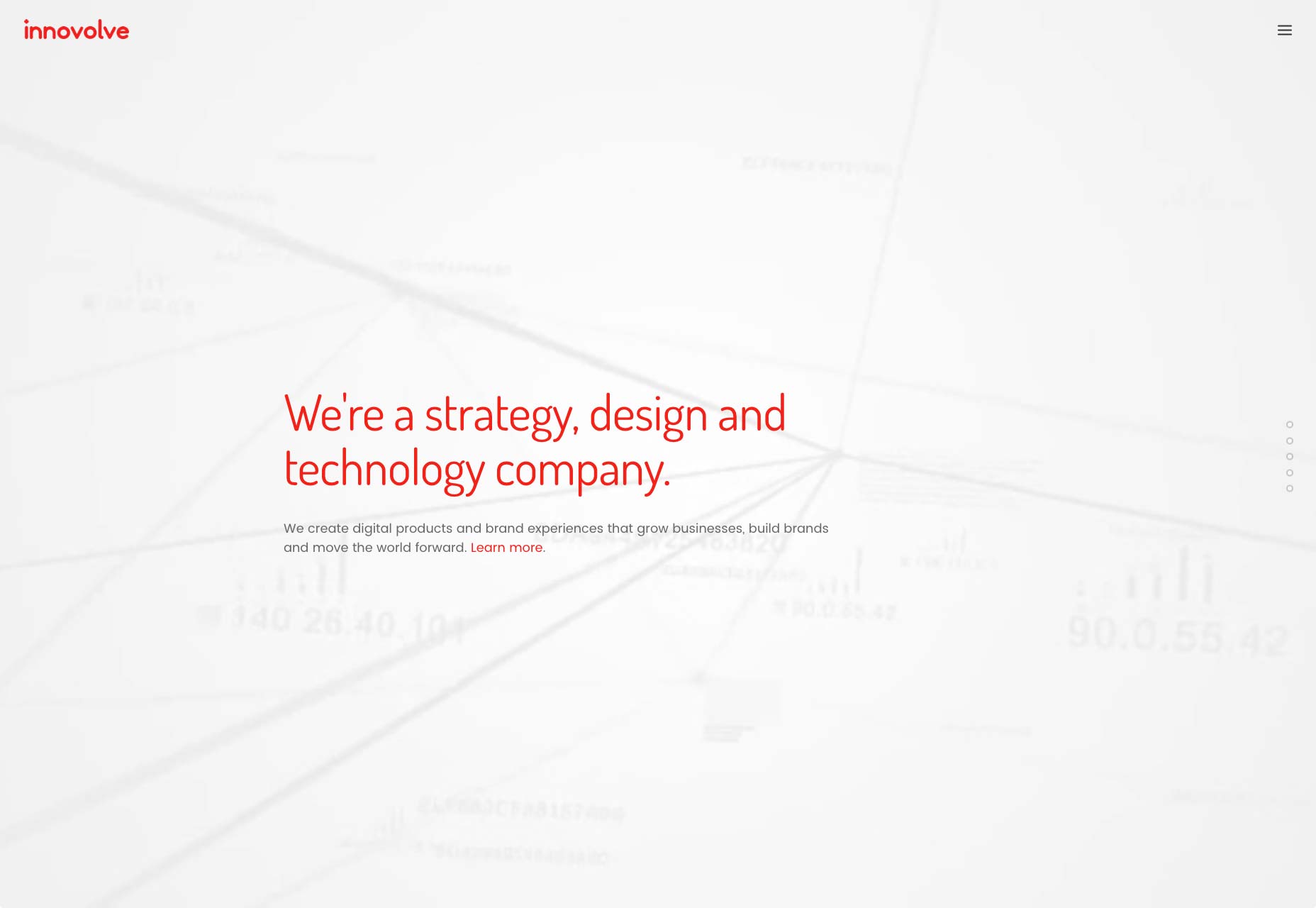
Frank Li
Frank Li’s portfolio takes advantage of his illustration skills to add personality to what is otherwise a fairly standard design. That said, the whole thing is well done. Good imagery, good type, good use of color.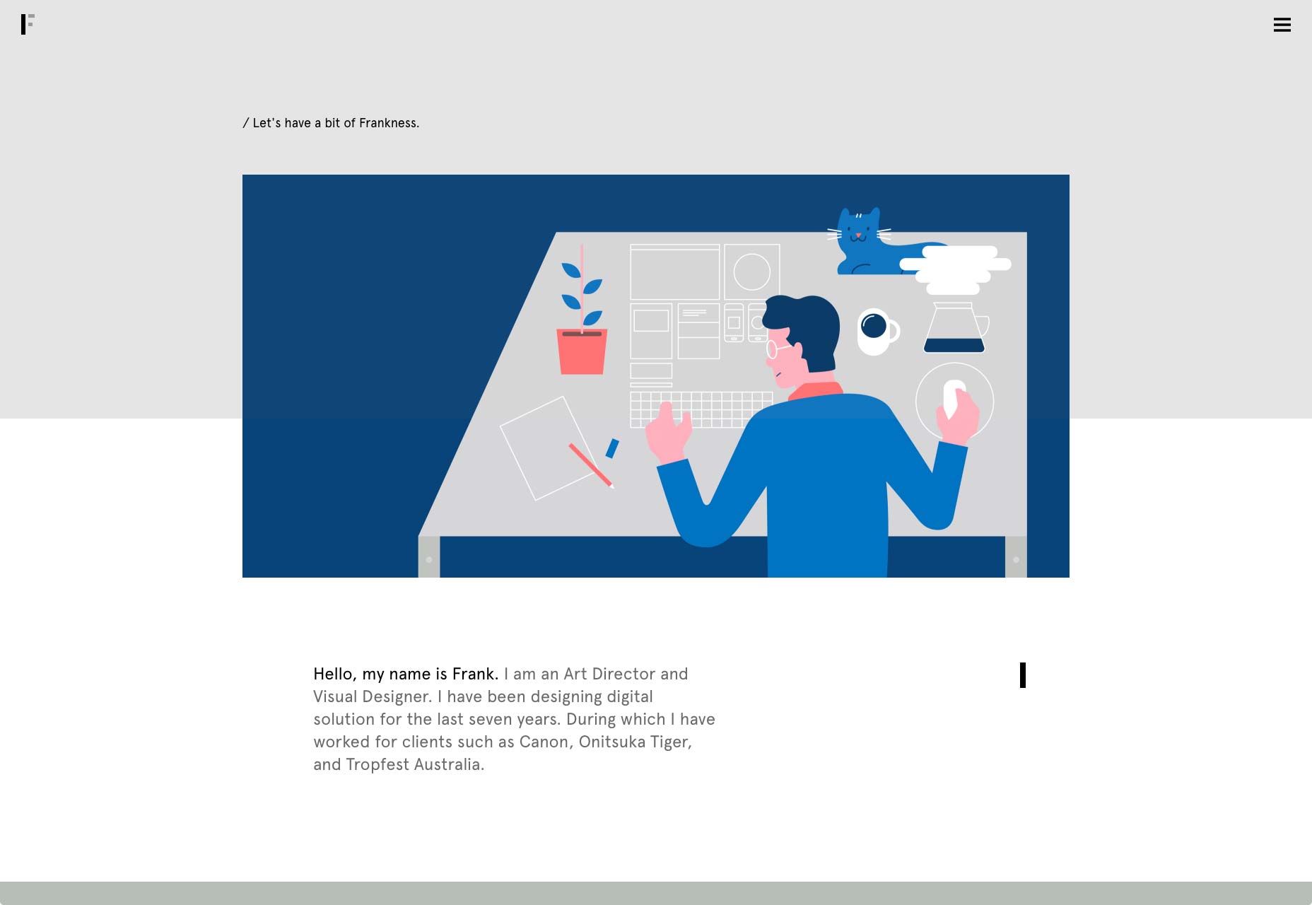
Erminando Aliaj
And here we have another portfolio that works more like a slideshow or presentation. Actually, this is the only case where I actually approve of this trend of putting the navigation around the edges of the screen I think it could be more obvious that the text is clickable, but nothing’s perfect.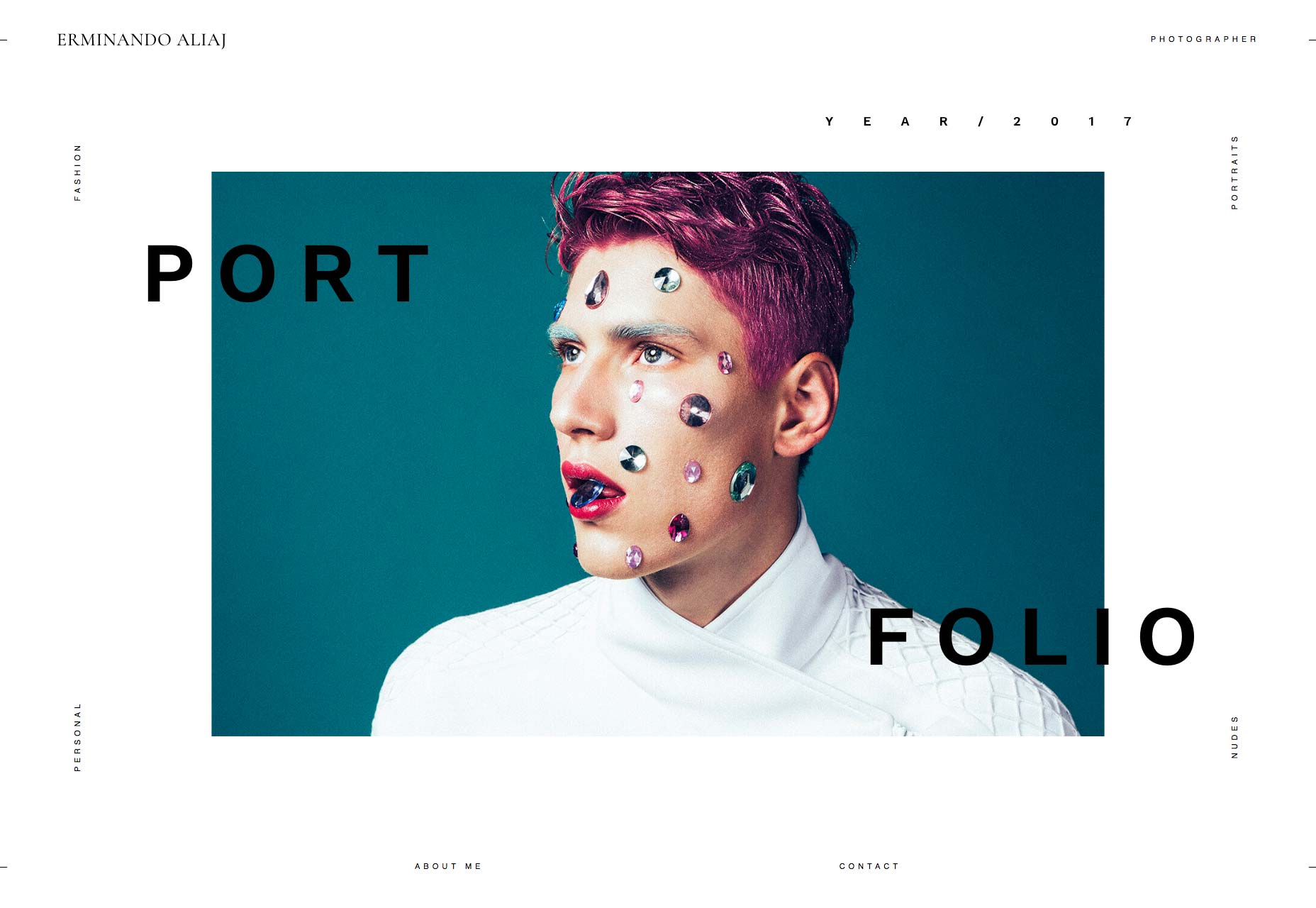
Lee Mawdsley
Lee Mawdsely has embraced minimalism all the way. The site basically consists of a navigation bar, and a whole bunch of images. That seems to be all he needs. Oh, and you know how I keep saying sites like this are more like presentations? This guy went all the way and included a fullscreen function.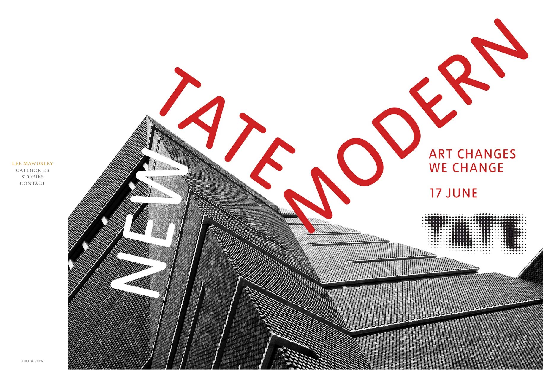
Bureau Cool
Once upon a time, people said that 3D portfolios were not the best idea. Then Bureau Cool stood up and said, “Whatever.” And made one anyway. It may not be the most usable interface out there, but for this month, it wins the award for creative interaction design. It’s a mental award that I just made up, but yeah. The whole site feels kinda ’90s, but a quick look at their portfolio makes it clear that this is intentional. This is... almost brutalism in 3D.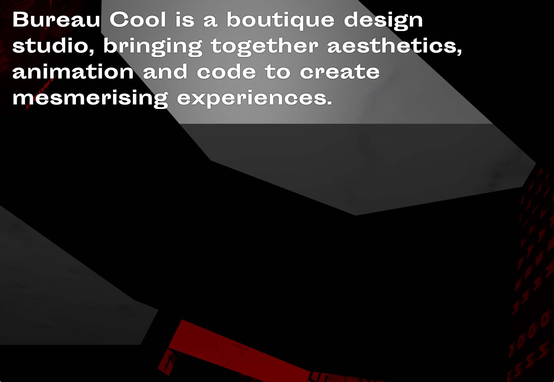
Ezequiel Bruni
Ezequiel Bruni is a web/UX designer, blogger, and aspiring photographer living in Mexico. When he’s not up to his finely-chiselled ears in wire-frames and front-end code, or ranting about the same, he indulges in beer, pizza, fantasy novels, and stand-up comedy.


Read Next

15 Best New Fonts, July 2024
Welcome to our monthly roundup of the best fonts we’ve found online in the last four weeks. This month, there are fewer…
By Ben Moss

20 Best New Websites, July 2024
Welcome to July’s round up of websites to inspire you. This month’s collection ranges from the most stripped-back…

Top 7 WordPress Plugins for 2024: Enhance Your Site's Performance
WordPress is a hands-down favorite of website designers and developers. Renowned for its flexibility and ease of use,…
By WDD Staff

Exciting New Tools for Designers, July 2024
Welcome to this July’s collection of tools, gathered from around the web over the past month. We hope you’ll find…

3 Essential Design Trends, July 2024
Add some summer sizzle to your design projects with trendy website elements. Learn what's trending and how to use these…

15 Best New Fonts, June 2024
Welcome to our roundup of the best new fonts we’ve found online in the last month. This month, there are notably fewer…
By Ben Moss

20 Best New Websites, June 2024
Arranging content in an easily accessible way is the backbone of any user-friendly website. A good website will present…

Exciting New Tools for Designers, June 2024
In this month’s roundup of the best tools for web designers and developers, we’ll explore a range of new and noteworthy…

3 Essential Design Trends, June 2024
Summer is off to a fun start with some highly dramatic website design trends showing up in projects. Let's dive in!

15 Best New Fonts, May 2024
In this month’s edition, there are lots of historically-inspired typefaces, more of the growing trend for French…
By Ben Moss

How to Reduce The Carbon Footprint of Your Website
On average, a web page produces 4.61 grams of CO2 for every page view; for whole sites, that amounts to hundreds of KG…
By Simon Sterne

20 Best New Websites, May 2024
Welcome to May’s compilation of the best sites on the web. This month we’re focused on color for younger humans,…