

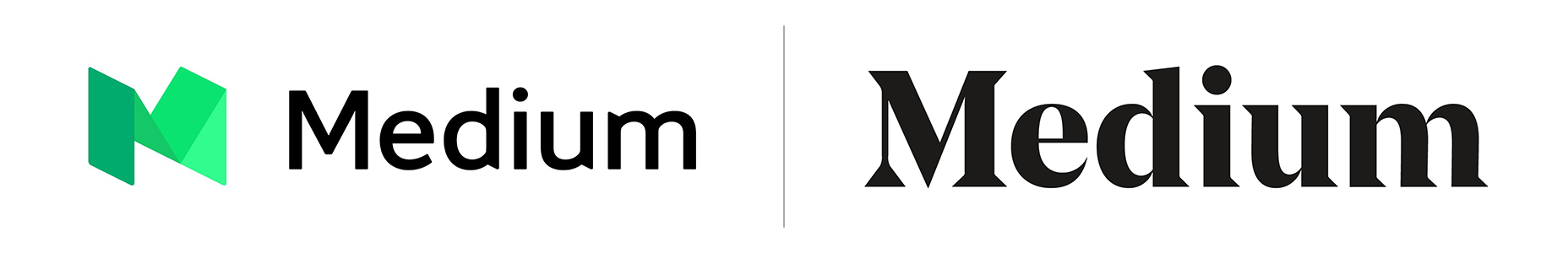
 2015–2017 logo (left), and the new 2017– logo (right)
The first success is that the logo now works in black and white (that’s logo design 101 passed). The second is that it honors the history of the brand—if a company this young can be said to have a history—without being a slave to it. The third is that the exaggerated contrast calls to mind the blackletter mastheads of credible publications like the New York Times, or the Washington Post, without actually embracing blackletter—it would be a foolhardy publication that adopted a blackletter masthead, with all its cultural connotations, in the current political climate.
The logotype is distinctly more modern than its predecessor, thanks to the sharp serifs and highly tapered shoulders. The only slight criticism might be levelled at the letter spacing: the uniform rhythm of the strokes and counters, coupled with the letter spacing, results in too little visual separation between the ‘i’, ‘u’, and ‘m’. It’s a minor gripe though, and this isn’t text that needs to be read in the conventional sense.
2015–2017 logo (left), and the new 2017– logo (right)
The first success is that the logo now works in black and white (that’s logo design 101 passed). The second is that it honors the history of the brand—if a company this young can be said to have a history—without being a slave to it. The third is that the exaggerated contrast calls to mind the blackletter mastheads of credible publications like the New York Times, or the Washington Post, without actually embracing blackletter—it would be a foolhardy publication that adopted a blackletter masthead, with all its cultural connotations, in the current political climate.
The logotype is distinctly more modern than its predecessor, thanks to the sharp serifs and highly tapered shoulders. The only slight criticism might be levelled at the letter spacing: the uniform rhythm of the strokes and counters, coupled with the letter spacing, results in too little visual separation between the ‘i’, ‘u’, and ‘m’. It’s a minor gripe though, and this isn’t text that needs to be read in the conventional sense.
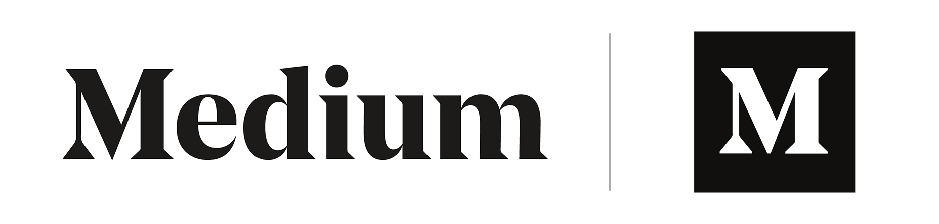 The new logotype (left), and the new monogram (right)
In addition to the logotype, Medium are using a monogram. This is the uppercase ‘M’ reversed on a black background. The monogram is intended for use where the logotype is too detailed—social media avatars spring to mind—and includes a couple of smart tweaks: the contrast is visibly reduced, and the serifs and apex are blunted; ensuring the shape does not feel weak, or blurred, at smaller sizes.
The logotype works well on the site, contrasting with the sans-serif used in the UI, clarifying the role of the UI labels far more effectively than the previous iteration. The monogram does a good job of taking a step back on individual post pages, letting the writer’s own personality dominate.
Of course, we have no idea what the brief was, or whether the work achieves what it set out to do, but the new logo indicates that Medium is finally ready to make the leap from fun SaaS, to serious publishing empire.
The new logotype (left), and the new monogram (right)
In addition to the logotype, Medium are using a monogram. This is the uppercase ‘M’ reversed on a black background. The monogram is intended for use where the logotype is too detailed—social media avatars spring to mind—and includes a couple of smart tweaks: the contrast is visibly reduced, and the serifs and apex are blunted; ensuring the shape does not feel weak, or blurred, at smaller sizes.
The logotype works well on the site, contrasting with the sans-serif used in the UI, clarifying the role of the UI labels far more effectively than the previous iteration. The monogram does a good job of taking a step back on individual post pages, letting the writer’s own personality dominate.
Of course, we have no idea what the brief was, or whether the work achieves what it set out to do, but the new logo indicates that Medium is finally ready to make the leap from fun SaaS, to serious publishing empire.
Ben Moss
Ben Moss has designed and coded work for award-winning startups, and global names including IBM, UBS, and the FBI. When he’s not in front of a screen he’s probably out trail-running.


Read Next

15 Best New Fonts, July 2024
Welcome to our monthly roundup of the best fonts we’ve found online in the last four weeks. This month, there are fewer…
By Ben Moss

20 Best New Websites, July 2024
Welcome to July’s round up of websites to inspire you. This month’s collection ranges from the most stripped-back…

Top 7 WordPress Plugins for 2024: Enhance Your Site's Performance
WordPress is a hands-down favorite of website designers and developers. Renowned for its flexibility and ease of use,…
By WDD Staff

Exciting New Tools for Designers, July 2024
Welcome to this July’s collection of tools, gathered from around the web over the past month. We hope you’ll find…

3 Essential Design Trends, July 2024
Add some summer sizzle to your design projects with trendy website elements. Learn what's trending and how to use these…

15 Best New Fonts, June 2024
Welcome to our roundup of the best new fonts we’ve found online in the last month. This month, there are notably fewer…
By Ben Moss

20 Best New Websites, June 2024
Arranging content in an easily accessible way is the backbone of any user-friendly website. A good website will present…

Exciting New Tools for Designers, June 2024
In this month’s roundup of the best tools for web designers and developers, we’ll explore a range of new and noteworthy…

3 Essential Design Trends, June 2024
Summer is off to a fun start with some highly dramatic website design trends showing up in projects. Let's dive in!

15 Best New Fonts, May 2024
In this month’s edition, there are lots of historically-inspired typefaces, more of the growing trend for French…
By Ben Moss

How to Reduce The Carbon Footprint of Your Website
On average, a web page produces 4.61 grams of CO2 for every page view; for whole sites, that amounts to hundreds of KG…
By Simon Sterne

20 Best New Websites, May 2024
Welcome to May’s compilation of the best sites on the web. This month we’re focused on color for younger humans,…