7 Free Tools For Testing Responsive Layouts
Every website should be designed with a responsive approach. To keep you on the right track, testing early and often, with any of these responsive testing tools, will ensure that your design looks right on all browsers, and at all viewport sizes.

1. XRespond
The XRespond app calls itself a “virtual device lab” and I’d say that’s pretty spot on. With this site you can preview how any website looks on a variety of devices. The site works in a long horizontal style where you have to scroll sideways to see all the screen formats. The label above each screen tells you the exact size and which device it matches to. Plus from the dropdown menu there’s a wide selection of smartphones, tablets, and laptops for testing specific devices. That dropdown even supports a custom width/height setting if you want to see how your site appears on specific monitors. An excellent testing tool for responsive design and it supports a lot of variety in device styles.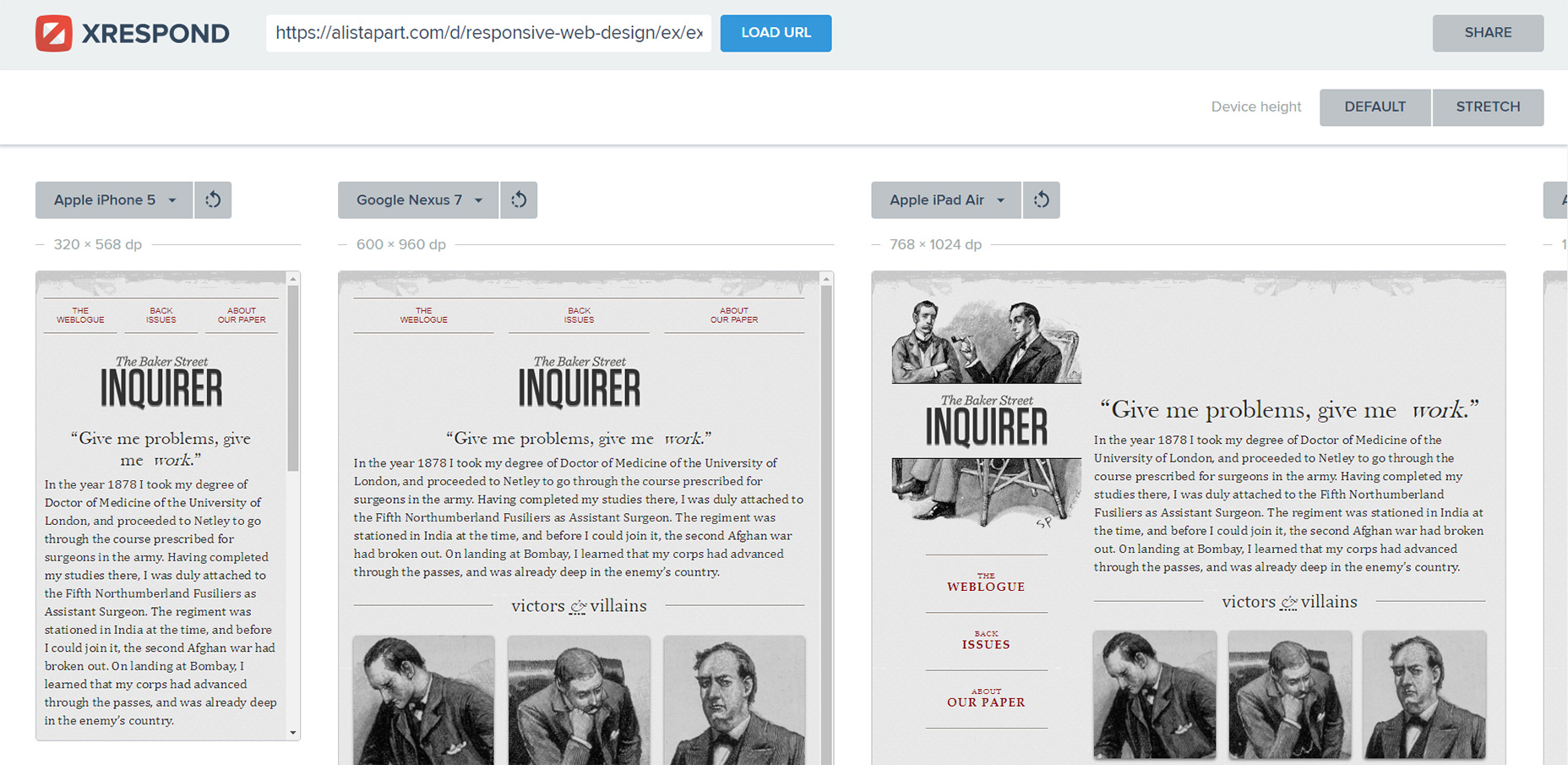
2. Responsinator
One similar app you also might enjoy is Responsinator. Instead of using a horizontal scrollbar this site lists each device preview in a vertical column. This way you can scroll down through each device and preview the site on each one. Devices include the most common iPhones and the Android Nexus devices, both with portrait and landscape previews. You’ll also find iPad device previews also in portrait and landscape. Another cool feature is the switch between HTTP and HTTPS. Responsinator offers both types for previewing sites depending on the URL you enter. It’ll automatically match whatever site you’re previewing to avoid SSL errors.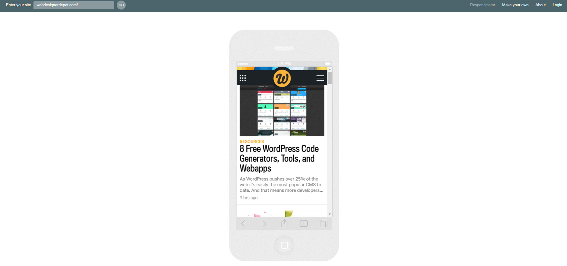
3. Responsive Design Checker
Need to quickly check if a website really is responsive? Then try using this Responsive Design Checker made specifically for custom screen sizes. Once you enter a URL you have full control over the responsive testing space. You can alter the width/height however you want and even use it to match certain screen ratios if you use an aspect ratio tool. In the sidebar you’ll find a ton of predefined screen sizes for common devices like Nexus tablets, Kindles, and even newer phones like the Google Pixel. The site also supports large screen sizes with desktop monitors up to 24" wide. Surprisingly these large sizes work well even on small monitors because the preview pane resizes based on ratio, not total pixel width. So if you’re struggling to test 1920px monitors on your smaller MacBook screen this tool is well worth bookmarking.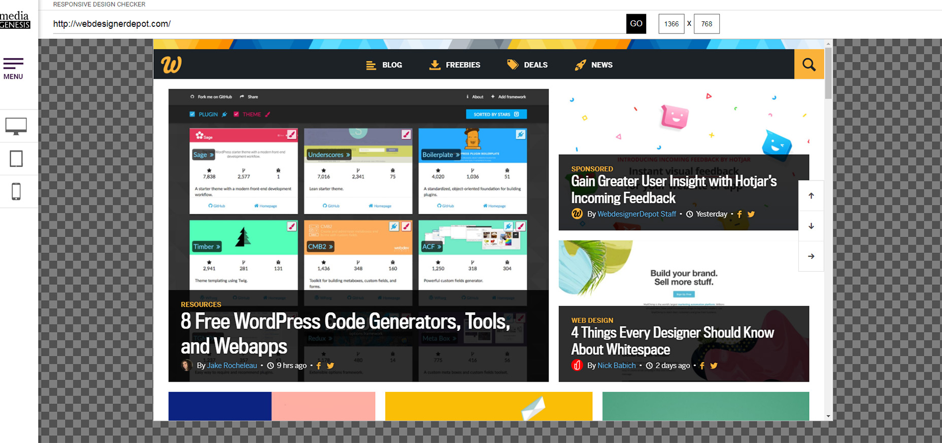
Bonus: LT Browser
LT Browser is a live mobile view debugging tool that allows you to check the mobile view of the website on various viewports and debug them on the go. You can perform responsive tests on 25+ mobile views & in case you find your favourite device missing, you can add a custom device, with the screen resolution and size you want. It also allows you to save these custom devices for any future use. With this testing tool, you can directly compare different mobile views simultaneously with the side-by-side view. It also supports mirror action, where your actions on the first device get replicated in the other one as well. Making it easier to compare the mobile view on different devices simultaneously. It comes with an in-built debugging tool, where you can validate your fixes on the go. To top it off you can mark bugs and share them with your team on your favourite project management tool such as Jira, Asana etc.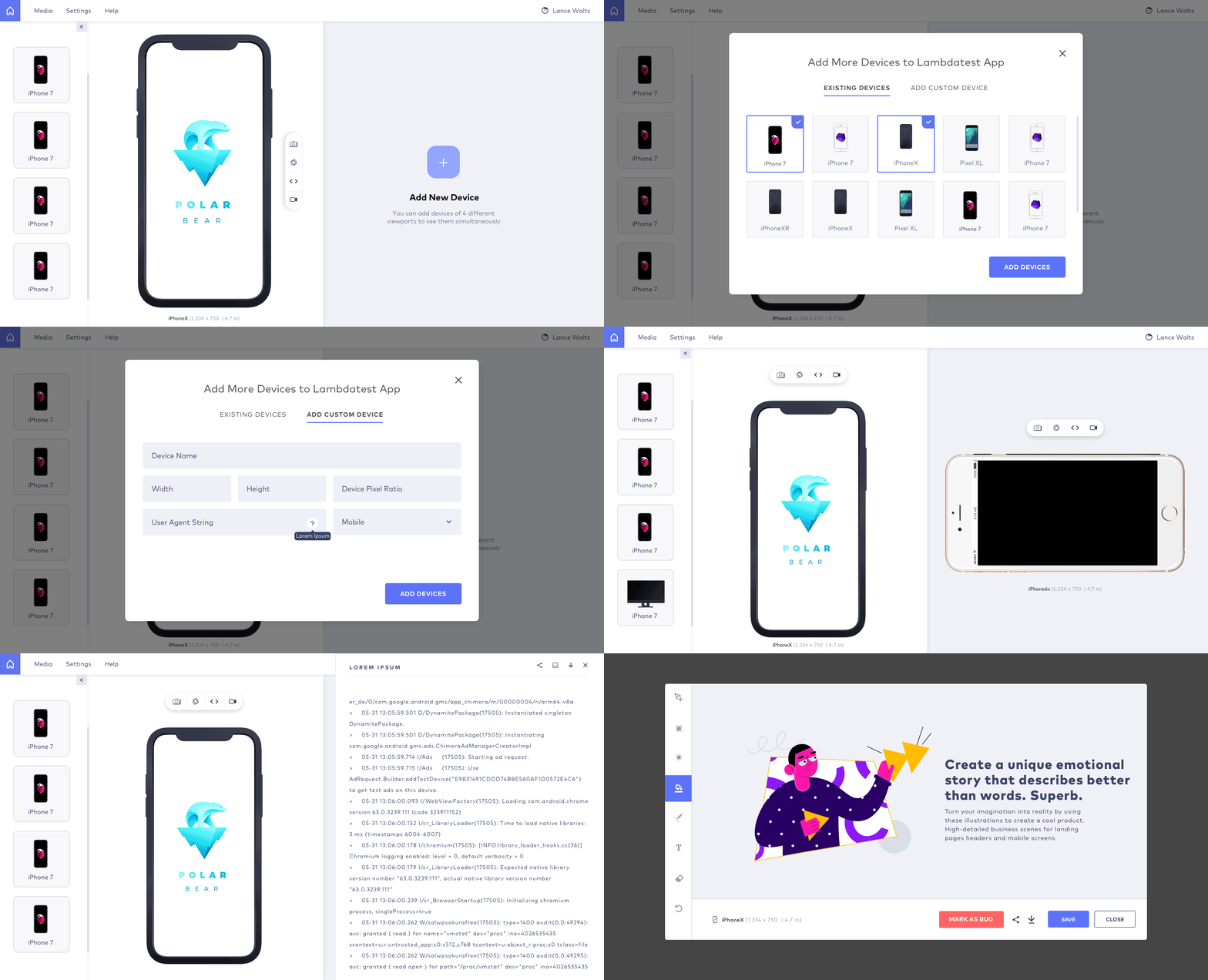
4. Google Mobile Test
Google is full of great tools for webmasters and their Mobile-Friendly Test is one such example. This testing tool isn’t really a previewer and it doesn’t help you spot UI bugs. Instead it’s a dedicated mobile tool for pinpointing issues within your site on mobile. Once the test runs you’ll either pass or fail as a mobile-friendly site. This is a little too generic for designers but Google offers tips based on problem areas & page elements that could use improvement. Keep this saved as a trustworthy mobile testing tool. It’s not a complete resource for responsive testing but it’s a great place to gather info and it comes from perhaps the most authoritative company on the web.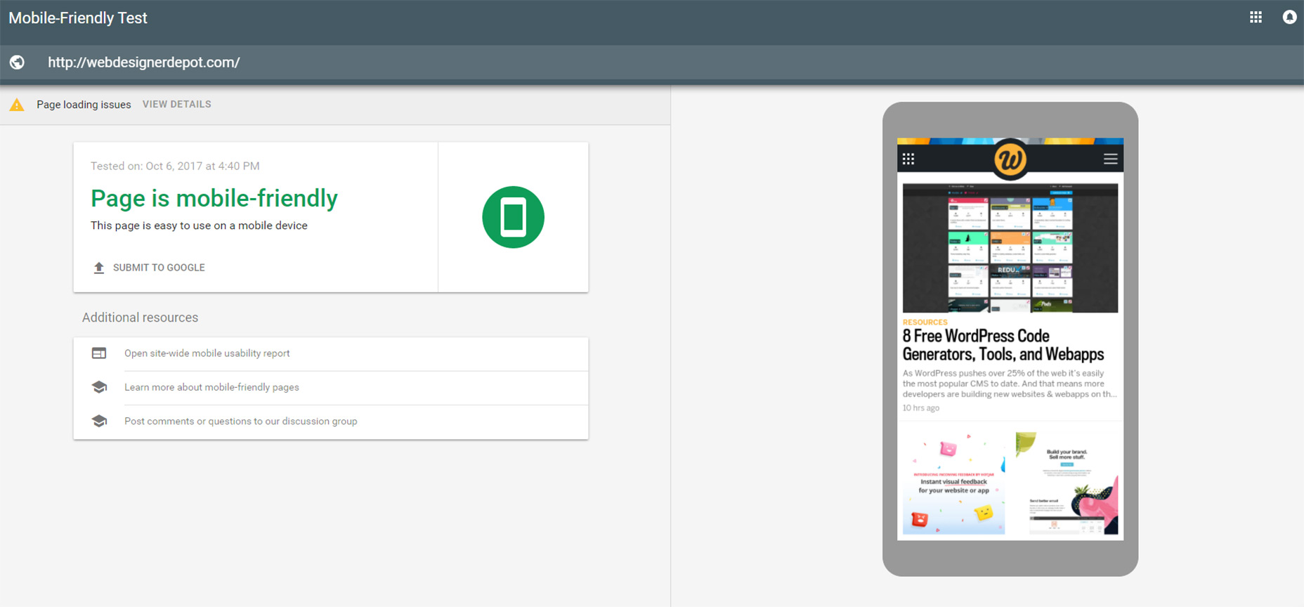
5. Matt Kersley’s Responsive Tool
Designer & developer Matt Kersley released his own free testing tool for responsive layouts. This one’s a lot simpler than others and doesn’t have many frills. Instead it’s a plain inline site previewer with 5 fixed widths: 240px, 320px, 480px, 768px, 1024px. The preview panes do feature scrollbars so you can move through content effortlessly. However you can’t click any links or browse through other pages within the panes, so this is really best for testing singular pages. But for a simple tool that gets the job done this works great and it’s one of the few testing tools that offers a 240px width by default.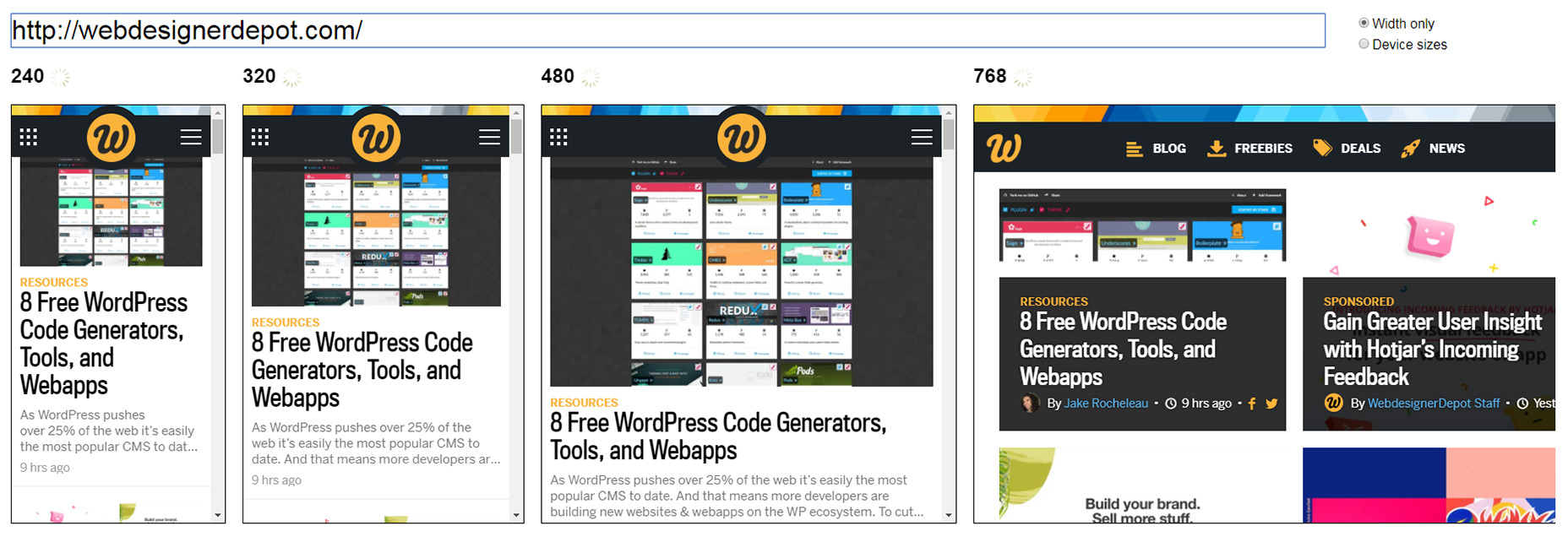
6. Am I Responsive?
You probably won’t need this tool if you’re looking for pixel-perfect accuracy. Instead the Am I Responsive? website works best for quick checks and previews on a few common device types. You simply enter a website URL and it’ll load into four device preview panes: a smartphone, tablet, laptop and desktop. These are not to scale so you’re only looking at the site as a ratio. But this is really cool for grabbing screenshots of your site to showcase how it looks in various devices. The rendering is accurate to scale and it relies on your browser for proper rendering. Plus this tool lets you run localhost addresses so you can even check projects you’re building locally on your computer.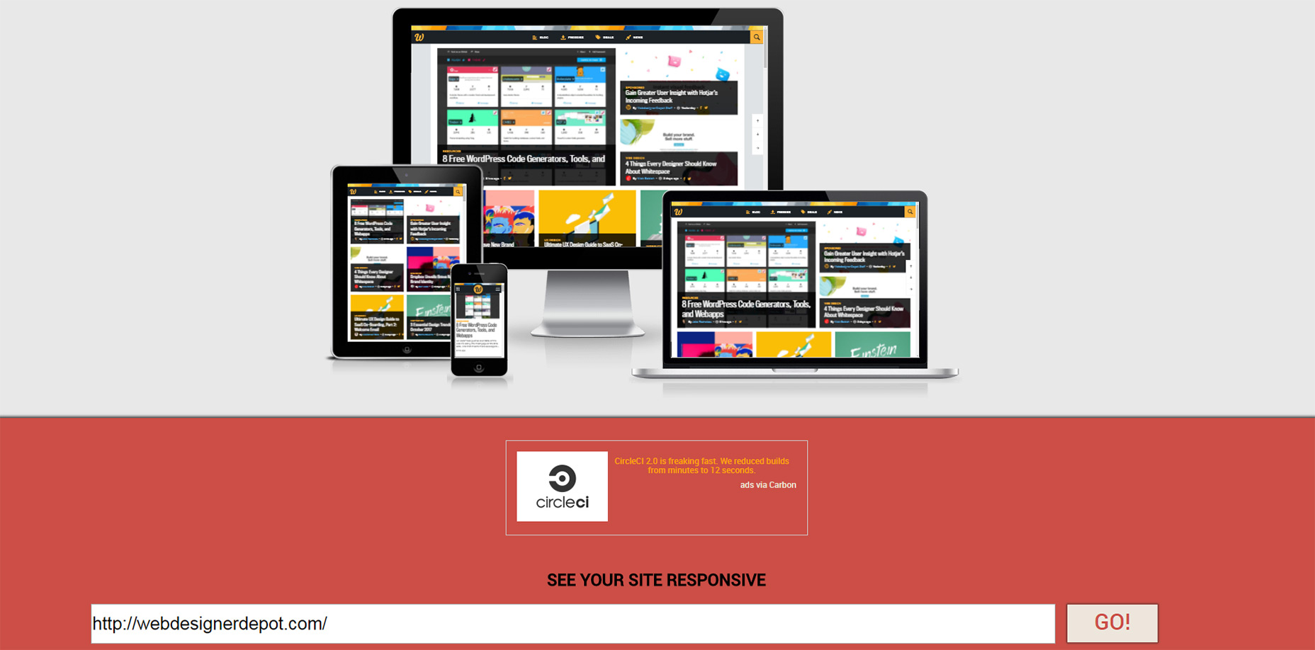
7. Designmodo Responsive Test
One other tool I really like is the Responsive Web Design Tester created by Designmodo. This free tool again lets you preview a site in your browser based on certain widths. But the one cool addition to this tool is the grid-based page setup. You can check your page for pixel points and even study the page’s grid using this webapp. Alongside the predefined device widths you can also drag the preview pane to fit whatever screen widths you’re testing. It has inputs for the width/height if you need to enter sizes manually too. But each device icon in the top-right corner lets you select from dozens of common screen sizes making this tool perfect for checking any device you can imagine.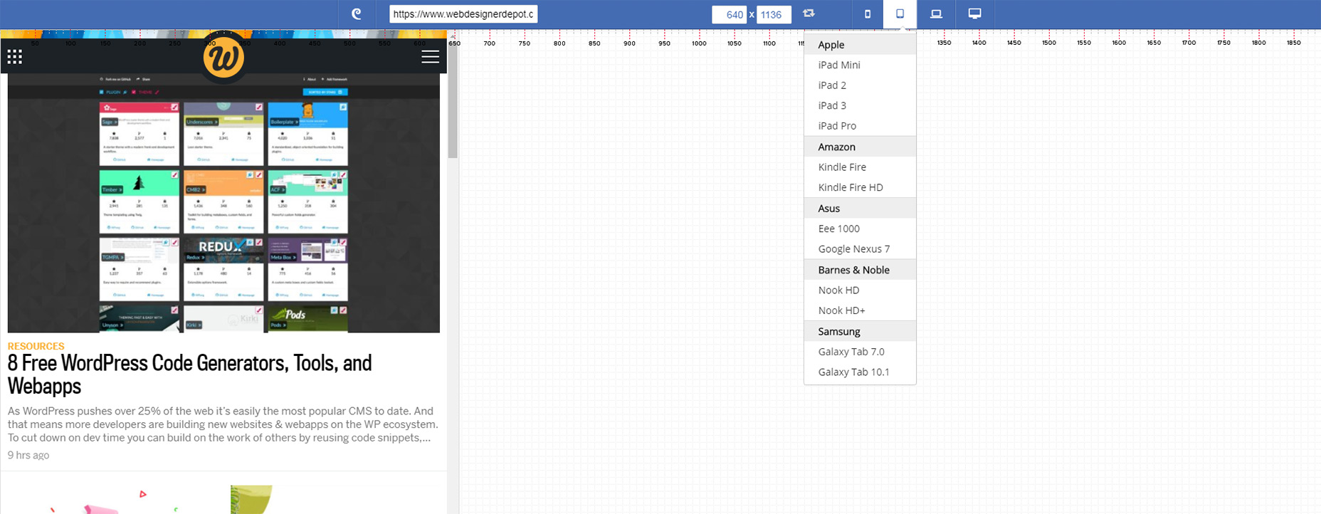
Jake Rocheleau
Jake is a writer and user experience designer on the web. He publishes articles discussing HTML5/CSS3 and jQuery coding techniques. Find out more on his website or you can follow his updates on Twitter @jakerocheleau
Read Next
15 Best New Fonts, July 2024
Welcome to our monthly roundup of the best fonts we’ve found online in the last four weeks. This month, there are fewer…
By Ben Moss
20 Best New Websites, July 2024
Welcome to July’s round up of websites to inspire you. This month’s collection ranges from the most stripped-back…
Top 7 WordPress Plugins for 2024: Enhance Your Site's Performance
WordPress is a hands-down favorite of website designers and developers. Renowned for its flexibility and ease of use,…
By WDD Staff
Exciting New Tools for Designers, July 2024
Welcome to this July’s collection of tools, gathered from around the web over the past month. We hope you’ll find…
3 Essential Design Trends, July 2024
Add some summer sizzle to your design projects with trendy website elements. Learn what's trending and how to use these…
15 Best New Fonts, June 2024
Welcome to our roundup of the best new fonts we’ve found online in the last month. This month, there are notably fewer…
By Ben Moss
20 Best New Websites, June 2024
Arranging content in an easily accessible way is the backbone of any user-friendly website. A good website will present…
Exciting New Tools for Designers, June 2024
In this month’s roundup of the best tools for web designers and developers, we’ll explore a range of new and noteworthy…
3 Essential Design Trends, June 2024
Summer is off to a fun start with some highly dramatic website design trends showing up in projects. Let's dive in!
15 Best New Fonts, May 2024
In this month’s edition, there are lots of historically-inspired typefaces, more of the growing trend for French…
By Ben Moss
How to Reduce The Carbon Footprint of Your Website
On average, a web page produces 4.61 grams of CO2 for every page view; for whole sites, that amounts to hundreds of KG…
By Simon Sterne
20 Best New Websites, May 2024
Welcome to May’s compilation of the best sites on the web. This month we’re focused on color for younger humans,…


