

 NBC News before…
 …and after.
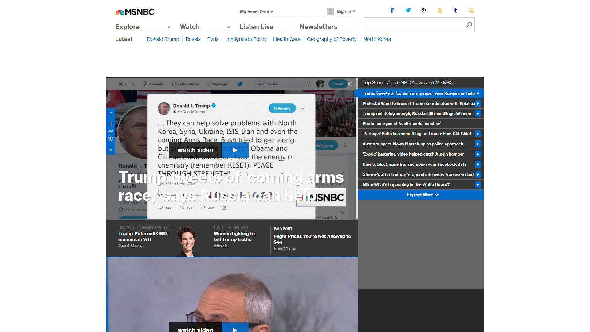 MSNBC before…
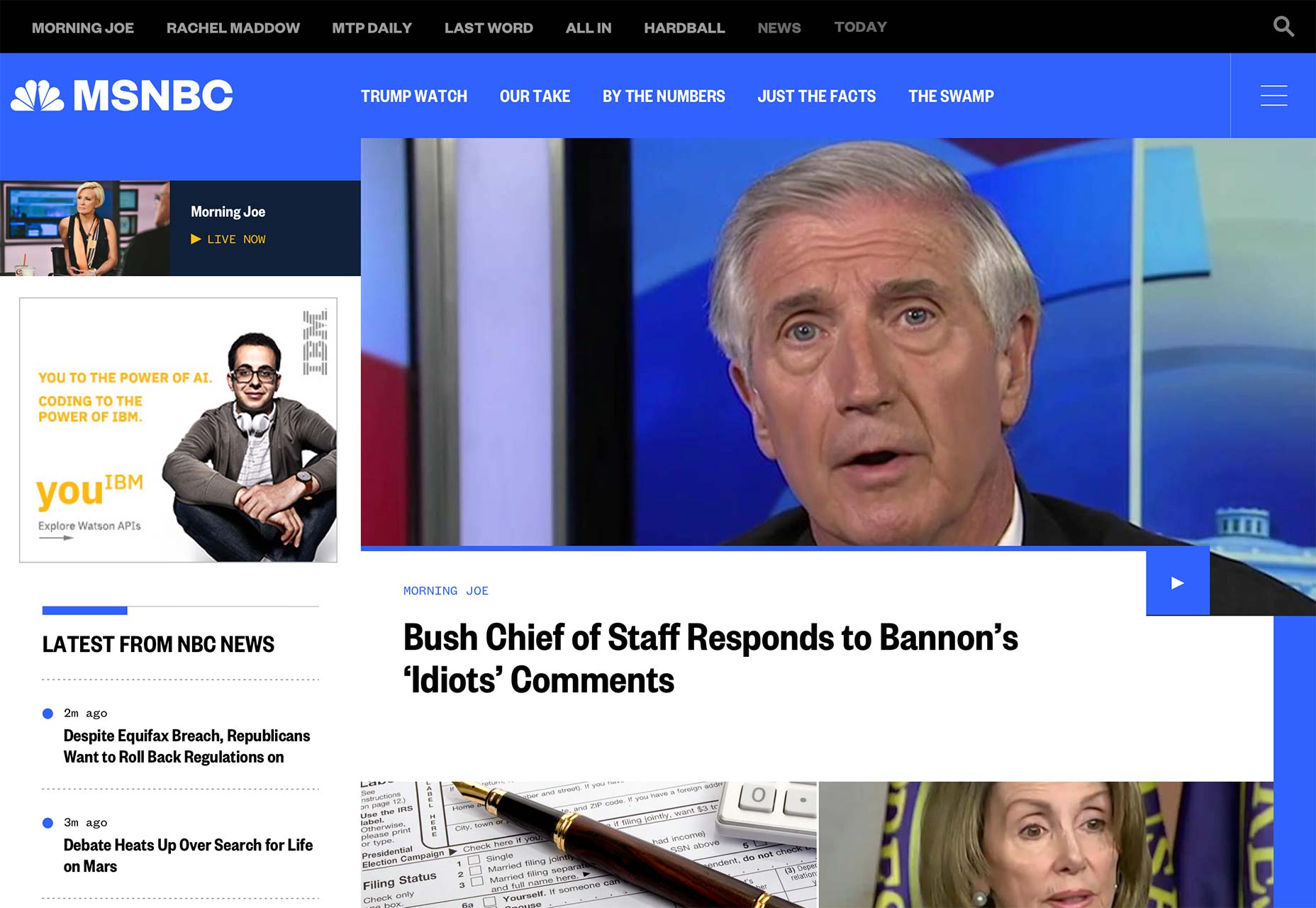 …and after.
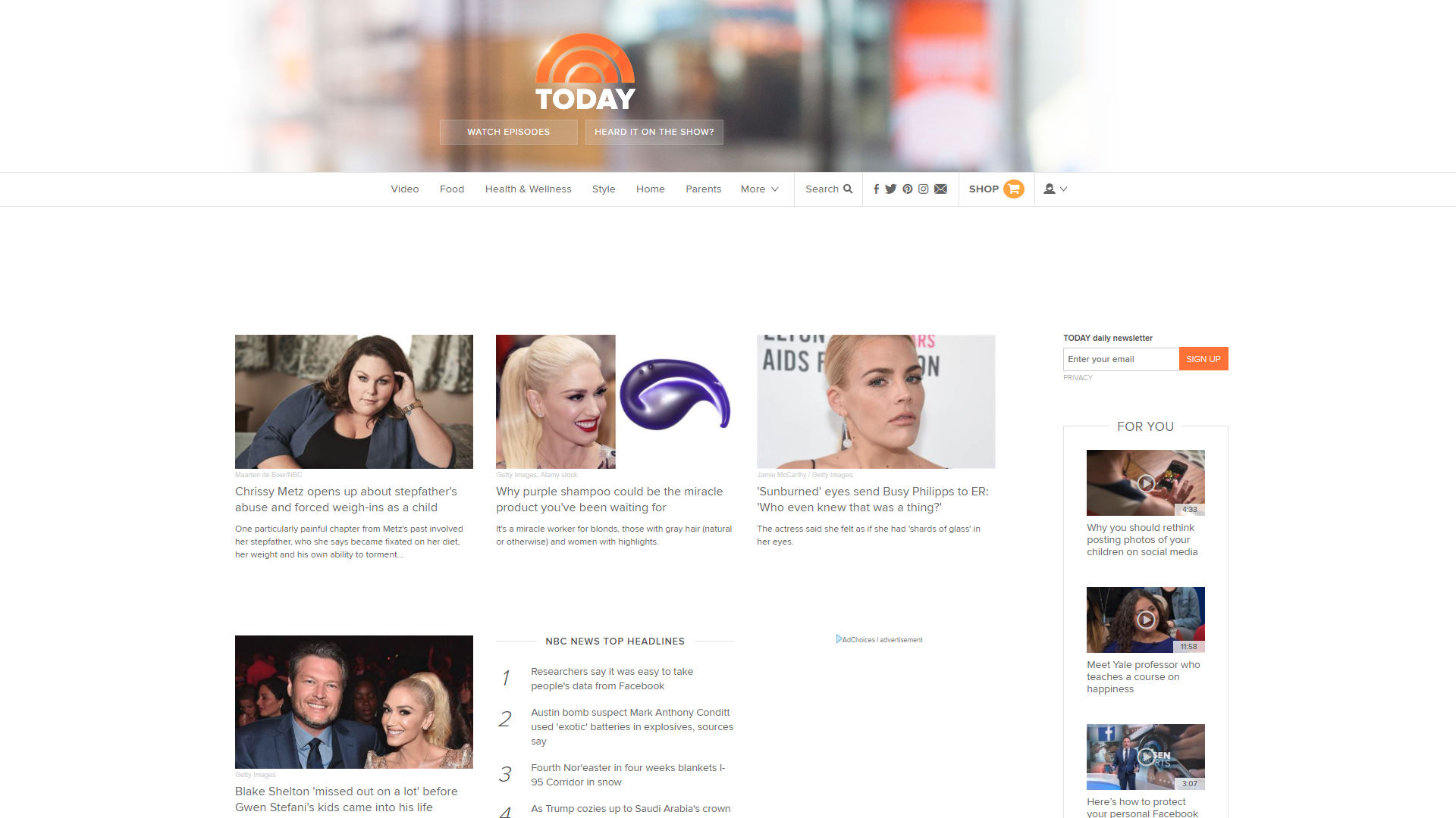 Today before…
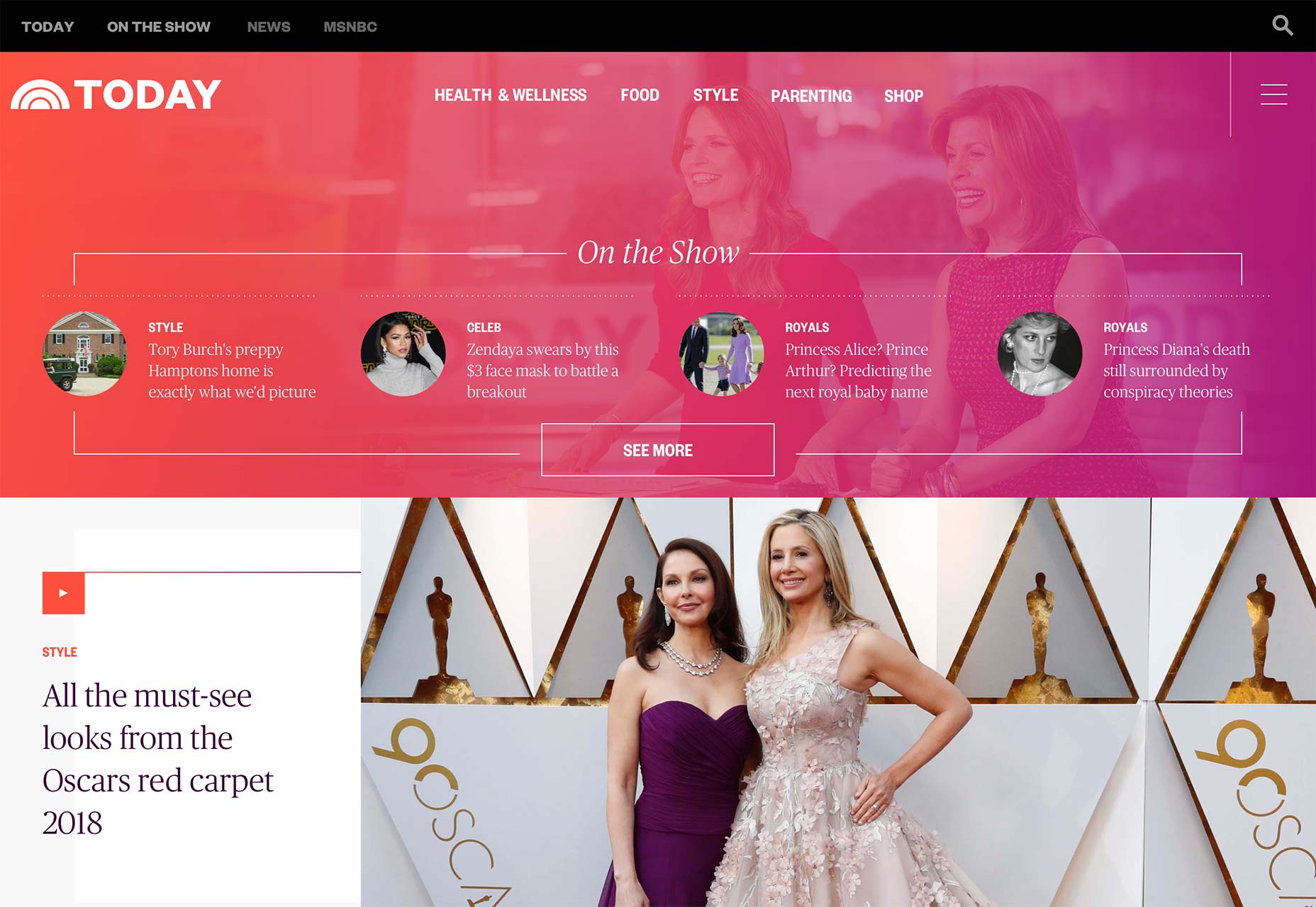 …and after.
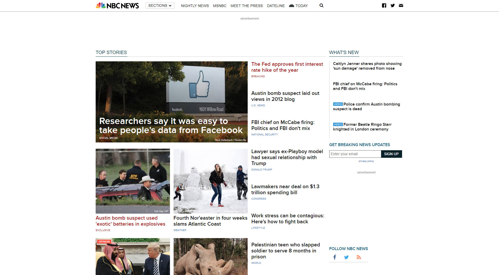
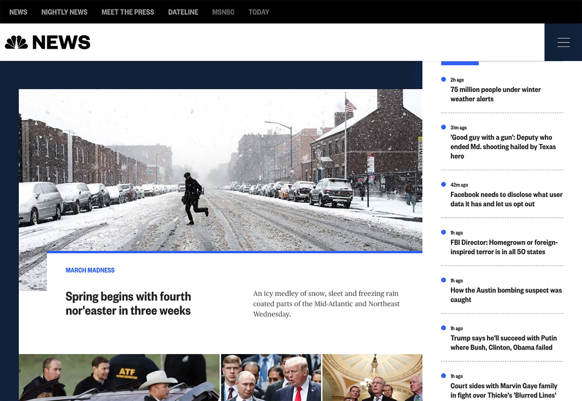
Now what has changed since they first implemented this design system? Well, the focus on imagery hasn’t gone anywhere, and neither has their emphasis on smooth video integration. There does seem to be more information and text packed into a somewhat smaller space than in the earlier iterations, but these home pages are on larger sites, so that makes sense.
The asymmetry they experimented with before has come out in full force, leaving some space for advertising, and some space to just let your eyes rest while you contemplate the headlines that just got burned into your brain. They’re going for the hit-them-with-sensory-input-and-see-what-sticks approach that, to be frank, has worked for news organizations for years, now. The main difference is that it mostly looks better, now.
NBC News and MSNBC frankly do look a lot like tech/business blogs (with more than a hint of Bloomberg, as someone commented on our last article about this), but they’re pretty and readable, so I say we go with it. Today looks like the lifestyle and celebrity gossip magazine it is, and that distinction is mostly accomplished through its typography, which is actually kind of impressive.
An interesting note is that, according to a press release, page layouts are actually supposed to change with the intensity of the news cycle, or rather, with the number of articles they have to show you all at once. I’m curious to see show this will work. I find myself wondering if the layout changes automatically, or if someone has to“flip the switch” on any given day.
There are also “sticky” ads that are supposed to be simultaneously more visible, and more visually pleasing. Even as someone who in part makes his living thanks to ads on this very site, I find myself wondering if there is such a thing as an ad that actually pleases people when they see it. Oh, ads can be intriguing, even interesting, but pleasing? We’ll see.
If you’re interested in what NBC themselves have to say about the redesign, there’s an older Medium post you can check out. It was published back when this new design system was first debuted, but it outlines NBCs goals for this redesign, which included things like staying away from rigid templates, making their video content feel like it belongs, a more cohesive treatment of images, improved readability, and evolving the brand (lightly).
Have a look at all three sites below, and judge them for yourselves whether they reached those goals. I think they largely have.
…and after.
Now what has changed since they first implemented this design system? Well, the focus on imagery hasn’t gone anywhere, and neither has their emphasis on smooth video integration. There does seem to be more information and text packed into a somewhat smaller space than in the earlier iterations, but these home pages are on larger sites, so that makes sense.
The asymmetry they experimented with before has come out in full force, leaving some space for advertising, and some space to just let your eyes rest while you contemplate the headlines that just got burned into your brain. They’re going for the hit-them-with-sensory-input-and-see-what-sticks approach that, to be frank, has worked for news organizations for years, now. The main difference is that it mostly looks better, now.
NBC News and MSNBC frankly do look a lot like tech/business blogs (with more than a hint of Bloomberg, as someone commented on our last article about this), but they’re pretty and readable, so I say we go with it. Today looks like the lifestyle and celebrity gossip magazine it is, and that distinction is mostly accomplished through its typography, which is actually kind of impressive.
An interesting note is that, according to a press release, page layouts are actually supposed to change with the intensity of the news cycle, or rather, with the number of articles they have to show you all at once. I’m curious to see show this will work. I find myself wondering if the layout changes automatically, or if someone has to“flip the switch” on any given day.
There are also “sticky” ads that are supposed to be simultaneously more visible, and more visually pleasing. Even as someone who in part makes his living thanks to ads on this very site, I find myself wondering if there is such a thing as an ad that actually pleases people when they see it. Oh, ads can be intriguing, even interesting, but pleasing? We’ll see.
If you’re interested in what NBC themselves have to say about the redesign, there’s an older Medium post you can check out. It was published back when this new design system was first debuted, but it outlines NBCs goals for this redesign, which included things like staying away from rigid templates, making their video content feel like it belongs, a more cohesive treatment of images, improved readability, and evolving the brand (lightly).
Have a look at all three sites below, and judge them for yourselves whether they reached those goals. I think they largely have.


Ezequiel Bruni
Ezequiel Bruni is a web/UX designer, blogger, and aspiring photographer living in Mexico. When he’s not up to his finely-chiselled ears in wire-frames and front-end code, or ranting about the same, he indulges in beer, pizza, fantasy novels, and stand-up comedy.


Read Next

15 Best New Fonts, July 2024
Welcome to our monthly roundup of the best fonts we’ve found online in the last four weeks. This month, there are fewer…
By Ben Moss

20 Best New Websites, July 2024
Welcome to July’s round up of websites to inspire you. This month’s collection ranges from the most stripped-back…

Top 7 WordPress Plugins for 2024: Enhance Your Site's Performance
WordPress is a hands-down favorite of website designers and developers. Renowned for its flexibility and ease of use,…
By WDD Staff

Exciting New Tools for Designers, July 2024
Welcome to this July’s collection of tools, gathered from around the web over the past month. We hope you’ll find…

3 Essential Design Trends, July 2024
Add some summer sizzle to your design projects with trendy website elements. Learn what's trending and how to use these…

15 Best New Fonts, June 2024
Welcome to our roundup of the best new fonts we’ve found online in the last month. This month, there are notably fewer…
By Ben Moss

20 Best New Websites, June 2024
Arranging content in an easily accessible way is the backbone of any user-friendly website. A good website will present…

Exciting New Tools for Designers, June 2024
In this month’s roundup of the best tools for web designers and developers, we’ll explore a range of new and noteworthy…

3 Essential Design Trends, June 2024
Summer is off to a fun start with some highly dramatic website design trends showing up in projects. Let's dive in!

15 Best New Fonts, May 2024
In this month’s edition, there are lots of historically-inspired typefaces, more of the growing trend for French…
By Ben Moss

How to Reduce The Carbon Footprint of Your Website
On average, a web page produces 4.61 grams of CO2 for every page view; for whole sites, that amounts to hundreds of KG…
By Simon Sterne

20 Best New Websites, May 2024
Welcome to May’s compilation of the best sites on the web. This month we’re focused on color for younger humans,…