
What is Website Accessibility?
Website accessibility isn’t a difficult concept to understand. It simply means that a website is equipped to deliver an experience to all users, regardless of any disability or impairment they might have. And it’s not just about being able to see, read, or understand the content either; users need to be able to navigate through websites and complete transactions just like everyone else. You may be surprised by the kinds of impairments that are affected by a lack of accessibility. Here are some of the broader categories:- Visual
- Auditory
- Cognitive
- Physical (think of someone with a broken arm or hand)
- Geographic (for instance, users living in areas with limited bandwidth)
Who Should Abide by Website Accessibility Rules?
The Winn-Dixie lawsuit was a big deal. It demonstrated that you don’t have to explicitly sell any goods or services online in order to be required by law to provide a fully accessible experience to all users. What ultimately matters is whether or not a website falls under the category of providing “public accommodation” as defined by the Americans with Disabilities Act. In the case of Winn-Dixie, the judge ruled against the grocery store chain because the lack of website accessibility consequently affected the in-store experience. But that’s not always the case. In another case from the United States, Andrews v. Blick Art Materials, LLC, Blick attempted to argue that, because it only sold art supplies online, that it did not technically fall under the “place of public accommodation” rule defined by the ADA. The judge, however, threw out their argument with the understanding that any business that deals with the public—either in person or online—should be held accountable for providing an accessible website. If you’re designing websites for businesses or individuals that intend on offering a service or selling a product to the public, then website accessibility needs to be a part of your workflow starting now. That said, it’s important to note that this will likely be a more common request you receive from clients based in the United States. While there are other countries where web accessibility laws have been established, most of them pertain to government and other public sector websites. While we wait for these laws to be revamped to account for more stringent web accessibility laws, it might still be a good idea to adopt the following tips into your workflow.Design and Development Tips for Website Accessibility
Below, you will find web design and development tips from W3C and the Website Accessibility Initiative (WAI) on how to build websites that better accommodate impaired users.1. Use Proper Tagging
Using header tags in text is helpful for a number of reasons. For one, the visual hierarchy of enlarged and stylized text makes it easier to understand content. But it also serves an important purpose in accessibility as the title tag and subsequent header tags of a page inform impaired individuals when they arrive at key points.2. Write Descriptive Code
Some users rely on markup to figure out what is on the screen. So you will need to use markup that provides some context for what they’re seeing on screen. This should include things like the language attribute.3. Be Careful with Color
Pay attention to color choice as well, especially as it pertains to text. When there’s a lower contrast between the text and background–usually with lighter fonts against white backgrounds or daker fonts with dark backgrounds—it can be too difficult for users to read. Rely on strong indicators like underlining, animation on hover, large call-to-action buttons, and high contrast text.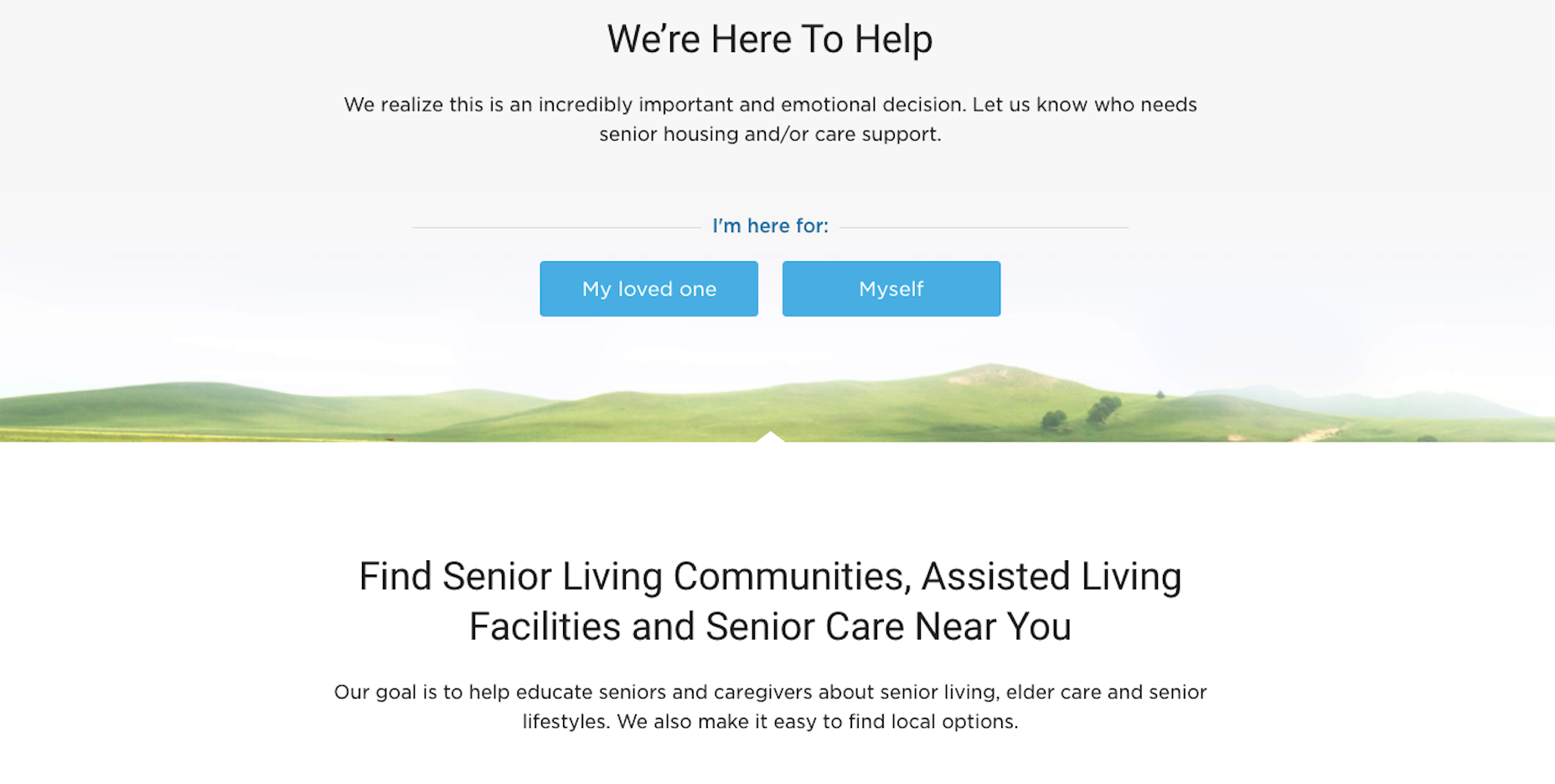 The Senior Living website does a great job with high-contrast text (and also large text).
4. Use Big Text
Use a font size that can be reasonably read from any and all devices or screen sizes. Beyond that, you may also want to integrate with a tool that enables users to increase the font size if it isn’t large enough for their needs.5. Make It Keyboard Accessible
Some visitors will access your site using a keyboard. If interactive elements (like the menu) are not tabbable or keyboard accessible, you’re going to have serious problems.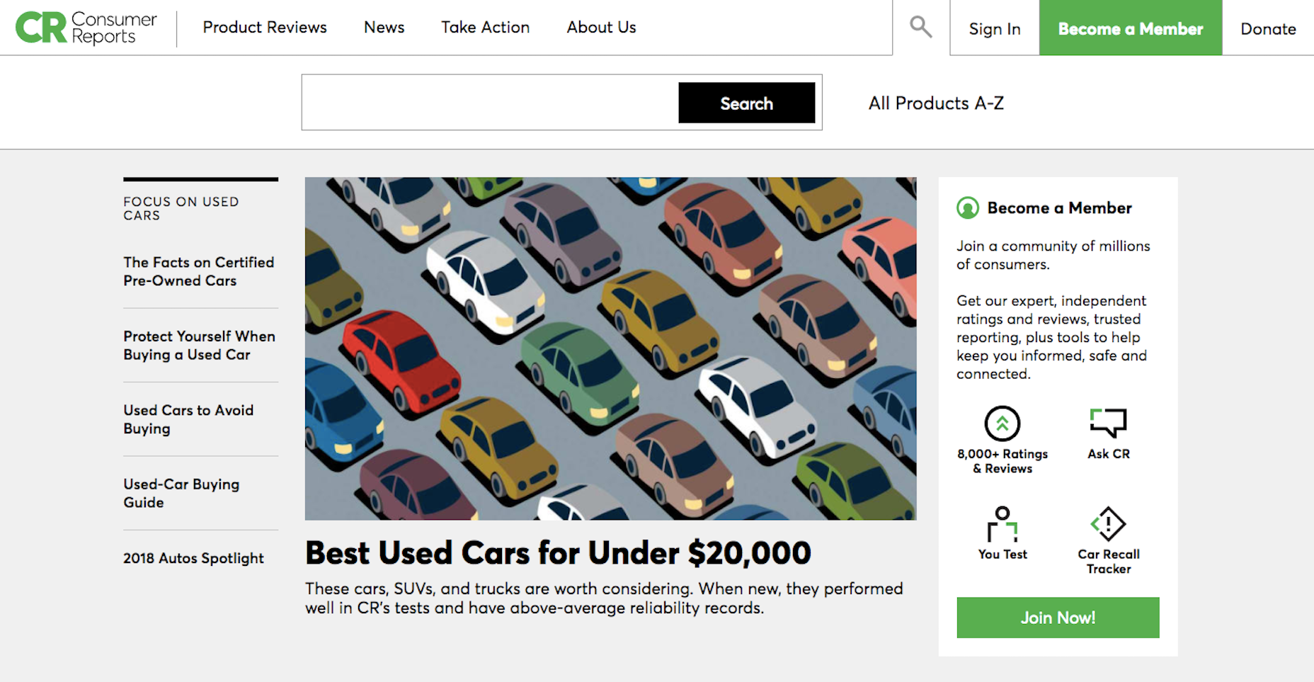 The Consumer Reports site is tab accessible.
6. Create Ultra Clear Forms
Contact forms are an important element in websites. Without them, you would have to rely on in-person or telephonic conversions (which just isn’t going to fly with a modern audience). So, pay extra special attention to these. Here are some tips:- Provide instructions on how to fill out the form.
- Include descriptive and clear labels for each field.
- Make form fields tabbable in the order in which they appear.
- Use big, bold error messages with exclamation points, shading, or warning symbols, to indicate problems to your users.
- Do not use CAPTCHA.
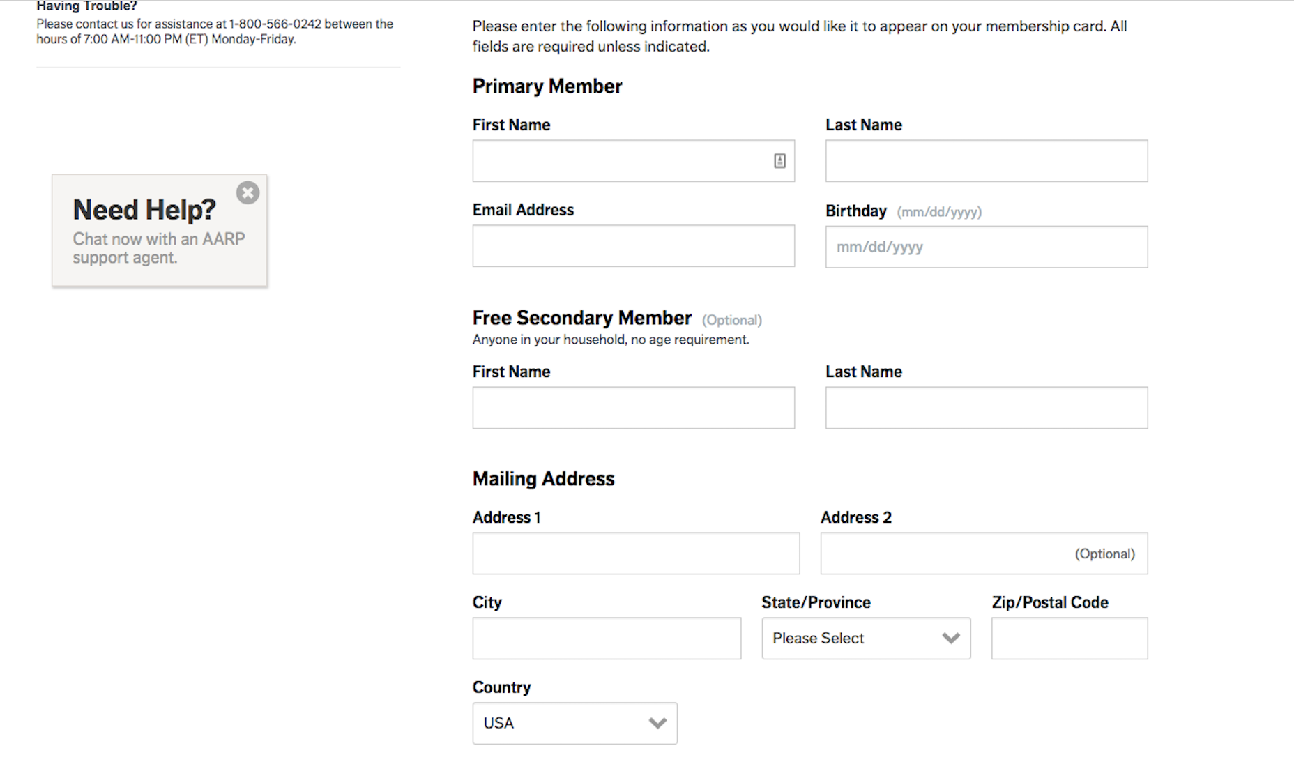 The AARP website has a well-labeled and easy to populate contact form.
7. Add Supportive Text
In order to ensure that everyone can consume your visual content, add supportive text.- For images, use alt-text that describes the photo as well as captions.
- For videos, add a transcript below or active captions within it.
- For podcasts and other audio, include a corresponding transcript.
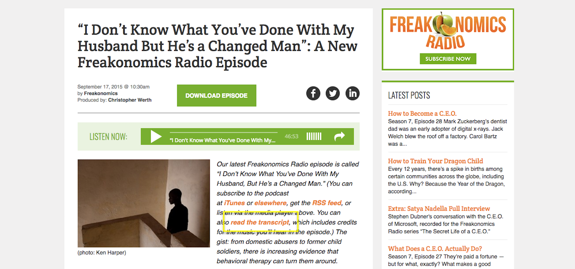 Freakonomics includes transcripts of each of its podcasts.
8. Use Abundant White Space
It may be difficult for some disabled individuals to focus on what’s most important if pages are cluttered. Use abundant white space to frame the most important parts of your site while also providing enough breathing room for them to comfortably view your content.9. Include Orientation Cues
Another way in which you can guide users through a site is by including orientation cues. Of course, navigation is an important part of this. You can also add breadcrumbs as well as strong UI elements that draw users down through the page. If all else fails, add a search bar to the top so they can instantly look for what they need.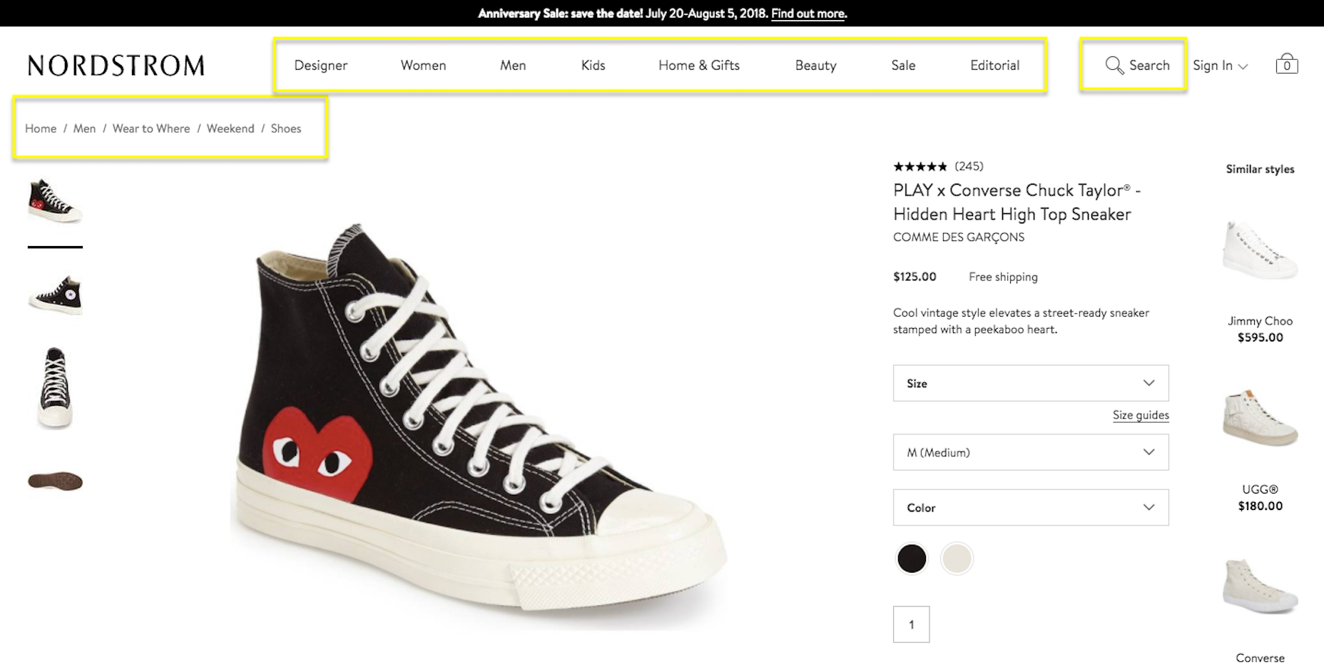 Nordstrom uses abundant navigational cues.
Wrapping Up
All in all, I would say that enabling a site for website accessibility is beneficial for all parties. Your site’s ability to deliver a consistently high-quality experience for all users will lead to higher times on page, lower bounce rates, and, ideally, greater conversion rates. This, in turn, will give your site a more favorable ranking in search… and who doesn’t want that?Suzanne Scacca
Suzanne Scacca is a freelance writer by day, specializing in web design, marketing, and technology topics. By night, she writes about, well, pretty much the same thing, only those stories are set under strange and sometimes horrific circumstances.
Read Next
15 Best New Fonts, July 2024
Welcome to our monthly roundup of the best fonts we’ve found online in the last four weeks. This month, there are fewer…
By Ben Moss
20 Best New Websites, July 2024
Welcome to July’s round up of websites to inspire you. This month’s collection ranges from the most stripped-back…
Top 7 WordPress Plugins for 2024: Enhance Your Site's Performance
WordPress is a hands-down favorite of website designers and developers. Renowned for its flexibility and ease of use,…
By WDD Staff
Exciting New Tools for Designers, July 2024
Welcome to this July’s collection of tools, gathered from around the web over the past month. We hope you’ll find…
3 Essential Design Trends, July 2024
Add some summer sizzle to your design projects with trendy website elements. Learn what's trending and how to use these…
15 Best New Fonts, June 2024
Welcome to our roundup of the best new fonts we’ve found online in the last month. This month, there are notably fewer…
By Ben Moss
20 Best New Websites, June 2024
Arranging content in an easily accessible way is the backbone of any user-friendly website. A good website will present…
Exciting New Tools for Designers, June 2024
In this month’s roundup of the best tools for web designers and developers, we’ll explore a range of new and noteworthy…
3 Essential Design Trends, June 2024
Summer is off to a fun start with some highly dramatic website design trends showing up in projects. Let's dive in!
15 Best New Fonts, May 2024
In this month’s edition, there are lots of historically-inspired typefaces, more of the growing trend for French…
By Ben Moss
How to Reduce The Carbon Footprint of Your Website
On average, a web page produces 4.61 grams of CO2 for every page view; for whole sites, that amounts to hundreds of KG…
By Simon Sterne
20 Best New Websites, May 2024
Welcome to May’s compilation of the best sites on the web. This month we’re focused on color for younger humans,…


