

1. Full Screen Photo
The oversized hero image gets even bigger with full-screen photo displays. The key element in this website design trend is that the home “screen” is stripped of other elements so that the photo fills the entire screen. There aren’t separate space for navigation or other elements outside the image area. All elements are actually contained within the image. This design concept works best with a great image. Only the best, most striking and interesting photos can carry a design in this way because of a lack of other elements. [pullquote]the image has to be a show-stopper[/pullquote] Most of the design examples below feature navigation that’s hidden within the image area – most commonly through use of a hamburger icon – and there are many other places to click or engage users. So the image has to be a show-stopper. While these designs look great, they can present some usability challenges including lack of contrasting spaces for other elements, minimal use or space for messaging and user confusion as to what to do after coming to the page. Additional design elements such as lines or user cues (“scroll for more”) can help. This type of design can work best for projects without a lot of content and strong visuals, of course.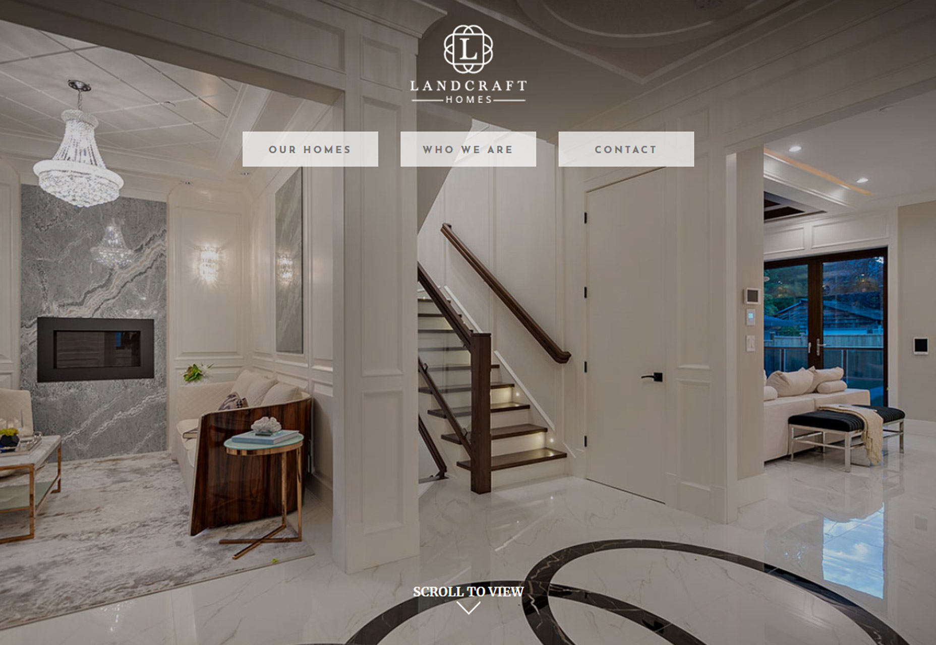
2. New Take on Split Screens
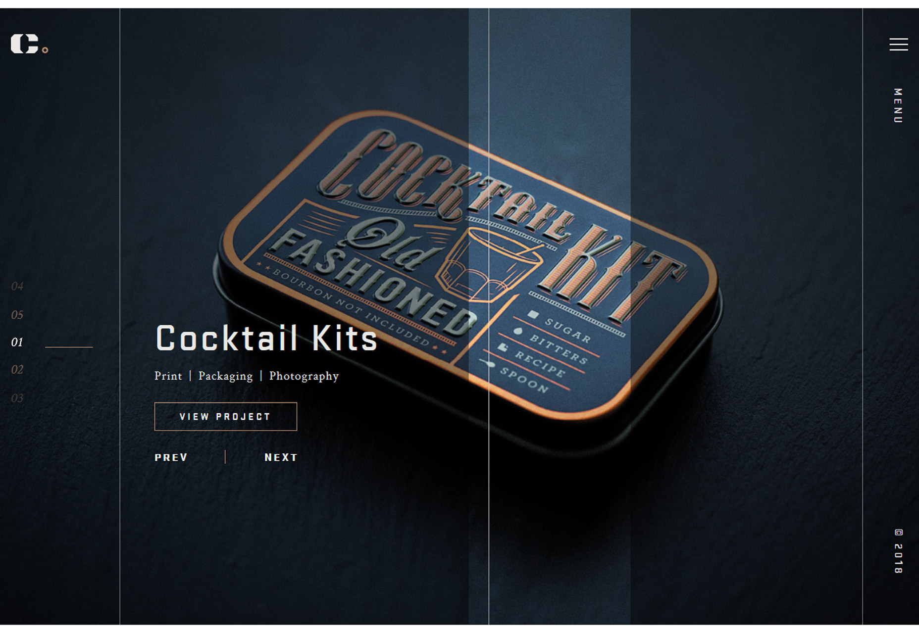
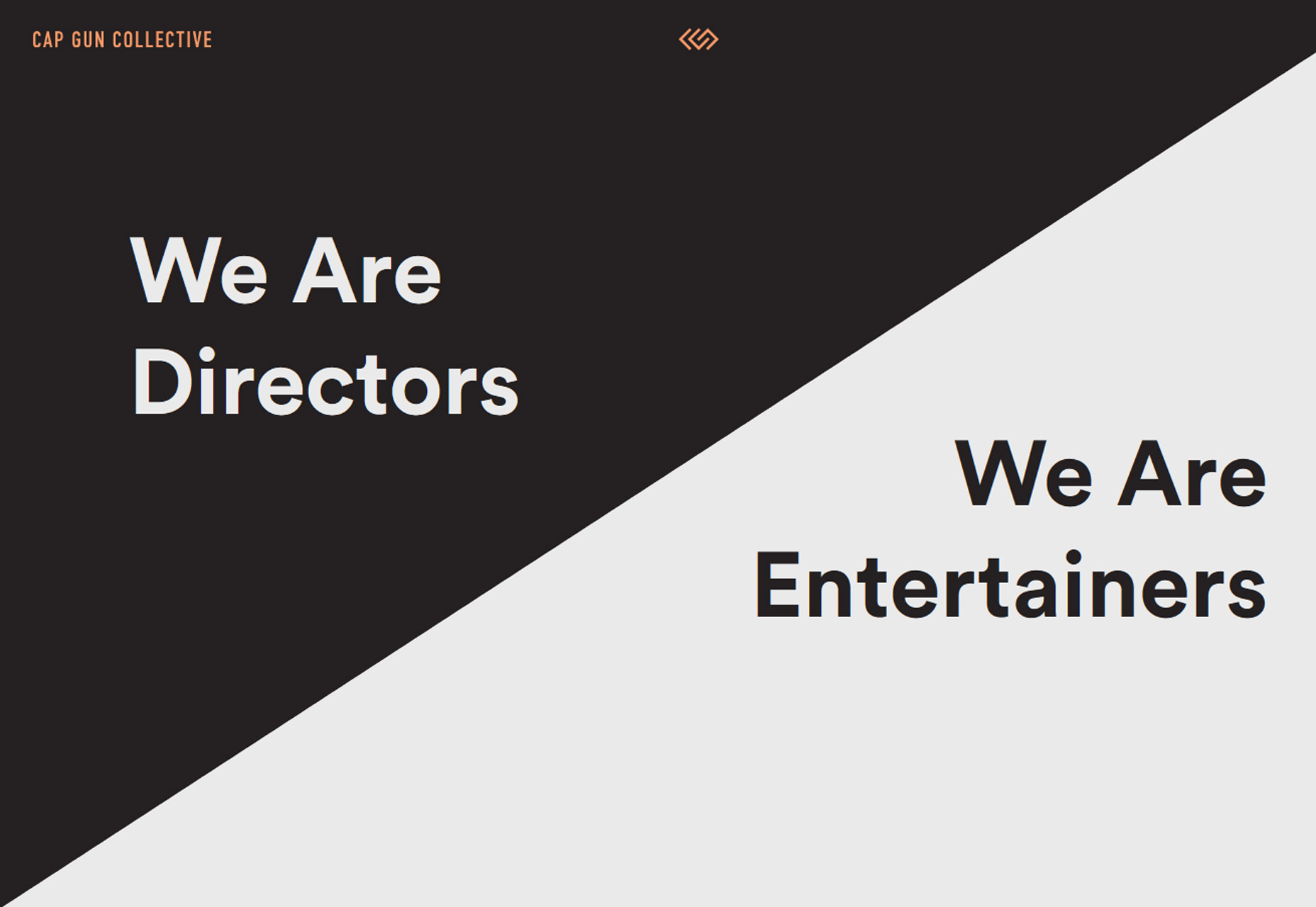
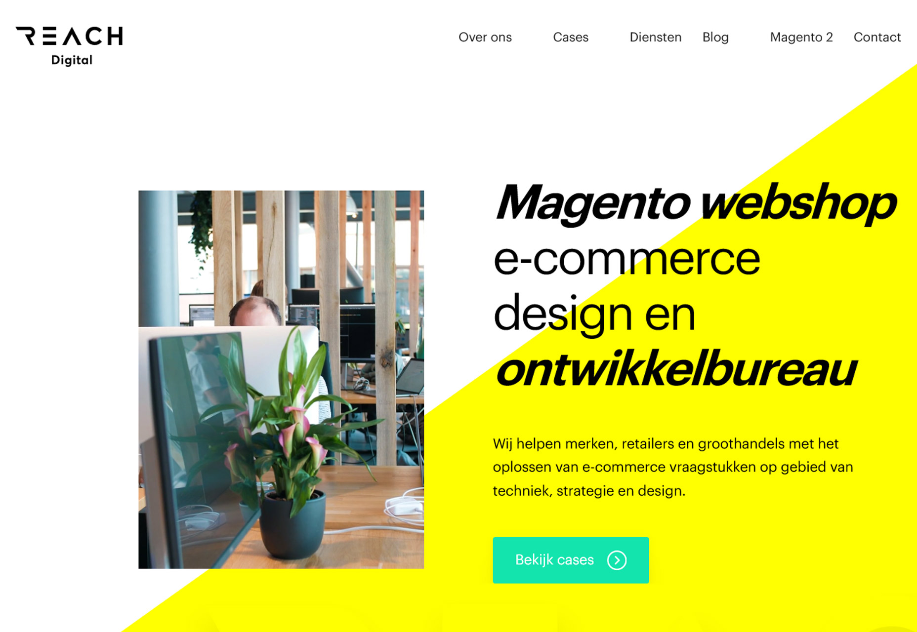
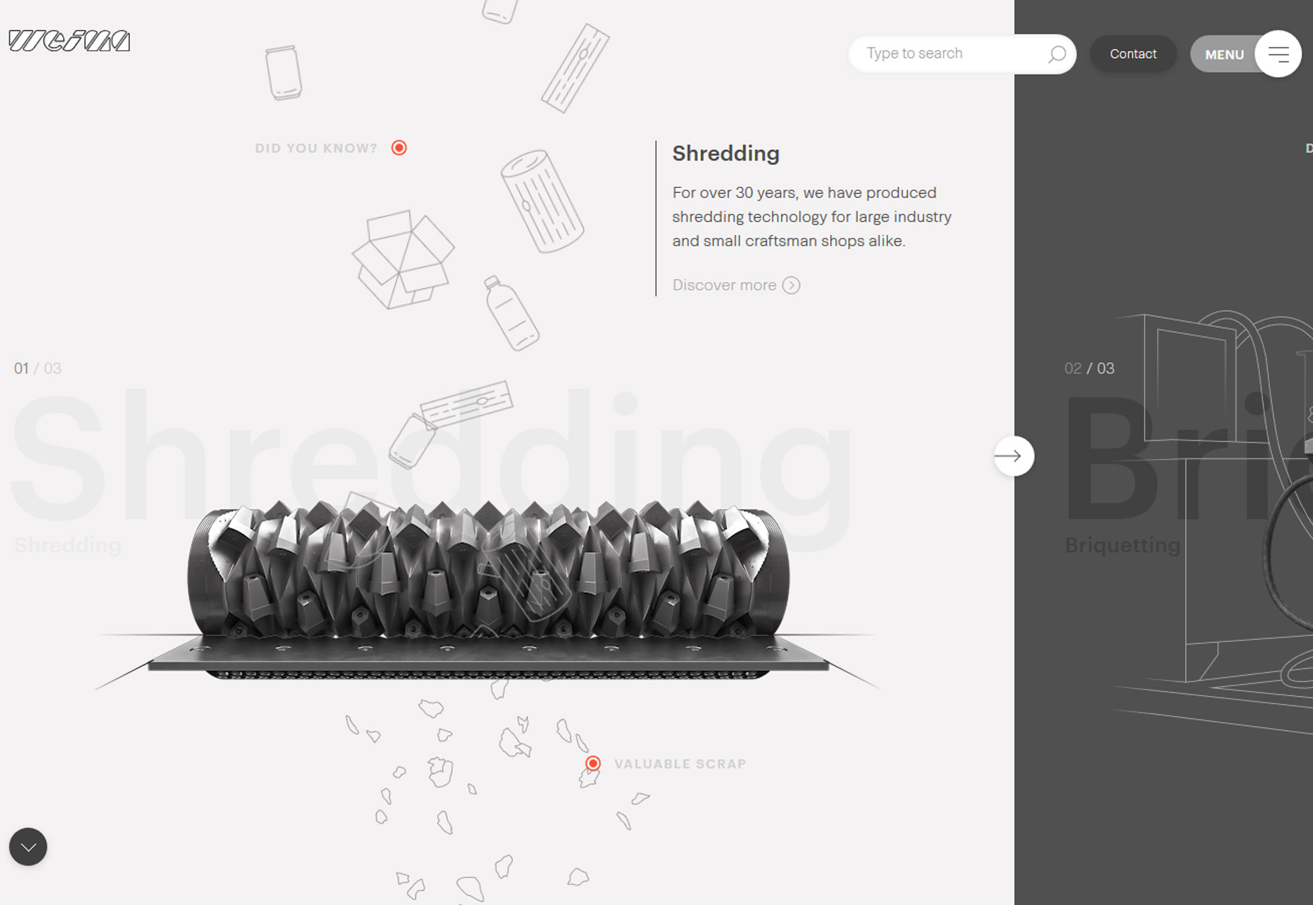
Split-screen designs are something that we’ve noted in the trend category a few times at Webdesigner Depot – in the February version of this roundup and in a layout trends post as far back as 2015.The great thing about split screen designs is that they work with the responsive format beautifully. You get double content on desktop and stacked content on mobile screens. Regardless of device, the user doesn’t feel like he or she missed out on anything by changing device type.The function and form of split-screen designs hasn’t changed all that much, but there has been a shift to more asymmetrical and diagonal split screens. The simple change to the aesthetic (while maintaining the great functionality of dual-content design elements) is attention-grabbing and worth trying. From the bright white and yellow combination of Reach Digital to the simple black and white style of Cap Gun Creative to the quarter-panel split by Weima, each of the alternative spits is a little more interesting than the perfectly symmetrical splits that have dominated this trend for a few years. The nice thing about split-screen projects is that they can work with almost any type or amount of content. From small sites to masses of content, a split screen gives users a choice when it comes to how and what to engage with first in the design. Split-screen options provide a “this or that” user experience, engaging users as they make a binary choice while interacting with content along the way. It’s easy to understand from a user perspective and highly functional.
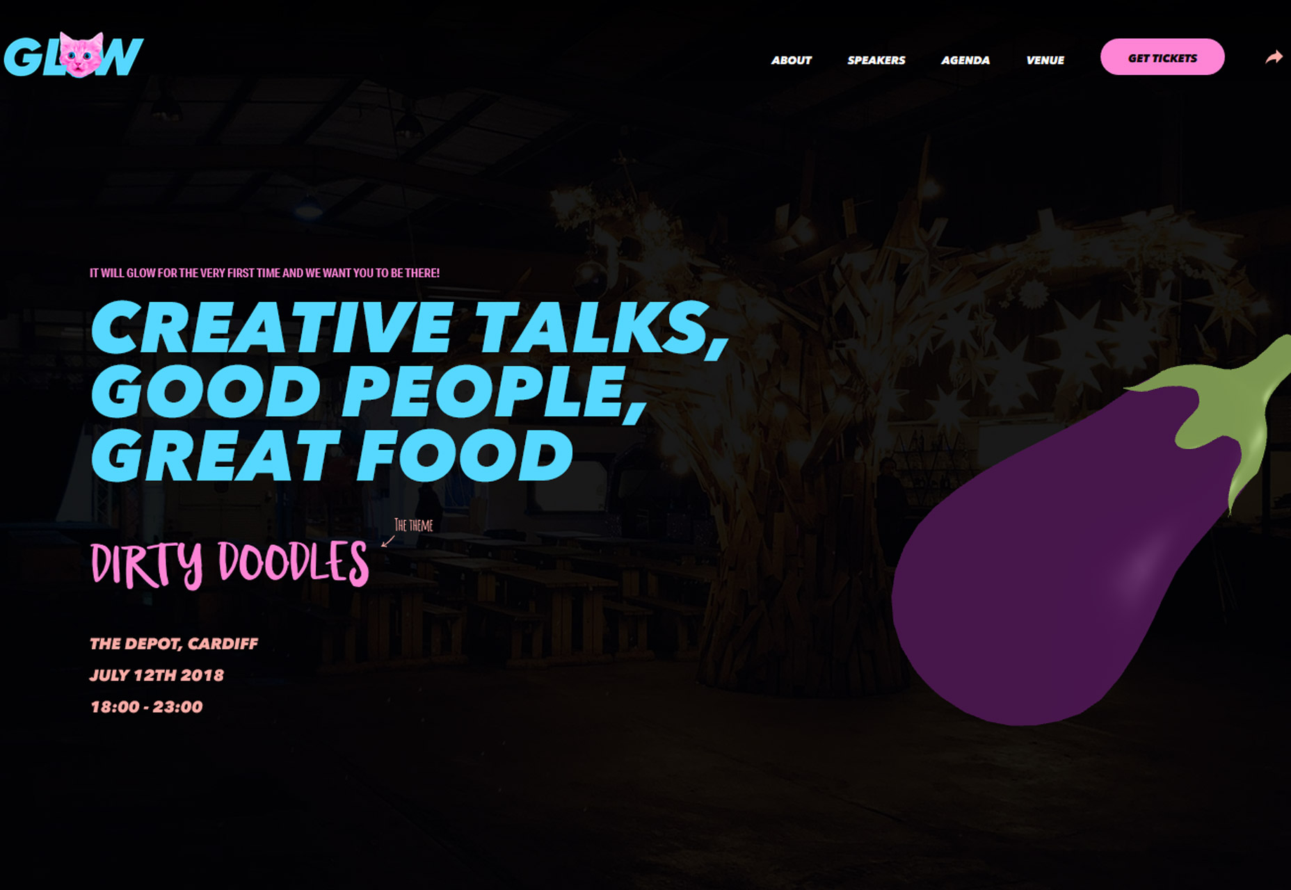
3. Color Overlays with Minimal Transparency
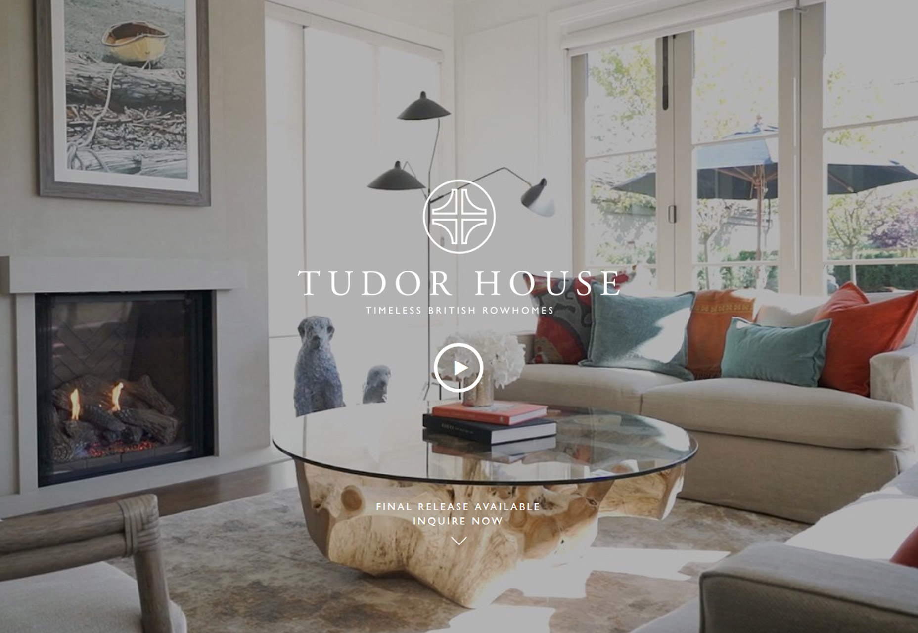
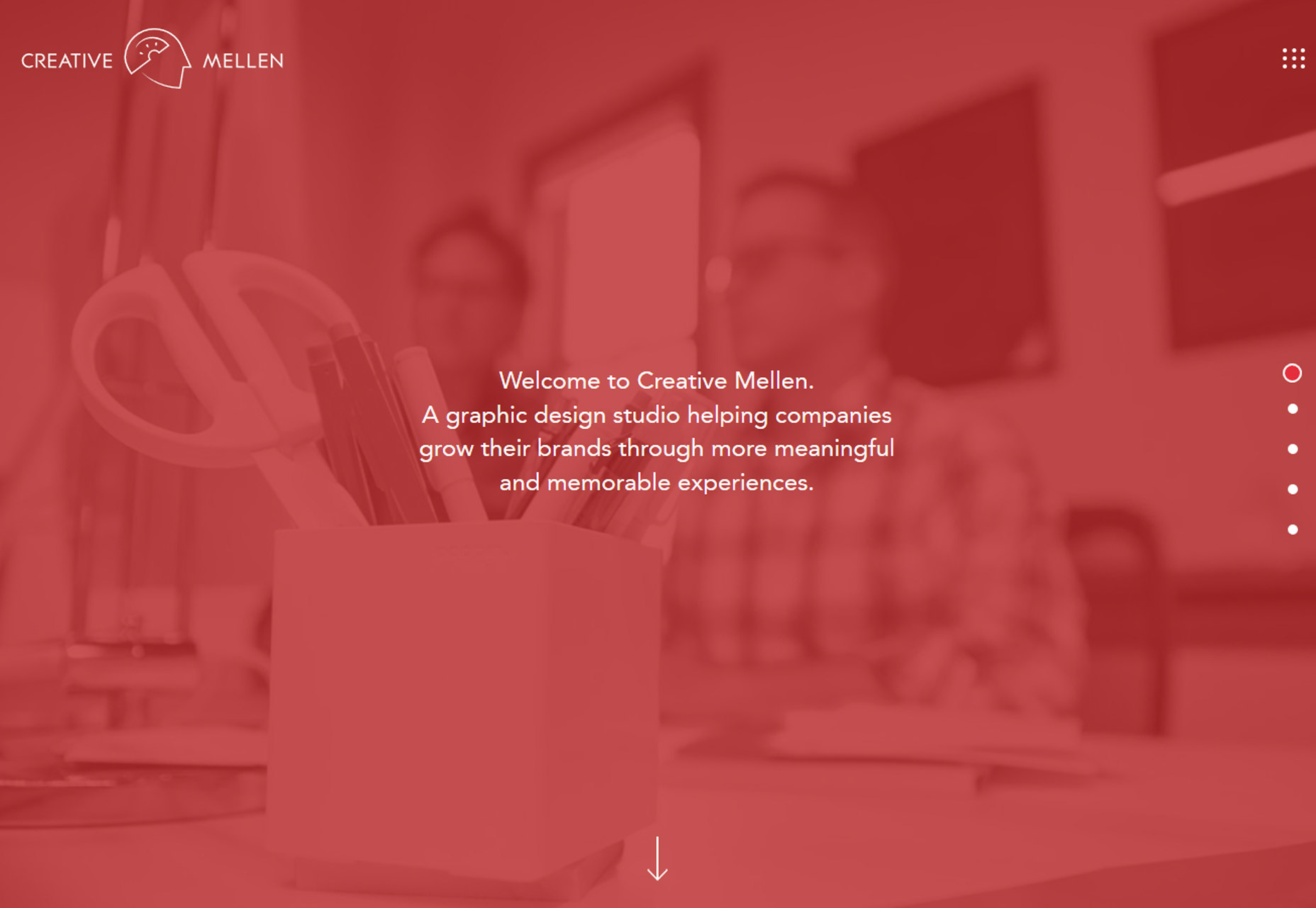
Another trend that’s become overwhelmingly popular is using a color overlay with transparency over photos or video. The technique is popular because it helps create a layering effect that can make it easier to include text and other elements on top of images with a more consistent level of color contrast. Designers are pushing the envelope with transparency options here so that the background element is hard to see at a glance. In each of the examples below, you really have to look closely to figure out what is happening in the image or how it pertains to the design. Two observations about this trend:- It looks pretty cool at a glance. There’s enough texture and depth from the overlay to have more visual interest than a single background color.
- But … you lose any sense of what information the image contains. The transparencies are too “thick” to clearly discern the image without a lot of “work.” (And we know casual website users aren’t going to work to understand content.)
Conclusion
Pushing trend forward is a lot of fun and one of the things that can keep design fresh and eliminate that uniform look that sometimes happens when a technique gets too popular. How do you feel about these evolutions in design? Would you use them? What trends are you loving (or hating) right now? I’d love to see some of the websites that you are fascinated with. Drop me a link on Twitter; I’d love to hear from you.Carrie Cousins
Carrie Cousins is a freelance writer with more than 10 years of experience in the communications industry, including writing for print and online publications, and design and editing. You can connect with Carrie on Twitter @carriecousins.


Read Next

15 Best New Fonts, July 2024
Welcome to our monthly roundup of the best fonts we’ve found online in the last four weeks. This month, there are fewer…
By Ben Moss

20 Best New Websites, July 2024
Welcome to July’s round up of websites to inspire you. This month’s collection ranges from the most stripped-back…

Top 7 WordPress Plugins for 2024: Enhance Your Site's Performance
WordPress is a hands-down favorite of website designers and developers. Renowned for its flexibility and ease of use,…
By WDD Staff

Exciting New Tools for Designers, July 2024
Welcome to this July’s collection of tools, gathered from around the web over the past month. We hope you’ll find…

3 Essential Design Trends, July 2024
Add some summer sizzle to your design projects with trendy website elements. Learn what's trending and how to use these…

15 Best New Fonts, June 2024
Welcome to our roundup of the best new fonts we’ve found online in the last month. This month, there are notably fewer…
By Ben Moss

20 Best New Websites, June 2024
Arranging content in an easily accessible way is the backbone of any user-friendly website. A good website will present…

Exciting New Tools for Designers, June 2024
In this month’s roundup of the best tools for web designers and developers, we’ll explore a range of new and noteworthy…

3 Essential Design Trends, June 2024
Summer is off to a fun start with some highly dramatic website design trends showing up in projects. Let's dive in!

15 Best New Fonts, May 2024
In this month’s edition, there are lots of historically-inspired typefaces, more of the growing trend for French…
By Ben Moss

How to Reduce The Carbon Footprint of Your Website
On average, a web page produces 4.61 grams of CO2 for every page view; for whole sites, that amounts to hundreds of KG…
By Simon Sterne

20 Best New Websites, May 2024
Welcome to May’s compilation of the best sites on the web. This month we’re focused on color for younger humans,…