

Is a Minimalist Website for You?
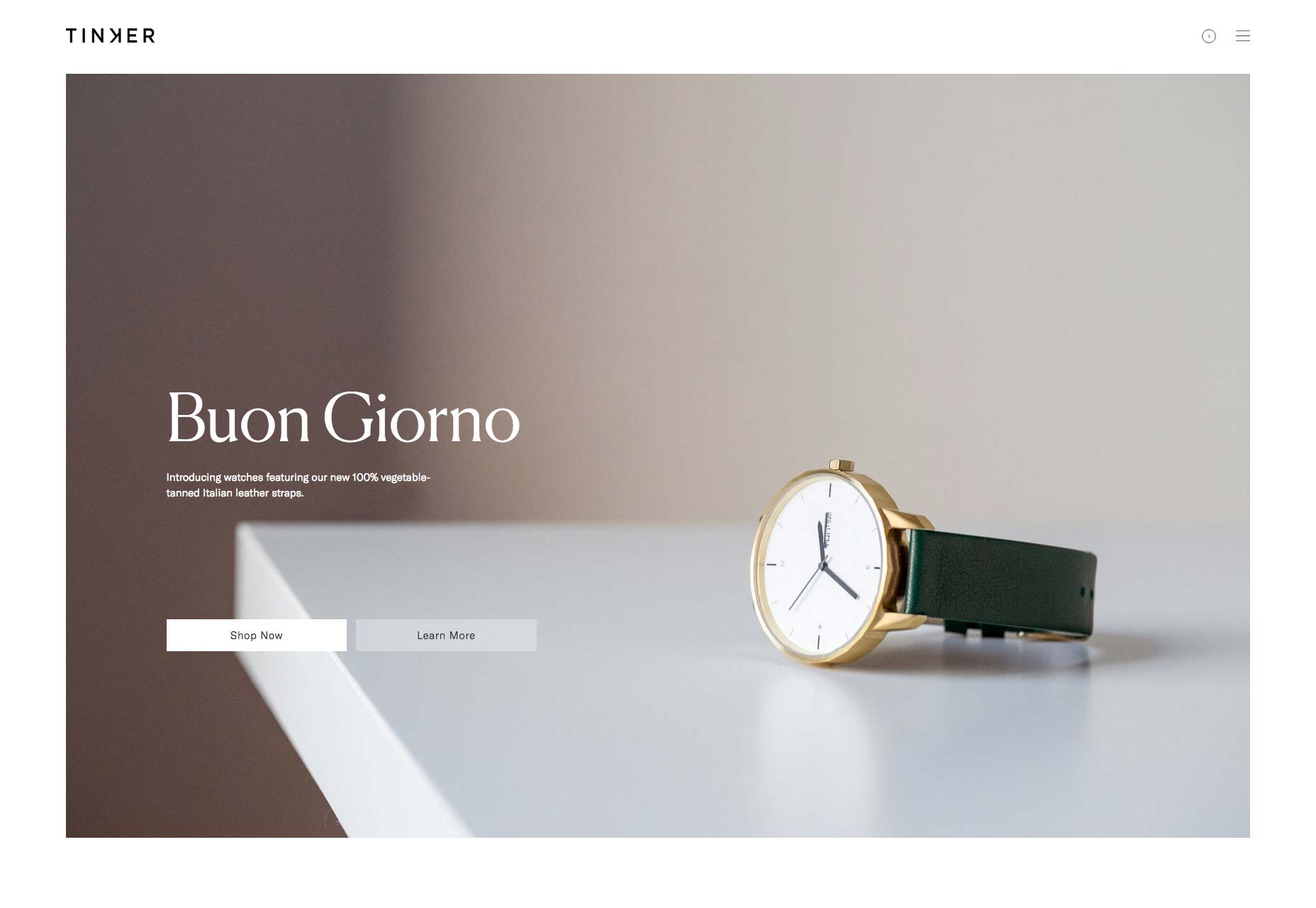
Minimalist websites can be a little like designer clothes: they look great on models, but when you try and squeeze your own body into them, you might find you lack the space to really express yourself. For web designers, this can leave something of a dilemma when it comes to dealing with clients, who inevitably like the look of the sleek designs on offer but usually have different ideas about what they want to say about their product. Often, they end up with a slick homepage, and make up for that with wordy ‘about’ and ‘services’ sections that explain in detail what they do. This is a reasonable compromise, but it’s the equivalent of wearing an Armani tie with a ‘regular cut’ shirt and comfy slacks: you’re not going to win any style awards. The fact is, organizations which sell a specific, technical service need to be able to tell people about it. They might have to settle for the tie, or not go down the designer route at all. But website designs that place a premium on the visual are suitable for a surprising variety of clients, if the words you do have space for are made to count. Obvious examples include:- Businesses selling physical items which can be photographed. If it’s something that’s being sold on its looks—such as clothes or furniture, for example—then it really makes sense to let the images do the talking. Just look at this elegant site selling watches.
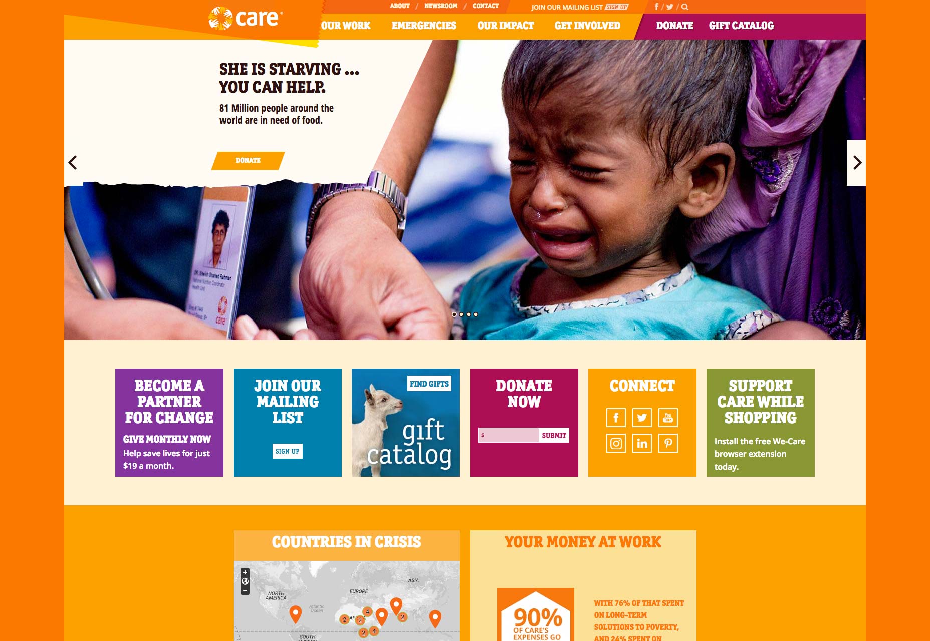
- Organisations which have a simple idea, goal or product. If it can be summarized in few words, it’s arguably better to do so in a short but high impact way, rather than filling a site with waffle. “She is starving, you can help”, for example.
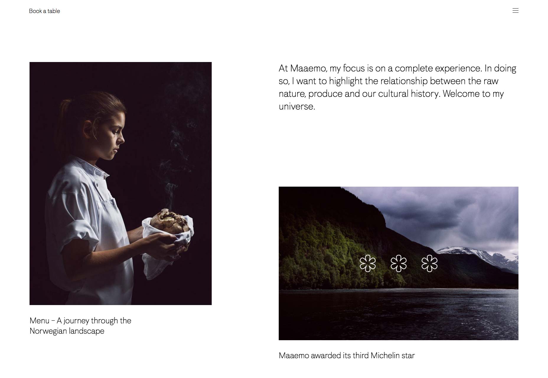
- Organisations whose service is too complicated, abstract of tailored to describe within the confines of a website. This is a surprisingly large category in the modern marketplace: think law firms, PR agencies or accountancy firms, or even better, an avant garde restaurant.
Use Bespoke Images
Images only speak when they’re good. Not only that, when you’re relying on them to tell a story, they must be relevant. Therefore, it’s unlikely that you’ll have a set of stock images that is truly suitable for a great visual website that is also functional. The first category of businesses highlighted above is unlikely to have a problem supplying images of its products. Indeed, retailers will often take the lead when it comes to setting out their wares with suitable style and a unifying theme. Others may need convincing of the need to hire a photographer. You will need to convince them that this is a suitable investment in creating a powerful online brand image. You will also need to find a photographer that understands that, and brief them thoroughly on the ideas and concepts you are hoping to portray.Craft Stunning Sentences
A retail site might be able to get away with nothing but simple text, but if you’re creating a site that needs to get a message across, you’ll need a few short sentences floating effortlessly on the pages to guide the visitor through the site. Just as an image can be worth a thousand words, so can a short sentence. Ideally, you should concentrate on a single, powerful concept. This will essentially be your clients selling point. If they are a law firm, the concept they project could be ‘we are experts’. For accountants, it could be the more direct: ‘we can save you money’. You can get away with focusing on different concepts for each section of the site, but beware of straying too far from what is known as ‘the power of one’: that single idea, in sharp focus, which is more compelling to people than a complicated set of rules, concepts or services. In this in-depth article about how the power of one was used to ignite the Arab Spring in Egypt, the common thread of the “most contagious” messages are identified as: simplicity, unexpectedness, specificity, credibility, emotion and personal narratives. Ideally, your sentences will appeal to customers on an emotional level carefully pitched to consider the raw psychological need the company is selling to. When you think about it, almost everyone is selling reassurance, happiness or hope. Surprise people by offering them that as confidently as you can.Words Should Add to the Images
You also need to think about what aspect of a brand, story or ethos you want to tell in images, and what side will be better with a few powerful words. Sometimes, both will target the same need, desire or emotional selling point. But arguably, that is an unnecessary repetition, and the words should add a new aspect to the imagery. Charities in particular are already good at striking this balance, with third sector websites finding ways to push the public’s emotional buttons with a combination of high quality imagery, words and design. For example, this Charity: Water site is both slick and informative. It would have been easy for the charity to have gone down the avenue of telling compelling human stories in depth, but it decided to do that purely through the images. The smiling children and the parched landscape behind are informative and evocative. The words concentrate on the very simple premise of the charity, and lead directly to a button for donations: “100% of your money brings clean water to people in need. You can transform lives for families around the world. Every single penny will help bring clean water to communities in need.” In 31 words and a number, they’re selling happiness, or if you’re a cynic, redemption. It’s short, powerful, and leaves room for great web design.Dominic Jeff
Dominic Jeff is a journalist and copywriter who has worked on The Scotsman, Scotland on Sunday and the Plymouth Herald. Since leaving the newspaper industry in 2015, he has worked closely with award-winning PR agencies and ambitious early-stage companies to produce great websites, exciting press releases, and closely-followed blog series. His own writing can be seen at www.dominicjeff.co.uk


Read Next

15 Best New Fonts, July 2024
Welcome to our monthly roundup of the best fonts we’ve found online in the last four weeks. This month, there are fewer…
By Ben Moss

20 Best New Websites, July 2024
Welcome to July’s round up of websites to inspire you. This month’s collection ranges from the most stripped-back…

Top 7 WordPress Plugins for 2024: Enhance Your Site's Performance
WordPress is a hands-down favorite of website designers and developers. Renowned for its flexibility and ease of use,…
By WDD Staff

Exciting New Tools for Designers, July 2024
Welcome to this July’s collection of tools, gathered from around the web over the past month. We hope you’ll find…

3 Essential Design Trends, July 2024
Add some summer sizzle to your design projects with trendy website elements. Learn what's trending and how to use these…

15 Best New Fonts, June 2024
Welcome to our roundup of the best new fonts we’ve found online in the last month. This month, there are notably fewer…
By Ben Moss

20 Best New Websites, June 2024
Arranging content in an easily accessible way is the backbone of any user-friendly website. A good website will present…

Exciting New Tools for Designers, June 2024
In this month’s roundup of the best tools for web designers and developers, we’ll explore a range of new and noteworthy…

3 Essential Design Trends, June 2024
Summer is off to a fun start with some highly dramatic website design trends showing up in projects. Let's dive in!

15 Best New Fonts, May 2024
In this month’s edition, there are lots of historically-inspired typefaces, more of the growing trend for French…
By Ben Moss

How to Reduce The Carbon Footprint of Your Website
On average, a web page produces 4.61 grams of CO2 for every page view; for whole sites, that amounts to hundreds of KG…
By Simon Sterne

20 Best New Websites, May 2024
Welcome to May’s compilation of the best sites on the web. This month we’re focused on color for younger humans,…