Uber Unveils Simple New Rebrand

A little less than three years ago, Uber rebranded as the cab-service of choice for dystopian sci-fi pac-man fans. It was a move reportedly intended to recast the startup as the choice of every day people; it actually stripped the brand of all personal connections.

This week, a little less than three years longer than it should have waited, Uber have unveiled a far more coherent, far more appealing identity.
Designed by the “Uber Brand Experience” team alongside Wolff Olins, the rebrand does an excellent job of correcting the obvious deficiencies in the previous identity.
As a corporation—they’re really no longer a startup—Uber is globally recognized; from name-drops in Netflix series, to street signs in Rome (mis)informing potential customers of heavy fines for using the service, you’ll struggle to find anyone who doesn’t have some idea of what Uber is, and what Uber does. This despite the fact that until now they had an underwhelming visual identity.
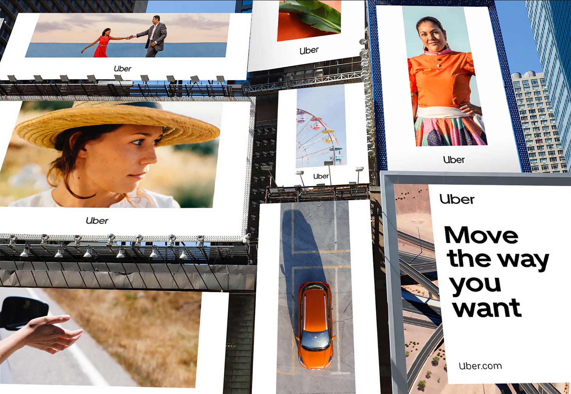
The biggest issue for Uber’s expansion has been an identity that worked globally. The old approach was to be adaptable to local cultures, the new approach is to be so simple that it works anywhere.
Uber’s global arrow icon
Central to the rebrand is a new logotype. And yes, as you feared, it’s based on a geometric sans-serif. (For anyone not au fait with type classifications, it’s the same style recently adopted by Google, Opera, Airbnb, Mastercard, et al.)
At first glance the Uber logotype is a little unbalanced, the weight on the left making it appear to rotate counter-clockwise. On closer inspection, it’s not the spacing, but the density caused by the proximity of the stems on the ‘U’ and the ‘b’ and specifically the lowercase style terminal on the uppercase ‘U’. What’s that doing there? Is it…does the whitespace…is it…a…road? If so, they must be gutted they didn’t name the company “Uiber”.
Having spent some time with the logotype, it’s growing on me. It doesn’t feel as effortless as I’d like, but it feels utilitarian which is a positive step away from Uber’s early exclusivity.
Designed alongside the logotype the company has commissioned a new typeface from LA-based studio MCKL. Named ‘Uber Move’ it does an excellent job of tying the brand materials together.

Uber’s custom typeface, Uber Move
Uber is adopting the color black—already heavily utilized in its previous branding—which alongside white replaces most color in the company’s communications. ‘Safety Blue’ has been introduced to call out important elements, ironically calling to mind Mirror’s Edge (in which you traverse a metropolis on foot). There is also scope for a few muted colors, but their inclusion feels less practical, than boardroom placating.
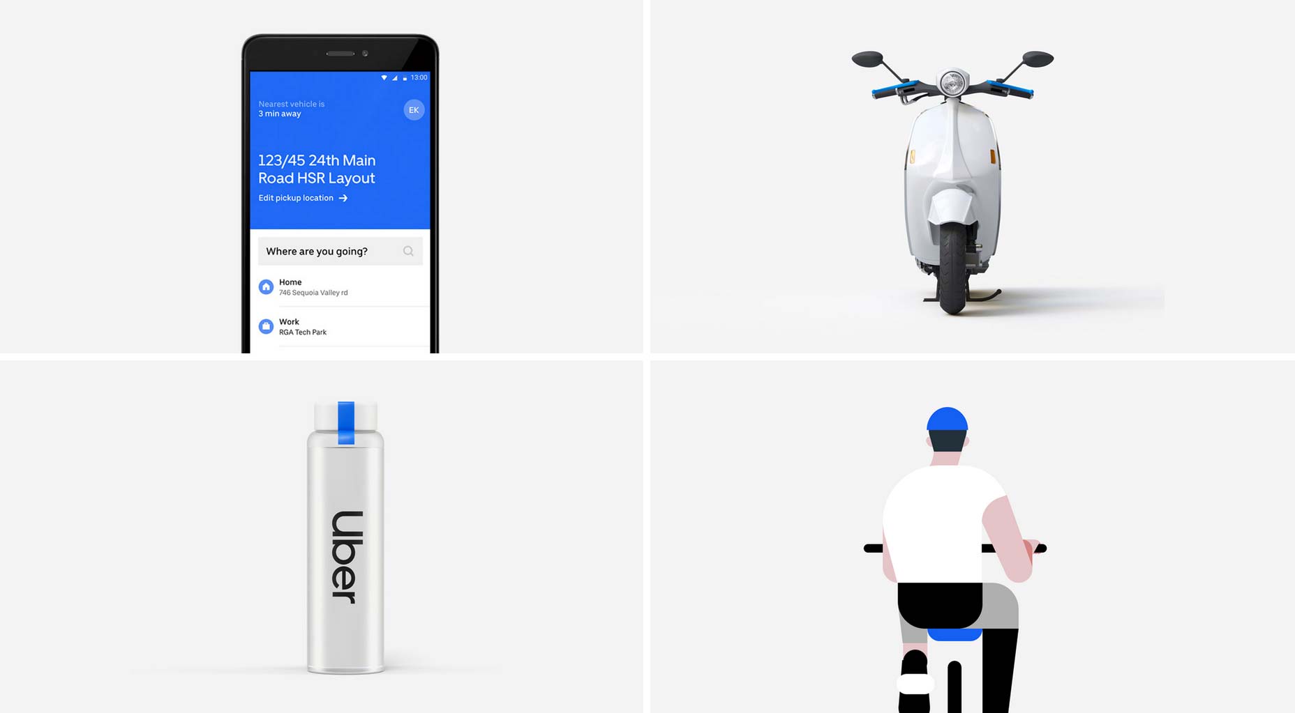
Uber’s ‘Safety Blue’ palette
On top of the other elements, Uber is introducing a new u-shaped frame. Adaptable, subtle, yet distinct, the frame can be repurposed in a number of ways, either in white, or as a mask for photo elements.
Uber’s new u-frame
As Uber moves away from cars alone, and towards bikes, tuk-tuks, and aircraft, it needs a simple, positive, robust identity. This rebrand is a brave, and probably successful, attempt to deliver that.
Ben Moss
Ben Moss has designed and coded work for award-winning startups, and global names including IBM, UBS, and the FBI. When he’s not in front of a screen he’s probably out trail-running.


Read Next

15 Best New Fonts, July 2024

20 Best New Websites, July 2024

Top 7 WordPress Plugins for 2024: Enhance Your Site's Performance

Exciting New Tools for Designers, July 2024

3 Essential Design Trends, July 2024

15 Best New Fonts, June 2024

20 Best New Websites, June 2024

Exciting New Tools for Designers, June 2024

3 Essential Design Trends, June 2024

15 Best New Fonts, May 2024

How to Reduce The Carbon Footprint of Your Website
