

The Good and Bad of Design Patterns
By definition, design patterns are established solutions to recurring problems. So for nearly any user interface designer, established patterns can be tremendously useful. For example, positioning the login call to action at the upper right hand corner of the navigation is a classic UI design pattern. People know to look in that area of an interface, because they’ve used the same behavior to log in or check their profile for years. You can see the pattern in use on the Interaction Design Foundation site: …and on LinkedIn:
 …and The New York Times:
 As I highlighted earlier, people enjoy the familiar. When an interface matches the user’s expectations, it reduces cognitive load, saves the user time, and makes the software more intuitive. That’s what gives these conventions lasting power.
What’s more, patterns have a number of advantages for your design process.
As I highlighted earlier, people enjoy the familiar. When an interface matches the user’s expectations, it reduces cognitive load, saves the user time, and makes the software more intuitive. That’s what gives these conventions lasting power.
What’s more, patterns have a number of advantages for your design process.
Utilizing a UI Pattern Saves You Time
Because you don’t have to design an interface from scratch, you’ll be able to move more quickly to testing and iterating your design.You’ll Be Building on a Solution That Has Worked in the Past
Just like scientists standing on the shoulders of giants, you’ll be standing on the shoulders of, well, designers who solved similar challenges for their audience. But it’s important to remember that patterns are only a starting place. They are models for your design, not fully-realized solutions to your users’ problems.Over-Reliance on UI Design Patterns Can Easily Lead to an Under-Researched Design
That is to say, instead of uncovering a solution that’s optimal for your users, you could settle for what’s ready-made in a design pattern. A lack of innovation, i.e., not tailoring the experience to solve the unique challenges of your users, will just leave your website or product feeling like a collection of templates.Choose the Right Pattern
Before you start customizing patterns, make sure you select the right pattern for the job. Yes, design patterns are usually reliable solutions to recurring problems, but if you don’t choose the right one your design could actually reduce clarity for your audience. There’s a simple solution. There are a number of repositories that offer examples of important design patterns. For example, ui-patterns.com organizes interface patterns by category, provides examples, and explains the rationale of each solution.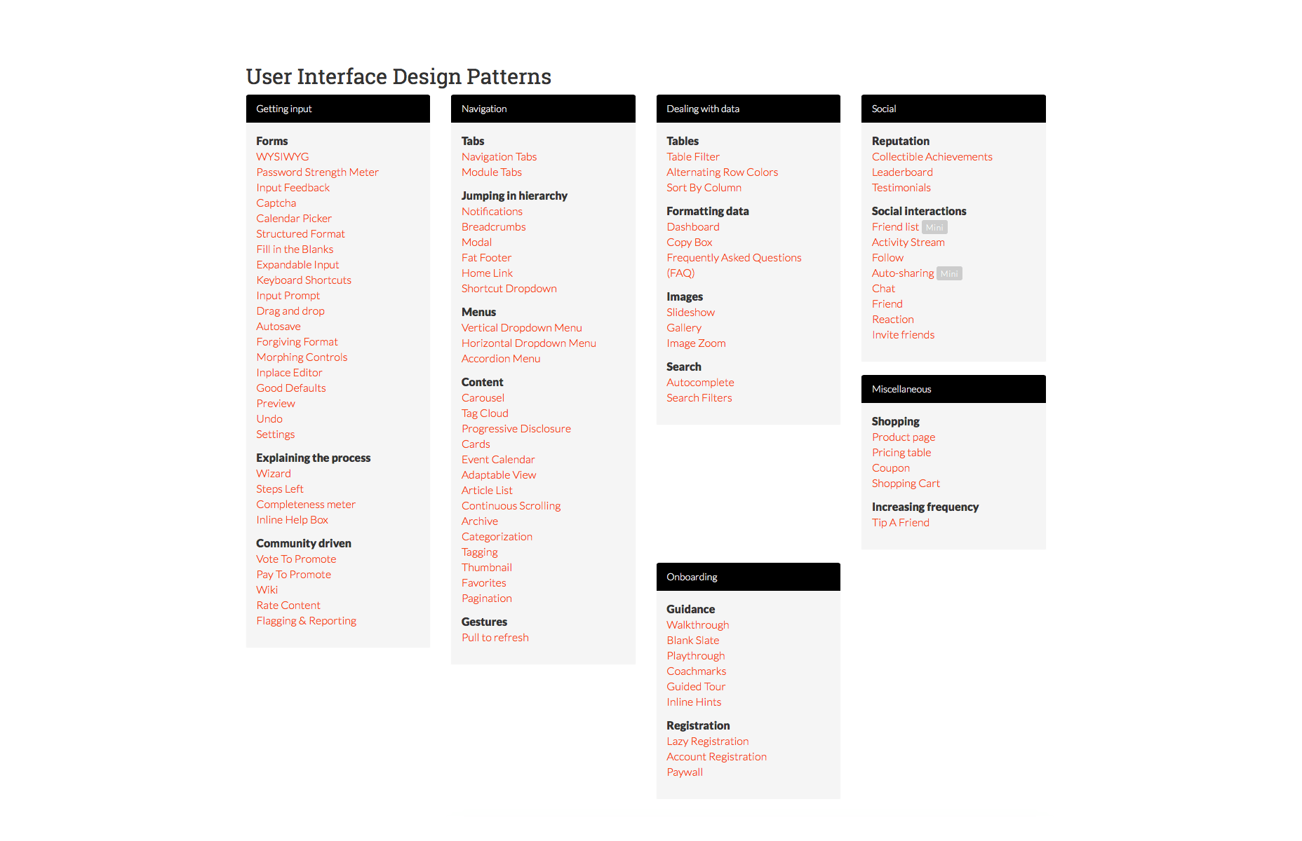 Side note: if you’ll be working on the same project (or working at the same company) for the foreseeable future, it’s wise to start building your own pattern library.
How to Innovate for Your Audience
Once you have your patterns in place, it’s time to move from the vanilla design pattern to an interface that’s optimized to help your audience accomplish their goals. To be clear, innovation in this context often means specific changes in a few parts of the interface. The fundamental design still fits a pattern, but new ideas are added to better help your users comprehend the interface, satisfy their needs, and accomplish their goals. Austrian physicist Erwin Schrodinger articulated the challenge best when he said:The task is, not so much to see what no one has yet seen; but to think what nobody has yet thought, about that which everybody sees.Of course, to do this, you must deeply understand the needs of your audience. We use a number of techniques that help us build deeper empathy with the audience and identify original functionality or UI elements that need to be added to a pattern. Here are two of our favorite techniques:
Mental Models
A mental model refers to an established belief someone has about how a system should look or function. This principles manifests when people find something challenging to use because the interface doesn’t function as they have already decided it should. Often, there’s a sizable disparity between how designers perceive a product or website and how users perceive the same experience. This is discrepancy is a common pathway to poor design. Snapchat learned the hard way when its 2018 redesign didn’t match the mental model its users had established based on the old design. Naturally, research is the best way to uncover what’s on your users’ minds. Usability testing — specifically where people verbalize what they’re thinking as they interact with your site — can be an excellent method for uncovering someone’s mental model of how they expect your site to perform. Similarly, card sorting, where users group types of data based on categories, can help you understand where in the interface people expect to find content. For example, Lyft utilized people’s mental models to design their UI.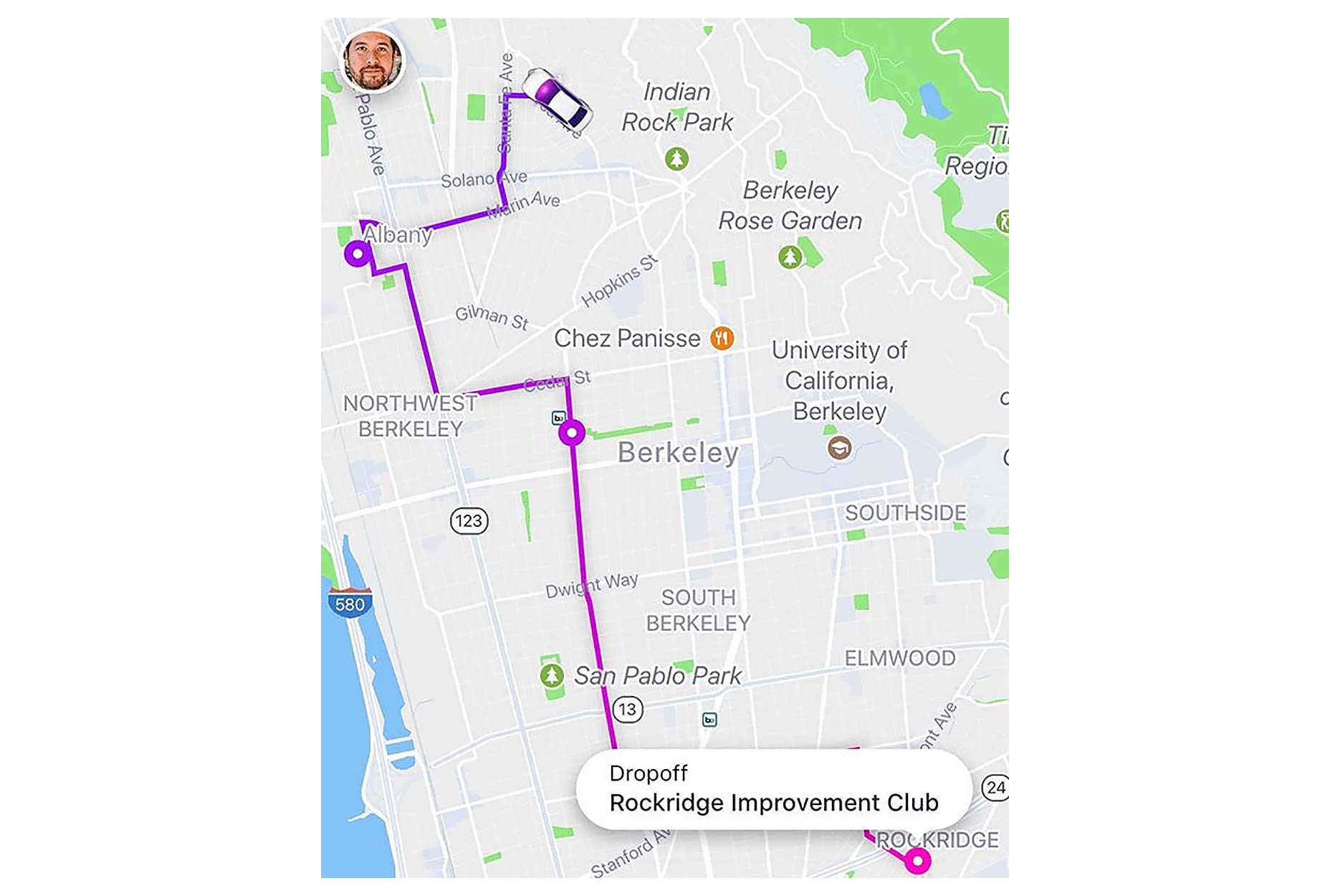 Their users were already familiar with navigation interfaces like Google Maps, so Lyft mirrored that convention and innovated based on the needs of the audience — like visualizing where drivers are located before and during the ride.
Empathy Maps
An empathy map is a qualitative research method that visualizes specific needs and actions of your users. Using data collected from user interviews, surveys, and field studies, empathy maps typically categorize user needs in four sections: Says, Thinks, Does, and Feels. Synthesizing research in this way is an excellent method for uncovering conflicts between the quadrants — for example what users feel versus what they do. These conflicts will help you identify what elements to highlight in your UI design based on the friction or gaps uncovered on the empathy map. This insight is useful in any circumstance, but particularly when you’re designing enterprise UX, where they are a lot of environmental constraints and conflicting priorities. Earlier this year, we utilized empathy maps to innovate the design of a fleet management application for a marine transport company. (Yes, it was as complex as it sounds.)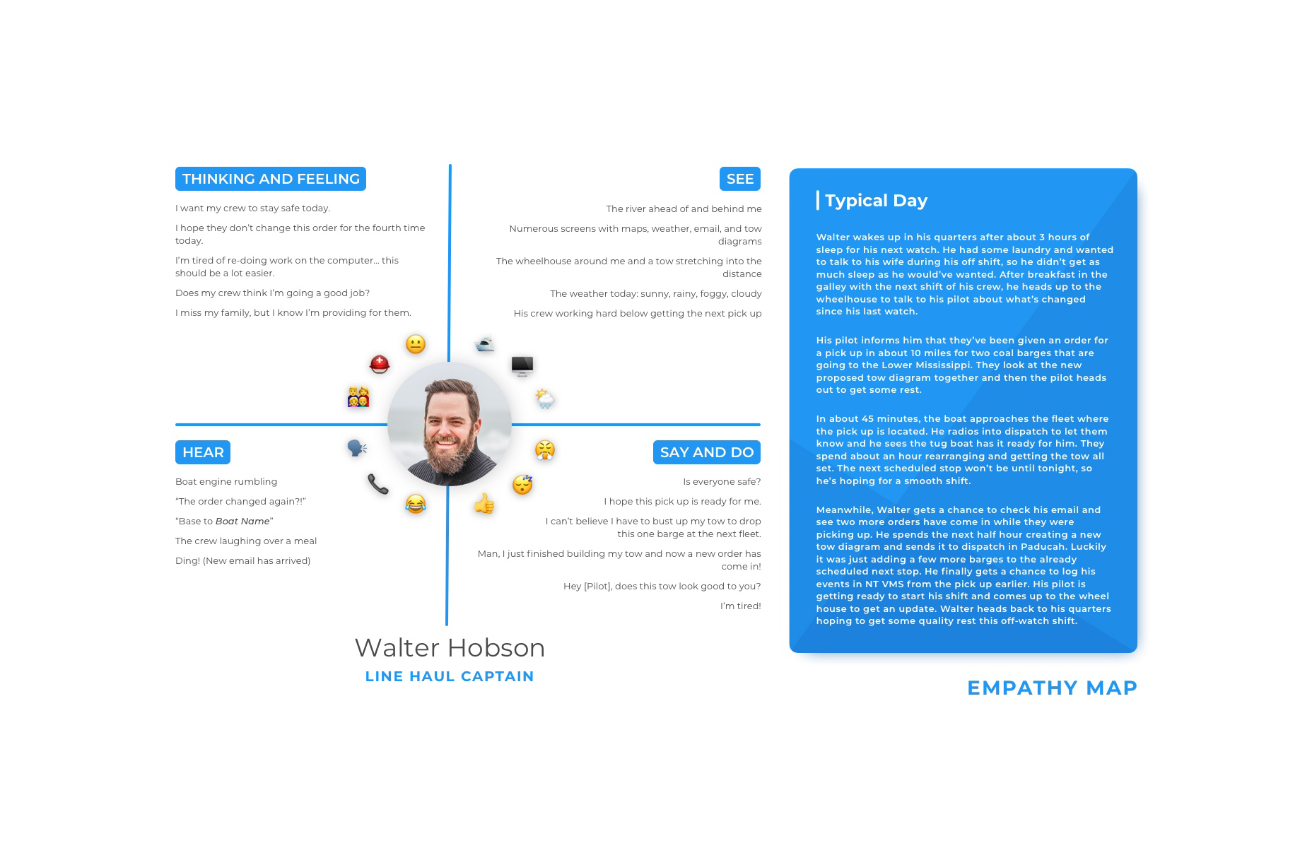 After we conducted our research, the empathy map revealed how much time the line haul captains needed to spend watching the river. So our designers knew that our application would only have a very limited amount of their attention.
By referencing what the line haul captains were seeing versus what they were thinking, our design team intuited that the interface had to have very large CTAs at the top of the screen to make the user’s cognitive load as small as possible.
The design was so popular that the line haul captains applauded when we presented the design for the new application.
It may not sound pioneering, but those small design innovations totally optimized the way they worked.
After we conducted our research, the empathy map revealed how much time the line haul captains needed to spend watching the river. So our designers knew that our application would only have a very limited amount of their attention.
By referencing what the line haul captains were seeing versus what they were thinking, our design team intuited that the interface had to have very large CTAs at the top of the screen to make the user’s cognitive load as small as possible.
The design was so popular that the line haul captains applauded when we presented the design for the new application.
It may not sound pioneering, but those small design innovations totally optimized the way they worked.
Conclusion
People like what’s familiar, but they also covet what’s uniquely useful. To add innovations that bridge the gap, it’s best to start with a design pattern and let your user research guide you to the innovations that will best equip your audience to complete their goals. Lyft screenshot via flickr user Buster Benson. Featured image via DepositPhotos.Zach Watson
Zach Watson is the DIrector of Content for DePalma Studios. His writing has been featured in publications like Entrepeneur, Invision, and Hubspot. Zach is a judicious coffee drinker and infrequent outdoorsman.


Read Next

15 Best New Fonts, July 2024
Welcome to our monthly roundup of the best fonts we’ve found online in the last four weeks. This month, there are fewer…
By Ben Moss

20 Best New Websites, July 2024
Welcome to July’s round up of websites to inspire you. This month’s collection ranges from the most stripped-back…

Top 7 WordPress Plugins for 2024: Enhance Your Site's Performance
WordPress is a hands-down favorite of website designers and developers. Renowned for its flexibility and ease of use,…
By WDD Staff

Exciting New Tools for Designers, July 2024
Welcome to this July’s collection of tools, gathered from around the web over the past month. We hope you’ll find…

3 Essential Design Trends, July 2024
Add some summer sizzle to your design projects with trendy website elements. Learn what's trending and how to use these…

15 Best New Fonts, June 2024
Welcome to our roundup of the best new fonts we’ve found online in the last month. This month, there are notably fewer…
By Ben Moss

20 Best New Websites, June 2024
Arranging content in an easily accessible way is the backbone of any user-friendly website. A good website will present…

Exciting New Tools for Designers, June 2024
In this month’s roundup of the best tools for web designers and developers, we’ll explore a range of new and noteworthy…

3 Essential Design Trends, June 2024
Summer is off to a fun start with some highly dramatic website design trends showing up in projects. Let's dive in!

15 Best New Fonts, May 2024
In this month’s edition, there are lots of historically-inspired typefaces, more of the growing trend for French…
By Ben Moss

How to Reduce The Carbon Footprint of Your Website
On average, a web page produces 4.61 grams of CO2 for every page view; for whole sites, that amounts to hundreds of KG…
By Simon Sterne

20 Best New Websites, May 2024
Welcome to May’s compilation of the best sites on the web. This month we’re focused on color for younger humans,…