

1. To Make Waiting Less Tedious
Waiting can be frustrating, and waiting for computers to do, “whatever they’re doing now, Gaaawwd!”, can be extra infuriating at times. That’s why God invented the loading icon. [pullquote]distract the eyes with a spinny-thing, while reassuring the brain that something is happening behind the scenes[/pullquote] Loading and waiting icons, particularly the ones that don’t function as actual progress bars, are perhaps the oldest example of distraction-to-improve-the-UX. They distract the eyes with a spinny-thing, while reassuring the brain that something is happening behind the scenes… probably. Of course, with time, we’ve developed all sorts of ways to make waiting seem like less of a chore. Simple transitional animations can give the browser a few extra milliseconds to load content from the next page or screen. Some more graphically heavy sites are (and I hate that this is still a thing), using animated splash screens as pre-loaders. Chrome gives you a game to play while you wait for your Internet to come back. Pretty much all solutions involve some sort of animation, if I’m honest. Moving things around on the screen is probably the most effective distraction there is, outside of auto-playing audio. And well… don’t do that.2. To Give New Context to Old Actions
I featured Kutia, a web development agency, in the May 2019 edition of our monthly portfolio showcase for a number of reasons, but mostly because of the way they “trick” the users into going to the contact page. Basically they just ask, “What can we help you with?”, and provide a number of potential answers for people to click on. Answers include things like “I need a new WordPress website”, “I want to sell things online”, and others. All of these answers take them straight to the contact page, but they also give people an idea of what the agency can do for them. It also helps the user to focus on communicating their end goal to the agency. Even when you figure out the trick, it’s helpful enough that I don’t see how anyone could get mad.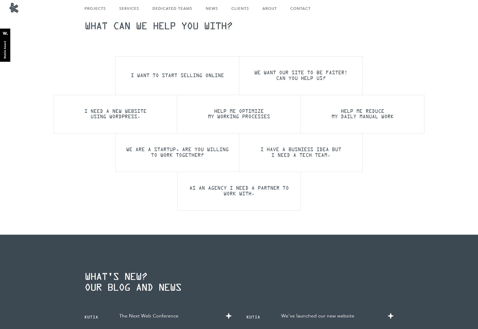
3. To Smooth Over Rough Edges in the Experience
The human eye is a strange and wonderful thing, but it’s not half as crazy as the bits of brain that have to interpret everything your eyes see. The brain filters out a lot of what we actually see to keep us from going nuts, or at least getting very dizzy. Even when you’re only moving your eyeballs, your brain “records” everything you see before your eyes twitch, and everything after. Everything seen while your eyeballs are moving fast is filtered out for your own sake. We can do that with websites, too. Take lazy loading images, for example: It’s a great way to save bandwidth, but then you have to deal with the fact that users will probably see partially or completely empty stretches of website while they scroll. [pullquote]Give them something quick-loading, big, bright, and shiny to look at for a second[/pullquote] Or what about when the content is there, but not all the styles have loaded yet, and your custom typeface is taking a second? A flash of un-styled text is, in my opinion, a lot better than missing text, but it’s still not ideal. There are many ways to make these issues less jarring (with placeholders, and so on), but what about distracting the user? Give them something quick-loading, big, bright, and shiny to look at for a second. Throw in a paragraph for them to read while the first set of images right below the viewport load in advance. If people just don’t see or really notice the rough bits, they may as well not exist.4. To Entertain and Surprise People
This is, of course, the essence of stage magic right here. You distract them so you can surprise them, entertain them, delight them. The problem with this approach is that users generally don’t want to be too surprised by the websites they visit. They just want them to work. An entertaining surprise can be very hard to pull off on the web for the simple reason that most users aren’t there to be wowed. They’re there to get something they need, and get out. “Surprises” are so often the result of bugs or bait-and-switch tactics, that most users would probably prefer that your site behave mostly predictably. However, if you can give them a surprise they actually like, they’ll gladly forgive any tricks you pulled. The problem is that this is rare enough that I actually can’t think of any examples.And That’s Pretty Much It
Look, there really aren’t a lot of good reasons for deceiving people outright, even if it’s only for a moment. By and large, transparency will get you a lot farther than tricks. The only times when it’s even remotely acceptable are those occasions when tricking the user’s brain actually makes their experience smoother, and their day a little better. Anything else is fishy at best. Featured image via Unsplash.Ezequiel Bruni
Ezequiel Bruni is a web/UX designer, blogger, and aspiring photographer living in Mexico. When he’s not up to his finely-chiselled ears in wire-frames and front-end code, or ranting about the same, he indulges in beer, pizza, fantasy novels, and stand-up comedy.


Read Next

15 Best New Fonts, July 2024
Welcome to our monthly roundup of the best fonts we’ve found online in the last four weeks. This month, there are fewer…
By Ben Moss

20 Best New Websites, July 2024
Welcome to July’s round up of websites to inspire you. This month’s collection ranges from the most stripped-back…

Top 7 WordPress Plugins for 2024: Enhance Your Site's Performance
WordPress is a hands-down favorite of website designers and developers. Renowned for its flexibility and ease of use,…
By WDD Staff

Exciting New Tools for Designers, July 2024
Welcome to this July’s collection of tools, gathered from around the web over the past month. We hope you’ll find…

3 Essential Design Trends, July 2024
Add some summer sizzle to your design projects with trendy website elements. Learn what's trending and how to use these…

15 Best New Fonts, June 2024
Welcome to our roundup of the best new fonts we’ve found online in the last month. This month, there are notably fewer…
By Ben Moss

20 Best New Websites, June 2024
Arranging content in an easily accessible way is the backbone of any user-friendly website. A good website will present…

Exciting New Tools for Designers, June 2024
In this month’s roundup of the best tools for web designers and developers, we’ll explore a range of new and noteworthy…

3 Essential Design Trends, June 2024
Summer is off to a fun start with some highly dramatic website design trends showing up in projects. Let's dive in!

15 Best New Fonts, May 2024
In this month’s edition, there are lots of historically-inspired typefaces, more of the growing trend for French…
By Ben Moss

How to Reduce The Carbon Footprint of Your Website
On average, a web page produces 4.61 grams of CO2 for every page view; for whole sites, that amounts to hundreds of KG…
By Simon Sterne

20 Best New Websites, May 2024
Welcome to May’s compilation of the best sites on the web. This month we’re focused on color for younger humans,…