UX For Enterprise: 3 Biggest Challenges (and How to Tackle Them)
When was the last time you created the perfect UX design for an enterprise application? For most (if not all) of us, the answer is “never”. There’s always something we’d like to go back and fix after we design enterprise applications, if only we had the time.

Challenge 1. Giving Users What They Need
When you design an enterprise application, it’s too easy to focus on the aesthetics and flashy features rather than an intuitive, user-friendly UX. But while good looks are important (especially with UX for enterprise apps aimed at brands willing to pay for the most cutting-edge, trendy designs), it shouldn’t be the core focus. You want users to enjoy exploring the app and find its aesthetics pleasant, but it’s vital to remember that functionality is paramount. Users may spend hours upon hours interacting with the app every week, whether it’s a CRM, a billing system or anything else. [pullquote]part of achieving outstanding functionality means giving users what they need rather than what they want.[/pullquote] And part of achieving outstanding functionality means giving users what they need rather than what they want. Speaking to existing or prospective users about what they’d like to see in the final product is a good idea in the early design of an enterprise application. They’ll provide you with clear pointers to aid effective enterprise information architecture and identify what they don’t want, but they also can suggest features that seem appealing yet only go to waste. So, how do you fix this? By analyzing user behavior and determining which functions prove most beneficial or necessary during hands-on tests.- First, invite users to try the application and provide them with a list of tasks to complete. Study them. What features do they use most? What functions do they seem to miss when trying to find a solution?
- Test the app with users from different backgrounds or departments, to see how user-friendly it is for those who may not necessarily have used a similar product before. Do they find navigation easy within seconds? Can they understand how to locate certain features?
- Ask how the design of the enterprise application impacts the user’s experience. Are the colors in the enterprise dashboard design too garish and causing them to strain their eyes? Does the layout and button placement allow for smooth performance and fluid navigation? Try to find a way to make the app’s presentation eye-catching without being a distraction.
Challenge 2. Putting Pride Before Good UX
A strong skill for UX designers to have is being a “feedback wrangler,” according to this post by Suzanne Scacca. And that’s true: embracing user feedback is essential when trying to design high-quality SaaS applications. But it’s not always so easy. The best-designed SaaS products are built on a thorough understanding of the user’s goals, pain points and expectations. That means performing comprehensive testing and inviting users to address issues that could cause problems down the line. The same is true whether you’re focusing on SaaS web design or SaaS products for a small business. [pullquote]The best-designed SaaS products are built on a thorough understanding of the user’s goals, pain points and expectations[/pullquote] But building enterprise applications is hard work. Lots of hard work. And hearing someone tell you it’s not right is incredibly tough. You might feel as if the problems being highlighted “don’t really matter” or “won’t really affect performance too much”. And if users can find a workaround that adds a few seconds onto a task, what’s the big deal? Sadly, that’s putting your own pride above the product’s quality. And the standard of UX for enterprise apps affects the users’ work in one way or another. Leaving glitches or clumsy design elements in the final app just because you don’t want to fix them is a big mistake that could prove costly. How can you fix this?- Recognize that creating the best enterprise application with the strongest UX you’re capable of is an ongoing effort. Right from the start, tell yourself (and your team) that you won’t get it right first time.
- Encourage collaboration and transparent communication in your team, to ensure nobody feels too intimidated or shy about raising issues before a user does—this will save everyone time and may reduce frustration.
- Try a lean approach to UX design, which incorporates real-time feedback and adapting to necessary changes more than traditional design processes

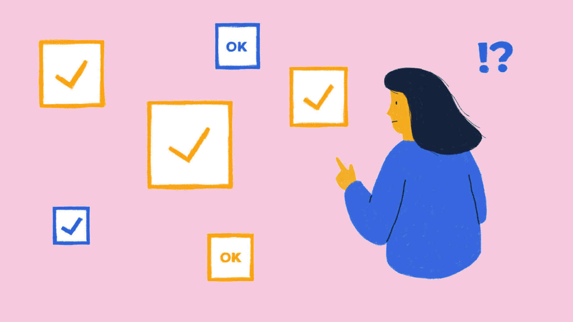
Challenge 3. Giving Users Too Much Choice
What are the elements of good application design? All the right ones. Apologies for such a vague (and, frankly, frustrating) answer, but it’s true. Good UX for enterprise apps hinges on equipping users with everything they need to accomplish their respective goals (managing customer communications, staying on top of billings, etc.). [pullquote]Good UX…hinges on equipping users with everything they need to accomplish their respective goals[/pullquote] That’s why the two fixes we’ve covered so far are so important: You create only the most practical, necessary functions and take user feedback on board. Without doing either of these, you run the risk of creating a product with more elements than it needs. And that can lead to poor UX. Here’s your fix:- Validate all additions you make to the enterprise application: analyze user behavior to see whether new features and options are actually used.
- Identify why any unused elements aren’t necessary and try to determine if they can be tweaked to offer the user more value.
- Remove aspects of the application that don’t add to the user experience and ensure their extraction doesn’t affect the product’s performance elsewhere.
 Quality function and performance both have the power to aid users in a wealth of tasks, but failure to overcome the above challenges will result in a sub-par experience. Follow these tips and take action to deliver a higher standard of UX design in enterprise applications.
WDD Staff
WDD staff are proud to be able to bring you this daily blog about web design and development. If there's something you think we should be talking about let us know @DesignerDepot.


Read Next

15 Best New Fonts, July 2024
Welcome to our monthly roundup of the best fonts we’ve found online in the last four weeks. This month, there are fewer…
By Ben Moss

20 Best New Websites, July 2024
Welcome to July’s round up of websites to inspire you. This month’s collection ranges from the most stripped-back…

Top 7 WordPress Plugins for 2024: Enhance Your Site's Performance
WordPress is a hands-down favorite of website designers and developers. Renowned for its flexibility and ease of use,…
By WDD Staff

Exciting New Tools for Designers, July 2024
Welcome to this July’s collection of tools, gathered from around the web over the past month. We hope you’ll find…

3 Essential Design Trends, July 2024
Add some summer sizzle to your design projects with trendy website elements. Learn what's trending and how to use these…

15 Best New Fonts, June 2024
Welcome to our roundup of the best new fonts we’ve found online in the last month. This month, there are notably fewer…
By Ben Moss

20 Best New Websites, June 2024
Arranging content in an easily accessible way is the backbone of any user-friendly website. A good website will present…

Exciting New Tools for Designers, June 2024
In this month’s roundup of the best tools for web designers and developers, we’ll explore a range of new and noteworthy…

3 Essential Design Trends, June 2024
Summer is off to a fun start with some highly dramatic website design trends showing up in projects. Let's dive in!

15 Best New Fonts, May 2024
In this month’s edition, there are lots of historically-inspired typefaces, more of the growing trend for French…
By Ben Moss

How to Reduce The Carbon Footprint of Your Website
On average, a web page produces 4.61 grams of CO2 for every page view; for whole sites, that amounts to hundreds of KG…
By Simon Sterne

20 Best New Websites, May 2024
Welcome to May’s compilation of the best sites on the web. This month we’re focused on color for younger humans,…