3 Lessons UX Designers Can Take from Netflix
There’s a reason consumers are drawn to streaming video services like Netflix, Hulu, and HBO Go. And it’s not just the fact that the combined cost of these services is often cheaper than many cable packages.

1. Make Onboarding Painless
Obviously, Netflix is a household name, so it doesn’t need to mince words on its website.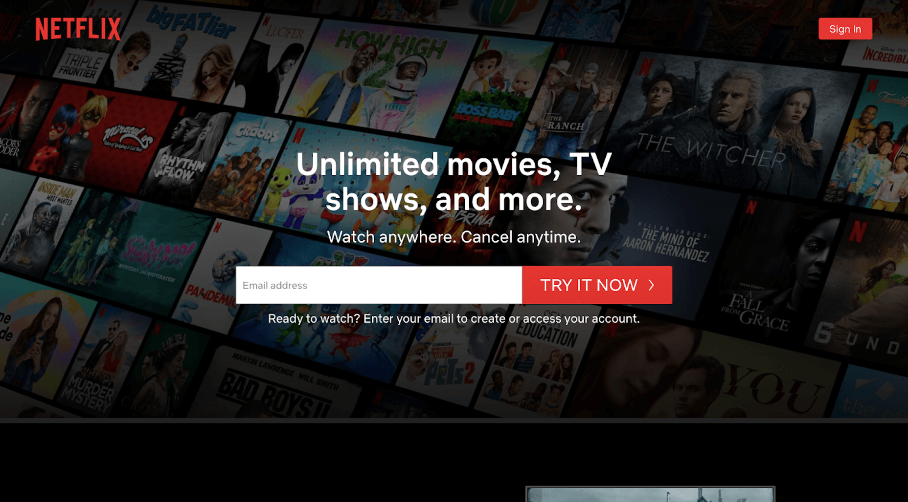 While you won’t be able to get away with a navigation-less website, what you can do to emulate the Netflix UX is to deliver just as brief and benefits-driven of a message above-the-fold.
Unlimited movies, TV shows, and more. Watch anywhere. Cancel anytime.It perfectly sums up what users get while also taking the risk and fear out of it with “Cancel anytime.” Can you do the same? Totally. While you’re at it, build a shortcut to the conversion point (e.g. newsletter subscription, SaaS purchase, schedule an appointment, etc.) in the same banner. Most of your visitors will need some time to educate themselves, but this will at least shorten the signup process for those who are ready to take action. When that happens, make sure your conversion funnel is streamlined, too.
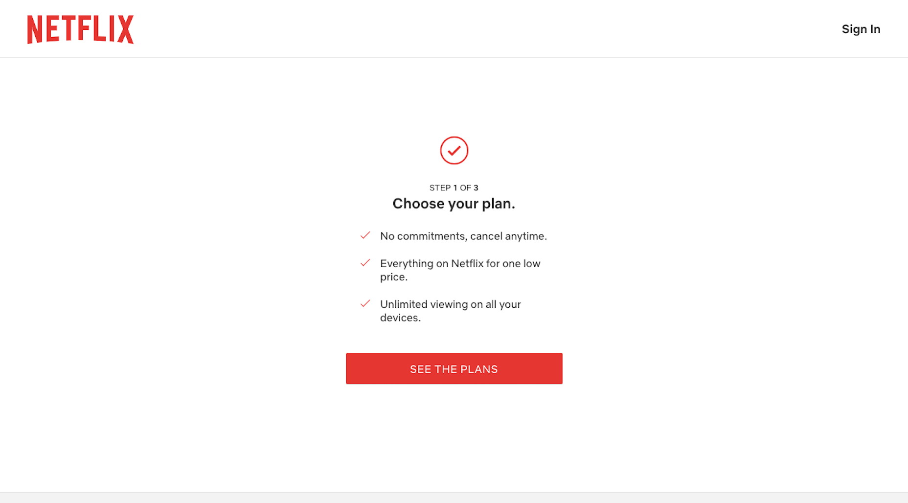 In the first step of Netflix’s signup process, it lets customers know how many steps there are while reiterating the benefits. The interface is distraction-free and easy to follow.
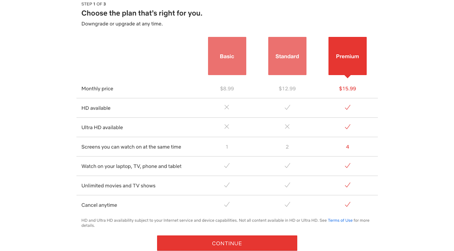 Next, users see plan options. Again, the UI is simple and easy to follow. The table comparing the features and value of each plan is a nice touch, too.
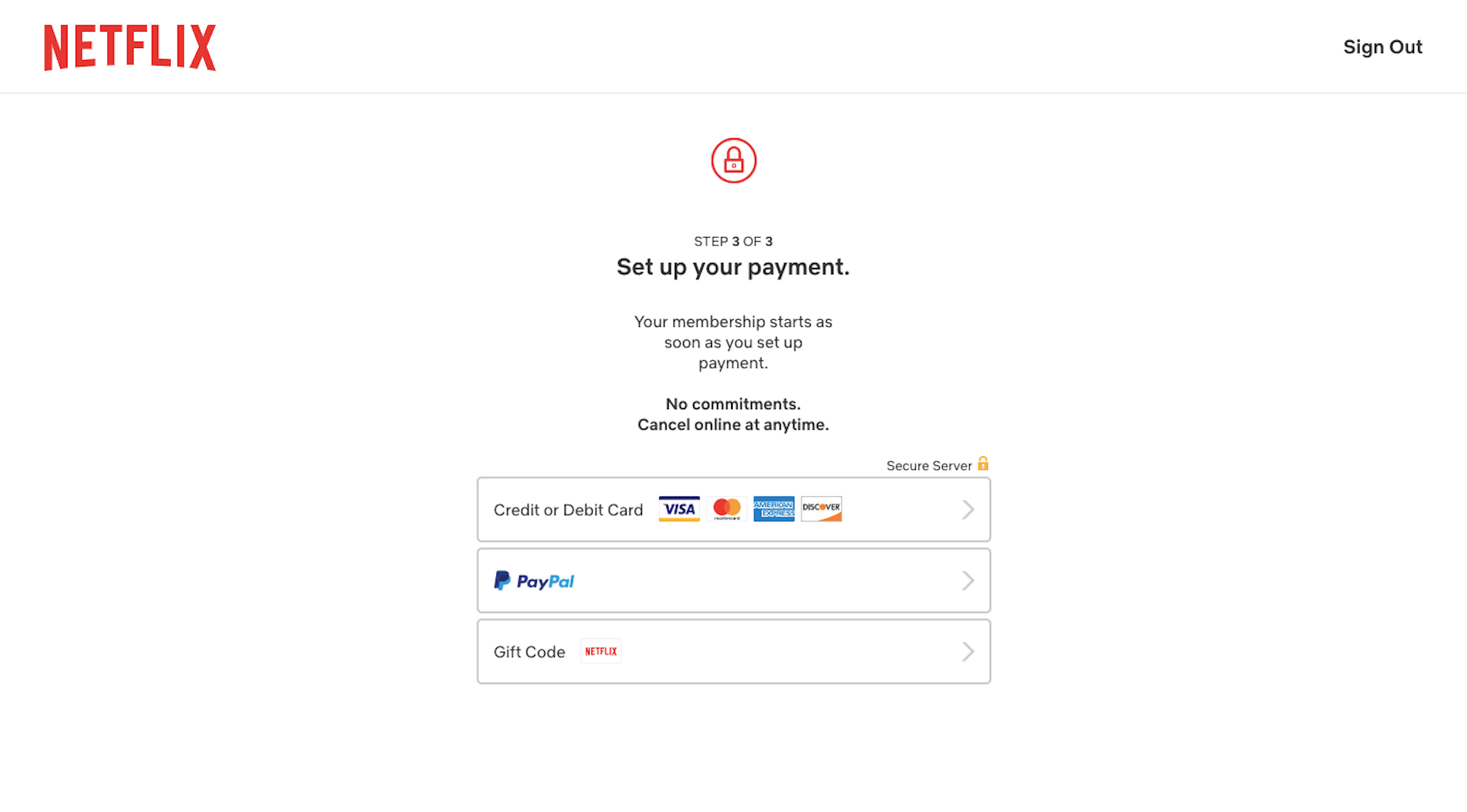 The final step is just as minimally designed. With a clean and clear interface, and a benefits-driven message, there’s no reason a user should have any problems getting through this process nor should they have any doubts along the way.
2. Use Your Data to Create a More Personal UX
Every year, it seems like we have a new law that sends web designers and business owners scrambling to strengthen their website privacy and security policies. And while it might feel like we’re losing control over all that big data we’ve gained access to in recent years, that’s not really the case. What’s happening is that consumers want businesses to more carefully protect their data. Plain and simple. There’s nothing in these laws that’s telling us to stop collecting user data. If that happened, I think consumers would be just as outraged. Personalization is one of those things consumers actually look for in the user experience — and the better a website can deliver on it, the more loyal they’ll be as customers. As far as being responsible with user data, that’s up to you and your clients to manage. As for using the data you’re given, Netflix has shown us a number of ways to use only the most necessary data points to create a very personal experience. First, you need to start collecting data that’ll help you refine the experience. Netflix empowers customers to help with this here: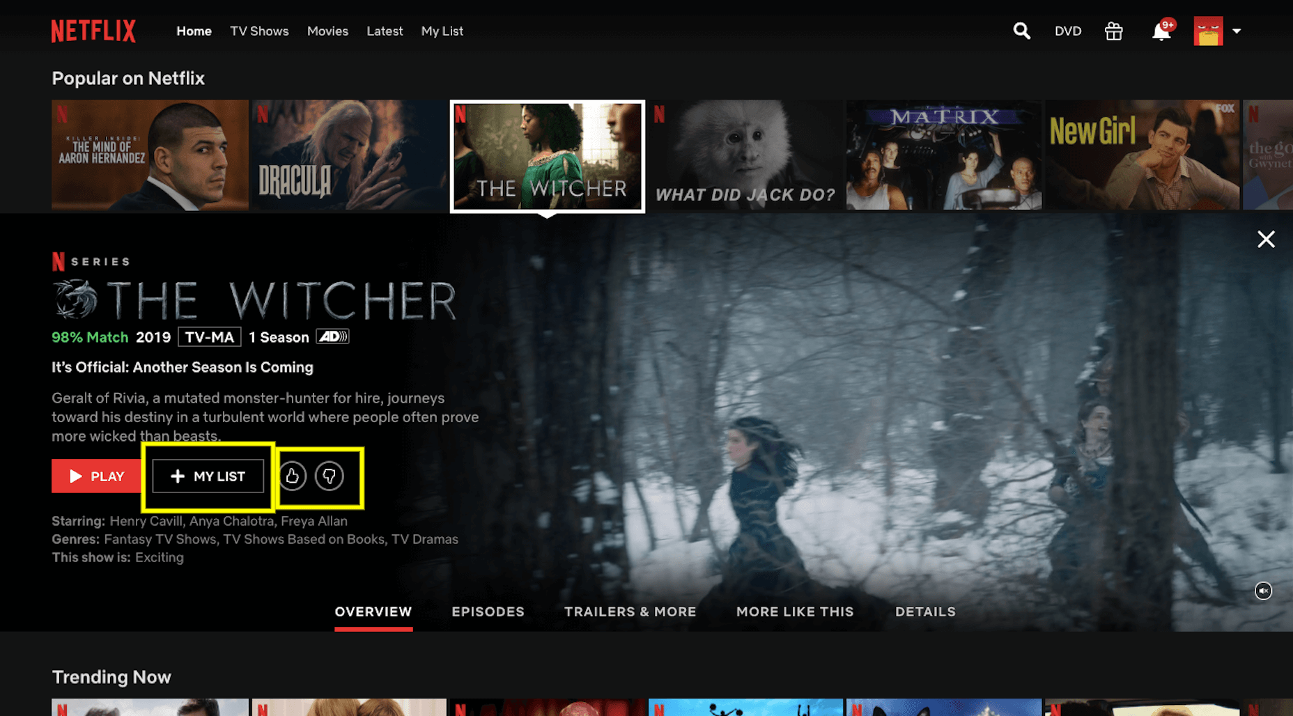 With each movie or show’s page, users can:
- Add it to their personal viewing list;
- Rate it with a thumbs up or thumbs down.
 When customers are rooting around for a new movie or show to watch, this percentage should give them a clue as to how much they’ll like or dislike it. This, in turn, encourages them to rate more programs so that Netflix’s ranking algorithm can become more attuned to their preferences.
The second spot Netflix provides personalized recommendations is the main page. It actually uses this page in a couple of ways to deliver custom suggestions to users.
The first is with “Because You Watched” categories:
When customers are rooting around for a new movie or show to watch, this percentage should give them a clue as to how much they’ll like or dislike it. This, in turn, encourages them to rate more programs so that Netflix’s ranking algorithm can become more attuned to their preferences.
The second spot Netflix provides personalized recommendations is the main page. It actually uses this page in a couple of ways to deliver custom suggestions to users.
The first is with “Because You Watched” categories:
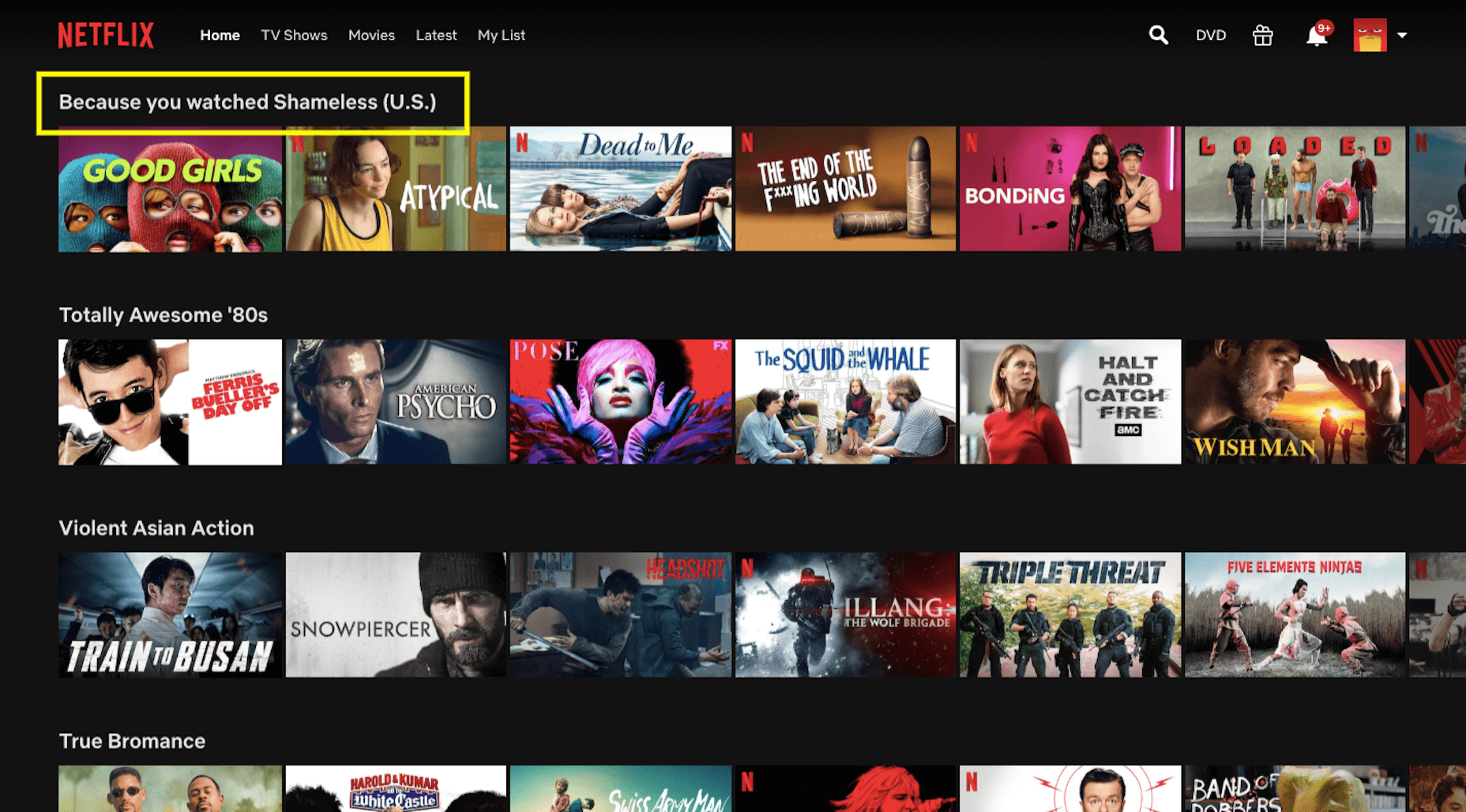 If a user spends enough time with a particular product, service, or content on your site, there’s a good chance they’ll like similar ones. So, this is a great way to build those suggestions into the UX.
The other way Netflix uses this page to deliver a personalized experience is through its categories. Note the categories I was shown above:
If a user spends enough time with a particular product, service, or content on your site, there’s a good chance they’ll like similar ones. So, this is a great way to build those suggestions into the UX.
The other way Netflix uses this page to deliver a personalized experience is through its categories. Note the categories I was shown above:
- Totally Awesome 80’s;
- Violent Asian Action;
- True Bromance.
3. A/B Test All New Features
I’ve been a Netflix customer since 2007, so I’ve seen it go through a ton of changes over the years. WebDesigner Depot has, too: From branding to layouts, and pricing to features, Netflix always seems to be switching things up. But here’s the thing: Netflix always implements changes that are meant to enhance the user experience. And when they don’t? It simply rolls the platform back to the way its customers preferred it.
One of the first times I remember this happening was with Max, Netflix’s talking bot:
This wasn’t a feature that was shoved onto users. It would sit in its dedicated space, waiting to be interacted with. Max would then welcome you back and ask what you’re in the mood to watch. You could pick a genre or you could let the bot provide recommendations based on how you rate other movies.
In all honesty, I was on the fence about Max. It was entertaining and I loved finding hidden gems through it. However, there were too many nights where I’d use Max hoping to find the perfect movie… only to abandon it and find something on my own.
That’s why it was no surprise when Max quietly slipped away. I have a feeling other users were just as ambivalent about it as I was.
There are a number of lessons, UX or otherwise, you can take away from this:
From branding to layouts, and pricing to features, Netflix always seems to be switching things up. But here’s the thing: Netflix always implements changes that are meant to enhance the user experience. And when they don’t? It simply rolls the platform back to the way its customers preferred it.
One of the first times I remember this happening was with Max, Netflix’s talking bot:
This wasn’t a feature that was shoved onto users. It would sit in its dedicated space, waiting to be interacted with. Max would then welcome you back and ask what you’re in the mood to watch. You could pick a genre or you could let the bot provide recommendations based on how you rate other movies.
In all honesty, I was on the fence about Max. It was entertaining and I loved finding hidden gems through it. However, there were too many nights where I’d use Max hoping to find the perfect movie… only to abandon it and find something on my own.
That’s why it was no surprise when Max quietly slipped away. I have a feeling other users were just as ambivalent about it as I was.
There are a number of lessons, UX or otherwise, you can take away from this:
- Be careful of trying the latest AI fads, they’re just too costly to invest in without hard data that proves that’s what your users want;
- Give a new feature enough time to build up steam and provide you with reliable metrics — I remember Max being available for about six months, that’s more than enough time to gather user feedback and decide if a feature is worth keeping or not;
- Personalization is great, but not necessarily if it’s at the expense of your customers’ time, sometimes the simpler feature is better.
 This appears when the opening credits and theme song play at the start of a TV show. There’s really not a lot of value in sitting through this every time, and I’m willing to bet that Netflix saw that most of its users were manually fast-forwarding through them when it decided to try out this feature.
Here’s another recent feature that I think has some staying power:
This appears when the opening credits and theme song play at the start of a TV show. There’s really not a lot of value in sitting through this every time, and I’m willing to bet that Netflix saw that most of its users were manually fast-forwarding through them when it decided to try out this feature.
Here’s another recent feature that I think has some staying power:
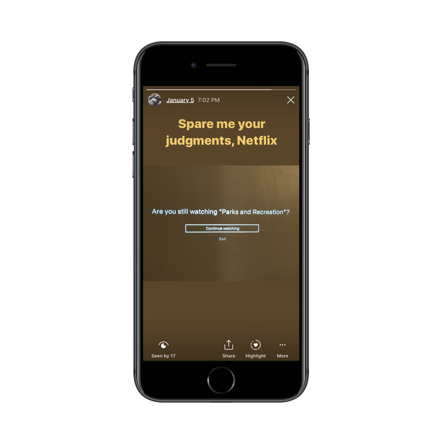 While streaming services are responsible for the epidemic of binge-watching, it’s not necessarily in their best interest to allow customers to do so. Think of this “Are you still watching?” wake-up call as a form of ethical design.
This feature has been around for over a year, and it’s still going strong.
Bottom line? It’s really important to research your users when you’re in the process of building a website. However, there’s nothing more valuable than real user input from a live website.
Whether you plan to roll out a new feature or simply want to test the validity of one that exists, don’t run on assumptions. Use the new data coming in every day to further improve your design and features.
While streaming services are responsible for the epidemic of binge-watching, it’s not necessarily in their best interest to allow customers to do so. Think of this “Are you still watching?” wake-up call as a form of ethical design.
This feature has been around for over a year, and it’s still going strong.
Bottom line? It’s really important to research your users when you’re in the process of building a website. However, there’s nothing more valuable than real user input from a live website.
Whether you plan to roll out a new feature or simply want to test the validity of one that exists, don’t run on assumptions. Use the new data coming in every day to further improve your design and features.
Invaluable Lessons UX Designers Can Take from Netflix
Although Netflix’s market share is slowly being chipped away at by the competition, it continues to reign supreme when it comes to streaming video services. I don’t see that changing anytime in the future either, considering how how long it’s demonstrated its willingness to innovate alongside evolving consumer needs. And that’s really the key point I want to make in this post. While I could’ve pointed out its dramatic color palette or use of a responsive layout, we already are familiar with these concepts. The most important UX lessons we should be taking away from Netflix are the ones here.WDD Staff
WDD staff are proud to be able to bring you this daily blog about web design and development. If there's something you think we should be talking about let us know @DesignerDepot.


Read Next

15 Best New Fonts, July 2024
Welcome to our monthly roundup of the best fonts we’ve found online in the last four weeks. This month, there are fewer…
By Ben Moss

20 Best New Websites, July 2024
Welcome to July’s round up of websites to inspire you. This month’s collection ranges from the most stripped-back…

Top 7 WordPress Plugins for 2024: Enhance Your Site's Performance
WordPress is a hands-down favorite of website designers and developers. Renowned for its flexibility and ease of use,…
By WDD Staff

Exciting New Tools for Designers, July 2024
Welcome to this July’s collection of tools, gathered from around the web over the past month. We hope you’ll find…

3 Essential Design Trends, July 2024
Add some summer sizzle to your design projects with trendy website elements. Learn what's trending and how to use these…

15 Best New Fonts, June 2024
Welcome to our roundup of the best new fonts we’ve found online in the last month. This month, there are notably fewer…
By Ben Moss

20 Best New Websites, June 2024
Arranging content in an easily accessible way is the backbone of any user-friendly website. A good website will present…

Exciting New Tools for Designers, June 2024
In this month’s roundup of the best tools for web designers and developers, we’ll explore a range of new and noteworthy…

3 Essential Design Trends, June 2024
Summer is off to a fun start with some highly dramatic website design trends showing up in projects. Let's dive in!

15 Best New Fonts, May 2024
In this month’s edition, there are lots of historically-inspired typefaces, more of the growing trend for French…
By Ben Moss

How to Reduce The Carbon Footprint of Your Website
On average, a web page produces 4.61 grams of CO2 for every page view; for whole sites, that amounts to hundreds of KG…
By Simon Sterne

20 Best New Websites, May 2024
Welcome to May’s compilation of the best sites on the web. This month we’re focused on color for younger humans,…