

 While fine art is a subjective field, graphic design is more formulaic in its fundamentals. An effective design should make people feel a certain way and take a certain action. In this article I’d like to share Gravity Switch’s web design principles and our thinking behind them.
Those rules are: define goals first; focus on users second; design for emotion; follow the rules of visual design; build a clear, visual hierarchy; be consistent; break the rules (when necessary); don’t overuse gimmicks; and finally test, measure & improve.
1. Define goals first
I bet you thought I was going to say "focus on users first", that's what most people say. Forget that, let’s start with your goals. Begin every website design project with a brainstorming session that outlines clear, realistic website goals that reinforce to your business objectives.
To better illustrate this let’s look to Amazon. Their objective is to maximize product sales. Through “upselling” and “cross-selling” they can maximize the purchasing power of each user, but to be successful in this they slow down the buying process. Unlike many of their competitors, Amazon does not have a “buy now” button in their search results. Users must visit one more page (with potential upsells) before making a purchase. This is a perfect example of how a site design can meet clear business goals.
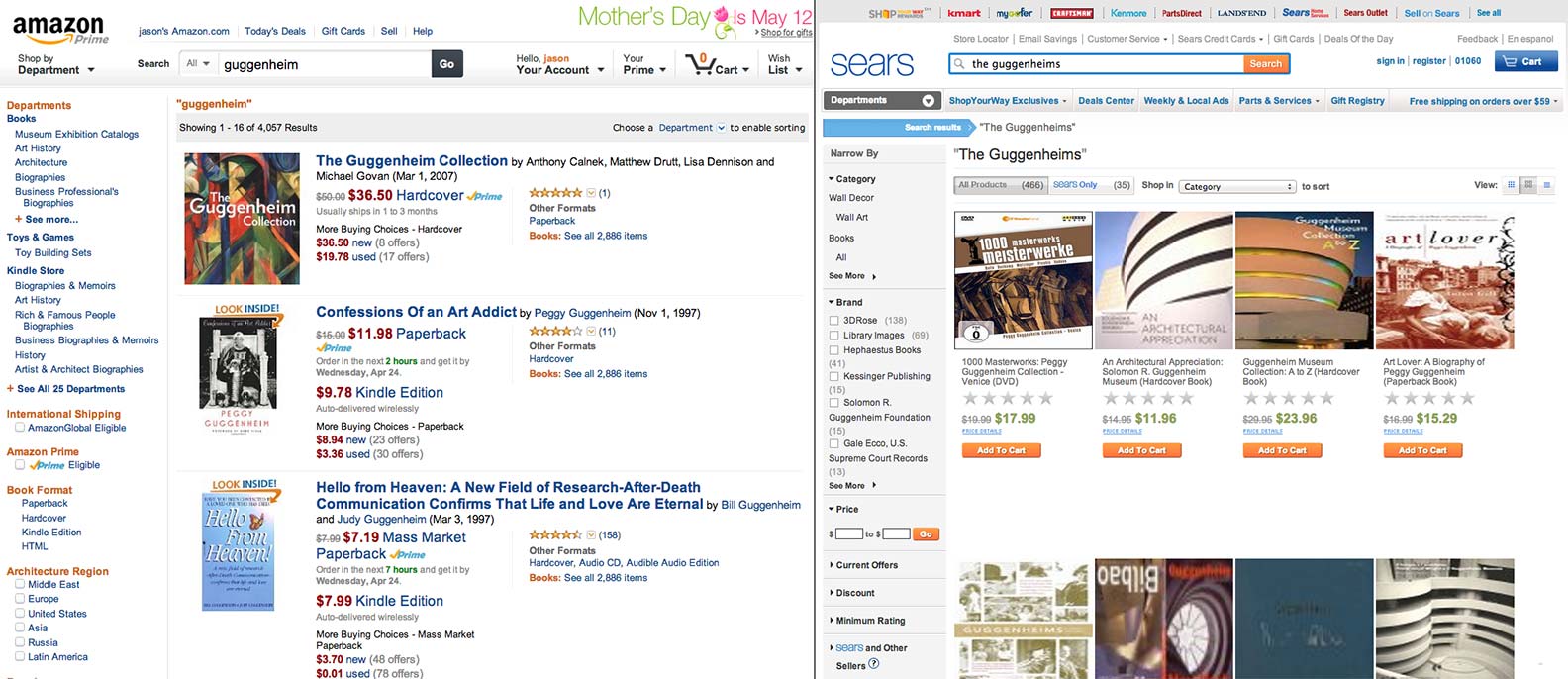
Most modern ecommerce sites have removed the “buy now” button from their search results, although some brick and mortar outlets still have it.
2. Focus on users second
With your clear goals top of mind, you’ll then need to define and prioritize users. Be as specific as possible. Some examples of questions to ask are:
- Male vs. female breakdown?
- Education level?
- Locations in country?
- Related hobbies?
- Income bracket?
- Who’s driving kids' product purchases? Kids? Parents? Grandparents?
The key point is that designers should be aware of users so they can ensure their designs don't block key usage paths.
3. Design for emotions
Be sure you understand what emotions your brand should convey. Brainstorm. Ask questions. Get agreement. And possibly most importantly, focus on these emotions when presenting back to your clients. Never ask if your client “likes” a design. When you deliver designs you should instead ask questions such as “Which of these makes you feel most professional?” or “When you compare these two designs you’ll see that this one is more modern, while this one is more dynamic. Those were both emotions that were important to you, now that you’re seeing them visually which do you think is the most important emotion for you to present to your target audience?”
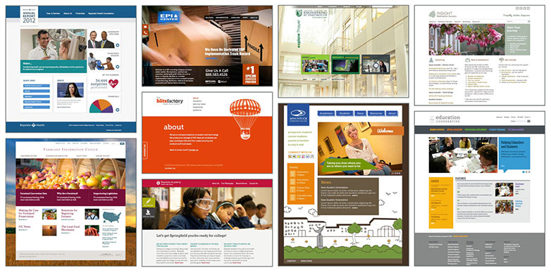
Which of these organizations are fun? Relaxing? Innovative? Busy? Real? (Designs by @JessicaShiner and Christine Mark)
4. Follow the rules of visual design
There are many small elements that website users consciously and subconsciously use to decide if they’re going to trust a website. The most important ones are:
- Cropping: selecting photos is only half the battle, cropping photos is what makes or breaks a page layout.
- Negative space: paying careful attention to margins, padding, and line height is the difference between looking like the New York Times vs. a high school newsletter.
- Fonts: everyone loves choosing fonts, but a great designer can spot a professional font quickly and has the restraint to keep the number of fonts on the website to 1-2 (not counting the logo which is often its own font).
- Colors: colors are one of the hardest things for designers to use effectively. There are so many rules to picking a good color palette, and while it’s tempting to use online color palette generators, spend time designing your own color palette.
- Layout: create good visual page “flow” so that the user’s eyes go where you want them to go on the page without other elements visually clouding your objectives.
5. Build a clear, visual hierarchy
Website visitors skim. They don’t read. Grab their attention and get them to the most important information with a clearly defined, well thought out visual hierarchy. A well thought out design — site > page > section — leads the user through the page the way you want. Users should be able to glance at your page and understand it in a split second.
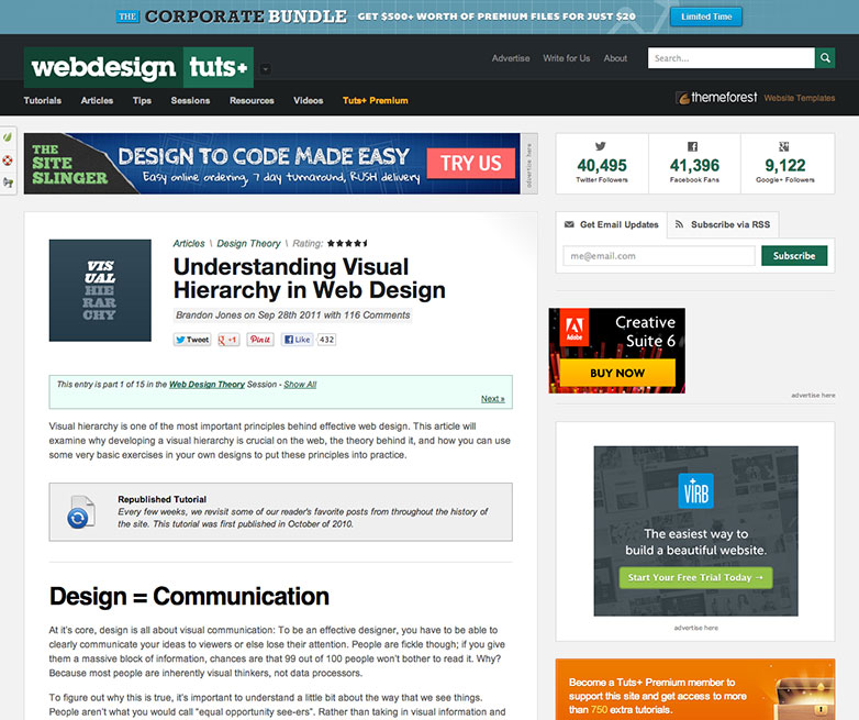
Look at the following example of an article and notice how it’s hard for your eye to tell what the page is about or where the article starts!
Below is a mockup I made by changing about a dozen lines of CSS to create a clearer visual hierarchy on this page in the following ways:
- The article title should be the most prominent element on the page. It’s currently a smaller font size than the heading further down the page! So I increased the size of the article title, and decreased the size of the headings.
- The heading further down the page was also disconnected from the content it was a heading for visually, so I also tightened up the spacing below the heading while leaving the space above the heading to let users know that it is a heading for the paragraph below it.
- I also moved the little image to the right of the title instead of the left so that when a user scans down the left-hand side of the page to orient themselves the article title is in their vision.
- I removed the border and background classes on the blue blurb so it no longer competes with the heading and removed the top margin. There was already a class in place to make it grey, which works fine in this instance.
- I also removed the distracting text and image which highlights that this is a reprint article as well as some empty paragraphs and <hr> tags.
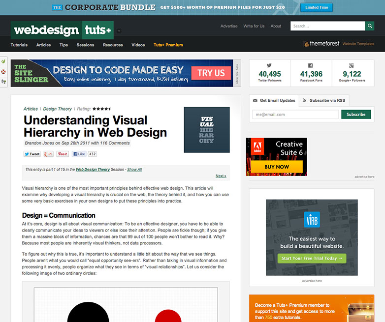
I intentionally left all advertisements as they were originally coded, assuming that’s a critical part of this page.
6. Be consistent
Don’t confuse your users. Links should be consistent and distinct. Should you choose to use icons, photos and illustrations throughout make sure they look and feel like they belong as a cohesive set. Inconsistencies will distract the your user and obscure your message. Don't use more than 3 fonts — it’s best if they're all in the same family. Limit yourself to 5-6 colors (Note: the logo can be a different font, and often should be).
7. Break the rules (when necessary)
If there is something particularly unique or important that you need to highlight, you may need to “break the rules.” You can use one or two contrasting colors to help the element stand out. For example the UK website below emphasizes the tax rate by making this a larger element with a pop of color.
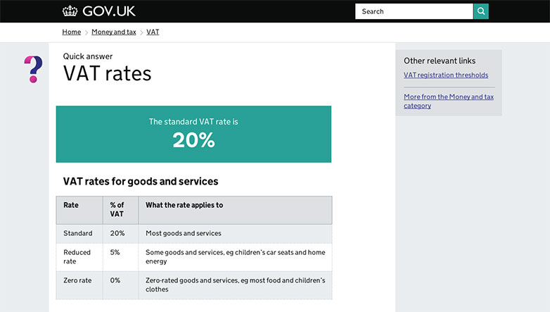
When people visit the info page about the VAT tax, the designers of GOV.UK made sure that the information most people need is front and center.
8. Don’t overuse gimmicks
Make your design fun, but make sure those elements support what you’re trying to accomplish on the site. For example the Inze site is beautiful to look at and wonderful on mobile but when I visited it on my desktop computer I was lost. It turns out the navigation is hidden until you start scrolling which unfortunately took my eye to the the bottom of the page. As a result I didn’t even notice the subtle navigation appearing at the top. I scrolled most of the way to the bottom before even realizing that there was (finally) a navigation on the top. The “hidden” navigation is a neat effect, but the “design” prevented me from taking the desired action. In the end, it conveys a confusing, sloppy brand image.
Compare Inze to what happens right in this article here on Web Designer Depot when you roll over a link on your desktop computer. We have a neat effect but it doesn’t create a “barrier” for users for the sake of a gimmick. It also degrades gracefully so it won’t break on mobile or older browsers.
9. Test. Measure. Improve
Websites evolve. Design for flexibility and adaptability. Collecting and analyzing ongoing test data will drive constant improvement. Remember, it’s all about creating a design that meets your goals.
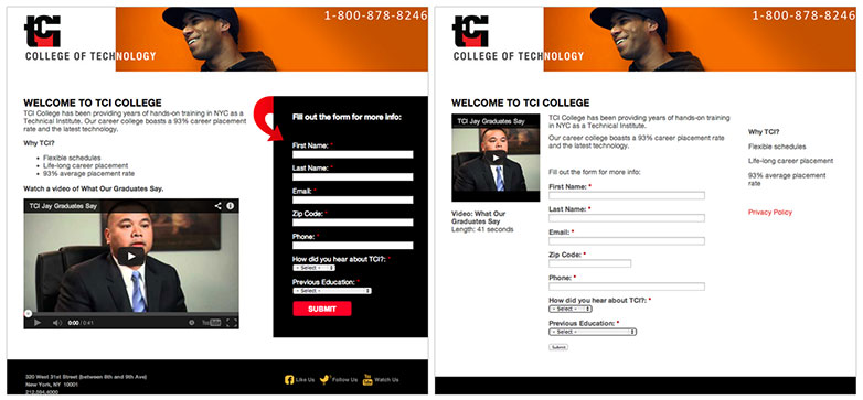
By carefully measuring the results of a series of minor design changes to the original landing page (left) we came up with a new design (right) that increased the percent of signups by 60%!
Remember
Effective graphic design needs to emotionally connect the user with the brand while at the same time getting them to do what you want. It can be done.
Do you agree with these rules for design? Would you add any more? Let us know your views in the comments.
Featured image/thumbnail, emotion image via Shutterstock.
Jason Mark


Read Next

15 Best New Fonts, July 2024

20 Best New Websites, July 2024

Top 7 WordPress Plugins for 2024: Enhance Your Site's Performance

Exciting New Tools for Designers, July 2024

3 Essential Design Trends, July 2024

15 Best New Fonts, June 2024

20 Best New Websites, June 2024

Exciting New Tools for Designers, June 2024

3 Essential Design Trends, June 2024

15 Best New Fonts, May 2024

How to Reduce The Carbon Footprint of Your Website
