
Defining the Marketing Call to Action
Let’s start simple, by looking at what a CTA actually is. A call to action is a button or link that tells the user on your website what to do next. When a potential customer scrolls to the bottom of your landing page or home page, they might see a CTA telling them to “Create an Account”, “Buy Now”, or “Download Here”. CTAs are all about one thing: action. The mystorytime.com website simply uses the CTA “Start” on its homepage: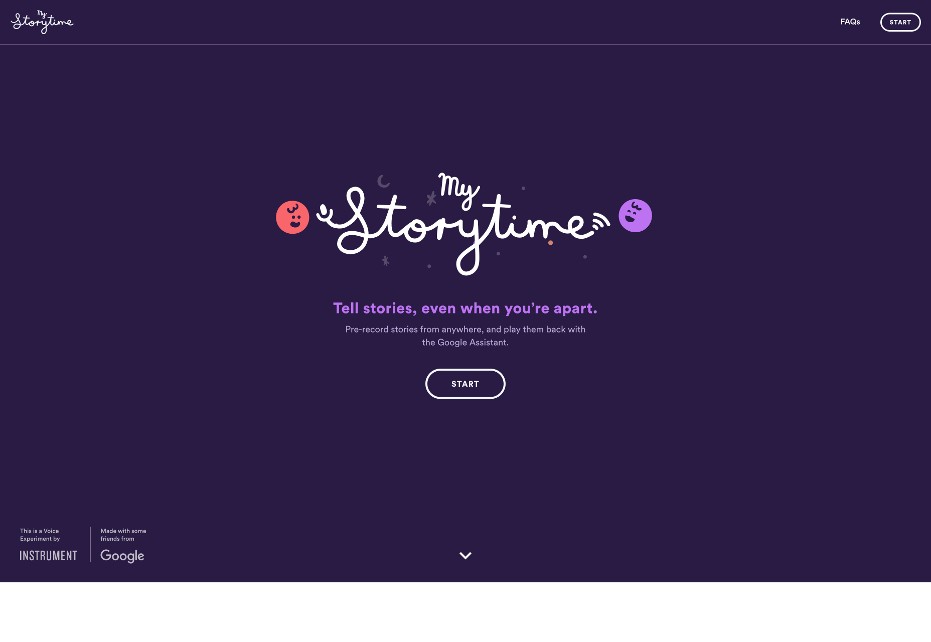 Regardless of the end goal of your CTA, the goal is always to drive conversions. For instance, you might be encouraging:
- Awareness: “Learn More”, “Find out how”
- Consideration: “Download Now”
- Decision: “Contact us”, “Book a Demo”
- Retention: “Become a Member”, “Sign up Now”
- Advocacy: “Share your Thoughts”
Different Web Pages Require Different Numbers of CTA
Just because every web page should have a CTA, doesn’t mean that it’s a good idea to use the same strategy for everything. Each asset in your digital portfolio, from your home pages to your landing pages plays a role in the customer journey. While some assets, like your homepage, need to give your audience members plenty of choice, others should be as focused as possible. Let’s look at how many CTAs are appropriate for the different pages on your website.Homepage CTAs
A homepage is going to have multiple CTAs because it’s the first page introducing customers to your brand and whatever you have to offer. The people who visit a company or client’s homepage won’t necessarily have a single goal in mind. Some of them will want to learn more about a brand, while others will want to check out your client’s products. Take a look at the King and Mcgaw homepage, for instance, there are plenty of options to click on: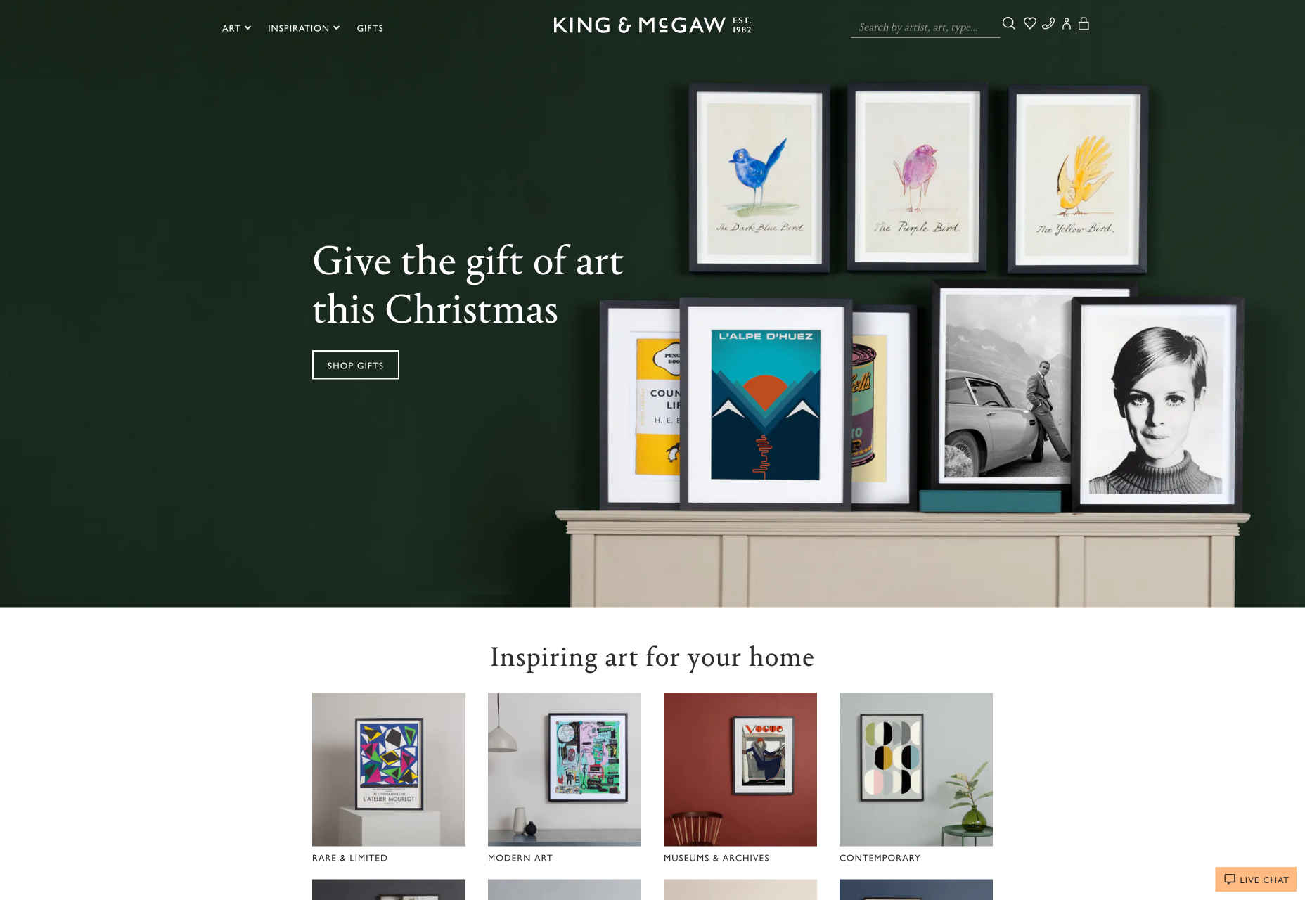 With a homepage, you want to give customers as much freedom as possible. They’re at a stage in their buyer journey where they don’t want to be pushed into a single decision.
Sure, some customers might arrive on your website and decide to immediately buy something, but it’s not likely. Give leads a chance to enter a journey of nurturing with your client business before you push them into doing too much, too fast.
With a homepage, you want to give customers as much freedom as possible. They’re at a stage in their buyer journey where they don’t want to be pushed into a single decision.
Sure, some customers might arrive on your website and decide to immediately buy something, but it’s not likely. Give leads a chance to enter a journey of nurturing with your client business before you push them into doing too much, too fast.
Product Page CTAs
Most product pages will have at least a couple of CTAs available, because there’s a chance that your site will have more than one kind of visitor. On the one hand, you could have a buyer that wants to add your product to their basket and continue browsing; On the other hand, you might have a lead that just wants to check out straight away. Depending on the kind of product that your client is selling, you might even have people visiting a website’s product pages that just want to talk to a customer service rep. There are plenty of product pages out there that include a link to the contact page. Check out this page from Karimoku Cat for instance. It comes with a link to both a product page, and an Amazon page, so customers can choose how they want to continue their journey.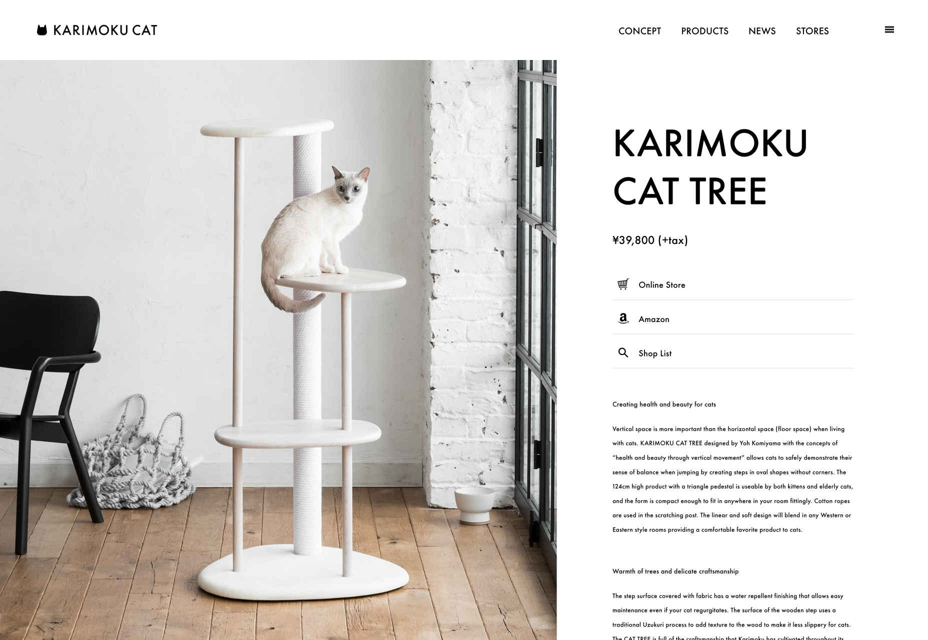
Support Page CTAs
Support or contact pages on a website will also probably have a number of CTAs. After all, most businesses don’t just give their customers the option to call a service rep when they have problems today. Instead, they might want you to design a page where users can answer their own questions through an FAQ, reach a chatbot, or connect with other users in a forum. The onwards.agency support page comes with access to an email address for users, a phone number, and links to Google Maps, Twitter, and Instagram: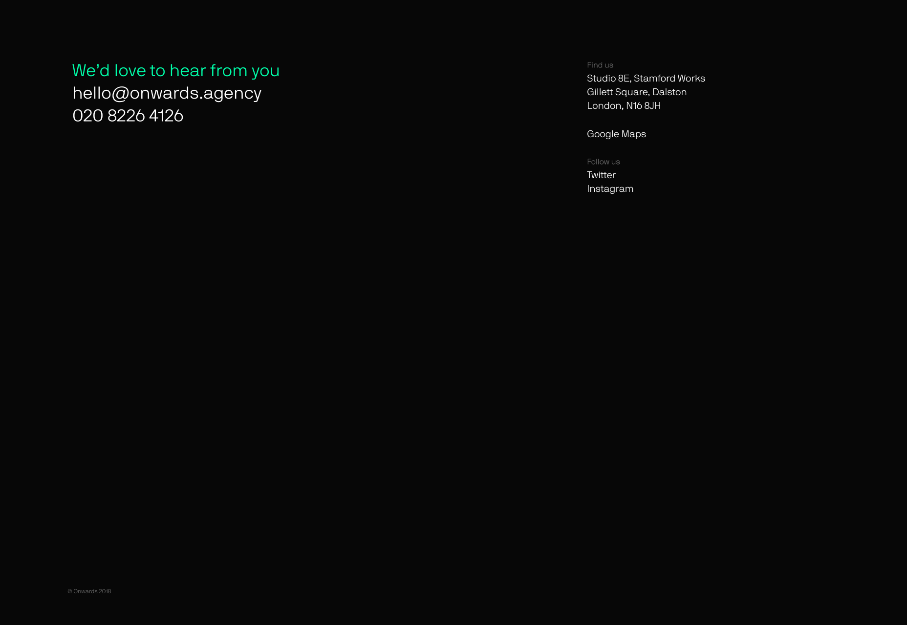 As a designer, you can choose whether to present those links as buttons, or just basic hyperlinks for customers to click on.
Landing Page CTAs
Now here’s where everything starts to change. While many of the web pages on a site can get away with having more than one CTA button, your dedicated landing pages can’t. A landing page isn’t just another part of a client website website, it’s focused strategy intended to drive specific action from a customer. Because of this, most landing pages should only stick with a single CTA that tells the audience member exactly what they want to do next. That’s the case with this simple Squeeze page here: When your clients put a lot of time, effort and focus into getting their users to arrive on a certain page, it’s your job as a designer to make sure that they stay there. Focus on a specific conversion request that keeps the visitor focused.
If you do decide to place an extra CTA on a landing page, make sure it’s something that will drive a similar outcome to the fundamental call to action. For instance “Buy now” could be accompanied by “Enquire today”.
When your clients put a lot of time, effort and focus into getting their users to arrive on a certain page, it’s your job as a designer to make sure that they stay there. Focus on a specific conversion request that keeps the visitor focused.
If you do decide to place an extra CTA on a landing page, make sure it’s something that will drive a similar outcome to the fundamental call to action. For instance “Buy now” could be accompanied by “Enquire today”.
Choosing The Right Number of CTAs for Any Page
There’s a common belief in the digital design world that you should only ever design a web page around a single call to action. However, that’s just not the case. While some pages should definitely have a single focus – others shouldn’t. A single call to action is the best route for dedicated pages where you want your customers to do one thing and nothing else. Squeeze pages, landing pages and lead capture pages often perform better the more focused they are. If a customer has clicked on an add or an email link to arrive at your landing page, there’s a good chance that they’re already ready to convert. There are other pages on a site that might require a single CTA too. For instance, a particular service page might just offer the option to send an inquiry to a team. However, there is room in website design for multiple CTAs too. A home page, store pages, and even contact pages might include more than one CTA button – and that’s okay. It’s all about adhering to the experience your client needs at different stages in the buying cycle when they’re trying to reach their customer.WDD Staff
WDD staff are proud to be able to bring you this daily blog about web design and development. If there's something you think we should be talking about let us know @DesignerDepot.


Read Next

15 Best New Fonts, July 2024
Welcome to our monthly roundup of the best fonts we’ve found online in the last four weeks. This month, there are fewer…
By Ben Moss

20 Best New Websites, July 2024
Welcome to July’s round up of websites to inspire you. This month’s collection ranges from the most stripped-back…

Top 7 WordPress Plugins for 2024: Enhance Your Site's Performance
WordPress is a hands-down favorite of website designers and developers. Renowned for its flexibility and ease of use,…
By WDD Staff

Exciting New Tools for Designers, July 2024
Welcome to this July’s collection of tools, gathered from around the web over the past month. We hope you’ll find…

3 Essential Design Trends, July 2024
Add some summer sizzle to your design projects with trendy website elements. Learn what's trending and how to use these…

15 Best New Fonts, June 2024
Welcome to our roundup of the best new fonts we’ve found online in the last month. This month, there are notably fewer…
By Ben Moss

20 Best New Websites, June 2024
Arranging content in an easily accessible way is the backbone of any user-friendly website. A good website will present…

Exciting New Tools for Designers, June 2024
In this month’s roundup of the best tools for web designers and developers, we’ll explore a range of new and noteworthy…

3 Essential Design Trends, June 2024
Summer is off to a fun start with some highly dramatic website design trends showing up in projects. Let's dive in!

15 Best New Fonts, May 2024
In this month’s edition, there are lots of historically-inspired typefaces, more of the growing trend for French…
By Ben Moss

How to Reduce The Carbon Footprint of Your Website
On average, a web page produces 4.61 grams of CO2 for every page view; for whole sites, that amounts to hundreds of KG…
By Simon Sterne

20 Best New Websites, May 2024
Welcome to May’s compilation of the best sites on the web. This month we’re focused on color for younger humans,…